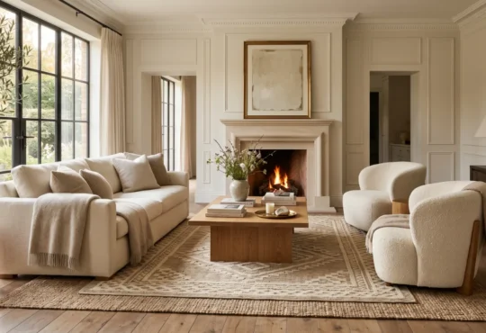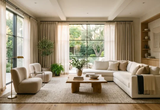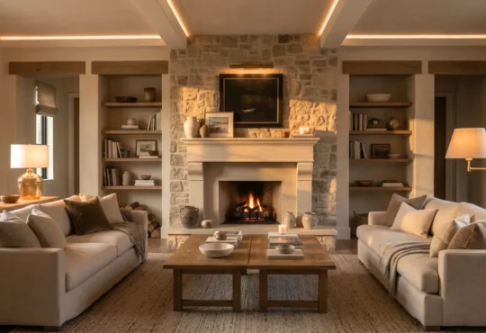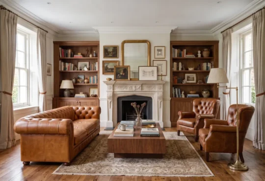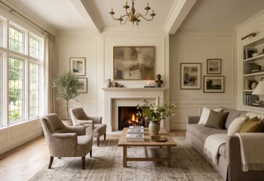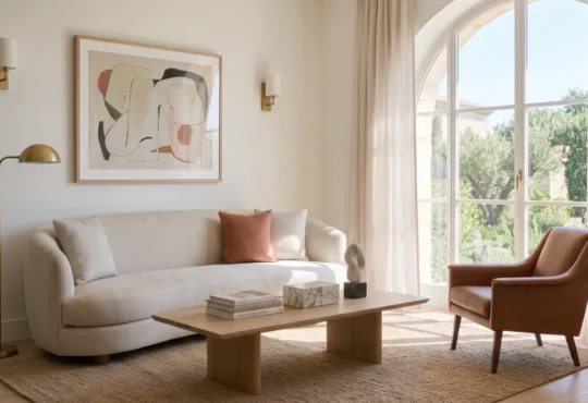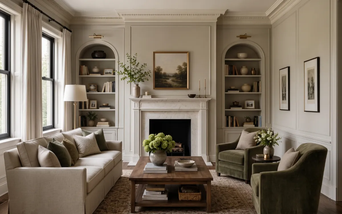
When thoughtfully paired with molding and architectural details, living room paint colors become part of the structure itself, creating interiors that feel refined, welcoming, and beautifully enduring. More than a decorative finish, the right color shapes mood, responds to light, and enhances texture and architectural details.
Whether you are designing a compact city apartment, a modern minimalist home, or a grand luxury living room, the right paint palette has the power to define space with quiet confidence. The most timeless interiors are rarely built around trends alone.
They emerge from a thoughtful balance of color, light, texture, and proportion. Every surface contributes to a living room that feels cohesive, elegant, and designed to endure.
Paint & Architecture
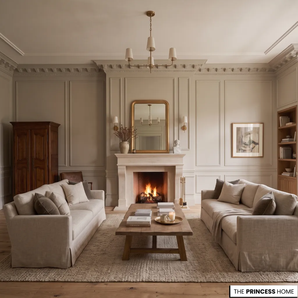
The relationship between living room paint colors and architectural details is one of quiet collaboration. Paint has the unique ability to either amplify or soften the structural features of a room, transforming how we perceive everything from ceiling height to wall depth.
In a compact living room, a light, airy shade applied uniformly across walls and trim can visually expand the space, making it feel larger and more open. Conversely, in a spacious luxury living room, a deep, saturated tone can create intimacy and warmth, drawing the eye inward and making the room feel more grounded.
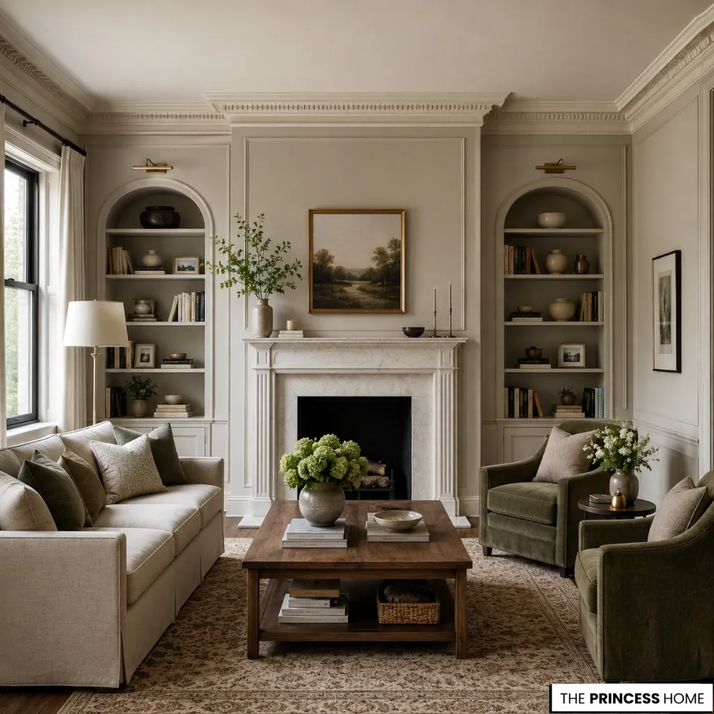
The key lies in understanding how color interacts with architectural elements such as crown molding, wainscoting, and built-in shelving. A warm neutral like a soft putty or taupe tends to soften the edges of ornate molding, creating a cohesive, enveloping feel that suits traditional and transitional interiors.
A cool neutral, such as a classic dove gray or a muted sage, sharpens the contrast with crisp white trim, emphasizing clean lines and contemporary geometry. This interplay is not merely decorative—it is architectural.
By treating paint as an extension of the home’s bones, you create a living room that feels inherently cohesive, where every surface speaks the same visual language and contributes to an overall sense of refined harmony.
Natural Light
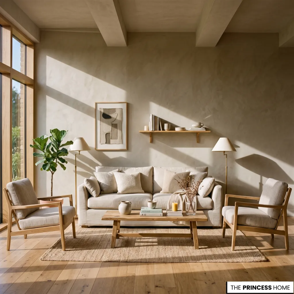
Natural light is the single most dynamic variable in how living room paint colors are perceived, transforming a single shade into countless variations throughout the day.
A color may read as a soft, comforting greige in the cool morning light. It may reveal warm, almost lavender undertones in the golden afternoon sun. Under evening lamplight, it can shift again to a deep, charcoal-tinged hue.
Understanding this daily evolution is essential to selecting a palette that feels timeless rather than fleeting. In a compact living room where natural light may be limited, a pale, warm-toned color can help bounce light around the room, creating the illusion of brightness and spaciousness.
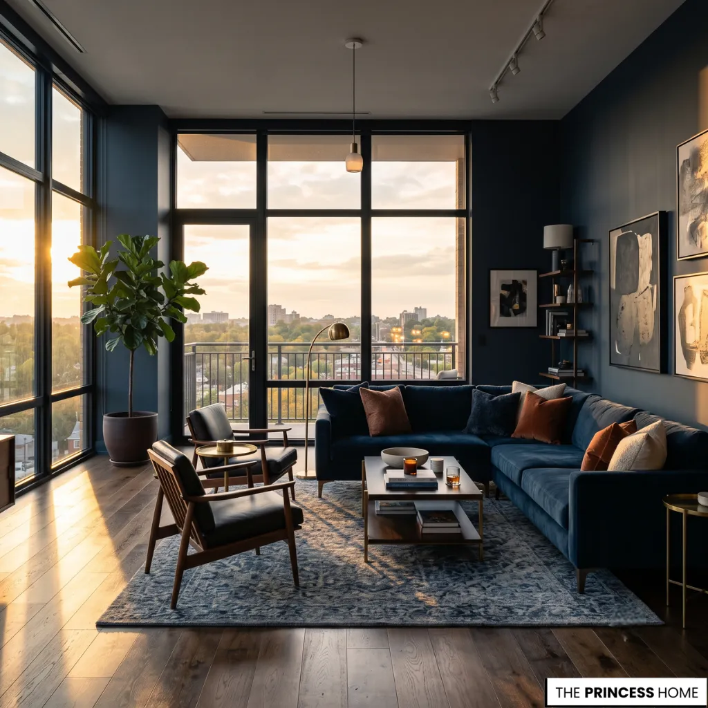
In a modern apartment with expansive windows, a cooler palette can balance the intensity of direct sunlight, preventing the room from feeling overly warm or washed out. For luxury living rooms with southern or western exposure, deeper, more saturated tones can be particularly effective.
They absorb rather than reflect the strong light, creating a rich, moody atmosphere. The effect changes beautifully as the sun moves across the sky.
The goal is not to fight the light but to work with it, choosing living room paint colors that embrace the natural rhythms of your space and evolve gracefully from dawn to dusk, ensuring your living room feels alive and responsive at every hour.
💡 EXPLORE MORE:
Looking for the right curtain scale and fabric? Read our complete guide to Living Room Curtains.
Walls & Trim
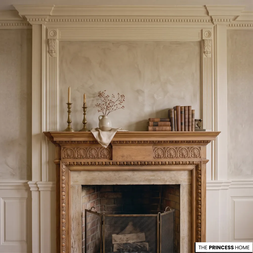
The quiet conversation between walls and molding is one of the most nuanced decisions in any living room paint color scheme, as it determines how architectural details are perceived and how the room ultimately feels.
The choice between a warm neutral palette and a cool neutral palette dramatically influences this relationship. Warm neutrals—think soft putty, creamy beige, or gentle taupe—make walls and trim feel integrated and soft, allowing decorative moldings to blend harmoniously rather than compete for attention.
This approach is particularly well-suited to traditional interiors and compact living rooms, where seamless transitions between surfaces can make the space feel larger and more cohesive.
Cool neutrals, such as classic gray, muted blue, or soft sage, create a distinct contrast with crisp white or off-white trim, emphasizing the sharp lines of paneling, picture rails, and crown molding.
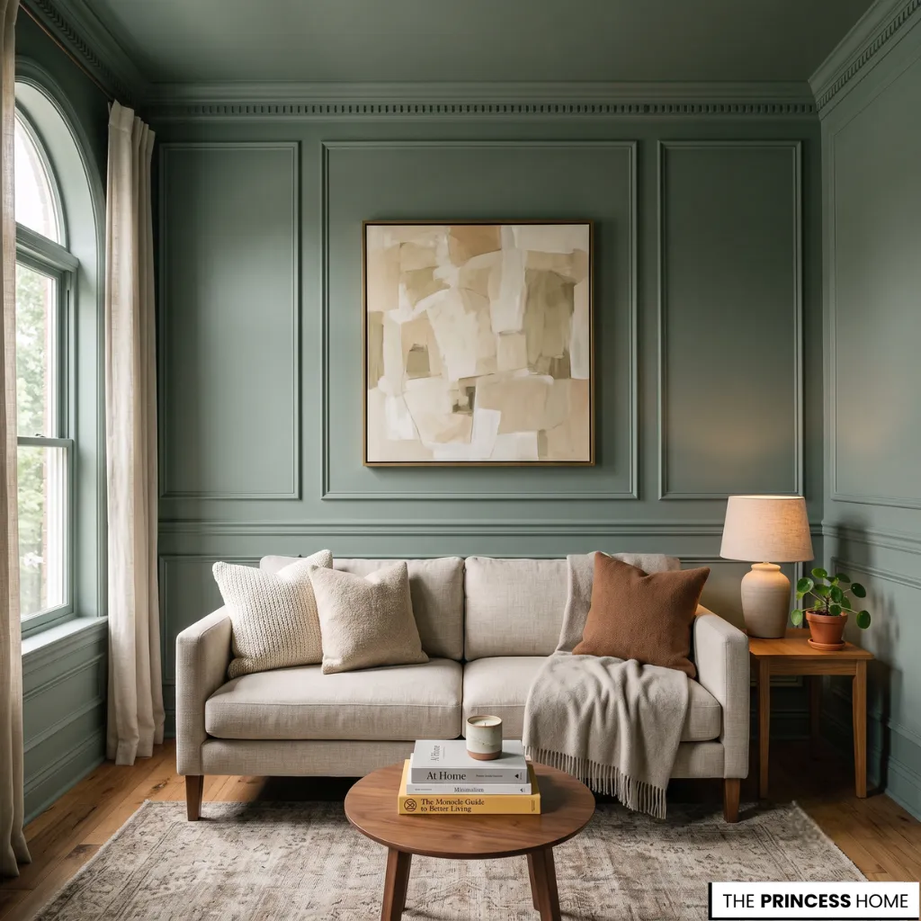
In a modern living room, this contrast lends a clean, architectural quality that feels fresh and current. For the homeowner seeking a timeless look, painting the walls and molding the same color can be remarkably effective.
This technique, known as color-drenching, works especially well in smaller spaces. It allows the eye to travel uninterrupted across surfaces, creating a serene, enveloping atmosphere that feels both collected and intentional.
The molding is not lost but rather becomes a subtle textural shift within a unified field of color, a quiet expression of craftsmanship that supports rather than dominates the overall design.
Timeless Neutrals
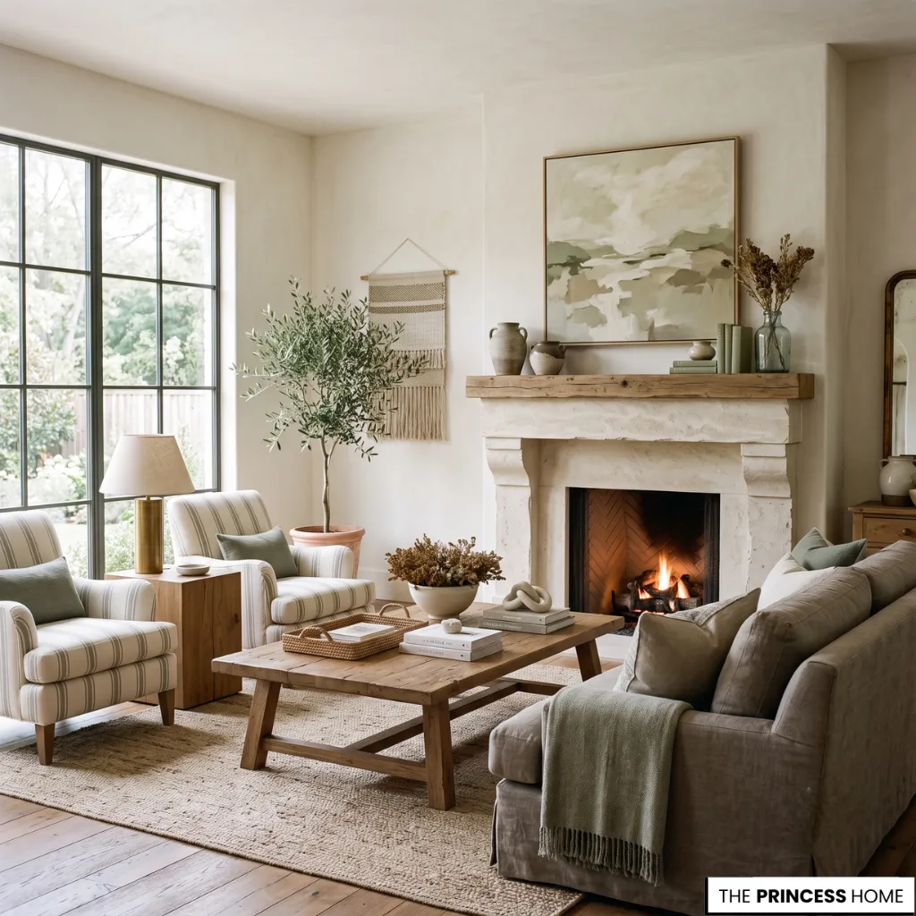
Timeless living room paint colors share a common trait: they are quiet, understated, and deeply respectful of the architecture they inhabit. These are not colors that shout for attention but rather shades that provide a serene, enduring foundation for the life of the room.
Warm whites, soft greiges, muted taupes, and gentle sage greens fall into this category, offering versatility and longevity that more fashionable hues simply cannot match.
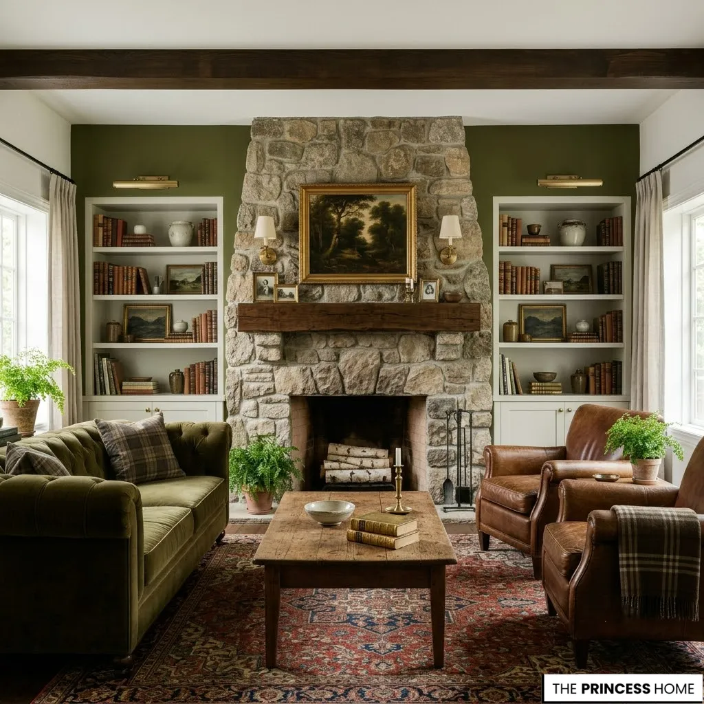
A deep, organic olive green, for example, feels eternal because it mimics the natural world, providing a majestic anchor for a stone fireplace and making the firebox the natural heart of the room.
Similarly, a clean, chalky white never goes out of style because it offers the perfect neutral canvas for a marble surround, allowing the natural veining to take center stage while maintaining a calm, uncluttered backdrop.
These palettes are especially effective in luxury living rooms, where the goal is often to create a sense of collected calm rather than theatrical drama.
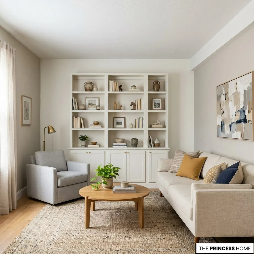
For a compact living room, sticking to lighter shades within this timeless spectrum can help maximize the sense of space. Deeper tones can be used judiciously on a single accent wall or built-in shelving. They add depth without overwhelming the room.
The beauty of timeless neutrals lies in their adaptability. They work equally well in modern apartments, traditional homes, and everything in between. They provide a flexible canvas that allows furniture, art, and textiles to shine.
Material Texture & Paint
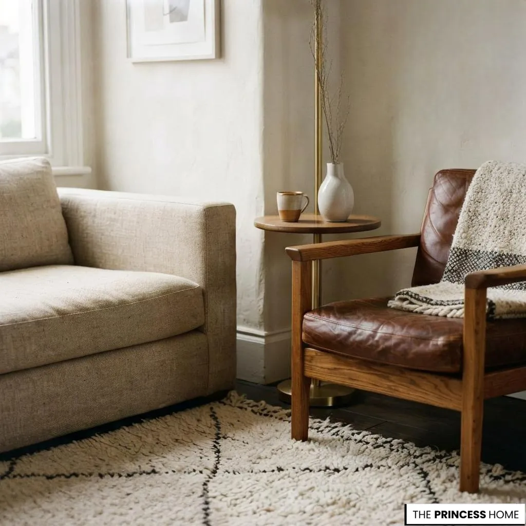
Texture gives living room paint colors their lasting presence. It transforms a flat, two-dimensional surface into a tactile, sensory experience that interacts with light and touch. The finish you choose, whether flat matte, eggshell, satin, or gloss, has as much impact on the final look as the color itself.
A flat matte finish absorbs light, giving the wall a dense, velvety richness. It feels like a natural extension of a linen sofa or a jute rug. This finish is particularly effective in luxury living rooms and formal spaces. A soft, non-reflective surface conveys understated elegance and allows the texture of adjacent materials to take precedence.
An eggshell or satin finish offers a subtle luminosity. It beautifully mirrors the soft sheen of polished brass, the gentle gleam of a silk curtain, or the warmth of natural wood. This makes it an excellent choice for modern living rooms and high-traffic areas. Its durability and slight sheen help mask imperfections while maintaining a refined appearance.
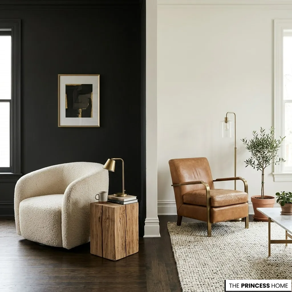
Pairing the paint finish with surrounding materials is crucial. A dark, moody living room paint color demands the tactile relief of bouclé upholstery or raw timber. This prevents the space from feeling heavy. A pale, airy color becomes more profound when paired with the solidity of a leather armchair or a textured wool rug.
This interplay of sheen and surface ensures that the color has a physical presence beyond mere pigment, creating a living room that feels layered, sophisticated, and deeply considered.
Living Room Palettes
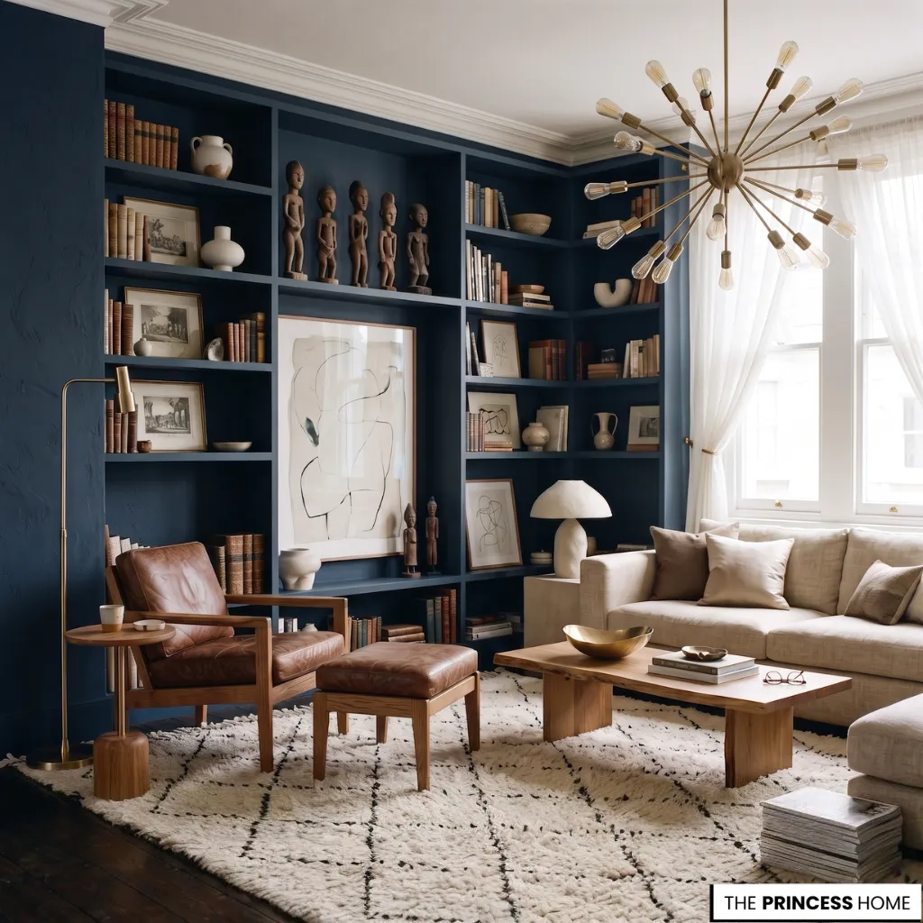
The goal of any sophisticated living room paint color strategy is to create a space that feels collected over time, where every element looks as though it belongs together naturally rather than having been purchased as a matching set.
In a small living room, this is achieved by using the wall color as a unifying force, painting walls, trim, and even built-in bookshelves the same muted tone to prevent the eye from being fragmented by contrasting surfaces.
This monochromatic approach creates a serene, continuous envelope. It allows your varied art collection, vintage finds, and a singular sculptural floor lamp to stand out as individual pieces within a cohesive whole. For a modern apartment, a curated palette might include a single bold accent wall in deep charcoal or forest green. Lighter, neutral adjacent walls keep the accent feeling intentional rather than overwhelming.
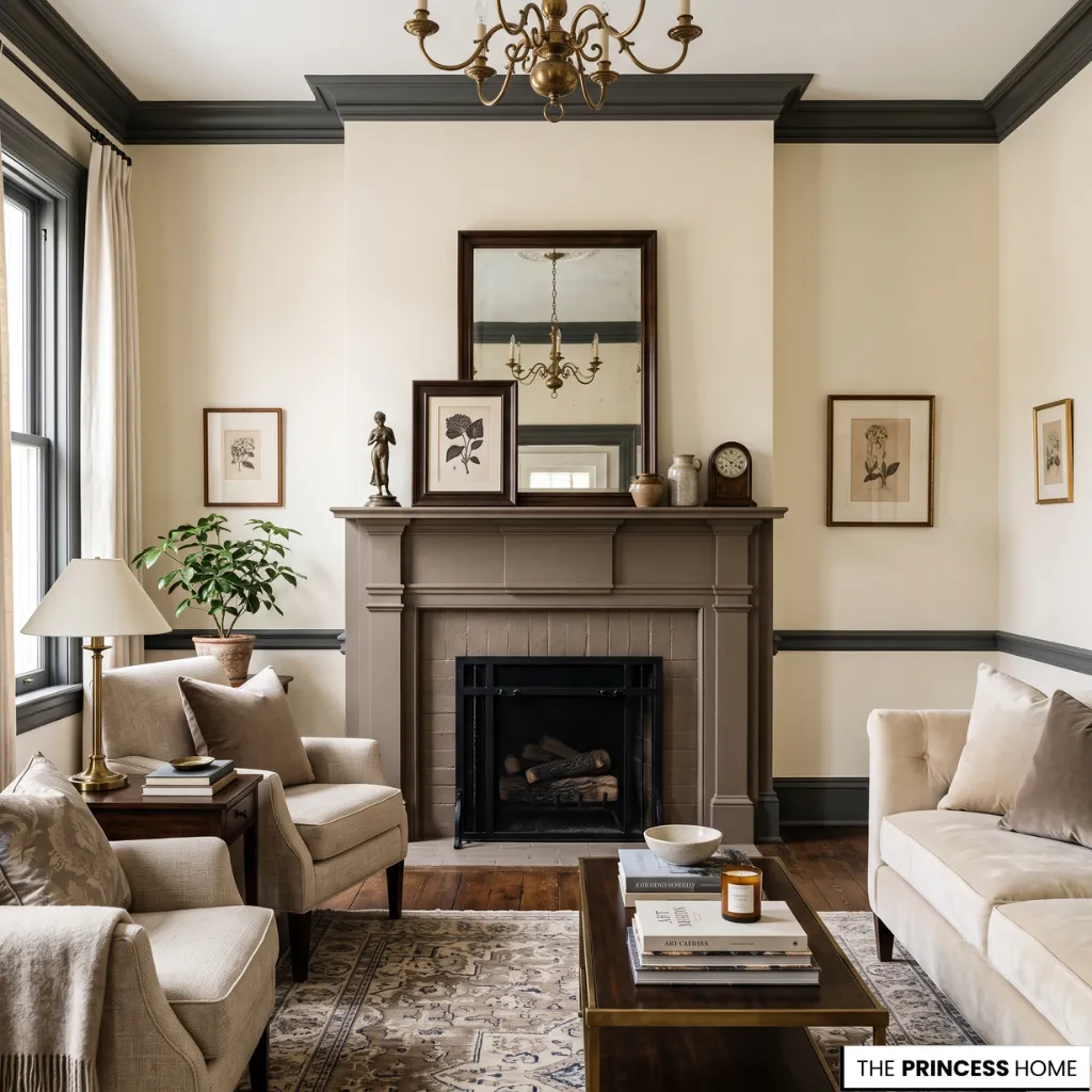
In a luxury living room, a more layered approach might incorporate multiple complementary shades used on different surfaces—a soft cream on the main walls, a deeper taupe on the fireplace surround, and a dark trim that ties the entire scheme together.
The key is restraint. Choose a few carefully considered living room paint colors and apply them with conviction. Trust that the resulting harmony will create a room that feels both personal and polished. The paint becomes the invisible glue that holds a collection of distinct objects together. It creates a collected interior that feels curated over years rather than assembled in an afternoon.
Timeless Color Trends
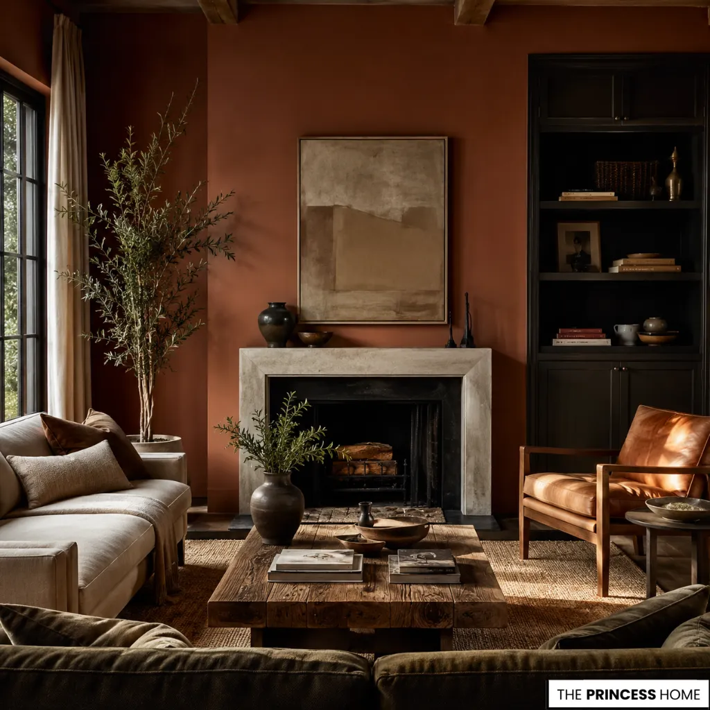
While trends come and go, certain living room paint colors have demonstrated remarkable staying power. They transcend fleeting fashion to become modern classics. These are the shades that consistently appear in the most admired interiors. They are chosen not because they are trendy, but because they work.
Warm earth tones, including terracotta, clay, and muted ochre, have reemerged as sophisticated alternatives to cooler neutrals. They are especially effective in living rooms where warmth and a grounded feel are desired. These colors pair beautifully with natural materials like wood, stone, and leather. That makes them well suited to both modern apartments and luxury living rooms.
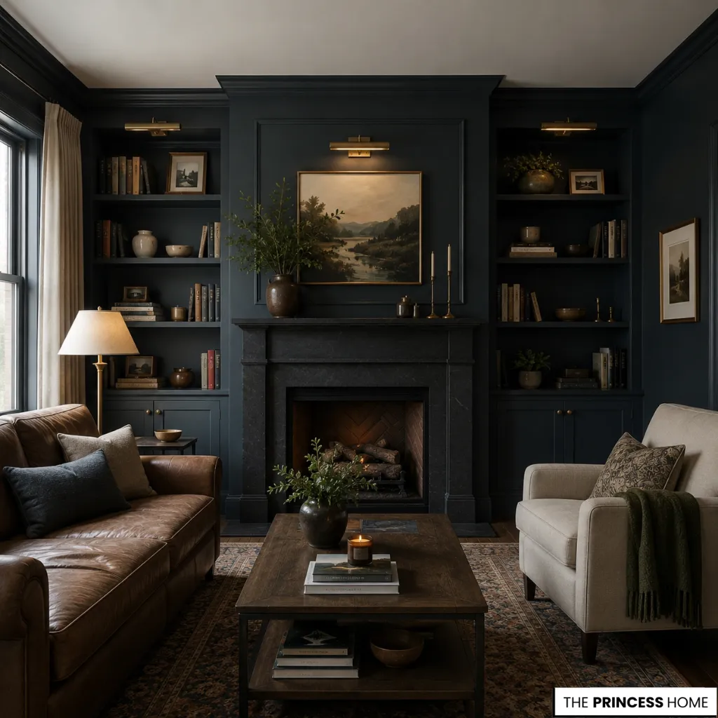
Deep, moody hues such as navy, forest green, and charcoal have also earned their place in the timeless canon. They offer a dramatic, cocooning effect that feels both contemporary and enduring. When used in a compact living room, these darker shades can make the space feel more intimate and enveloping. They create a welcome refuge from the busy world outside.
The secret to incorporating trend-adjacent colors without sacrificing longevity is to choose shades with a natural, organic quality. Look for colors found in nature, such as weathered stone, dried leaves, or a twilight sky. These colors have an inherent timelessness that no trend can replicate. They help ensure your living room remains stylish and relevant for years to come.
💡 DESIGN TIP: To create a cohesive look across all visual layers, balance your wall palette with the right window treatment proportions. Learn more in our full guide to Living Room Curtains.
Lighting & Color
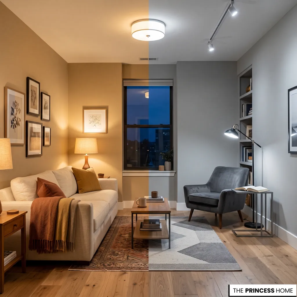
Beyond natural light, the artificial lighting you choose plays a crucial role in how living room paint colors are perceived. It affects everything from the warmth of a neutral to the intensity of a bold accent.
Warm-toned bulbs, typically rated between 2700K and 3000K, enhance the richness of warm neutrals like beige and taupe. They make these colors feel more inviting and golden. Conversely, cooler bulbs in the 3500K to 4000K range can make cool grays and blues appear sharper and more contemporary.
This effect works especially well in modern living rooms and urban apartments. Layering your lighting by combining ambient, task, and accent lighting allows you to control the mood. It also highlights the subtle nuances of your chosen palette.
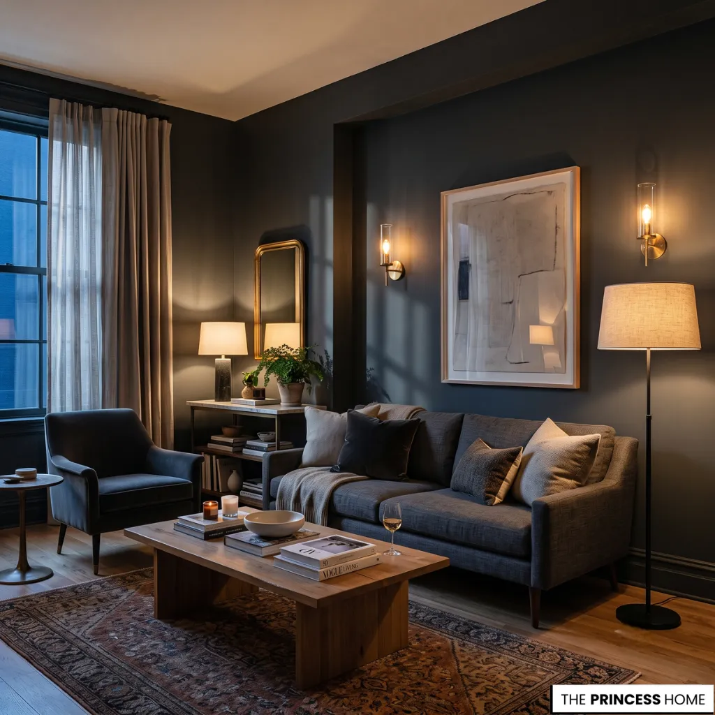
A wall painted in a deep, sophisticated charcoal will look different under the soft glow of a floor lamp with a linen shade than it will under a stark overhead fixture. For this reason, it is essential to consider the full lighting scheme when selecting living room paint colors.
For compact living rooms, a combination of wall sconces and table lamps creates pockets of warm light. This layered lighting helps the space feel larger and more inviting.
For luxury living rooms, dimmable fixtures offer the ultimate flexibility, allowing you to adjust the ambiance from bright and airy during daytime gatherings to intimate and subdued for evening entertaining.
The interplay between lighting and color is a powerful design tool, one that can elevate even the simplest palette into something truly remarkable.
Small Room Colors
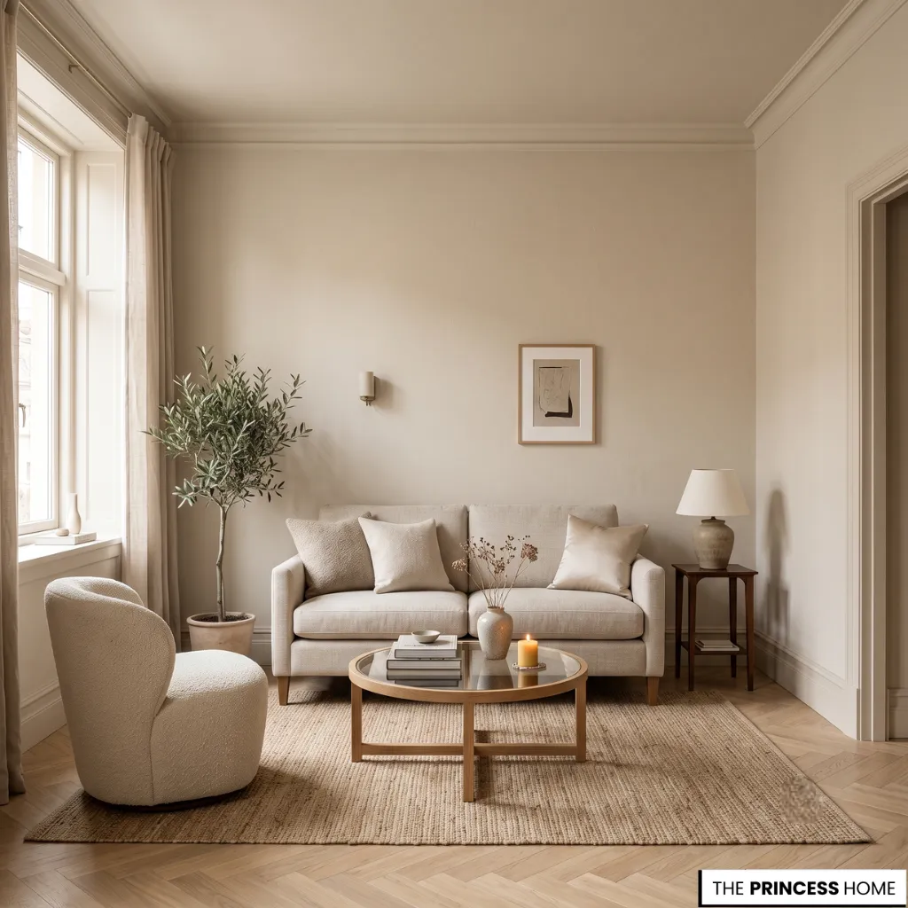
Designing with living room paint colors for a compact space requires a thoughtful approach that prioritizes lightness, continuity, and optical illusion. The most effective strategy is to choose a single, pale neutral for the walls, trim, and ceiling, creating a seamless monochromatic envelope that blurs boundaries and makes the room feel larger than it is.
A warm white, a soft greige, or a pale sage can all serve this purpose, providing a clean, serene backdrop that allows furniture and accessories to take center stage without visual clutter.
Color-drenching—using the same color on all surfaces—is particularly effective in small living rooms because it eliminates the visual interruptions created by contrasting trim or accent walls, allowing the eye to travel uninterrupted across the space.
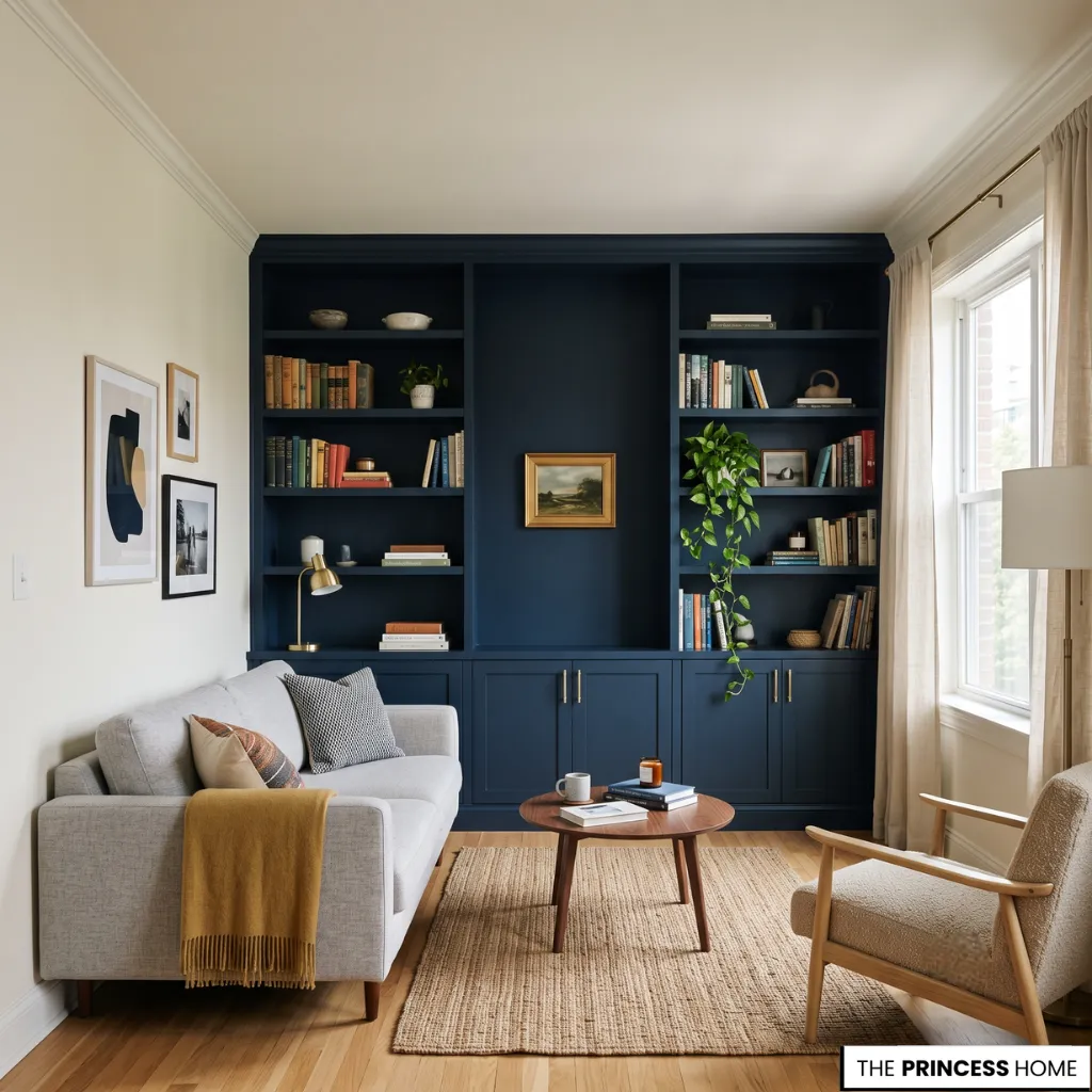
For those who crave a bolder look in a compact setting, consider using a deeper, more saturated color on built-in shelving or a single focal wall, while keeping the remaining walls light and airy. This approach adds depth and interest without overwhelming the room, creating a sophisticated, contemporary feel.
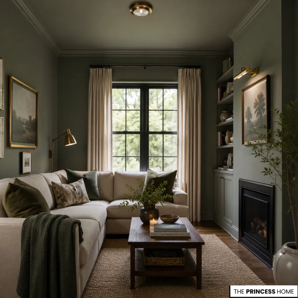
Another powerful technique is to carry the wall color onto the ceiling, a trick that can make a small living room feel surprisingly spacious by eliminating the visual stop created by a white ceiling.
Ultimately, the goal is to choose living room paint colors that work with the architecture to enhance the sense of space, creating a compact room that feels generous, welcoming, and beautifully designed.
FAQ
What are the best living room paint colors for a timeless look?
Soft whites, warm greiges, muted taupes, gentle sage, and deep earthy greens remain timeless because they complement changing décor, natural light, and architectural details.
How do I choose living room paint colors?
Start with your room’s natural light, architectural features, and flooring, then select colors that create harmony with molding, furniture, and the overall atmosphere.
Can living room paint colors make a small room look bigger?
Yes. Light, warm neutrals and a continuous color palette across walls, trim, and ceilings can create a brighter, more spacious appearance.
Which paint finish works best for living room walls?
Matte finishes create a soft, elegant look, while eggshell and satin offer subtle durability and gentle light reflection for everyday living spaces.
What colors work best with white molding?
Warm neutrals create a seamless, classic appearance, while cool grays, muted blues, and soft sage provide crisp contrast that highlights architectural details.
Is color drenching still popular for living rooms?
Yes. Using the same paint color on walls, trim, and molding remains a popular approach for creating cohesive, sophisticated interiors with a calm, immersive feel.
Why are neutral living room paint colors so versatile?
Neutral palettes adapt easily to different furniture styles, materials, lighting conditions, and seasonal décor, making them a lasting choice for both modern and traditional homes.
Final Thoughts
The most memorable living room paint colors do more than brighten walls—they shape atmosphere, highlight architecture, and bring every material into harmony. Whether your home is a compact apartment, a contemporary residence, or a spacious luxury interior, a thoughtfully chosen palette creates a living room that feels welcoming today and timeless for years to come.