

Colour Suggestions for Bedroom: Top Relaxing Palettes
Your bedroom is your personal sanctuary—a place where you rest, recharge, and unwind from the world. The right colour palette can significantly enhance its calming nature. Whether you’re creating a soothing retreat, a modern hideaway, or a cozy nest, the hues you choose play a crucial role in setting the mood. To help you design a space that promotes relaxation and comfort.
Here are 15 top relaxing bedroom colour palette ideas to inspire your next makeover.

1. Soft Sage Green + Ivory White
Sage green, a muted and earthy hue, brings the tranquility of nature indoors. When paired with ivory white, the combination feels fresh, airy, and peaceful—perfect for nature-inspired bedrooms, minimalist aesthetics, and farmhouse or country themes. To enhance the serene, spa-like atmosphere, incorporate natural wood furniture and leafy plants.

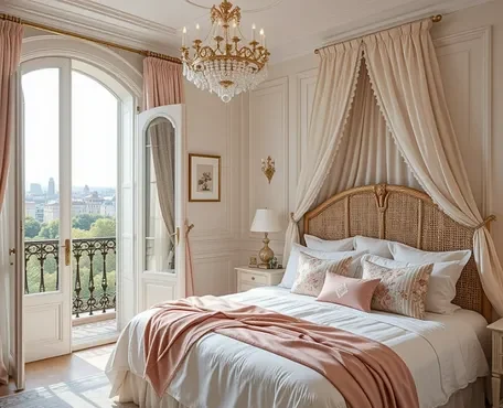
2. Muted Lavender + Dusty Rose
Lavender promotes serenity, while dusty rose adds a gentle warmth, creating a dreamy and romantic setting without feeling overly feminine. Ideal for romantic and vintage-inspired bedrooms, this combination shines when paired with soft, flowing fabrics and antique-style lamps for added charm.

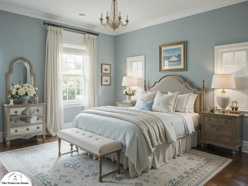
3. Sky Blue + Crisp White
Sky blue evokes the open air and calm oceans, instantly promoting relaxation. Paired with white, it creates a clean, timeless look that’s perfect for coastal, beach, or breezy contemporary styles. Enhance the aesthetic with white linen curtains and blue-toned abstract wall art for a soothing, airy atmosphere.

4. Warm Taupe + Cream
Warm taupe offers grounded sophistication, while cream adds a touch of brightness, making this palette ideal for achieving understated elegance. Perfect for transitional or modern traditional bedrooms, it comes to life with layered textures—think cozy rugs, soft linens, and upholstered headboards.

5. Pale Peach + Soft Grey
Peach adds a gentle glow, while soft grey grounds the space, creating a nurturing and harmonious atmosphere. Ideal for small bedrooms and Scandinavian or Japandi-inspired designs, this palette shines when paired with light wood tones and minimalist decor.
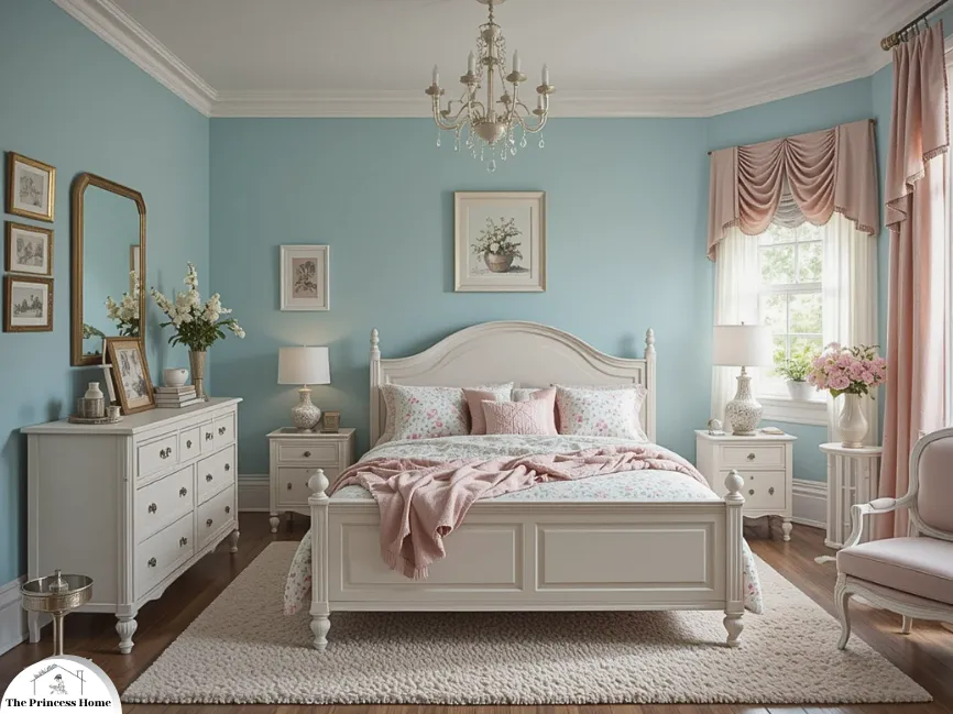
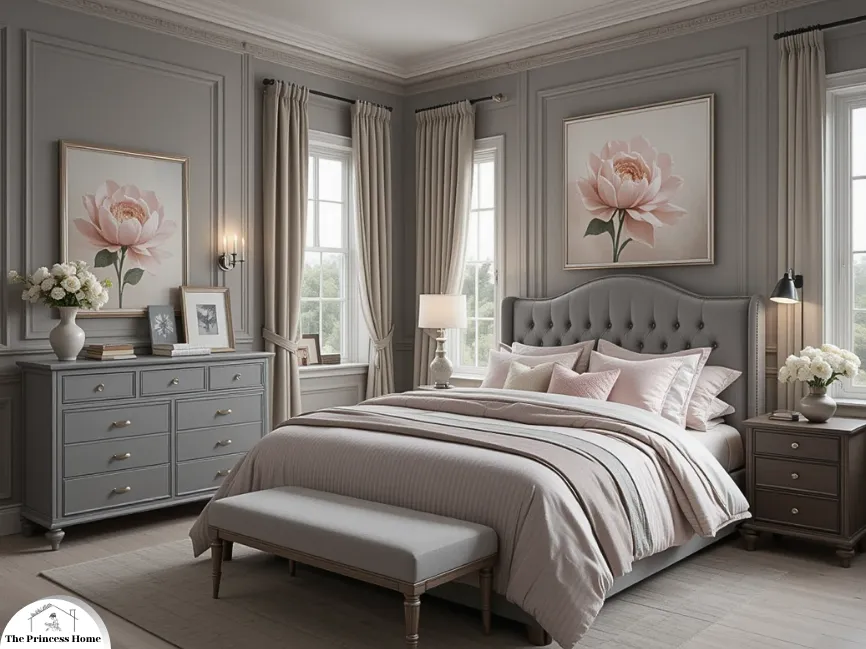
6. Powder Blue + Blush Pink
This pastel combination is soft, sweet, and perfect for creating a dreamy atmosphere without being overly saccharine. Best suited for cottagecore, shabby chic, or feminine retreats, it pairs beautifully with whitewashed furniture and delicate floral prints for a charming, romantic feel.

7. Charcoal Grey + Cool White
The contrast between charcoal and white is striking yet soothing, offering a modern take on relaxation. Charcoal adds depth without overwhelming the space, especially when balanced with crisp white. Ideal for urban lofts and modern minimalist styles, this palette benefits from layered lighting and metallic accents to keep the space warm and inviting.

8. Pale Aqua + Linen Beige
Aqua brings a fresh, watery calmness, while linen beige softens the tone, creating a palette that feels like a breath of fresh air. Perfect for coastal-inspired or casual chic bedrooms, this combination shines with the addition of woven textures and coastal artwork for an effortlessly laid-back vibe.
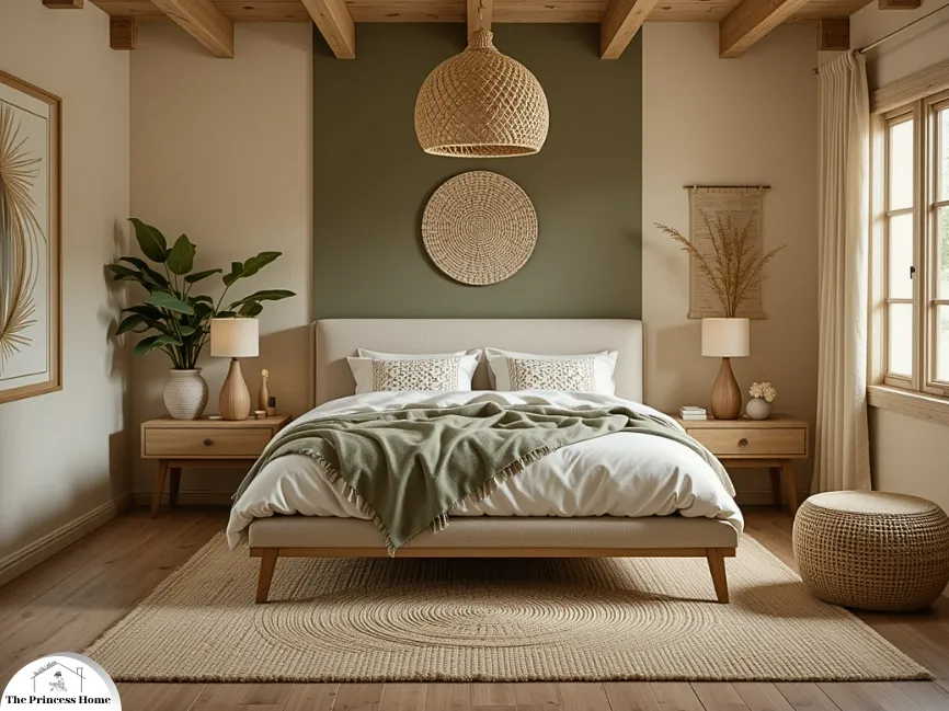
9. Olive Green + Clay Beige
Olive green has a grounding effect, while clay beige adds a warm, earthy undertone—together evoking a sense of calm and a deep connection to nature. Ideal for rustic, bohemian, or Mediterranean-inspired spaces, this palette comes alive with woven baskets, terracotta pots, and natural linens for an organic, lived-in feel.
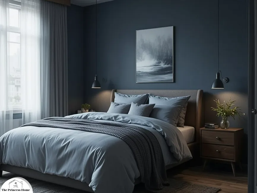
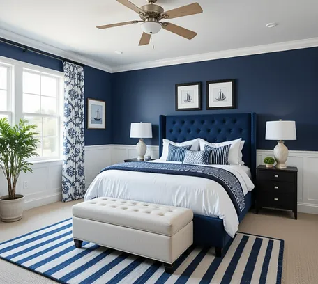
10. Dusky Blue + Slate Grey
This moody combination creates a serene, cocooning effect—perfect for unwinding after a busy day. Ideal for masculine, industrial, or modern luxe aesthetics, the look stays cozy and inviting with the addition of soft bedding and warm lighting.
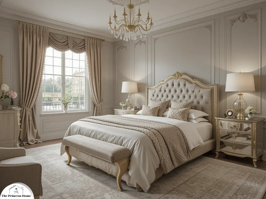
11. Champagne Gold + Dove Grey
This elegant pairing feels sophisticated and upscale, with champagne gold bringing a soft glow and dove grey grounding the mood for a relaxing atmosphere. Perfect for glamorous, classic, or hotel-inspired bedrooms, it’s enhanced by mirrored furniture and silky fabrics for a refined, luxurious finish.

12. Terracotta + Soft White
Terracotta is warm and earthy without being overpowering, and when balanced with soft white, it creates a cozy and comforting retreat. This combination brings warmth and tranquility to any space, making it perfect for creating a peaceful sanctuary.

13. Buttercream Yellow + Pale Mint
Buttercream is cheerful yet subtle, while pale mint offers a refreshing balance. This unexpected combination feels light, uplifting, and full of charm. Perfect for eclectic or vintage-inspired interiors, it pairs beautifully with retro patterns or soft gingham prints to add a playful touch.
14. Dusty Blue + Warm White
Dusty blue is muted enough to serve as a neutral while still offering a touch of color, and warm white enhances its softness without feeling too stark. Ideal for traditional, Hamptons-style, or serene classic spaces, this palette comes to life with embroidered linens and soft area rugs for a beautifully layered feel.
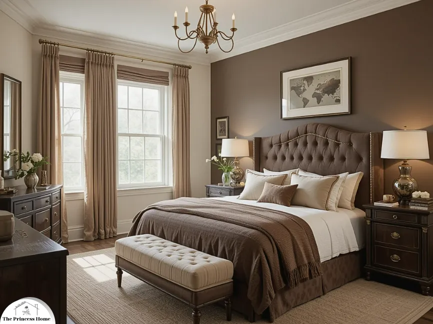
15. Mocha Brown + Creamy White
Mocha adds depth and richness, while creamy white lifts the palette, maintaining a cozy feel without becoming too dark. This combination feels grounded, warm, and timeless—perfect for cozy, traditional, or transitional styles. Enhance the atmosphere with plush bedding, tufted headboards, and soft lighting to further elevate the warmth.
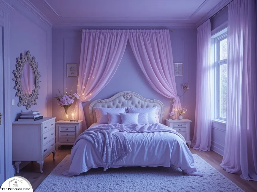
16. Periwinkle Blue + Soft Lilac
Periwinkle, a blue-violet hybrid, inspires creativity and calm, while soft lilac adds a dreamy, ethereal touch. Together, they create an airy and otherworldly feel—perfect for winding down. Ideal for artistic, whimsical, or serene feminine bedrooms, this duo shines when layered with sheer drapes and delicate fairy lights for a magical touch.
17. Stormy Grey + Pale Blush
The weight of stormy grey adds quiet drama, while pale blush brings a subtle warmth. Together, they strike a perfect balance of cool and cozy. Ideal for contemporary, romantic, or luxe urban bedrooms, this pairing is enhanced by matte finishes and plush fabrics for a soft, enveloping feel.

18. Soft Coral + Creamy Tan
Muted coral offers a gentle energy, while creamy tan provides a neutral foundation, creating a palette that is inviting and cheerful without being overwhelming. Perfect for transitional or beach-inspired bedrooms with a sunny vibe, this combination is enhanced with woven textures and coastal accessories like driftwood for added warmth and charm.
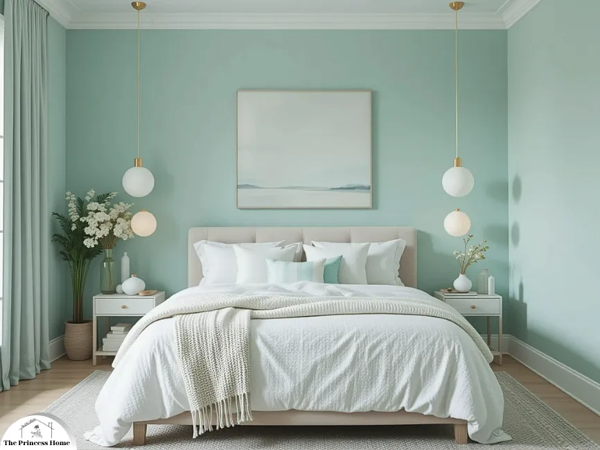
19. Frosted Mint + Porcelain White
Frosted mint feels cool, crisp, and rejuvenating, while porcelain white enhances the spa-like freshness, perfect for clearing the mind. Ideal for minimalist, Scandinavian, or zen-inspired spaces, this palette is best complemented by sleek furniture and tactile interest through soft knits and ceramics for a serene, balanced atmosphere. Frosted mint feels cool, crisp, and rejuvenating. Paired with porcelain white, it creates a spa-like freshness that’s ideal for clearing the mind.

20. Greige (Grey + Beige) + Whisper Pink
Greige offers a perfect neutral base—less cold than grey, less warm than beige—while whisper pink adds just a hint of soft, calming color. Ideal for neutral-lovers seeking a touch of warmth or femininity, this pairing works beautifully with tone-on-tone styling and pink-toned accessories or metallic rose gold accents for a refined, tranquil feel.
Final Thoughts
Choosing the right colour palette for your bedroom is more than a design decision—it’s an investment in your well-being. Soft, muted, and natural hues tend to have the most relaxing impact, helping you transition from the stresses of the day into a peaceful night’s rest. Whether you’re drawn to breezy blues, warm earth tones, or romantic pastels, there’s a soothing palette here for every style.
Pro Tip: Always test paint swatches in your space under different lighting conditions before committing. What looks tranquil in a showroom might feel different at home.
So go ahead—transform your bedroom into a haven of calm and comfort with one of these 15 relaxing colour palette ideas.
Conclusion
By following the steps outlined in this guide, you can confidently choose a color scheme that reflects your personality and creates a harmonious and inviting bedroom environment. Remember that your bedroom is your sanctuary, so make sure the colors you choose resonate with you and contribute to the overall comfort and aesthetics of the space. With a well-considered colour suggestions for bedroom your bedroom will become a place of relaxation and rejuvenation that truly feels like home.
Here are some frequently asked questions related to the article :
Q1: How do I know which colors will work well in a small bedroom?
A1: In a small bedroom, it’s generally advisable to opt for lighter colors. Lighter shades like soft blues, pastels, and light grays can make the room feel more spacious and open. They reflect more light, creating the illusion of a larger space.
Q2: What if I have a large bedroom? Can I use dark colors?
A2: Yes, in a larger bedroom, you have more flexibility to use darker colors. Deep colors like rich burgundies, deep blues, and dark grays can create a cozy and intimate atmosphere in a spacious room. Just be sure to balance them with lighter accents to avoid overwhelming the space.
Q3: How can I create a calming atmosphere in my bedroom through color choices?
A3: To create a calming atmosphere, consider cool colors such as soft blues, greens, and muted grays. These colors are known for their ability to promote relaxation and a sense of serenity. Pair them with soft, neutral tones for a soothing effect.
Q4: What colors are best for a romantic bedroom design?
A4: For a romantic bedroom, consider using colors like dusty rose, lavender, or deep shades of red. These colors evoke feelings of love and intimacy. Adding gold or champagne accents can enhance the romantic ambiance.
Q5: Should I consider the bedroom’s orientation and lighting when colour suggestions for bedroom?
A5: Absolutely. The quality and type of lighting in your bedroom can significantly affect how colors appear. Consider the room’s orientation and the time of day you use it. Test colors in different lighting conditions to ensure they look the way you want them to.
Q6: How can I update the color scheme in my bedroom without completely redecorating?
A6: If you want to update your bedroom’s color scheme without a complete overhaul, focus on smaller changes. You can repaint an accent wall, change your bedding and curtains, or add new decor accessories in the desired colors to refresh the room’s look.
Q7: Can I mix and match different color palettes in my bedroom?
A7: Mixing and matching color palettes can work well if done thoughtfully. Stick to a cohesive color story by choosing a dominant color and harmonizing secondary and accent colors that complement each other. Ensure there is a visual connection between the colors to maintain balance and harmony.
Q8: Are there any color combinations I should avoid in a bedroom?
A8: While personal preferences vary, it’s generally best to avoid overly bright or clashing color combinations that may disrupt your sleep and relaxation. It’s a good idea to limit the use of extremely bold or jarring colors as dominant hues.
Q9: Should I follow current design trends or go with timeless colors for my bedroom?
A9: It’s a matter of personal preference. Timeless colors like neutral tones (whites, grays, and beiges) are versatile and always in style. However, if you’re drawn to current trends, incorporating them as accent colors or in decor accessories can give your bedroom a modern touch.
Q10: How can I use accessories to enhance the chosen color scheme in my bedroom?
A10: Accessories like bedding, curtains, rugs, and decorative items can complement and enhance your color scheme. Use them to add texture, pattern, and pops of color. Ensure these accessories harmonize with your chosen palette for a cohesive and polished look.


