Morning light slips across the walls, softening every edge before settling into the quiet corners of the room. In that fleeting moment, a small space rarely feels limited by its square footage. It is defined instead by how color gathers light, how surfaces dissolve into one another, and how the room invites you to linger.
Painting small rooms is the art of using color, light, and architectural continuity to shape how a compact space feels rather than simply how large it appears—showing how thoughtful paint choices can make compact interiors feel richer, calmer, and more expansive.
Whether in a compact apartment, a contemporary home, or a traditional residence, proportion, texture, and carefully chosen paint work together so naturally that the boundaries begin to fade.
Beyond White Paint
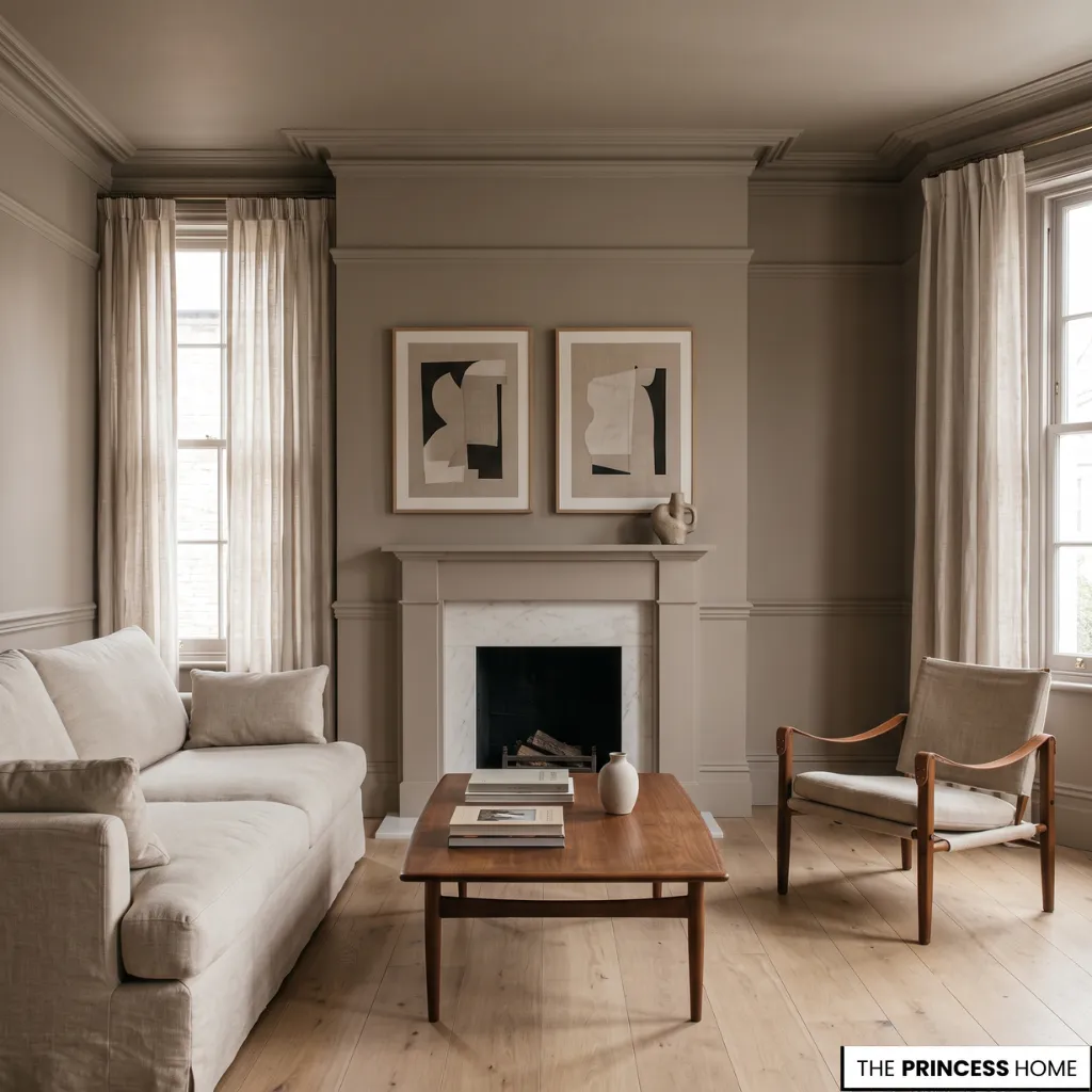
For years, white has been treated as the universal answer for compact interiors. Its clean appearance and reflective quality made it an easy default, especially in apartments and smaller homes where every inch feels valuable.
Yet today’s most memorable interiors often reveal a different perspective. Rather than relying on stark contrast to define a space, interior designers increasingly allow color to soften its architecture. When looking for the best paint colors for small rooms, the goal shifts from forcing brightness to embracing intimacy.
Walls become quieter. Corners lose their sharpness. The eye drifts effortlessly instead of stopping at every painted edge, creating a sense of continuity that feels equally appropriate in modern interiors and traditional period homes. Luxury rarely announces itself through brightness alone;
it appears through restraint, continuity, and an atmosphere that feels complete from every angle.
Color Drenching
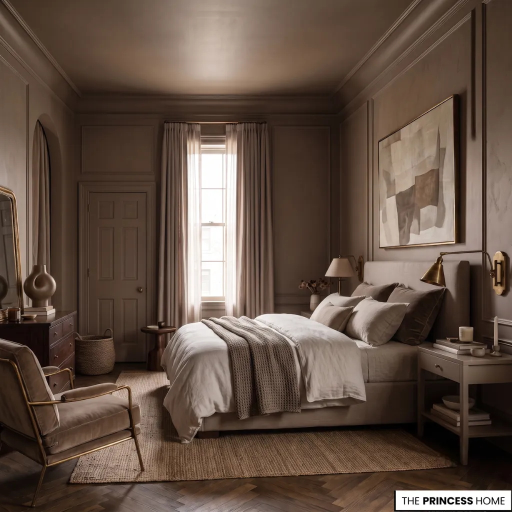
The most refined approach to small room paint ideas rarely separates the ceiling from the walls with dramatic shifts in tone. Instead, it utilizes color drenching—a technique that creates a visual envelope where every architectural surface belongs to the same composition.
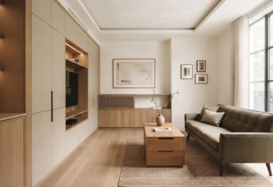
Wrapping walls, trim, doors, and even the ceiling in a single hue allows the architecture itself to recede into the background. This gentle continuity transforms the experience of an intimate bedroom, a narrow hallway, or a cozy living room.
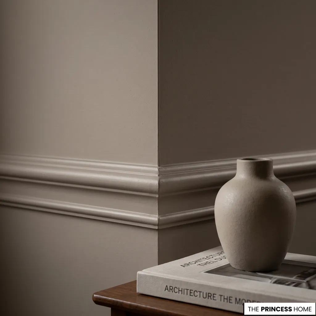
Door frames become part of the background, and trim no longer interrupts the eye. A small bathroom, for instance, can feel unexpectedly composed when its baseboards and crown moldings share the same tone as the walls.
By extending this single shade vertically across the ceiling, the visual boundary overhead dissolves, making the room feel quietly elevated as the architecture disappears behind a singular, immersive atmosphere.
Complex Neutrals
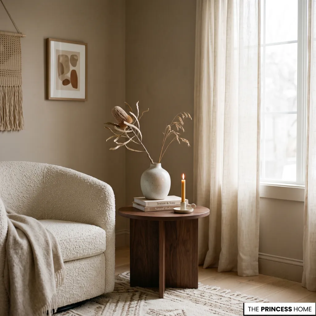
Not all neutral paints create the same emotional response. The shades that define sophisticated interiors often carry subtle, shifting undertones that respond beautifully to changing daylight and evening shadows.
Rather than chasing stark brightness, master colorists often rely on these multi-layered undertones when selecting paint colors that make a room look bigger and more architecturally significant.
Designers often turn to colors such as Benjamin Moore Revere Pewter, Farrow & Ball Shadow White, and Sherwin-Williams Accessible Beige. Each offers layered depth without overwhelming a compact room.
Among today’s most sophisticated small room color ideas, layered neutrals continue to dominate because they adapt beautifully to changing light and materials. A mushroom taupe may appear warm beside oak flooring in a living room before becoming cooler beneath overcast skies.
Muted olive and soft clay offer a richness that flat white rarely achieves, while remaining remarkably versatile across different interior styles.
The paint finish contributes just as much as the color itself. In many professionally designed interiors, selecting a soft matte or eggshell finish on the walls paired with a subtle satin or semi-gloss on the trim creates an elegant interplay of light.
Matte surfaces create a velvety softness that absorbs shadows, while low-sheen finishes introduce a delicate reflection that prevents deep tones from feeling heavy. Together, these elements give light something to interact with, allowing the room to evolve naturally from morning to evening.
Elevated Materials
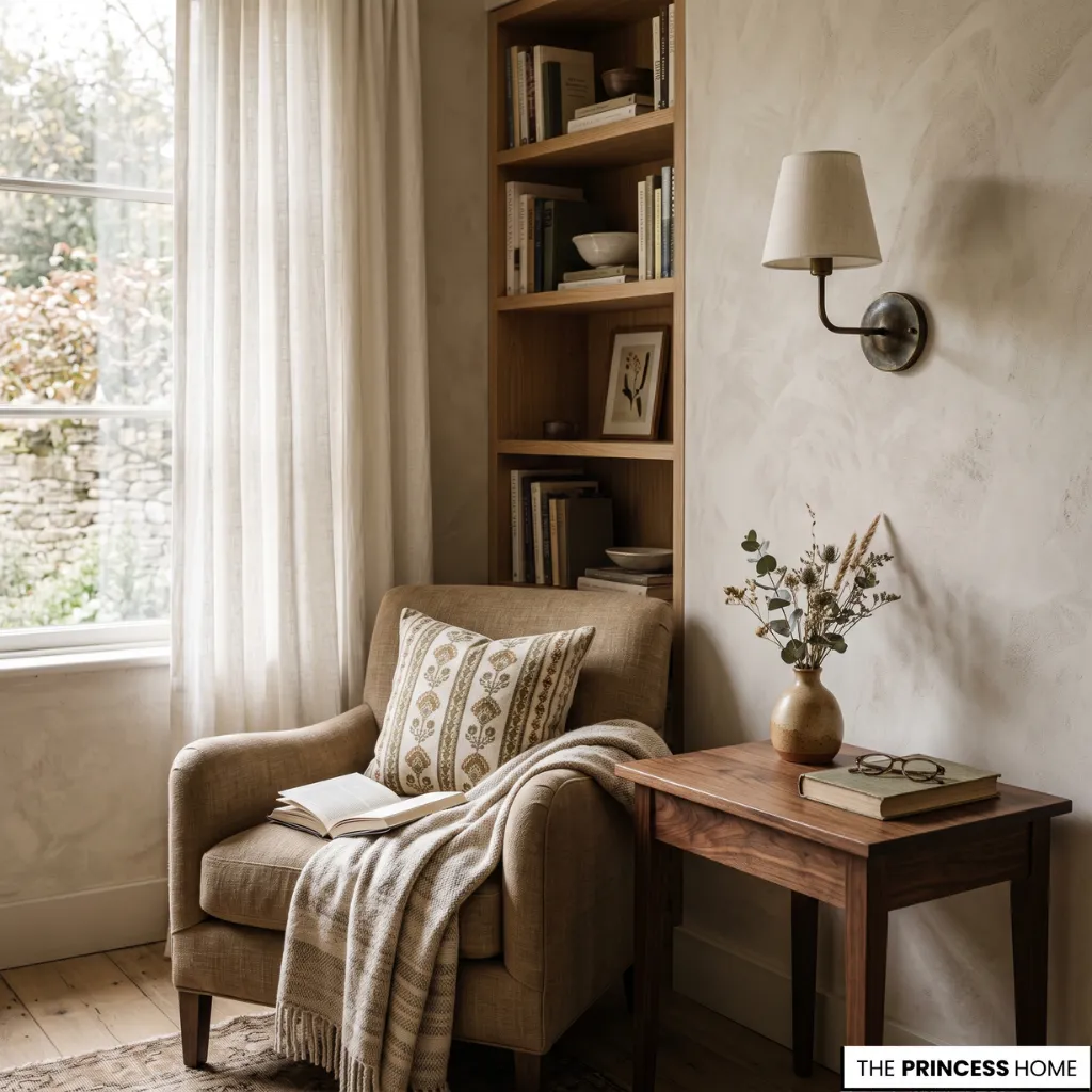
Once the palette becomes quieter, every surrounding material begins to speak more clearly. The choice of paint ceases to be a background choice and becomes an active participant in how textures come alive.
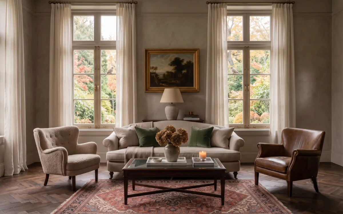
Imagine a compact reading nook wrapped in a weathered linen hue: natural linen curtains filter daylight into a gentle glow across the walls, while antique brass accents catch the light without becoming overly reflective.
The chalky depth of raw plaster or a subtle limewash finish coexists beautifully with the cool, veined elegance of a marble hearth. Natural oak and rich walnut grains appear warmer, gaining an understated presence against these complex backdrops.
Furniture and architectural elements feel naturally integrated when their materials echo the surrounding palette, creating an interior where every element belongs to the same visual conversation instead of competing for attention.
Natural Light
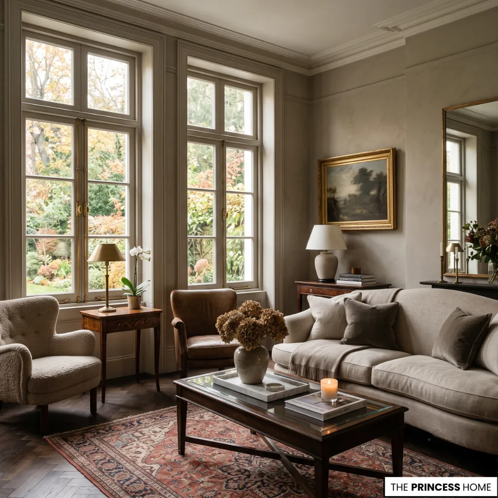
A paint sample never exists in isolation. It changes constantly, caught in an ongoing dialogue with orientation, weather, and time.
In a north-facing studio, the light often carries a cool, slightly blue cast. Rather than fighting this chill with stark white—which can look flat and grayed-out in shadow—a complex warm greige absorbs the cool light, turning it into a soft, enveloping mist.
Conversely, the generous, amber warmth of southern exposure lifts muted clays and stone grays, allowing their deeper, hidden undertones to show true complexity. Afternoon light may turn an earthy neutral into a luminous beige, while artificial evening light adds a final, amber-toned layer that pulls the room inward.
The same paint can reveal entirely different undertones as daylight shifts throughout the day. Because of this, selecting color for a small room becomes an experience of observing atmosphere rather than settling on a fixed paint color; the room feels alive, responding quietly as light moves across its surfaces.
Visual Continuity
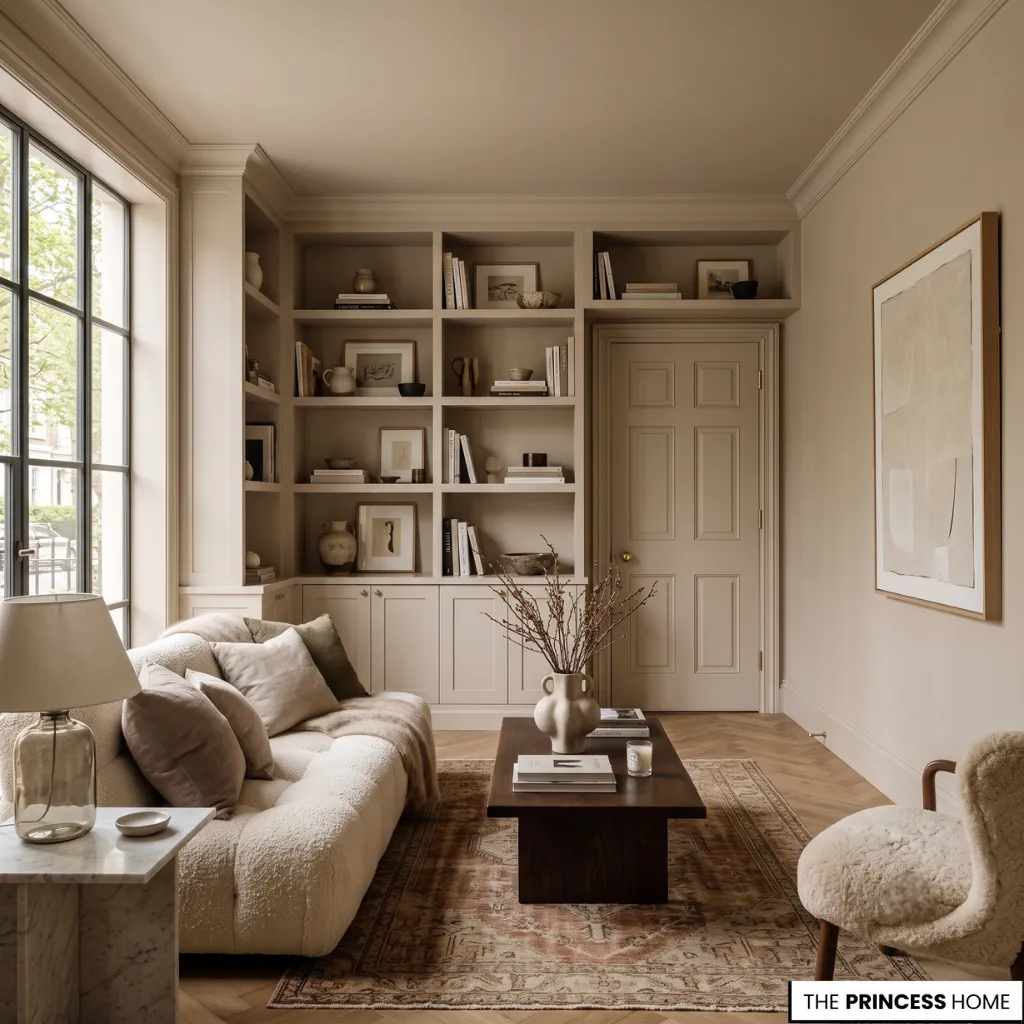
Visual calm has its own sense of generosity. When shelving, moldings, doors, and built-ins belong to the exact same tonal family as the walls, the room no longer asks the eye to process multiple boundaries at once.
This seamless integration allows the mind to perceive uninterrupted space, making it one of the most natural ways to compose an interior that feels unconfined by its dimensions.
When the traditional line between the wall and the ceiling is quietly erased, the eye travels upward without interruption, lending the room an unexpected sense of height. Attention shifts naturally toward furniture, artwork, textiles, and the changing quality of daylight instead of the edges of the architecture.
Whether found in a compact apartment, a contemporary home, or a traditional residence with classic detailing, this continuity allows every room to feel intentional, scaling gracefully from intimate spaces to expansive luxury interiors.
Quiet Luxury
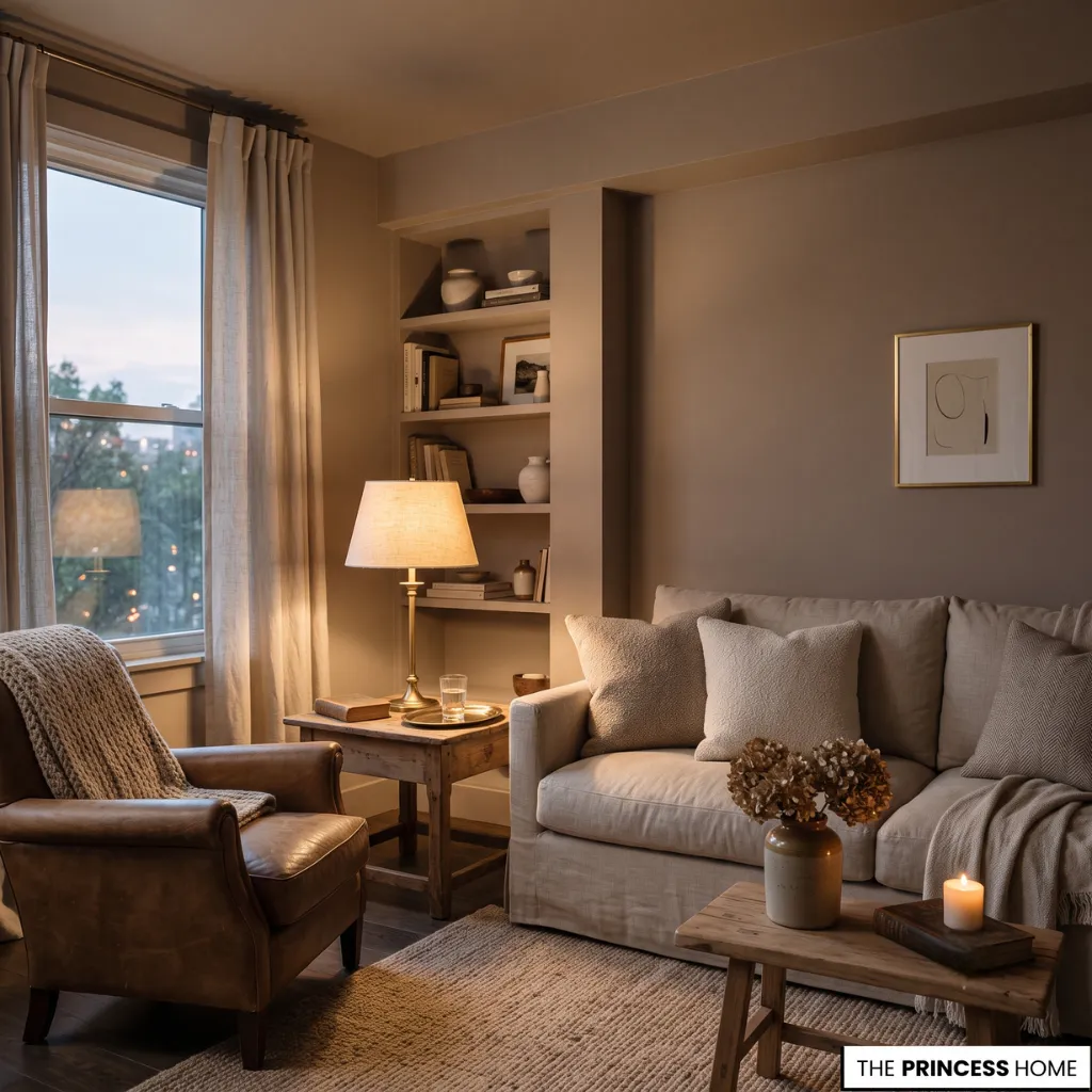
The most luxurious small rooms achieve their feeling through confidence rather than contrast. Their walls carry gentle depth instead of stark brightness. Their ceilings belong to the same visual story as the surrounding architecture.
Every painted surface feels connected, allowing light, texture, materials, and proportion to speak in a quieter voice. As dusk falls, the true magic of this approach reveals itself. The amber glow of a single lamp catches the soft matte texture of the wall, casting long, gentle shadows that melt into the matching ceiling.
The room does not feel small; it feels close, protective, and profoundly still. Whether you’re refreshing a compact city apartment or reimagining a quiet guest bedroom, the most successful paint choices create a room that feels intentional long before it feels larger.
In the end, painting small rooms is not simply the act of choosing a color. It is the art of creating an atmosphere where architecture, light, materials, and color work together so the room feels composed, timeless, and effortlessly elegant—the kind of space that never needs to appear larger because it already feels complete.
Video Inspiration
After watching this inspiring video, let’s translate those visual concepts into reality. In this dedicated space, we unveil deliberate answers to the most defining interior styling questions, curated to help you articulate your home’s unique story:
FAQ
What are the best paint colors for small rooms?
Complex neutrals like warm greige, mushroom taupe, muted olive, and soft clay create depth while helping small rooms feel calm, cohesive, and visually spacious.
Why isn’t white always the best choice for small rooms?
Bright white can emphasize edges and contrast, while layered colors soften architectural lines and create a more balanced, luxurious atmosphere.
How does color drenching make a small room feel bigger?
Painting the walls, ceiling, trim, and doors in the same color reduces visual breaks, allowing the eye to move seamlessly through the space.
Which paint finish works best for small rooms?
Matte and eggshell finishes create soft depth on walls, while satin or semi-gloss trim adds subtle contrast without disrupting visual continuity.
Can dark paint colors work in small rooms?
Yes. Deep, complex colors with warm undertones can make a compact room feel intimate and sophisticated when paired with balanced lighting and cohesive materials.
How do natural light and undertones affect paint colors?
Natural light changes how paint appears throughout the day, revealing different undertones and influencing the warmth, depth, and mood of a room.
How can you start painting a small room for a luxury look?
Choose a layered neutral palette, coordinate walls with ceilings and trim, select low-sheen finishes, and use natural materials to create a unified, timeless interior.
Final Thoughts
Painting small rooms is ultimately about shaping perception rather than chasing square footage. When color, light, finishes, and materials work together as a single composition, even the most compact space can feel refined, welcoming, and quietly luxurious. Thoughtful paint choices create interiors that feel timeless—not because they appear larger, but because every surface contributes to a sense of harmony that endures.