Imagine walking into a room and being instantly washed over by a wave of serenity. Or entering another and feeling an immediate surge of vibrant energy and optimism. This is the alchemy of color. It is not merely a collection of shades and tints; it is a silent language that speaks directly to the soul, shaping our moods and defining our daily experiences.
In this guide, we won’t just dissect the mechanics of the color wheel. We’re inviting you on a creative odyssey to explore the depths of this interconnected universe. By analyzing the philosophies of world-class interior designers, we aim to help you move beyond “decorating” a house and toward “curating” a sanctuary that tells your unique story.
The Evolution of Color
Before we dive into design philosophy, let’s look at the roots of this magic. In 1666, Sir Isaac Newton discovered that white light is composed of a visible spectrum, which he arranged into the first circular diagram. Since then, the color wheel has evolved into an indispensable map for understanding visual relationships.
The Color Wheel
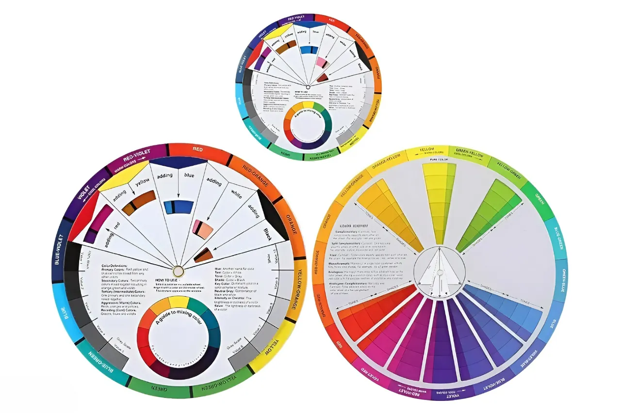
The traditional color wheel consists of 12 carefully structured hues, divided into three interconnected families: primary, secondary, and tertiary colors. Together, they form the backbone of color theory and the starting point for every intentional design decision.
1. Primary Colors
At the core of the wheel lie the three primary colors—red, blue, and yellow. These hues cannot be created by mixing others; instead, they act as the origin of all color combinations. Interior designers often describe primary colors as “anchors of visual energy.
” According to Emily Henderson, bold primary tones can define focal points in a room, especially when used intentionally rather than overwhelmingly.
2. Secondary Colors
By blending two primary colors, we get the secondary trio green, orange, and violet. These hues sit between primaries on the wheel, creating a natural transition and visual balance. Design experts emphasize their versatility. As highlighted in design theory guides, secondary colors soften the intensity of primaries while maintaining vibrancy, making them ideal for creating welcoming, livable spaces.
Renowned stylist Justina Blakeney often incorporates rich greens and warm oranges to bring a sense of nature and personality into interiors showing how secondary colors bridge boldness and comfort.
3. Tertiary Colors
Completing the wheel are six tertiary colors, formed by mixing a primary with a neighboring secondary (such as blue-green or red-orange). These hues fill the gaps, creating a seamless spectrum of color relationships. Tertiary colors are where design becomes deeply expressive.
They allow for subtle storytelling—what many designers call “emotional layering.” For example, designer Kelly Wearstler is known for combining complex tertiary tones (like dusty coral or muted teal) to create interiors that feel both sophisticated and deeply personal.
Beyond the Basics: What Designers Really See
While the 12-color structure is fundamental, designers don’t just see colors—they see relationships and emotions.
The wheel reveals warm colors (reds, oranges, yellows) that energize spaces
And cool colors (blues, greens, violets) that calm and ground environments
As noted in Architectural Digest, the color wheel helps designers build harmony through techniques like complementary and analogous schemes, turning theory into lived experience.
Color strategist Nate Berkus often stresses that color is not just visual—it’s emotional: “Your home should tell your story, and color is the fastest way to say it.”
A More Powerful Way to Use the Color Wheel
To elevate your design thinking, go beyond memorizing categories:
- Think in mood first, color second
- Use the wheel to create contrast (complementary) or flow (analogous)
- Layer tertiary tones for depth and sophistication
Because ultimately, the color wheel isn’t just about 12 hues—
it’s about infinite possibilities built on a simple, timeless structure.
Masterclass Insights: How the Experts Speak “Color”
True professionals treat color as a living element. Here is how some of the industry’s most influential voices translate theory into human experience:
1. Laura Guido-Clark: The Color Storyteller
For Laura, color isn’t a “finish”—it’s the heartbeat. She believes color communicates before a single word is spoken. Through her initiative, Project Color Corps, she uses vibrant palettes to bring joy and a sense of belonging to “optically underserved” communities, proving that color is a tool for social equity.
The Takeaway: Stop fearing color. “Play” with it to discover unexpected relationships.
2. Alvin Wayne: The Zen of Balance
Known for his “High-Low” luxe aesthetic, Alvin Wayne champions the Golden Rule of Neutrals. He advises balancing bold pigments with black or white to prevent a space from feeling overwhelming. Interestingly, Wayne often uses deep Navy as a “new neutral,” providing a grounded foundation for more adventurous accents.
3. Joshua Praught: The Emotional Renaissance
As we move toward 2026, Joshua Praught of Studio Joshua notes a shift away from sterile minimalism toward “Dopamine Decor.” He argues that people are starving for individuality. His palette for the future includes moody maroons, jewel tones, and dramatic forest greens—colors that prioritize how a room feels over how it looks on camera.
4. Leatrice Eiseman & “Cloud Dancer” (Pantone 2026)
Leatrice Eiseman introduces Cloud Dancer—a soft, architectural white—as a response to a chaotic world. It isn’t just a neutral; it’s a “breath of fresh air” that creates spa-like tranquility. It invites us to focus on texture rather than just pigment, allowing materials like linen, stone, and wood to shine.
The Grammar of Design: How to Orchestrate Harmony
To apply these expert insights, you need a framework. Here are the classic color harmonies, enhanced with professional secrets:
The Layout of Harmony
| Scheme | Definition | Best For |
| Monochromatic | Using different tints and shades of a single color. | Creating a restful, sophisticated sanctuary (e.g., Bedrooms). |
| Analogous | Colors sitting side-by-side (Blue, Blue-Green, Green). | Mimicking nature; very easy on the eyes. |
| Complementary | Colors opposite each other (Blue and Orange). | High-energy spaces that need a bold, vibrant focal point. |
| Triadic | Three colors equally spaced (Red, Yellow, Blue). | Playful, balanced diversity—perfect for creative studios or kitchens. |
The Secret Ratios: 60-30-10
Professional designers rarely use colors in equal amounts. They follow the 60-30-10 Rule:
60% Dominant Color: Usually the walls or large rugs.
30% Secondary Color: Upholstery, linens, or drapery.
10% Accent Color: The “jewelry” of the room—pillows, art, and accessories.
The Missing Link: Light and Texture
To truly master the wheel, you must consider two invisible factors:
The Light Factor: A color that looks warm in a south-facing room may look grey and cold in northern light. Always test your “swatches” at different times of the day.
The Texture Factor: Color behaves differently on different surfaces. A “Forest Green” on velvet feels deep and luxurious, while the same green on a sleek metal chair feels industrial and modern.
2026 and Beyond: The Future is Warm and Honest
The trend forecast for 2026 shows a collective move toward Earth-Centric Warmth. We are saying goodbye to “Millennial Grey” and embracing:
Buttery Yellows and Terracotta: Colors that feel like a hug.
Biophilic Greens: Bringing the healing power of the outdoors inside.
Individualism: Using the color wheel not to follow a trend, but to mirror your own emotional landscape.
Conclusion
The color wheel is more than a technical diagram; it is a map of human emotion. It invites you to be an artist in your own life. When you understand these relationships and more importantly, when you listen to your intuition you transform your home from a physical structure into a reflection of your soul.
Here are some frequently asked questions related to the article :
1. What are the primary colors on the color wheel?
Primary colors red, yellow, and blue are the foundation of the color wheel. They are “pure” because they can’t be made by mixing other colors. All other colors are created from them, making them essential in building any interior design palette.
2. How do secondary colors differ from primary colors?
Secondary colors are made by mixing primary colors: green (blue + yellow), orange (red + yellow), and purple (red + blue). They add more depth and variety, helping create a richer and more balanced design.
3. Why are jewel tones becoming popular in interior design?
Jewel tones like plum and teal are trending for their richness and versatility. Designers such as Emily Henderson encourage experimenting with these shades to create bold, personalized spaces. They add depth, drama, and a touch of sophistication to any room.
4. How can I use primary colors to set the mood in my home?
Primary colors shape the mood of a space. Red adds energy and drama, yellow brings warmth and cheer, while blue creates a calm, relaxing feel. Use them thoughtfully to influence how your home feels.
5. What are some tips for creating a harmonious color palette?
Use complementary colors (opposites on the color wheel like blue and orange) to create balance and contrast. For a softer, more cohesive look, choose analogous colors (next to each other on the wheel). Both approaches help you design a space that feels harmonious and visually pleasing.
6. How do designers like Jase Sullivan incorporate plum into their designs?
Jase Sullivan recommends pairing plum with jewel tones and neutrals. This creates a rich, balanced look. The mix feels sophisticated yet grounded. It also helps reflect personal style in any space.
7. What are the benefits of using green in interior design?
Green symbolizes nature and renewal. It’s a versatile choice in interior design. Different shades create balance and harmony. Designers often use it in living rooms and bedrooms. It helps create a calm, relaxing space connected to the outdoors.
The princess home on Pinterest