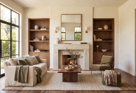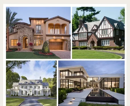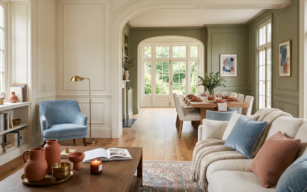
There are moments when a room feels unusually calm before a single word is spoken, or when a storefront quietly draws us closer without revealing why. Sometimes it is not the furniture, the architecture, or even the people that shape the experience. It is color.
Gentle, confident, vibrant, or restrained, every shade carries a subtle emotional presence that changes the way we perceive spaces, objects, and even one another.
Color and psychology describe this quiet relationship between visual perception and emotional response, shaping how we experience homes, brands, workplaces, and everyday environments long before we consciously notice its influence.
Whether in a compact apartment, a contemporary home, or a spacious interior, color quietly influences atmosphere, emotion, and perception in ways that feel both immediate and lasting.
Color Psychology Basics
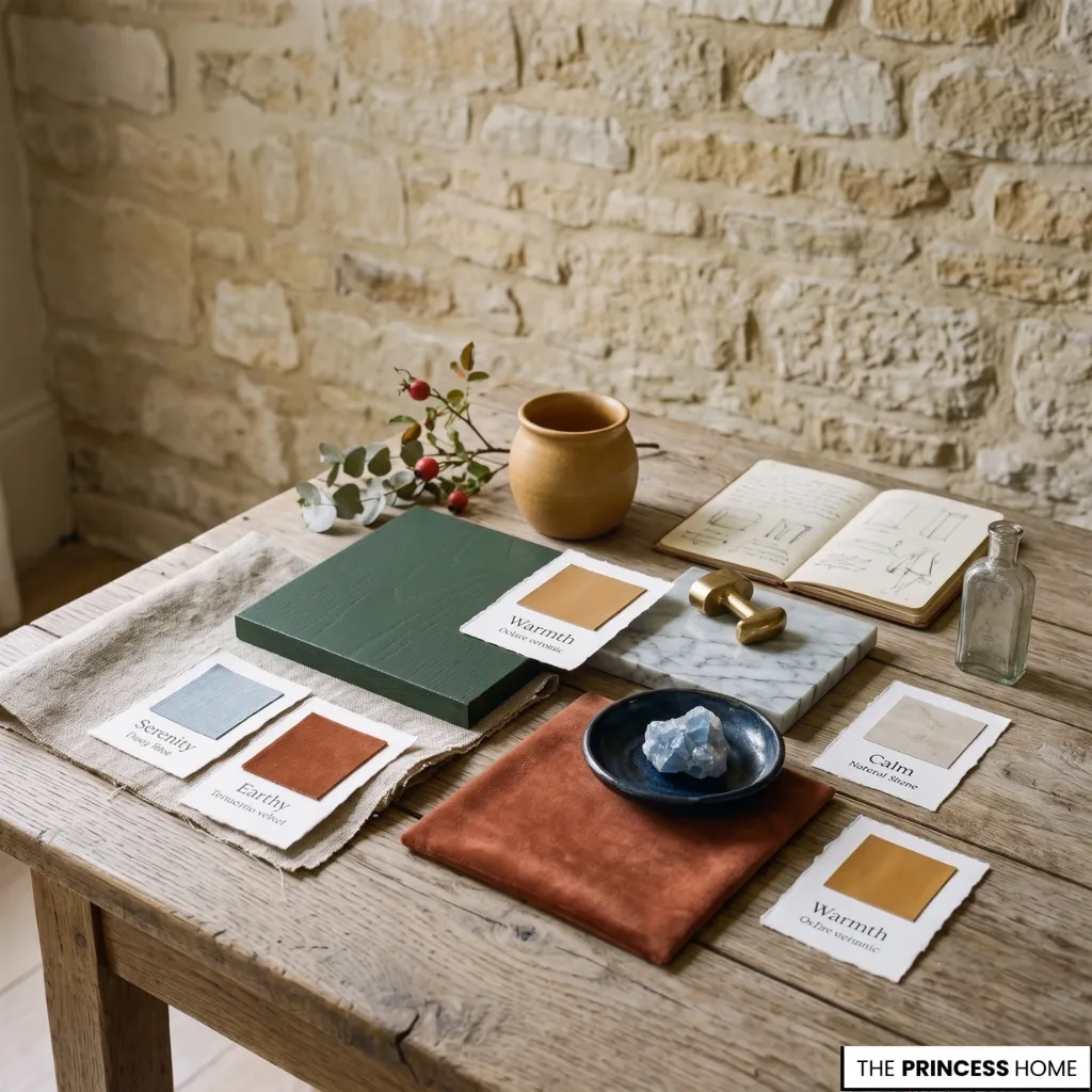
Long before colors become part of a carefully designed interior or an elegant brand identity, they exist as emotional signals. A deep navy often suggests confidence and stability, while a soft sage green settles into a room with effortless calm.
Warm terracotta brings familiarity, rich burgundy hints at sophistication, and pale ivory creates an atmosphere that feels open and restorative. Individual colors also carry associations that appear repeatedly across design disciplines.
Blue is often linked with trust and serenity, green with balance and renewal, yellow with optimism, red with energy and passion, while black and white frequently express sophistication or simplicity depending on their surroundings.
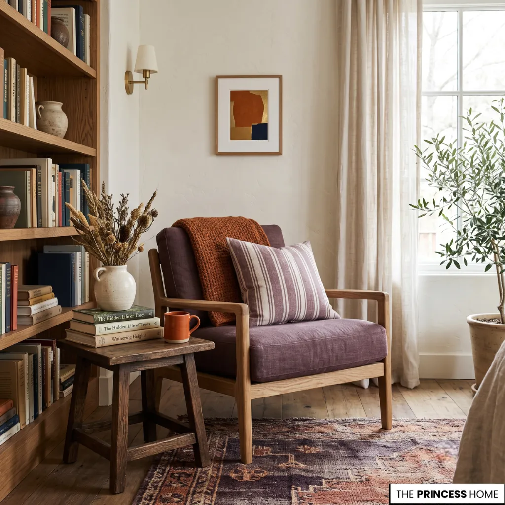
Purple often conveys creativity and luxury, while orange introduces warmth and enthusiasm. Rather than fixed rules, these meanings form a visual language shaped by universal perception, cultural influences, and personal experience. This is the quiet foundation of color and psychology.
Rather than functioning as decoration alone, colors become part of the emotional character of a place. They influence perception, shape expectations, support visual harmony, and help define how an environment is experienced without demanding conscious attention.
Although personal memories and cultural traditions naturally influence emotional responses, certain visual impressions appear consistently across architecture, interior design, branding, marketing, and visual communication, making color one of the most enduring forms of nonverbal expression.
💡 BACK TO BASICS:
Master the foundational rules of home styling with our comprehensive Free Interior Design Course Learn the Skills to Design Your Home.
Colors Shape Mood
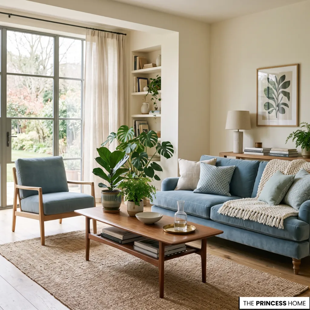
Entering two identical rooms painted in different palettes rarely feels like the same experience. One may encourage conversation, while the other invites silence. The dimensions remain unchanged, yet the emotional atmosphere shifts almost immediately.
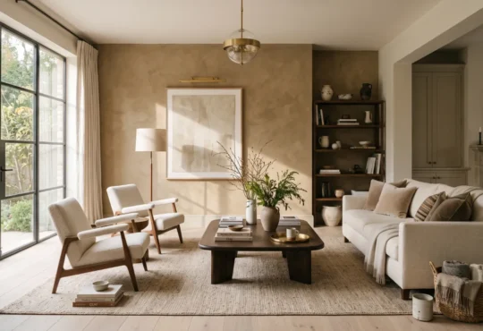
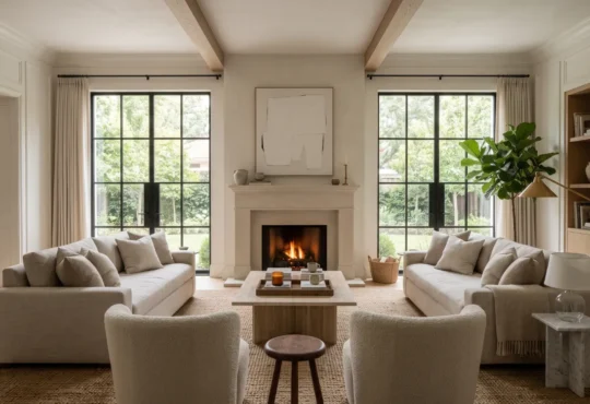
Soft blues tend to create an impression of openness and quiet reflection. Earth-inspired greens strengthen the feeling of balance between nature and everyday living. Gentle neutrals allow light to move freely across surfaces, making furniture, textures, and architectural details feel connected rather than competing for attention.
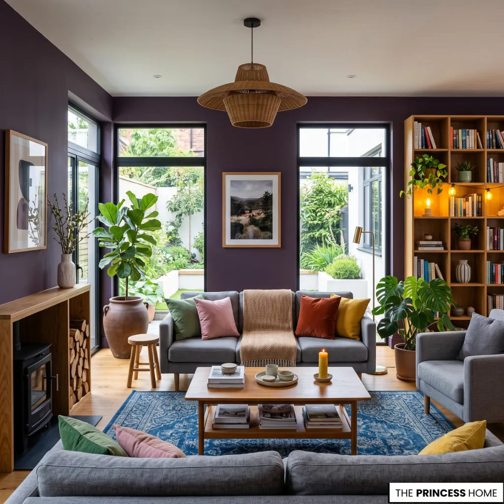
More saturated colors introduce a different rhythm. Deep emerald, charcoal, or plum can make a room feel intimate and enveloping, especially when paired with layered lighting and natural materials. Bright yellows, vivid oranges, and energetic reds introduce movement and optimism, bringing visual energy to otherwise restrained interiors.
Whether in a compact apartment, a contemporary family home, or a spacious luxury residence, the emotional impact of color depends on proportion, surrounding materials, furniture placement, architectural scale, and the way natural and artificial light move across each surface throughout the day.
💡 EXPLORE MORE:
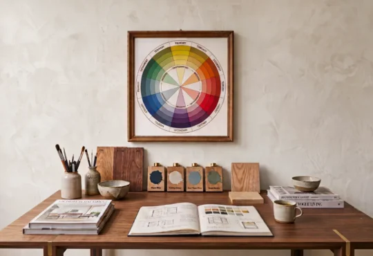
See how primary, secondary, and tertiary hues interact visually on the spectrum in Understanding the Color Wheel Primary & Secondary Colors.
Color Meaning Context
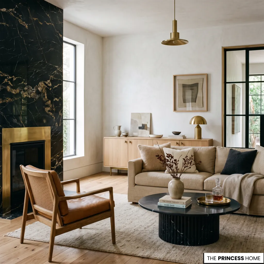
No single color carries exactly the same meaning in every setting. A rich black may communicate timeless elegance in a luxury living room while suggesting authority in fashion or modern branding. White can express simplicity in contemporary interiors, serenity in wellness environments, or celebration in different cultural traditions.
Context quietly reshapes emotional perception. Material choices, lighting conditions, neighboring colors, architectural scale, cultural associations, and the intended function of a space all influence the emotional message that eventually reaches the viewer.
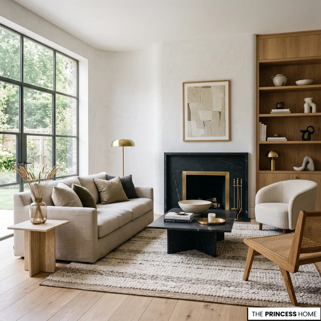
This is why thoughtfully composed interiors often feel harmonious without appearing predictable. The emotional experience comes not from one dominant color but from the relationship between every surface, finish, texture, furnishing, and source of light.
Modern interiors often emphasize restrained palettes with clean transitions, while more traditional settings may rely on layered tones that create depth and familiarity.
Interior Color Design
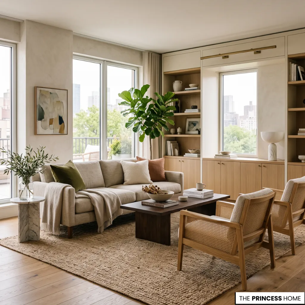
Experienced designers rarely choose colors as isolated decisions. Instead, they consider how each tone supports a broader emotional atmosphere and how every finish contributes to the visual balance of a room.
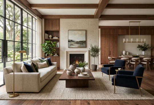
A modern apartment filled with natural daylight may rely on soft mineral tones to preserve openness, while a more traditional home with darker architectural features can embrace richer palettes that enhance depth and warmth.
Larger luxury interiors often balance expansive spaces with layered color palettes that create intimacy without sacrificing elegance. These choices are rarely about trends alone. They are about creating environments that feel emotionally coherent from the first impression to the smallest decorative detail.
Color psychology therefore becomes less about assigning fixed meanings to individual hues and more about understanding how complete visual compositions—including furniture placement, materials, texture, proportion, lighting, and circulation—shape comfort, confidence, focus, relaxation, and a lasting sense of place.
💡 READ NEXT:
Learn how to apply high-impact feature colors on dedicated focal points in Accent walls and feature Colors adding visual interest to a space.
Color Communication Guide
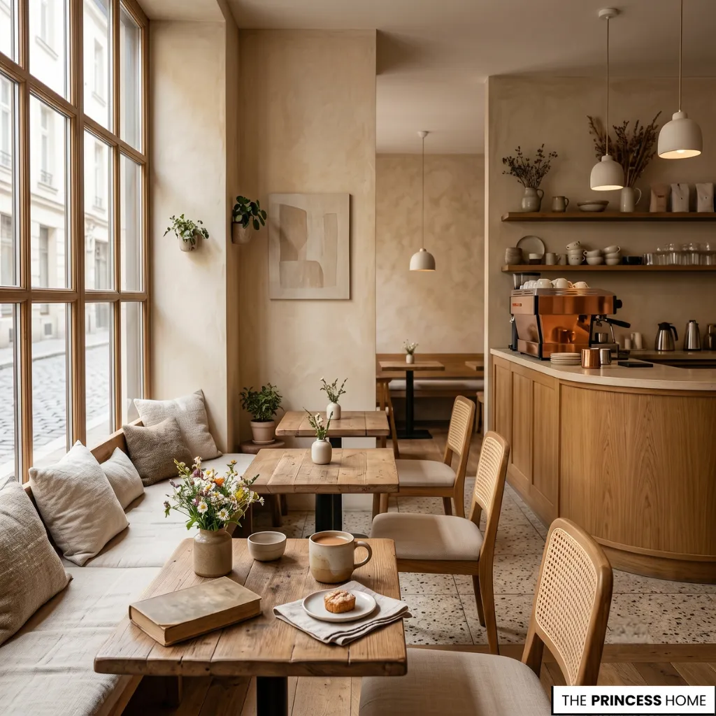
The influence of color extends well beyond residential spaces. A carefully selected palette shapes how a café welcomes guests, how a product feels before it is touched, how a retail environment encourages exploration, and how a website guides attention across a screen.
Luxury brands frequently rely on restrained palettes that communicate refinement through subtle contrast rather than visual noise. Wellness environments often embrace gentle greens, warm neutrals, and muted blues that encourage calm. Creative studios may introduce brighter accents to reinforce curiosity and innovation without overwhelming the eye.
Across branding, interior design, marketing, and digital experiences, color psychology works alongside color symbolism to communicate identity, reinforce recognition, and create emotional connections before words, typography, or imagery have an opportunity to speak.
Color Psychology Research
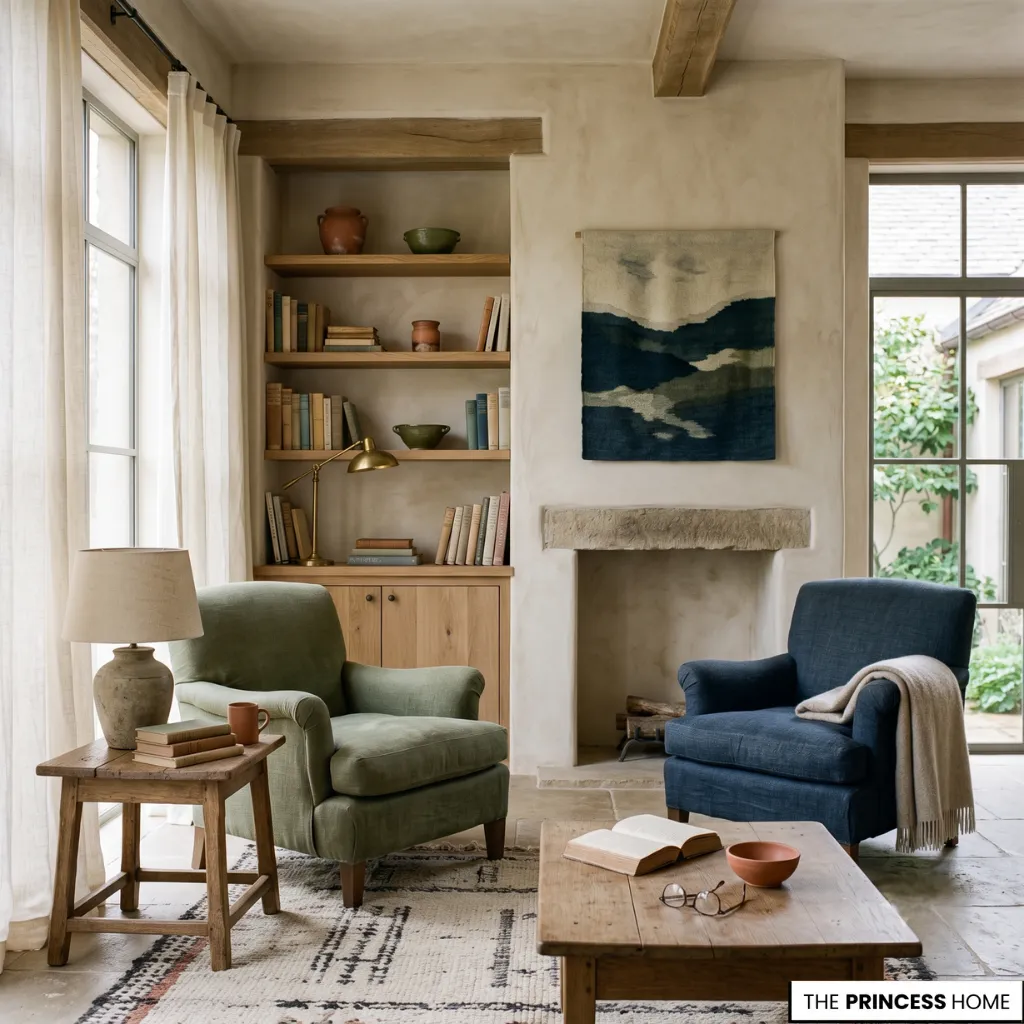
Researchers have explored the relationship between colors, perception, and emotion for decades, yet emotional responses remain deeply connected to personal experiences, cultural backgrounds, and environmental context.
Scientific findings continue to reveal recurring patterns while also acknowledging that memory, expectation, and culture shape how colors are interpreted.
Rather than promising identical emotional outcomes, color psychology offers a thoughtful framework for understanding how visual environments influence human experience. Every shade contributes to a broader sensory composition, where memory, light, material, texture, and atmosphere work together to create meaning.
Emotional Color Impact
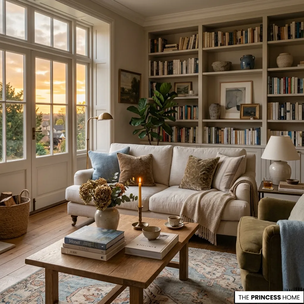
The most memorable interiors, brands, and visual experiences are rarely remembered because of a single object. They linger because of how they made people feel. Color quietly shapes that memory, weaving together emotion, light, texture, proportion, and space into something that feels natural rather than designed.
In this way, color and psychology reveal a relationship that is both subtle and enduring. Every carefully chosen palette becomes more than a collection of beautiful hues.
It becomes an atmosphere that influences perception, enriches everyday experiences, strengthens emotional connection, and leaves an impression long after the colors themselves fade from conscious attention.
💡 INSIDER TIPS:
Avoid common palette errors and undertone conflicts with our guide to Color Choices The Most Common Mistakes in Interior Design.
💡 DESIGN INSPIRATION:
Discover enduring palettes that create a lasting emotional calm in Color Trends: Timeless Palettes for Modern Living.
FAQ
What is color and psychology?
Color and psychology explore how different colors influence emotions, perception, and behavior, shaping experiences in homes, workplaces, branding, and everyday environments.
How do colors affect emotions?
Colors can encourage feelings such as calm, energy, comfort, confidence, or optimism. Their emotional impact depends on context, lighting, culture, and personal experience.
Which colors create a calming atmosphere?
Soft blues, gentle greens, warm neutrals, and muted earth tones are commonly associated with relaxation, balance, and a peaceful visual environment.
Can color psychology work in small spaces?
Yes. Thoughtful color choices can make small apartments feel brighter, more open, and emotionally balanced while maintaining visual harmony.
Why is color psychology important in interior design?
It helps designers create spaces that feel cohesive, comfortable, and emotionally engaging by balancing color, light, materials, and proportion.
How is color psychology used in branding?
Brands use color psychology to communicate identity, build recognition, influence perception, and create emotional connections before customers read any text.
Is color psychology supported by research?
Research shows that colors can influence perception and emotional responses, although personal memories, cultural background, and context also shape individual experiences.
Final Thoughts
Color quietly shapes how people experience the world, influencing emotion, atmosphere, and perception in ways that often go unnoticed. Whether expressed through interiors, branding, or everyday surroundings, understanding the relationship between color and psychology allows every palette to become more intentional, meaningful, and emotionally resonant.