
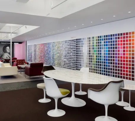

Color is an integral aspect of our lives, influencing our perceptions, emotions, and behaviors in profound ways. Whether in art, design, or everyday life, understanding color theory is essential for creating visually appealing compositions and communicating effectively. In this article, we will explore the fundamental principles of color theory, focusing on the concepts of hue, value, and saturation, and their significance in various contexts.
Whether we’re admiring a vibrant sunset, selecting clothing, or designing a website, understanding the properties of color is crucial. In the realm of color theory, three primary properties reign supreme: hue, value, and saturation. Each of these properties plays a unique role in defining the characteristics and appearance of colors, guiding artists, designers, and enthusiasts alike in their creative endeavors.
The Essence of Color
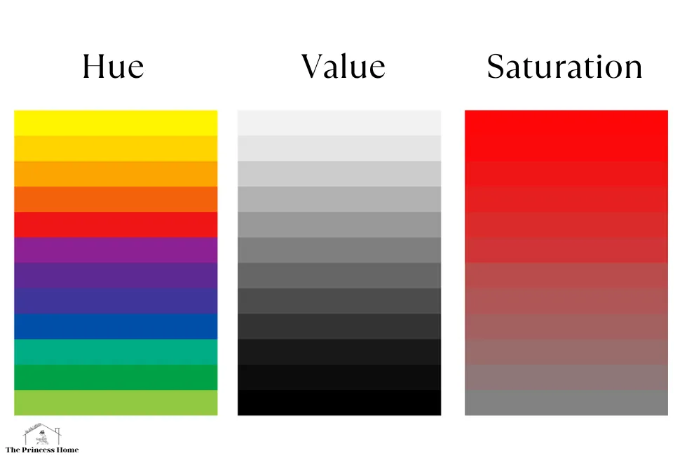
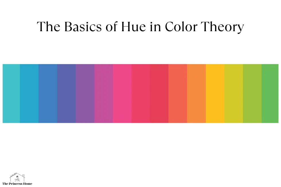
1. Hue:
Hue is perhaps the most immediately recognizable property of color. It refers to the basic classification of color families, encompassing the entire spectrum of visible light. When we think of hue, we think of red, blue, green, yellow, and all the colors in between. In essence, hue is what distinguishes one color from another on the color wheel.
The color wheel, a visual representation of the spectrum of hues, serves as a valuable tool for understanding how different hues relate to one another. It organizes colors in a circular format, with primary colors (red, blue, and yellow) forming the basis and secondary colors (orange, green, and purple) resulting from the mixing of adjacent primaries. Tertiary colors further expand the spectrum by combining primary and secondary hues.
Hue plays a significant role in evoking emotions and setting the tone of a composition. Warm hues like reds, oranges, and yellows are often associated with energy, passion, and warmth, while cool hues such as blues and greens evoke feelings of calmness, serenity, and tranquility. Understanding the psychological effects of different hues is essential in various fields, including marketing, interior design, and visual arts.
The Lightness or Darkness of Color
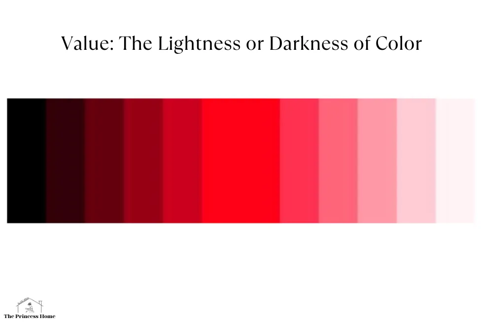
2. Value:
While hue defines the essential color family, value determines its lightness or darkness. In simpler terms, value refers to how light or dark a color appears. This property is crucial in creating contrast, depth, and dimension within a composition.
Value is often represented on a scale ranging from pure white to pure black, with varying shades of gray in between. In color theory, a tint is a lighter version of a color achieved by adding white, while a shade is a darker version created by adding black. Understanding value enables artists and designers to effectively manipulate contrast and balance within their work.
In visual arts, the concept of value is integral to techniques such as shading, highlighting, and chiaroscuro (the use of strong contrasts between light and dark). By mastering value, artists can imbue their creations with depth, realism, and mood, regardless of the chosen hue.
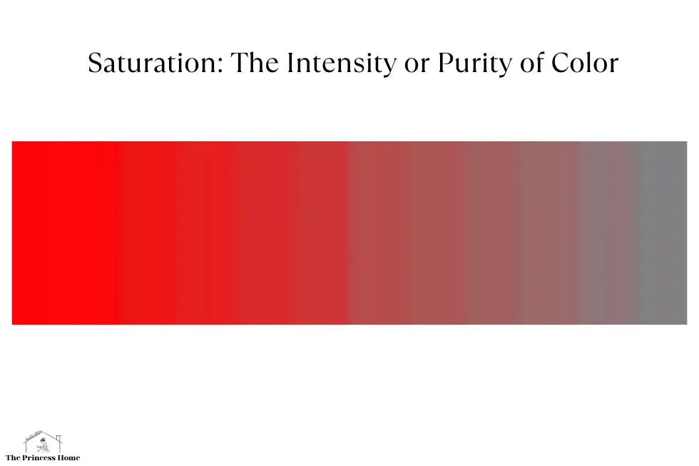
The Intensity or Purity of Color
3. Saturation:
Saturation, also known as chroma or intensity, refers to the vividness or purity of a color. A highly saturated color appears vibrant and rich, while a desaturated color appears more muted or subdued. Saturation is what distinguishes a bright, electric blue from a dull, grayish-blue.
On a color wheel, saturation is often depicted radially, with fully saturated colors towards the outer edge and less saturated or neutral colors towards the center. This radial representation visually illustrates how saturation impacts the perceived intensity of a color.
Saturation is a powerful tool in the hands of designers, allowing them to create visual hierarchy, emphasis, and focal points within their designs. By strategically adjusting the saturation of different elements, designers can control the viewer’s attention and guide their gaze through a composition.
The Harmony of Hue, Value, and Saturation
In the realm of color theory, hue, value, and saturation are the building blocks upon which all colors are constructed. Understanding these properties empowers artists, designers, and enthusiasts to create compelling and impactful visual experiences.
The Role of Color in Design:
In design, understanding color theory is essential for creating effective visual communication and achieving specific objectives. Different colors evoke different emotions and associations, making color selection a critical aspect of design strategy.
For example, warm colors like red, orange, and yellow are often associated with energy, warmth, and excitement, making them suitable for promoting action or stimulating emotions. On the other hand, cool colors like blue, green, and purple convey a sense of calmness, tranquility, and professionalism, making them ideal for creating a sense of stability or trust.
Color theory also guides the creation of color schemes, which are combinations of colors chosen for a specific purpose or aesthetic effect. Common color schemes include complementary, analogous, monochromatic, and triadic schemes, each offering its own unique balance of harmony and contrast.
Application in Art:
In art, color theory serves as a foundational principle for painters, illustrators, and other visual artists. Understanding how colors interact allows artists to create dynamic compositions, convey mood and emotion, and evoke a response from the viewer.
For example, artists may use contrasting colors to create visual interest and focal points within their compositions. They may also manipulate value and saturation to create depth and dimension, or employ color symbolism to convey deeper meaning or narrative elements.
By mastering the interplay between hue, value, and saturation, one can unlock endless possibilities for creativity and expression.
Conclusion:
Color theory is a powerful tool for artists, designers, and anyone interested in visual communication. By understanding the principles of hue, value, and saturation, individuals can harness the expressive potential of color to create compelling artwork, impactful designs, and immersive experiences. Whether in painting, graphic design, interior decoration, or marketing, mastering color theory opens up a world of creative possibilities and enhances the way we perceive and interact with the world around us.
FAQs (Frequently Asked Questions) Related to Understanding Color Theory:
1. What is the significance of understanding color theory?
Understanding color theory is essential in various fields such as art, design, marketing, and psychology. It allows individuals to effectively communicate, evoke emotions, and create impactful visual compositions by manipulating the properties of color.
2. What are the primary properties of color in color theory?
The primary properties of color in color theory are hue, value, and saturation. These properties define the characteristics and appearance of colors and guide artists, designers, and enthusiasts in their creative endeavors.
3. How does hue differ from value and saturation?
Hue refers to the basic classification of color families, encompassing the entire spectrum of visible light. Value determines the lightness or darkness of a color, while saturation refers to the intensity or purity of a color.
4. What role does hue play in evoking emotions and setting the tone of a composition?
Hue plays a significant role in evoking emotions and setting the tone of a composition. Warm hues like reds, oranges, and yellows are associated with energy and passion, while cool hues such as blues and greens evoke feelings of calmness and serenity.
5. How does value contribute to creating contrast and dimension within a composition?
Value determines the lightness or darkness of a color and is crucial in creating contrast, depth, and dimension within a composition. By manipulating value, artists and designers can achieve varying degrees of contrast and balance in their work.
6. What is the difference between a tint and a shade?
In color theory, a tint is a lighter version of a color achieved by adding white, while a shade is a darker version created by adding black. Tints and shades allow artists and designers to create variations in value within a color palette.
7. How does saturation impact the perceived intensity of a color?
Saturation, also known as chroma or intensity, refers to the vividness or purity of a color. Highly saturated colors appear vibrant and rich, while desaturated colors appear more muted or subdued. Saturation impacts the perceived intensity and visual impact of a color.
8. How can designers use saturation to create visual hierarchy and emphasis within their designs?
Designers can use saturation strategically to create visual hierarchy, emphasis, and focal points within their designs. By adjusting the saturation of different elements, designers can control the viewer’s attention and guide their gaze through a composition.
9. What are some practical applications of understanding color theory in design and marketing?
Understanding color theory has practical applications in design and marketing, including creating cohesive color palettes, evoking specific emotions, establishing brand identities, and influencing consumer perceptions and behavior.
10. How can individuals further explore and apply color theory in their creative endeavors?
Individuals can further explore and apply color theory in their creative endeavors through experimentation, observation, and study. By analyzing the work of other artists and designers, practicing color mixing and manipulation, and observing the effects of color in different contexts, individuals can deepen their understanding and mastery of color theory.


