

Color is a fundamental aspect of our visual world, influencing everything from our moods to our perceptions and Understanding the basics of color theory, particularly the color wheel, provides a framework for artists, designers, and anyone interested in visual aesthetics to create harmonious and impactful compositions so At the heart of this theory lies the concept of primary, secondary, and tertiary colors, which form the building blocks of all hues so Let’s delve deeper into the intricacies of the color wheel and how these categories interplay to create the rich tapestry of colors we perceive.
In this article, we will delve into the intricacies of the color wheel.
Understanding the Color Wheel:
Primary, Secondary, and Tertiary Colors
Color is an integral part of our visual experience, influencing our emotions, perceptions, and even behaviors so Understanding the color wheel is fundamental to grasping the principles of color theory and its applications in various fields such as art, design, psychology, and marketing. so the heart of this understanding lie the primary, secondary, and tertiary colors, which form the basis of color mixing and composition.
The Color Wheel:
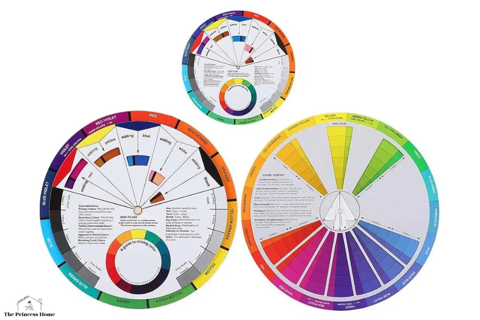
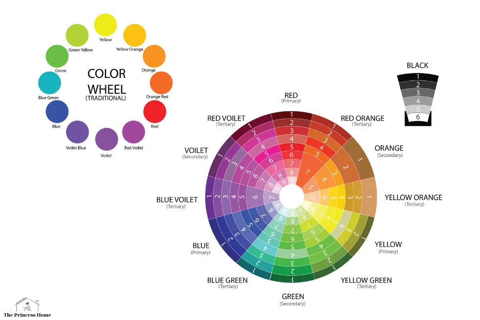
The color wheel is a circular arrangement of colors, depicting their relationships and organization based on hues, saturation, and brightness. It serves as a visual representation of the spectrum of colors, aiding in color selection, combination, and harmony. The primary colors, secondary colors, and tertiary colors are key components of the color wheel, each playing a distinct role in color theory.
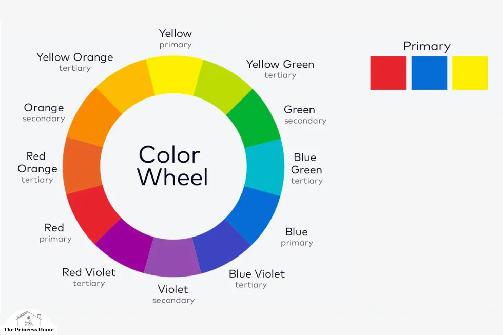
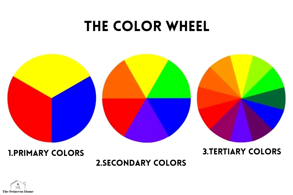
1.Primary Colors:
Primary colors are the foundational hues that cannot be created by mixing other colors. In traditional color theory, the primary colors are red, blue, and yellow. These colors are essential in color mixing, as they serve as the basis for generating all other colors on the spectrum. By combining primary colors in different proportions, a vast array of secondary and tertiary colors can be produced.
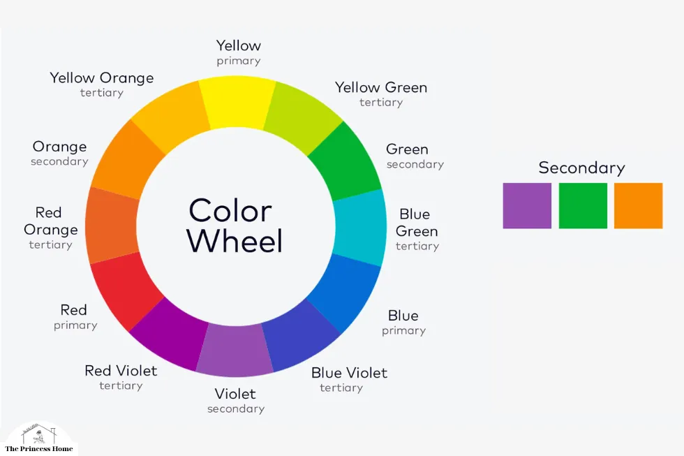
2.Secondary Colors:
Secondary colors are formed by mixing equal parts of two primary colors and There are three secondary colors: orange (red + yellow), green (yellow + blue), and purple (blue + red). So these colors occupy the spaces on the color wheel between the primary colors from which they are derived. Secondary colors exhibit characteristics of both primary colors involved in their creation, resulting in vibrant and dynamic hues.
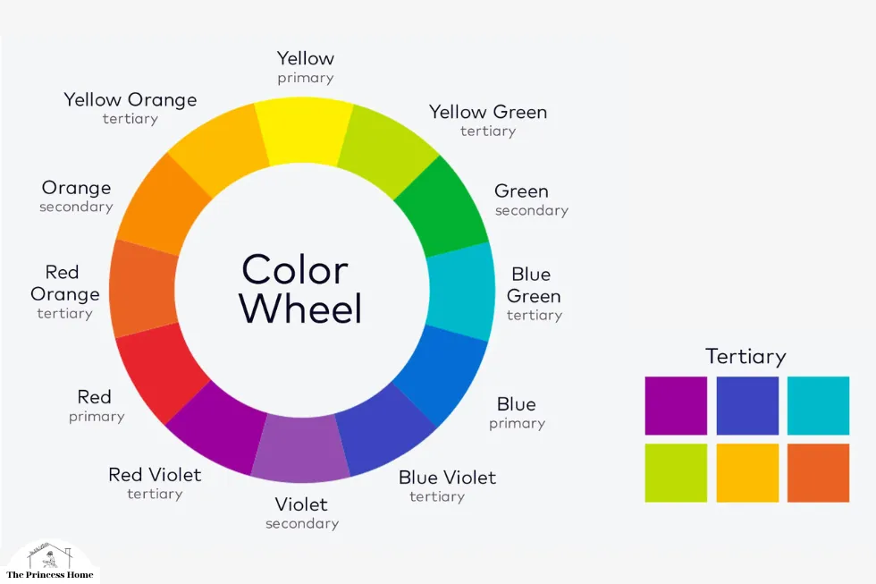
3.Tertiary Colors:
Tertiary colors are further combinations of primary and secondary colors and They are created by mixing unequal proportions of adjacent primary and secondary colors. For example, mixing red with orange yields red-orange, while combining blue with green produces blue-green so tertiary colors bridge the gaps between primary and secondary colors on the color wheel, offering a spectrum of nuanced shades and tones.
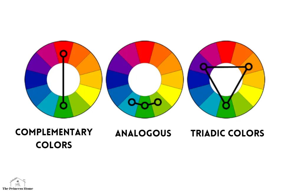
Understanding Color Relationships:
The color wheel facilitates understanding of color relationships, including complementary, analogous, and triadic colors.
1.Complementary Colors:
Complementary colors are located opposite each other on the color wheel and They create high contrast when placed together and intensify each other’s properties. For example, red is complementary to green, blue to orange, and yellow to purple. Complementary color schemes are often used to create visually striking designs and compositions.
2.Analogous Colors:
Analogous colors are adjacent to each other on the color wheel and They share similar undertones and create harmonious color palettes so for instance, yellow-green, yellow, and yellow-orange form an analogous color scheme. Analogous colors are frequently employed in design to evoke feelings of unity and coherence.
3.Triadic Colors:
Triadic colors are evenly spaced around the color wheel, forming equilateral triangles and they offer a balanced contrast while maintaining harmony. For example, the triadic relationship between red, yellow, and blue creates a vibrant and dynamic color scheme. Triadic color combinations are versatile and can be used to achieve visual interest without overwhelming the viewer.

Applications of Color Theory:
Understanding the principles of the color wheel and color theory has numerous applications across various disciplines.
1.Art and Design:
In art and design, knowledge of the color wheel enables artists and designers to create visually compelling compositions so By understanding color relationships, they can effectively use color to convey mood, emotion, and narrative in their work. Whether creating paintings, illustrations, or graphic designs, mastery of color theory is essential for achieving impactful visual communication.

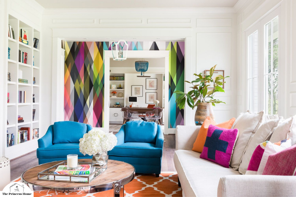
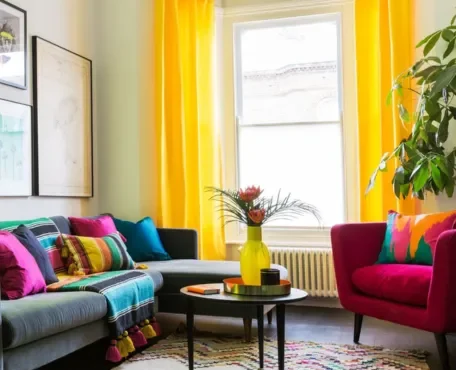
2.Interior Design:
In interior design, the color wheel serves as a guide for selecting color schemes that enhance the ambiance and functionality of a space so by considering factors such as lighting, spatial layout, and psychological effects of color, designers can create environments that are both aesthetically pleasing and conducive to their intended purpose. From residential interiors to commercial spaces, thoughtful application of color theory can transform spaces into inviting and inspiring environments.

3.Fashion and Textiles:
In the realm of fashion and textiles, understanding the color wheel is crucial for designing garments, accessories, and fabric patterns so fashion designers use color theory to create cohesive collections, coordinate outfits, and evoke desired emotions through color choices. consequently, textile designers leverage color theory to develop prints, weaves, and dyeing techniques that enhance the visual appeal of fabrics and textiles.
4.Marketing and Branding:
In marketing and branding, color plays a significant role in shaping consumer perceptions and brand identities. Companies strategically select colors to evoke specific emotions, establish brand recognition, and differentiate themselves from competitors. For example, the use of red in branding can convey energy and passion, while blue evokes trust and reliability .So by understanding the psychological effects of color, marketers can effectively leverage color theory to influence consumer behavior and enhance brand equity.
Psychology and Therapy:
In psychology and therapy, color is recognized for its therapeutic properties and its ability to influence mood and well-being. Color therapists use the principles of color psychology to promote relaxation, alleviate stress, and stimulate emotional healing. so by understanding the psychological effects of different colors, therapists can tailor interventions to meet the needs of their clients and facilitate positive outcomes.
Conclusion:
The color wheel serves as a fundamental tool for understanding the intricacies of color theory and its applications across various disciplines So by exploring the relationships between primary, secondary, and tertiary colors, as well as their significance in composition and design, we gain insights into the visual language of color. Whether in art, design, psychology, or marketing, a thorough understanding of the color wheel empowers individuals to harness the power of color to communicate, evoke emotion, and create impactful experiences.
FAQs (Frequently Asked Questions) Related to Understanding the Color Wheel and Color Theory:
1. Why is understanding the color wheel important?
Understanding the color wheel is crucial because it provides a framework for comprehending how colors interact and relate to each other and It helps artists, designers, and individuals interested in visual aesthetics create harmonious compositions and effectively use color to convey mood, emotion, and meaning in their work.
2. What are primary colors, and why are they significant?
Primary colors are foundational hues that cannot be created by mixing other colors. In traditional color theory, the primary colors are red, blue, and yellow. They are significant because they serve as the basis for generating all other colors on the spectrum through color mixing.
3. How are secondary colors created?
Secondary colors are formed by mixing equal parts of two primary colors. There are three secondary colors: orange (red + yellow), green (yellow + blue), and purple (blue + red). These colors occupy the spaces on the color wheel between the primary colors from which they are derived.
4. What are tertiary colors, and how are they different from primary and secondary colors?
Tertiary colors are further combinations of primary and secondary colors. Moreover, they are created by mixing unequal proportions of adjacent primary and secondary colors. Additionally, tertiary colors bridge the gaps between primary and secondary colors on the color wheel. Consequently, they offer a spectrum of nuanced shades and tones.
5. What are some common color relationships discussed in color theory?
Some common color relationships discussed in color theory include complementary colors, analogous colors, and triadic colors. Complementary colors are opposite each other on the color wheel, analogous colors are adjacent, and triadic colors are evenly spaced around the wheel.
6. How can I apply color theory in practical settings, such as interior design or branding?
In interior design, color theory can be applied to select color schemes that enhance the ambiance and functionality of a space. In branding, colors can be strategically chosen to evoke specific emotions and establish brand identity. Understanding color theory allows designers and marketers to make informed decisions about color selection and its impact on the intended audience.
7. Are there cultural or psychological implications associated with certain colors?
Certainly, colors can have cultural and psychological implications that vary across different societies and individuals. For example, red may symbolize luck and prosperity in some cultures but evoke danger or passion in others. Similarly, colors can elicit different emotional responses based on personal experiences and associations.
8. How can I learn more about color theory and the color wheel?
Certainly, there are many resources available to learn more about color theory and the color wheel. These resources include books, online courses, workshops, and tutorials. Furthermore, artists, designers, and educators often provide valuable insights into color theory through their work and teachings. Additionally, experimenting with colors and observing their effects in different contexts can deepen understanding and appreciation of color theory.
9. Can color theory be applied to digital design and photography?
Yes, color theory principles can be applied to digital design and photography to enhance visual communication and aesthetic appeal. Designers and photographers use color theory to create balanced compositions, evoke emotions, and guide viewer attention. Understanding color theory allows for more intentional and effective use of color in digital media.
10. How does color theory intersect with other fields, such as psychology or marketing?
Color theory intersects with other fields such as psychology and marketing by recognizing the psychological effects of color on human emotions and behaviors. In psychology, colors are studied for their therapeutic properties and influence on mood and well-being. In marketing, colors are strategically used to influence consumer perceptions, evoke specific emotions, and establish brand identities. Understanding color theory allows practitioners in these fields to leverage the power of color to achieve desired outcomes.


