
Color is more than decoration it’s emotion, psychology, and storytelling all at once. Whether you’re designing a home, branding a product, or creating digital art, the right color scheme can instantly elevate your work. This guide explores how to choose the perfect palette, backed by expert insights from leading interior designers and modern design thinking.
Why Color Choice Matters
Before diving into the technical side of design, it’s essential to understand why colors matter so much. Colors influence emotions, with blue creating a sense of calm, red evoking urgency, and green reflecting nature.
They also carry strong cultural associations for example, red symbolizes luck in China but represents danger in Western road signs. Beyond psychology, colors play a vital role in brand recognition, with studies showing that consistent use of color can boost recognition by up to 80%.
In terms of user experience, the right color choices can make a significant difference: in web design, a button’s color can increase click-through rates, while in interior design, the right tones can make a room feel larger or smaller.
Ultimately, choosing the right color scheme is about finding the perfect balance between aesthetics, functionality, and psychology.
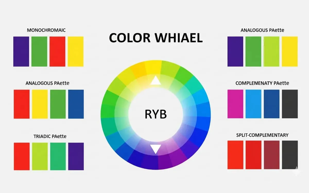
Color Theory Mastery
The color wheel introduced by Isaac Newton is the foundation of color theory, organizing primary, secondary, and tertiary hues into a visual guide that reveals how colors relate and interact. Designers like Nate Berkus rely on this structure to create balanced, timeless palettes.
Kelly Wearstler uses it to craft bold, expressive compositions. By understanding harmony (analogous), contrast (complementary), and balance (triadic), designers can shape mood, highlight focal points, and build visually compelling work across any medium.
Color Scheme Secrets
Popular color schemes like monochromatic, analogous, and complementary palettes remain foundational because they balance harmony, contrast, and mood through the color wheel (Vents Magazine). Designers such as Kelly Wearstler emphasize layering tones within a single palette to create depth, while Nate Berkus advocates mixing neutrals with bold accents for a timeless yet personal look.
Meanwhile, Le Corbusier famously treated color as a spatial tool, proving that curated palettes can shape perception and emotion in interiors (Wikipedia). Today’s trend leans toward warm, earthy schemes and subtle contrasts, reflecting a shift toward comfort, personality, and emotional connection in design.
1. Monochromatic Color
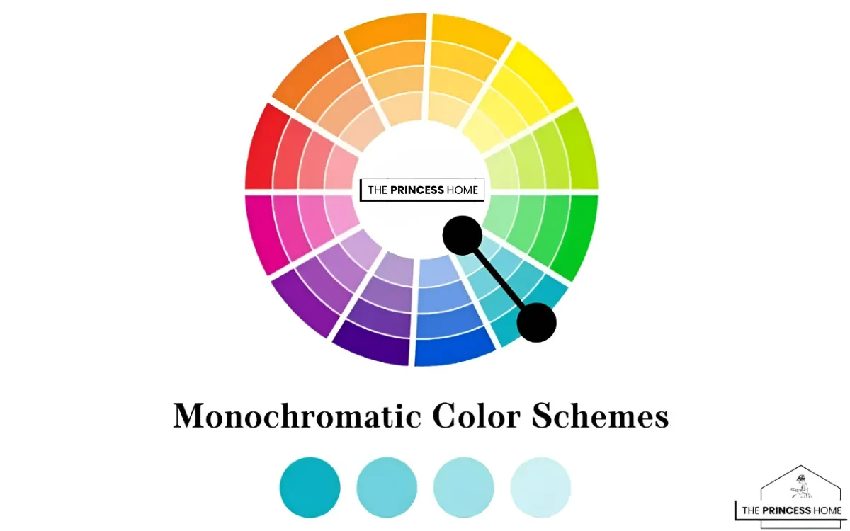
Monochromatic color schemes are a foundational concept in the world of color theory and design. Stemming from a single base hue, monochromatic schemes offer a harmonious and elegant aesthetic by utilizing variations in saturation and brightness. This approach creates a palette that is cohesive and visually appealing, making it a popular choice for a wide range of design projects.
Mono Color Power
Monochromatic color schemes create effortless harmony by using one base hue with variations in tint, tone, and shade to build depth and sophistication. Designers like Kelly Wearstler use tonal contrast to add drama, while Nate Berkus embraces layered neutrals for a calm, timeless aesthetic.
Designers such as Suzanne Kasler and Barbara Barry highlight how texture and subtle variation can transform a single-color palette into something rich and inviting. This approach not only simplifies design decisions but also delivers a cohesive, polished, and emotionally impactful result across interiors, branding, and digital spaces.
Monochromatic Design Drawbacks
Monochromatic color schemes, while elegant and cohesive, can sometimes feel flat or visually repetitive if not executed carefully. Because they rely on a single hue, there is a risk of limited contrast, which can make it harder to highlight focal points or create visual hierarchy within a space.
Designers in the Color Theory often note that without variation in texture, pattern, or material, monochromatic interiors may lack depth and interest. This approach can also restrict creativity, as working within one color family may limit bold or dynamic design choices.
However, professionals like Kelly Wearstler overcome these challenges by incorporating rich textures, mixed materials, and layered lighting to add dimension and prevent the design from feeling one-dimensional.
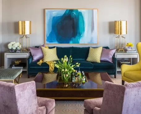
2. Analogous Color
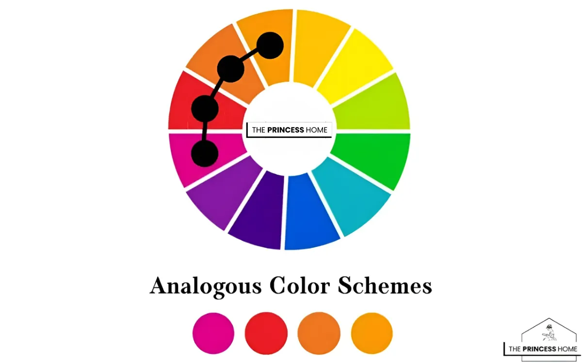
Analogous color schemes create natural harmony by combining colors that sit next to each other on the color wheel, producing smooth, seamless transitions and a unified visual experience. Designers like Kelly Wearstler often use these palettes to layer subtle variations and add depth without disrupting cohesion, while Nate Berkus incorporates them to craft warm, inviting spaces with effortless flow.
This approach is widely favored in modern design, as it delivers balance, cohesion, and a sense of calm. By leveraging closely related hues, analogous schemes make it easy to build visually pleasing and emotionally consistent designs.
Analogous Color Harmony
Analogous color schemes use hues that sit next to each other on the color wheel, creating smooth transitions and naturally cohesive designs. Designers like Kelly Wearstler use these palettes to build layered, atmospheric spaces, while Nate Berkus relies on them to craft warm, inviting environments with emotional depth.
Experts such as Stephanie Kraus, Mark D. Sikes, and James T. Farmer showcase how blues, greens, and other adjacent hues can echo nature’s harmony. By blending similar tones, analogous schemes deliver calm, balanced, and visually fluid designs that feel both timeless and effortlessly elegant.
Analogous Design Drawbacks
Analogous color schemes—using colors that sit next to each other on the color wheel—are known for their harmony, but they can also present some limitations within the framework of Color Theory.
One of the main drawbacks is the lack of contrast, which can make a design feel too uniform or visually soft, sometimes reducing the impact of focal points. Without enough variation, spaces or designs may appear less dynamic and can risk looking slightly dull or monotonous.
Designers like Nate Berkus often address this by introducing contrast through texture, lighting, or small accent colors, ensuring the palette still feels engaging. Another challenge is limited color variety, which can restrict creativity and make it harder to create bold statements compared to more contrasting schemes like complementary palettes.
To succeed with an analogous scheme, it’s important to balance harmony with subtle contrast, so the design remains visually interesting while maintaining its natural flow.
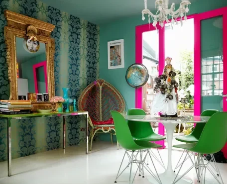
3. Complementary Color
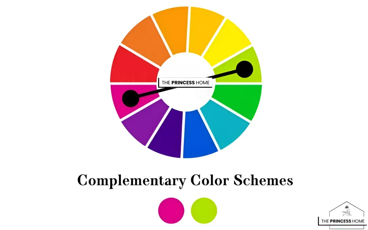
Complementary color schemes are a dynamic and impactful approach to color combinations, based on colors that are opposite each other on the color wheel. This type of scheme creates a high level of contrast and visual interest, making it a popular choice for designs that aim to grab attention and make a bold statement.
Complementary Color Magic
Complementary color schemes harness the power of opposite hues on the color wheel to create bold contrast, energy, and visual impact. Designers like Justina Blakeney use vibrant pairings such as red and green to add playful, lively character, while Jonathan Adler embraces combinations like blue and orange for striking yet balanced interiors.
Experts such as Kelly Wearstler push these contrasts to create dramatic focal points, while Joanna Gaines balances them with neutrals for warmth and livability. When used thoughtfully, complementary palettes deliver dynamic harmony, ensuring designs feel both energetic and refined without overwhelming the eye.
Complementary Design Drawbacks
Complementary color schemes—based on colors opposite each other on the color wheel in Color Theory—create strong contrast, but they can also introduce challenges if not used carefully.
One major drawback is visual intensity, where the high contrast can feel overwhelming or harsh, especially in large doses. This can make a space or design feel too bold or even tiring to look at over time. Another issue is balance difficulty if both colors are used equally, the design can feel chaotic or compete for attention instead of creating harmony.
Designers like Jonathan Adler often manage this by letting one color dominate while using the complementary color as an accent, helping to control the visual impact. Additionally, complementary schemes can sometimes feel less versatile, as finding the right balance between two strong colors requires careful planning, lighting considerations, and thoughtful use of neutral elements.
When handled skillfully, these schemes can be powerful—but they demand precision to avoid visual overload.
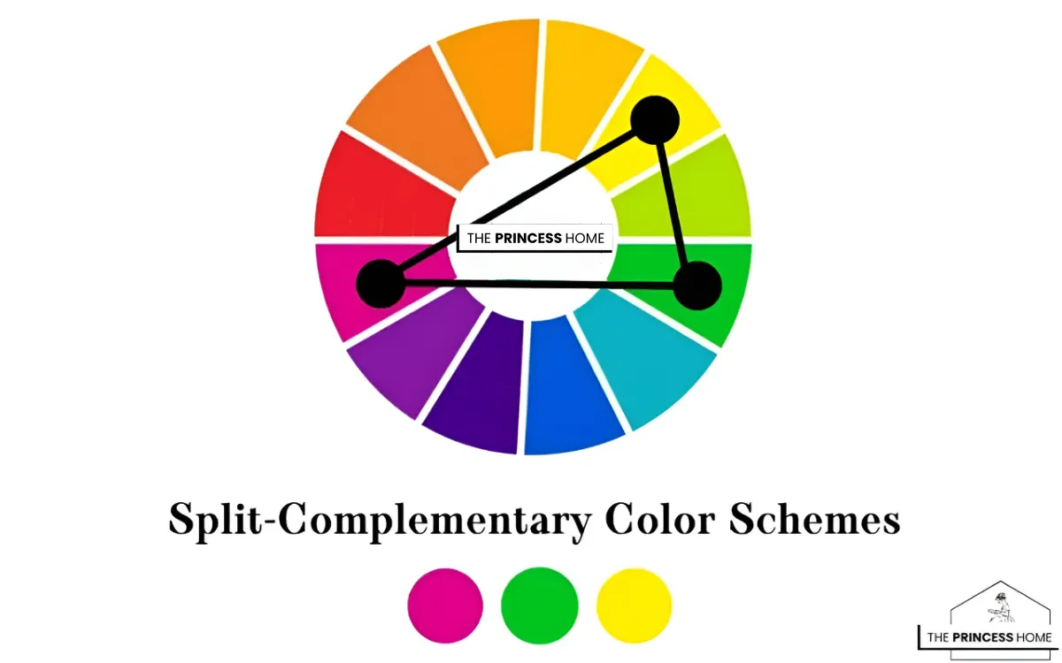
4. Split Complementary Color
Split-complementary color schemes offer a refined twist on bold contrast by pairing one base color with the two hues adjacent to its opposite on the color wheel. Designers like Emily Henderson favor this approach for its ability to create visual interest without the intensity of full complementary contrasts, while Nate Berkus highlights its balance between vibrancy and harmony.
This palette allows for more flexibility in layering tones, making spaces feel dynamic yet approachable. When thoughtfully styled, split-complementary colors deliver depth, softness, and a polished designer look across interiors and branding.
Split Complementary Magic
Split-complementary color schemes blend contrast and harmony by pairing a base color with two hues adjacent to its complement, creating a vibrant yet balanced palette. Designers like Emily Henderson value this approach for its versatility and layered depth, while Jonathan Adler uses it to introduce playful energy without overwhelming a space.
Nate Berkus highlights how this scheme adds richness and dimension while maintaining visual comfort. By softening sharp contrasts and layering tones, split-complementary palettes deliver a polished, dynamic, and approachable design across interiors and branding.
Split-Complementary Design Drawbacks
Split-complementary color schemes—where one base color is paired with the two colors adjacent to its opposite on the wheel in Color Theory—offer more balance than direct complementary schemes, but they still come with a few limitations.
One drawback is complexity in balance. With three colors in play, it can be tricky to maintain harmony without one color overpowering the others. If not carefully controlled, the palette may feel uneven or visually cluttered. Another challenge is reduced contrast clarity—while it’s less intense than complementary schemes, the contrast can sometimes feel weaker or less striking than intended.
Designers like India Mahdavi often manage this by assigning clear roles to each color—one dominant, one supporting, and one as an accent—to keep the composition organized. Additionally, this scheme can feel less intuitive to work with, especially for beginners, because it requires a deeper understanding of color relationships and careful fine-tuning to avoid visual imbalance.
5.Triadic Color
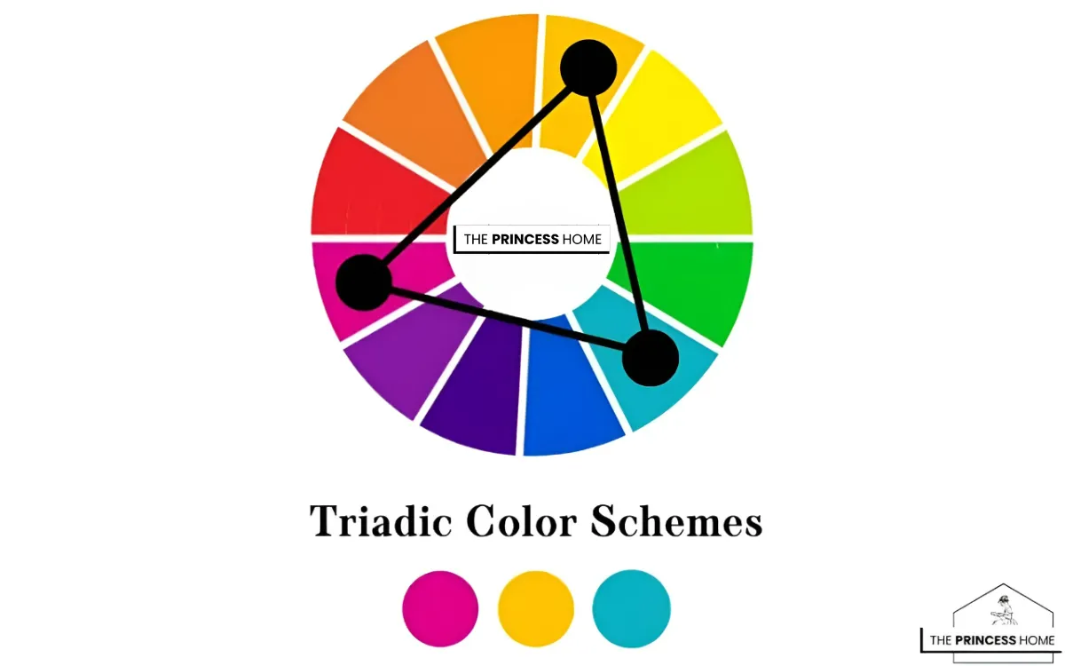
Triadic color schemes are a dynamic and vibrant approach to color combinations, involving the selection of three colors that are evenly spaced around the color wheel. This type of scheme creates a balanced and visually appealing palette that offers a high level of contrast and interest.
Triadic Color Magic
Triadic color schemes use three evenly spaced hues on the color wheel to create a vibrant yet balanced palette that feels naturally harmonious. Designers like Jonathan Adler use triadic combinations to inject playful energy and bold personality, while Kelly Wearstler leverages them to build rich, layered spaces with striking visual depth.
Emily Henderson emphasizes balancing saturation and proportion to keep the palette cohesive and approachable. When carefully managed, triadic schemes deliver dynamic harmony, allowing designs to feel both creative and visually refined across interiors, branding, and digital work.
Triadic Design Drawbacks
Triadic color schemes—using three colors evenly spaced around the wheel in Color Theory—can create vibrant and balanced compositions, but they also come with notable challenges.
One key drawback is visual intensity. Because triadic schemes involve three distinct hues, the result can feel overly bold or busy if all colors are used in equal strength. This can make a design appear chaotic rather than harmonious if not carefully balanced.
Another issue is complexity in coordination. Managing three colors at once requires thoughtful control of proportions, contrast, and placement to ensure the design feels unified. Without a clear hierarchy, the palette may lack focus or feel overwhelming.
Designers like Kelly Wearstler often address this by choosing one dominant color, using a second color as support, and applying the third as an accent to maintain visual order.
Additionally, triadic schemes can be less subtle, which may not suit minimalist or calming design goals, as the inherent contrast tends to create a more energetic and expressive look.
Neutral + Accent Color Scheme
A neutral + accent color scheme combines a base palette of neutrals such as white, black, gray, or beige with a single bold highlight color. This approach creates a timeless, professional, and highly flexible look that adapts easily across different styles.
The neutral foundation ensures sophistication, while the accent color adds energy and focus without overwhelming the design. This scheme is especially effective for websites, office environments, luxury branding, and minimalist interiors where elegance and clarity are essential.
Color Psychology: Choosing by Emotion
Color choices go beyond beauty — they create emotional responses:
- Red: Excitement, energy, urgency.
- Blue: Trust, peace, security.
- Yellow: Optimism, warmth, happiness.
- Green: Nature, growth, wealth.
- Purple: Royalty, creativity, mystery.
- Black: Power, elegance, authority.
- White: Simplicity, purity, minimalism.
👉 Always ask: What do I want my audience to feel?
Factors to Consider When Choosing
When selecting a color scheme, there are several important factors to keep in mind. First, consider the purpose of your design—whether you’re creating a playful kids’ brand, a professional corporate office identity, or a modern fashion label, your colors should align with the brand’s message.
Next, think about your audience: younger people are often drawn to bold contrasts and vibrant tones, while professionals usually prefer more muted, sophisticated palettes. The medium also makes a difference, since colors can appear differently in print, on screens, or in physical spaces.
Prioritize accessibility by ensuring strong contrast for readability and usability, especially in digital design. Finally, balance trends versus timelessness; while trendy neon shades may capture attention now, a versatile and enduring palette will keep your design relevant for years to come.
The 60-30-10 Rule
A simple guideline for balance:
- 60% → Dominant color (background, walls, brand base).
- 30% → Secondary color (supporting elements, furniture, sections).
- 10% → Accent (buttons, accessories, highlights).
This rule keeps palettes visually organized and professional.
Tools to Help You Choose
- 🎨 Adobe Color → Explore and create schemes.
- 🎨 Coolors.co → Auto-generate palettes.
- 🎨 Canva Color Palette Generator → Extract colors from photos.
- 🎨 Paletton → Experiment with advanced schemes.
- 🎨 Material Palette → Ideal for UI designers.
Common Mistakes to Avoid
- ❌ Using too many colors (cluttered and confusing).
- ❌ Ignoring contrast (hurts readability).
- ❌ Forgetting cultural meanings.
- ❌ Distributing all colors equally (creates chaos).
- ❌ Blindly following trends without purpose.
Step-by-Step Guide to Picking Your Scheme
- Define your goal → Calm, energetic, luxurious, etc.
- Choose your base color → The foundation of your identity.
- Select a scheme type → Monochromatic, analogous, complementary, etc.
- Apply the 60-30-10 balance.
- Test in real context → Website mockups, room renders, product samples.
- Check contrast & accessibility.
- Get feedback and refine.
Conclusion
Choosing a color scheme isn’t just about creating something visually appealing—it’s about purpose, psychology, and balance. By understanding how colors interact and how they influence emotions, you can design a palette that strengthens brand identity, improves readability and user experience, evokes the right emotional response, and stands the test of time. Remember, color harmony is both an art and a science, and the most effective designers know how to master both to achieve impactful and timeless results.
Here are some frequently asked questions related to the article :
1. What are color schemes, and why are they important in design?
Color schemes are combinations of colors chosen to create a specific visual effect or mood in design. They are important because they help establish the overall aesthetic, mood, and impact of a design, whether it’s in graphic design, interior design, fashion, or any other creative field.
2. How do I choose the right color scheme for my project?
Choosing the right color scheme depends on factors such as the message you want to convey, the emotions you want to evoke, and the overall aesthetic you’re aiming for. Consider the purpose of your project, your target audience, and any existing branding guidelines if applicable.
3. What is the difference between monochromatic and analogous color schemes?
Monochromatic color schemes involve variations of a single hue, while analogous color schemes consist of colors that are adjacent to each other on the color wheel. Monochromatic schemes offer a more subtle and harmonious look, while analogous schemes provide a bit more variety and contrast.
4. Can I use complementary colors in equal proportions in my design?
Yes, you can use complementary colors in equal proportions, but it’s important to balance them appropriately to avoid overwhelming the viewer. Consider factors such as color intensity, saturation, and placement within the composition to achieve a visually pleasing result.
5. How do I create a split-complementary color scheme?
To create a split-complementary color scheme, start with a base color and then select the two colors adjacent to its complement on the color wheel. This creates a palette that maintains the vibrancy and contrast of complementary colors while offering a softer and more nuanced aesthetic.
6. Are triadic color schemes suitable for all types of designs?
Triadic color schemes offer versatility and can be used in a wide range of designs, but they may not be suitable for every project. Consider the message, mood, and audience of your design to determine whether a triadic scheme is appropriate.
7. How do I ensure that my chosen color scheme works well together?
To ensure that your chosen color scheme works well together, consider factors such as color harmony, contrast, and balance. Experiment with different combinations, and consider using tools like color wheels or color theory principles to guide your decisions. Additionally, test your color scheme in different contexts and lighting conditions to see how it performs in real-world settings.
The princess home on Pinterest


