


In the realm of design, mastering color concepts is not just about aesthetics; it’s about effective communication. Whether you’re a graphic designer, interior decorator, or branding consultant, understanding how to wield color effectively is paramount to satisfying clients and achieving successful outcomes. This article serves as a comprehensive guide for design professionals on how to master color concepts effectively when working with clients.
Understanding client preferences and effectively mastering color concepts are crucial skills for any designer or professional working in the visual arts industry.
Here are some key strategies to help you navigate this aspect of client interaction:
1.Active Listening:
Start by actively listening to your client’s vision and preferences regarding color. Ask open-ended questions to encourage them to articulate their ideas clearly. Understanding their objectives and the emotions they want to evoke with the color scheme is essential.
2.Create Visual Mood Boards:
Develop visual mood boards that showcase various color palettes, textures, and design elements. This helps clients visualize different color combinations and styles in the context of their project, making it easier for them to express their preferences.
3.Understand Color Psychology:
Familiarize yourself with the principles of color psychology to better understand how different colors can evoke specific emotions and reactions. For example, warm colors like red and orange often convey energy and passion, while cooler tones like blue and green evoke calmness and tranquility.
4.Consider Brand Identity:
If the project involves branding or marketing materials, consider the client’s existing brand identity and how the color scheme can align with their brand values and personality. Consistency across all visual elements is key to maintaining brand recognition and coherence.
5.Provide Options:
Offer clients a range of color options based on their preferences and project requirements. Presenting them with alternatives allows them to feel involved in the decision-making process and gives them a sense of ownership over the final outcome.
6.Visualize in Context:
Use design mockups or visual simulations to showcase how different color schemes will appear in the context of the final product, whether it’s a website, packaging, interior space, or marketing collateral. This helps clients make informed decisions and ensures that the chosen colors work well in real-world scenarios.
7.Be Flexible &Collaborative:
Remain open to feedback and be willing to make adjustments based on the client’s input. Collaboration is key to achieving a color scheme that meets the client’s vision while also satisfying design principles and objectives.
8.Educate Clients:
Sometimes, clients may not have a clear understanding of color concepts or how certain choices can impact the overall design. Take the opportunity to educate them on the basics of color theory and how different color combinations can influence perception and user experience.
By mastering these strategies, you can effectively collaborate with clients to create color schemes that resonate with their vision, convey the desired message, and enhance the overall impact of the design project.

1.*Understanding Client Preferences:
Before delving into color concepts, it’s crucial to understand your client’s preferences, objectives, and target audience. Schedule thorough consultations to gather insights into their brand identity, values, and the emotions they wish to evoke through design. Ask specific questions about color preferences, past experiences, and any existing brand guidelines. understanding your client’s preferences is fundamental to creating designs that resonate with their vision and objectives.
Here’s a more detailed breakdown of how to approach this initial phase:
1. Thorough Consultations:
Set aside dedicated time to meet with your client and discuss their project in detail. This could be done through in-person meetings, video calls, or detailed questionnaires, depending on the client’s preferences and availability.
2. Gather Insights:
During these consultations, focus on gathering insights into various aspects of their brand and project. This includes their brand identity, core values, target audience demographics, and the specific emotions or messages they want to convey through design.
3. Ask Specific Questions:
Pose targeted questions to uncover your client’s preferences regarding color. Inquire about their favorite colors, any colors they strongly dislike, and whether they have any existing color associations tied to their brand or industry.
4. Explore Past Experiences:
Learn from your client’s past experiences with design projects, including any successes or challenges related to color choices. Understanding what has worked well for them in the past can provide valuable insights into their preferences and expectations.
5. Brand Guidelines:
If your client has established brand guidelines, review them carefully to understand any existing color palettes or rules that need to be followed. This ensures consistency with their brand identity and helps you align your design proposals accordingly.
6. Dive Deep into Emotions:
Discuss the emotions or moods your client wants to evoke with their design. Different colors can elicit specific emotional responses, so understanding their desired emotional impact can guide your color choices effectively.
7.Mood Boards:
Collaboratively create mood boards or visual references that capture the aesthetic direction your client envisions. This can include not only color inspiration but also imagery, typography, and other design elements that contribute to the overall mood.
8. Be Attentive :
Pay attention to non-verbal cues during your interactions with the client, such as their reactions to certain colors or visual examples. These cues can provide additional insights into their preferences and help you tailor your design proposals accordingly.
By thoroughly understanding your client’s preferences, objectives, and target audience, you can lay a solid foundation for designing color concepts that align with their vision and goals. This proactive approach fosters collaboration and ensures that your design solutions effectively meet the client’s expectations.

2.*Communication Channels:
Clear and open communication is the foundation of any successful design project. Establishing effective communication channels with clients ensures that their vision is accurately translated into the final design. Utilize tools such as mood boards, color palettes, and visual references to facilitate discussions and align expectations. establishing clear and open communication channels is essential for ensuring a successful design project.
Here’s how you can effectively set up communication channels with clients:
1. Communication Methods:
Understand your client’s preferred communication methods and channels. Some clients may prefer email for formal communications, while others may prefer phone calls or video conferences for more immediate discussions. Respect their preferences and adapt your communication approach accordingly.
2. Schedule Regular Check-ins:
Set up regular check-in meetings or progress updates to keep the client informed about the project’s status. These meetings provide an opportunity to discuss any concerns, gather feedback, and ensure alignment with the client’s vision throughout the design process.
3. Utilize Visual Tools:
Visual aids such as mood boards, color palettes, and visual references are invaluable for facilitating discussions and aligning expectations. Use these tools to convey design concepts, explore different options, and gather feedback from the client in a clear and visual manner.
4. Collaborate in Real-Time:
Consider using collaborative design platforms or project management tools that allow for real-time collaboration and feedback. These tools enable both you and the client to view and comment on design iterations, ensuring that everyone is on the same page throughout the project.
5. Provide Clear Documentation:
Document key decisions, feedback, and project milestones in writing to avoid misunderstandings and miscommunications. This could include meeting summaries, design briefs, and revision notes, which serve as reference points for both parties throughout the project.
6. Be Responsive:
Respond to client inquiries and feedback in a timely manner to demonstrate your commitment to the project and maintain trust. Prompt communication helps address any concerns or revisions promptly, keeping the project on track and minimizing delays.
7. Encourage Open Dialogue:
Foster a collaborative and open dialogue with the client, encouraging them to share their thoughts, ideas, and concerns freely. Actively listen to their feedback, address any questions or uncertainties, and incorporate their input into the design process wherever possible.
8. Manage Expectations:
Be transparent about project timelines, deliverables, and any potential challenges or constraints. Managing client expectations from the outset helps prevent misunderstandings and ensures a smoother project experience for everyone involved.
By establishing effective communication channels and leveraging visual tools to facilitate discussions, you can ensure that your client’s vision is accurately translated into the final design, leading to a successful outcome for the project.

3.*Educating Clients on Color Psychology:
Many clients may not be familiar with the psychological impact of color on human emotions and perceptions. As a design professional, it’s your responsibility to educate clients on the significance of color psychology and its implications for their branding and marketing efforts. Provide examples and case studies to illustrate how different colors can convey specific messages and evoke desired responses from their target audience. Educating clients on color psychology is indeed crucial for helping them make informed decisions about their branding and marketing efforts.
Here’s how you can effectively educate clients on the significance of color psychology:
1. Explain Basic Principles:
Start by explaining the basic principles of color psychology, including how different colors can evoke specific emotions, associations, and perceptions. Provide examples of well-known brands that effectively utilize color to convey their brand identity and messaging.
2. Showcase Case Studies:
Share case studies and examples of successful branding and marketing campaigns that leverage color psychology to connect with their target audience. Highlight how certain color choices have contributed to the success of these campaigns and influenced consumer behavior.
3. Discuss Cultural Context:
Emphasize the importance of considering cultural context when choosing colors for branding and marketing materials. Different cultures may have varying associations with colors, so it’s essential to tailor the color palette to resonate with the target audience’s cultural preferences and values.
4. Demonstrate Mood &Tone:
Illustrate how different color palettes can convey varying moods, tones, and brand personalities. Show examples of color combinations that evoke feelings of trust, excitement, sophistication, or playfulness, depending on the brand’s objectives and target audience.
5. Address Brand Identity:
Discuss how color choices can shape and reinforce a brand’s identity and values. Help clients understand how selecting the right colors can strengthen brand recognition, establish brand consistency, and differentiate their brand from competitors.
6. Provide Visual Examples:
Use visual aids such as color swatches, mood boards, and color psychology infographics to make the concepts more tangible and easier to understand. Visual examples can help clients visualize how different color combinations may impact their branding materials.
7. Encourage Experimentation:
Encourage clients to experiment with different color palettes and variations to see how they resonate with their target audience. Conduct A/B testing or focus groups to gather feedback on color preferences and perceptions before finalizing branding decisions.
8. Offer Guidance &Recommendations:
Based on your expertise and understanding of color psychology, offer guidance and recommendations on color choices that align with the client’s brand identity, messaging, and target audience. Provide rationale and justification for your recommendations to build trust and credibility.
By educating clients on the significance of color psychology and its implications for branding and marketing, you empower them to make informed decisions that resonate with their target audience and drive desired outcomes for their business.

4.*Navigating Personal Preferences:
Clients may have personal preferences when it comes to color choices, which may not always align with design principles or best practices. While it’s essential to respect their preferences, it’s also your role to guide them towards choices that will best serve their objectives. Offer constructive feedback and rationale behind your recommendations, emphasizing the importance of balancing personal taste with strategic considerations. Navigating personal preferences in color choices can be a delicate balance between respecting the client’s preferences and guiding them towards choices that align with design principles and strategic objectives.
Here’s how you can effectively navigate this situation:
1. Understand the Client’s Vision:
Start by understanding the client’s vision and objectives for the project. Listen carefully to their preferences and the reasoning behind their color choices. This will provide valuable insight into their perspective and help you tailor your recommendations accordingly.
2. Provide Constructive Feedback:
Offer constructive feedback on the client’s color choices, highlighting the potential implications for the overall design and brand perception. Instead of dismissing their preferences outright, frame your feedback in a way that emphasizes the importance of achieving the desired objectives and resonating with the target audience.
3. Educate on Design Principles:
Educate the client on design principles and how certain color choices can impact readability, user experience, and brand recognition. Help them understand the rationale behind color theory and how strategic color decisions can enhance the effectiveness of their branding and marketing efforts.
4. Highlight Success Stories:
Share examples of successful brands or projects that have effectively balanced personal preferences with strategic considerations in their color choices. Case studies can help illustrate the benefits of aligning color choices with brand identity and target audience preferences.
5. Offer Compromises:
Suggest compromises or alternative color palettes that incorporate elements of the client’s preferences while also addressing strategic considerations. This demonstrates your willingness to collaborate and find solutions that meet both aesthetic preferences and project objectives.
6. Present Visual Comparisons:
Create visual comparisons or mockups that showcase the client’s preferred color palette alongside alternative options. This allows the client to see the potential impact of different color choices on the overall design and provides a basis for constructive discussion and decision-making.
7. Focus on Objectives:
Keep the focus on the client’s objectives and desired outcomes for the project. Emphasize how aligning color choices with these objectives can contribute to the overall success of the project and help achieve tangible results, such as increased brand awareness or customer engagement.
8. Be Flexible &Collaborative:
Remain open to feedback and be willing to adjust your recommendations based on the client’s input. Collaboration is key to finding the right balance between personal preferences and strategic considerations, ultimately leading to a design solution that satisfies both parties.
By offering constructive feedback, educating clients on design principles, and emphasizing the importance of strategic color choices, you can navigate personal preferences effectively while guiding the client towards decisions that best serve their objectives and brand identity.
5.*Utilizing Color Theory:
A solid understanding of color theory is indispensable for any design professional. Familiarize yourself with concepts such as color harmony, contrast, and the psychological effects of different color combinations. Use tools like the color wheel to create harmonious palettes that convey the desired mood and reinforce the client’s brand identity. having a strong grasp of color theory is essential for creating visually appealing and effective designs.
Here’s how you can utilize color theory to enhance your design work:
1. Understand Color Basics:
Start by familiarizing yourself with the fundamentals of color theory, including primary, secondary, and tertiary colors, as well as concepts like hue, saturation, and value. This foundational knowledge forms the basis for understanding more advanced color principles.
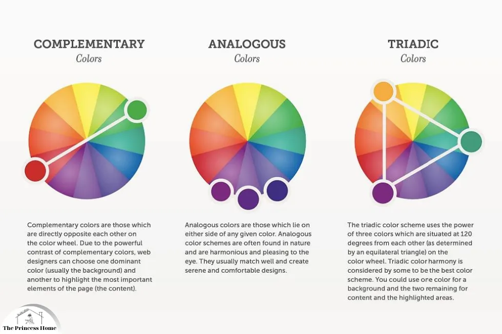
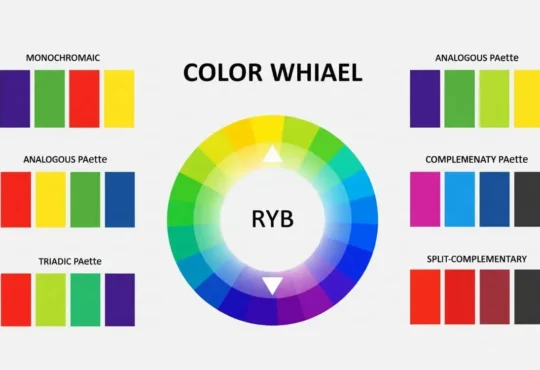
2. Explore Color Harmony:
Learn about different types of color harmony, such as complementary, analogous, triadic, and monochromatic schemes. Understanding these principles helps you create harmonious color palettes that are visually pleasing and balanced.
3. Experiment with Contrast:
Experiment with contrast to create visual interest and hierarchy in your designs. Contrast can be achieved through differences in hue, saturation, and value, as well as through the use of complementary or contrasting colors. Pay attention to contrast in text and background colors to ensure readability and accessibility.
4. Consider Psychological Effects:
Consider the psychological effects of different colors and color combinations on viewer perception and emotions. For example, warm colors like red and orange can evoke feelings of energy and excitement, while cool colors like blue and green can convey a sense of calmness and tranquility.
5. Use the Color Wheel:
Utilize the color wheel as a tool for creating harmonious color palettes. The color wheel helps you understand relationships between colors and facilitates the selection of complementary, analogous, or triadic color schemes. Online color wheel tools can also aid in exploring different color combinations.
6. Align with Brand Identity:
When designing for a client, ensure that your color choices align with their brand identity, values, and target audience. Consider any existing brand guidelines and color preferences to maintain consistency and reinforce brand recognition.
7. Test and Iterate:
Don’t be afraid to experiment with different color combinations and iterate on your designs. Test how colors appear in different contexts and lighting conditions, and gather feedback from clients or colleagues to refine your choices.
8. Stay Updated:
Stay updated on current trends and innovations in color theory and design. Explore resources such as books, online courses, and design blogs to expand your knowledge and keep your skills sharp.
By leveraging color theory principles in your design process, you can create visually compelling and impactful designs that effectively communicate your client’s message and resonate with their target audience.

6.*Creating Visual Mockups:
Visual mockups are invaluable for conveying design concepts to clients and soliciting feedback. Use software tools like Adobe Photoshop or Illustrator to create mockups that showcase different color schemes, typography, and layout options. Present these mockups to clients during meetings or presentations, allowing them to visualize how their brand will come to life with each color choice. visual mockups play a crucial role in communicating design concepts to clients and gathering feedback.
Here’s how you can create effective visual mockups using software tools :
1. Gather Design Assets:
Start by gathering design assets such as logos, images, icons, and typography that will be used in the mockup. Ensure that you have high-quality assets that accurately represent the brand identity and design direction.
2. Choose the Right Software:
Select the appropriate software tool for creating your visual mockups. Adobe Photoshop and Illustrator are popular choices due to their robust design capabilities and flexibility in creating mockups for various mediums, such as websites, mobile apps, or print materials.
3. Set Up Your Canvas:
Create a new document in your chosen design software and set up the canvas size and dimensions based on the project requirements. Consider the intended use of the mockup (e.g., web page, brochure, poster) and adjust the canvas accordingly.
4. Design the Layout:
Begin designing the layout of your mockup, incorporating elements such as images, text, buttons, and navigation menus. Pay attention to spacing, alignment, and visual hierarchy to ensure a clean and organized design.
5. Experiment with Color Schemes:
Explore different color schemes and palettes to see how they impact the overall look and feel of the design. Use tools like the color picker or swatches to select colors that align with the brand identity and evoke the desired mood or emotions.
6. Apply Typography:
Choose appropriate typography that complements the design and reinforces the brand voice. Experiment with different font styles, sizes, and weights to achieve optimal readability and visual appeal.
7. Incorporate Visual Elements:
Integrate visual elements such as illustrations, icons, or graphics to enhance the mockup and communicate key messages or features. These elements should support the overall design concept and contribute to a cohesive visual experience.
8. Present &Gather Feedback:
Once the mockup is complete, present it to the client during meetings or presentations. Walk them through the design choices and solicit feedback on elements such as color schemes, typography, and layout. Use this feedback to iterate on the mockup and refine the design further.
By creating visual mockups that showcase different color schemes, typography, and layout options, you provide clients with a tangible representation of how their brand will come to life. This facilitates meaningful discussions and ensures that the final design aligns with the client’s vision and objectives.

7.*Managing Expectations:
Effective project management involves managing client expectations throughout the design process. Be transparent about timelines, deliverables, and potential revisions, ensuring that clients are aware of what to expect at each stage. Communicate any challenges or constraints that may arise regarding color choices or implementation, offering alternative solutions where necessary. Managing client expectations is crucial for ensuring a smooth and successful design process.
Here are some key strategies for effectively managing expectations, particularly regarding color choices:
1. Establish Clear Communication:
From the outset, establish clear lines of communication with your client. Clearly outline project timelines, milestones, and deliverables, as well as the roles and responsibilities of both parties.
2. Define Scope &Objectives:
Clearly define the scope and objectives of the project, including any specific goals related to color choices and design aesthetics. Ensure that both you and the client have a shared understanding of what success looks like.
3. Set Realistic Timelines:
Be transparent about project timelines and deadlines, taking into account factors such as design complexity, feedback cycles, and client availability. Set realistic expectations for when deliverables will be completed and communicate any changes or delays promptly.
4. Provide Regular Updates:
Keep the client informed about the progress of the project through regular updates and status reports. This helps manage expectations and ensures that the client is aware of any developments or challenges that may arise.
5. Communicate Constraints:
If you encounter any constraints or limitations regarding color choices or implementation, communicate these to the client early on. Be transparent about any technical, budgetary, or timeline constraints that may impact the project and work together to find viable solutions.
6. Offer Alternative Solutions:
If certain color choices are not feasible or do not align with the project objectives, offer alternative solutions that meet the client’s needs while addressing any constraints. Presenting options and discussing alternatives demonstrates your flexibility and commitment to finding the best possible outcome.
7. Seek Feedback &Approval:
Throughout the design process, seek feedback and approval from the client at key milestones. This ensures that the client remains engaged and satisfied with the direction of the project, reducing the likelihood of surprises or misunderstandings later on.
8. Manage Revisions Effectively:
Be prepared for revisions and iterations as part of the design process. Clearly outline your revision policy, including the number of revisions included in the project scope and any additional charges for extra revisions. This helps manage client expectations and ensures that revisions are handled efficiently.
By implementing these strategies, you can effectively manage client expectations throughout the design process, particularly when it comes to color choices and implementation. Clear communication, transparency, and a collaborative approach are key to building trust and ensuring a successful outcome for the project.

8.*Seeking Feedback &Iteration:
Client feedback is an invaluable source of insight that can help refine and improve the final design. Encourage clients to provide specific feedback on color choices, emphasizing what resonates with their vision and what doesn’t. Iterate on the design based on their input, making adjustments as needed to achieve the desired outcome. seeking feedback and iterating on the design based on client input is essential for creating a final product that meets their expectations.
Here’s how you can effectively incorporate client feedback into the design process:
1. Encourage Specific Feedback:
Encourage clients to provide specific feedback on color choices by asking targeted questions. For example, ask them which colors they feel align with their brand identity and messaging, and which ones they think may not convey the desired emotions or resonate with their target audience.
2. Actively Listen:
Actively listen to the client’s feedback and take note of their preferences, concerns, and suggestions regarding color choices. Demonstrate your commitment to understanding their vision and objectives by addressing each point thoughtfully.
3. Iterate Based on Input:
Use the client’s feedback as a guide for iterating on the design. Make adjustments to the color palette, typography, layout, and other design elements as needed to address their preferences and concerns.
4. Present Iterations:
Present revised iterations of the design to the client for review and approval. Clearly communicate the changes you’ve made based on their feedback and explain how these adjustments align with their vision and objectives.
5. Provide Visual Comparisons:
When presenting iterations, provide visual comparisons between the original design and the revised version to highlight the changes. This helps the client understand the impact of their feedback and see how their input has been incorporated into the updated design.
6. Seek Clarification:
If the client’s feedback is unclear or conflicting, seek clarification to ensure that you fully understand their preferences and objectives. Ask probing questions to uncover the underlying reasons behind their feedback and use this information to inform your design decisions.
7. Offer Professional Recommendations:
As a design professional, use your expertise to offer recommendations and suggestions for color choices that align with design principles and best practices. Provide rationale for your recommendations and explain how they contribute to achieving the desired outcome for the project.
8. Collaborate Throughout the Process:
Maintain open lines of communication with the client throughout the design process, collaborating closely to refine the color choices and overall design direction. Foster a collaborative environment where both parties feel comfortable sharing ideas and providing input.
By actively seeking feedback, iterating based on client input, and maintaining open communication throughout the design process, you can create a final design that not only meets the client’s expectations but also effectively communicates their message and resonates with their target audience.

9.*Case Studies:
1.Rebranding Campaign: Showcase a successful rebranding campaign where strategic color choices played a pivotal role in revitalizing the client’s brand identity and positioning it for success in the market.
2.Interior Design Project: Highlight an interior design project where color was used to create cohesive and inviting spaces that reflected the client’s personality and lifestyle preferences.
3.Packaging Design: Illustrate how color psychology was leveraged in a packaging design project to differentiate the client’s product on the shelf and enhance its appeal to the target audience.
Conclusion:
Mastering color concepts effectively with clients is both an art and a science. By understanding client preferences, educating them on color psychology, utilizing color theory, and fostering open communication throughout the design process, design professionals can create compelling and impactful solutions that resonate with their clients and their audience. Remember, the true power of color lies not just in its visual appeal, but in its ability to evoke emotions, tell stories, and create meaningful connections. ower of color can elevate your brand’s communication to new heights.
Here are some frequently asked questions related to mastering color concepts effectively :
1.Why is mastering color concepts important when working with clients?
Mastering color concepts is crucial because color plays a significant role in conveying emotions, messages, and brand identity. Understanding how to effectively use color can help designers create impactful designs that resonate with clients and their target audience.
2.How do I determine the right color choices for my client’s brand?
To determine the right color choices for your client’s brand, start by understanding their brand identity, values, and target audience. Conduct thorough consultations to gather insights into their preferences and objectives. Consider using mood boards, color palettes, and visual references to facilitate discussions and align expectations.
3.What if my client has specific color preferences that don’t align with design principles?
If your client has specific color preferences that don’t align with design principles, it’s essential to balance their preferences with strategic considerations. Offer constructive feedback and rationale behind your recommendations, emphasizing the importance of achieving a balance between personal taste and effective communication.
4.How can I educate my clients on the importance of color psychology?
You can educate your clients on the importance of color psychology by providing examples, case studies, and explanations of how different colors evoke specific emotions and perceptions. Use visual aids and real-world examples to help illustrate your points and make the concepts more tangible for your clients.
5.What tools can I use to create visual mockups for presenting color concepts to clients?
There are various tools you can use to create visual mockups for presenting color concepts to clients, including Adobe Photoshop, Illustrator, Sketch, Figma, and Canva. Choose the tool that best fits your workflow and allows you to create high-quality mockups that effectively communicate your design concepts.
6.How do I manage client expectations regarding color choices and revisions?
Managing client expectations regarding color choices and revisions involves clear and transparent communication. Be upfront about timelines, deliverables, and potential revisions from the outset. Set realistic expectations and provide regular updates throughout the design process to ensure that clients are informed and involved every step of the way.
7.What if my client is indecisive about color choices?
If your client is indecisive about color choices, it’s essential to guide them through the decision-making process. Offer suggestions based on your expertise and experience, but also encourage them to provide feedback and input. Present multiple options and discuss the pros and cons of each to help them make an informed decision.
8.How do I handle feedback and revisions from clients regarding color choices?
Handle feedback and revisions from clients regarding color choices with professionalism and flexibility. Listen to their feedback carefully, and be open to making adjustments based on their preferences. Offer solutions and alternative options where necessary, and iterate on the design until you achieve a result that meets their expectations.


