
This article delves into the rich historical and cultural tapestry that has influenced the use of color in decoration across different epochs and societies.evoke emotions, and influence the perception of a room’s size and shape. Successful interior design projects often masterfully leverage color to create visually pleasing and harmonious environments. This article delves into several notable interior design projects, examining how color has played a pivotal role in their success, and explores the principles and psychological impacts behind effective color use.
1.*The Importance of Color in Interior Design
Color is more than just a visual element; it is a powerful tool that can affect mood, behavior, and even physiological responses. In interior design, color is used to:
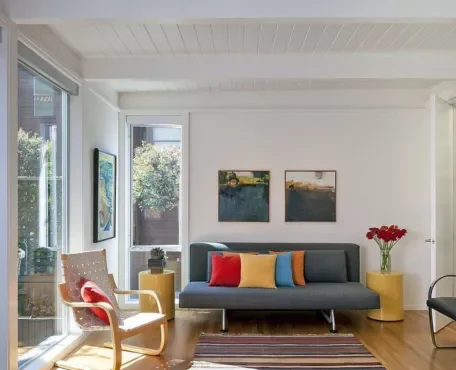
1.Set the Mood: Colors can evoke various emotions. Warm colors like red, orange, and yellow can create a cozy and inviting atmosphere, while cool colors like blue, green, and purple tend to have a calming and relaxing effect.
2.Define Space: Colors can help delineate different areas within a larger space. This is particularly useful in open-plan living areas where distinct zones need to be created without physical barriers.
3.Enhance Perception: Light colors can make a small room feel larger and more open, while dark colors can make a large room feel more intimate and cozy.
4.Create Focal Points: Using bold colors for accent walls or specific pieces of furniture can draw attention to certain areas or elements within a room.
2.*Case Studies of Successful Interior Design Projects
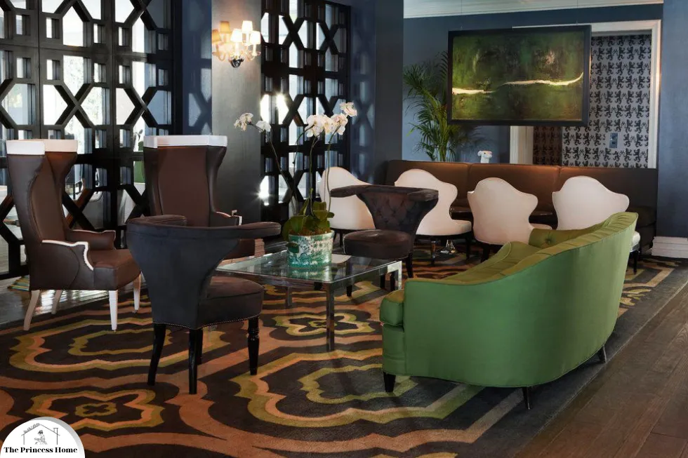
1. The Mondrian Hotel, Los Angeles
The Mondrian Hotel in Los Angeles is a prime example of how bold and strategic use of color can define a space. Designed by Philippe Starck, the hotel’s interior is a testament to the use of color in creating an unforgettable experience.
1.Color Scheme: The Mondrian Hotel employs a predominantly white palette, punctuated by bold splashes of color. The lobby features a striking yellow sofa and vibrant artwork, creating a dynamic and energetic atmosphere.
2.Impact: The use of a mostly white background allows the colorful elements to stand out, creating focal points that capture the attention of guests. The bright, bold colors infuse the space with a sense of playfulness and modernity.
2. The Viceroy, Santa Monica
Designed by Kelly Wearstler, the Viceroy Santa Monica showcases how a sophisticated and balanced color palette can evoke luxury and elegance.
Color Scheme: The hotel uses a mix of muted tones such as soft grays and greens, paired with rich, deep hues like emerald and navy. Gold accents are strategically placed to add a touch of opulence.
Impact: The balanced use of muted and rich colors creates a serene yet luxurious environment. The color scheme enhances the feeling of tranquility while maintaining an air of sophistication, perfectly complementing the coastal location.
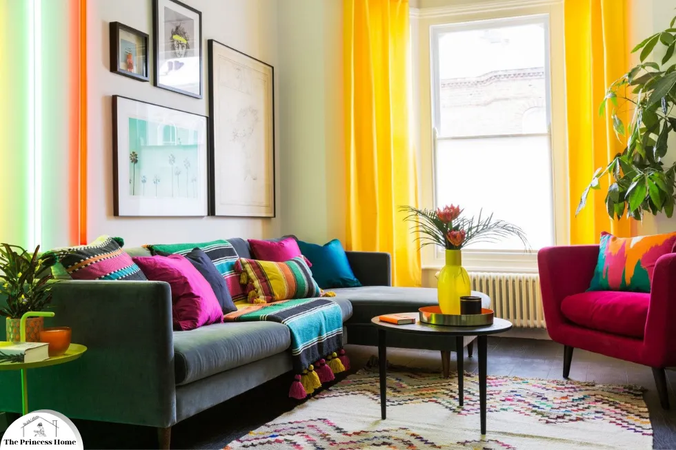
3. The Moxy Times Square, New York City
The Moxy Times Square, designed by the Rockwell Group, demonstrates how vibrant and eclectic color schemes can create a youthful and energetic vibe.
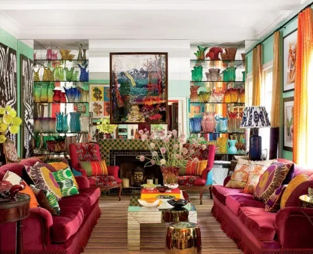
Color Scheme: This hotel features a diverse palette of bright, saturated colors, including pinks, blues, and yellows. The use of neon lights and bold patterns adds to the energetic ambiance.
Impact: The vibrant colors and eclectic design elements reflect the lively spirit of New York City. The playful use of color makes the space feel dynamic and fun, appealing to a younger, more adventurous clientele.
3.*Principles of Effective Color Use in Interior Design
To understand the success of these projects, it’s essential to grasp the principles that guide effective color use in interior design:
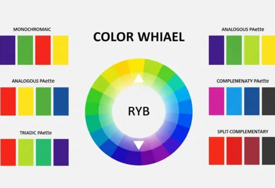
1.Color Harmony:
Achieving a harmonious color scheme is crucial. This can be accomplished using color theory principles, such as complementary (opposite colors on the color wheel), analogous (colors next to each other on the wheel), and triadic (three colors evenly spaced on the wheel) schemes.
2.Contrast:
Using contrasting colors can create visual interest and emphasize certain areas or elements. High contrast between colors can make a room feel more dynamic, while low contrast tends to create a more soothing and cohesive look.
3.Proportion &Balance:
The distribution of colors in a space should be balanced. A common approach is the 60-30-10 rule, where 60% of the space is dominated by a primary color, 30% by a secondary color, and 10% by an accent color.
4.Psychological Impact:
Understanding the psychological effects of colors is vital. For instance, blue is often associated with calmness and productivity, making it ideal for offices and bedrooms, while red can stimulate appetite and conversation, making it suitable for dining areas.
5.Cultural Context:
Colors can have different meanings and associations in different cultures. Designers must consider the cultural context to ensure that the color scheme is appropriate and resonates positively with the intended audience.
4.*Psychological Impact of Colors
Color is a powerful design tool that significantly influences human emotions, behaviors, and perceptions. Understanding the psychological impact of colors can help designers create spaces that evoke specific feelings and reactions. This article explores the psychological effects of various colors and their applications in contemporary design.
Understanding the psychological impact of colors can greatly enhance the effectiveness of interior design:
Red: Energy and Passion
Psychological Effects:
- Stimulates excitement and energy
- Increases heart rate and blood pressure
- Evokes feelings of passion, urgency, and intensity
Applications:
- Hospitality and Dining: Red is often used in restaurants and dining areas to stimulate appetite and create a lively atmosphere.
- Retail: Red can attract attention and create a sense of urgency, making it effective for sales and promotional displays.
- Home Decor: Used as an accent color in living rooms or dining areas to create a warm and inviting environment.
Blue: Calmness and Productivity
Psychological Effects:
- Promotes calmness and serenity
- Lowers heart rate and reduces anxiety
- Enhances focus and productivity
Applications:
- Workspaces: Blue is ideal for offices and study areas where concentration and productivity are essential.
- Healthcare: Often used in hospitals and clinics to create a calming environment for patients.
- Bedrooms: Light shades of blue can help create a peaceful and restful sleeping space.
Green: Balance and Renewal
Psychological Effects:
- Symbolizes nature and tranquility
- Promotes a sense of balance and harmony
- Reduces stress and enhances well-being
Applications:
- Biophilic Design: Green is integral to designs that incorporate natural elements, fostering a connection to nature.
- Living Areas: Commonly used in living rooms and lounges to create a relaxing and rejuvenating space.
- Educational Spaces: Green can enhance learning environments by promoting calmness and focus.
Yellow: Optimism and Warmth
Psychological Effects:
- Evokes feelings of happiness and optimism
- Stimulates mental activity and energy
- Can increase feelings of warmth and cheerfulness
Applications:
- Kitchens and Dining Rooms: Yellow can create an inviting and energetic atmosphere, encouraging social interaction.
- Retail and Commercial Spaces: Used to attract attention and create a sense of joy and positivity.
- Children’s Rooms: Bright yellows can stimulate creativity and playfulness in children’s spaces.
Purple: Luxury and Creativity
Psychological Effects:
- Associated with luxury, sophistication, and creativity
- Can evoke feelings of mystery and spirituality
- Stimulates imaginative thinking
Applications:
- Luxury Spaces: Often used in high-end hotels, spas, and lounges to create a sense of opulence.
- Creative Studios: Purple can inspire creativity and innovation, making it suitable for artistic environments.
- Bedrooms and Bathrooms: Deep purples add a touch of elegance and relaxation to private spaces.
Orange: Enthusiasm and Vitality
Psychological Effects:
- Combines the energy of red and the happiness of yellow
- Evokes feelings of enthusiasm, excitement, and warmth
- Stimulates social interaction and activity
Applications:
- Fitness Centers: Orange can boost energy levels and motivation, making it ideal for gyms and workout spaces.
- Social Spaces: Used in lounges and recreational areas to encourage socialization and activity.
- Retail: Can attract attention and stimulate impulse buying.
Pink: Compassion and Calm
Psychological Effects:
- Evokes feelings of compassion, warmth, and nurturing
- Associated with love and kindness
- Can have a calming effect in its softer shades
Applications:
- Healthcare: Soft pinks are used in hospitals and care facilities to create a soothing and supportive environment.
- Bedrooms: Ideal for creating a peaceful and loving atmosphere, especially in children’s and teens’ rooms.
- Retail: Light pinks can create a gentle and welcoming ambiance in stores and boutiques.
Black: Sophistication and Authority
Psychological Effects:
- Conveys sophistication, elegance, and authority
- Can evoke feelings of power and control
- Often associated with luxury and exclusivity
Applications:
- Luxury Interiors: Black is frequently used in upscale homes, hotels, and restaurants to create a sophisticated and modern look.
- Offices: Can convey professionalism and authority, making it suitable for executive offices.
- Fashion Retail: Black is often used in high-end boutiques to highlight luxury and exclusivity.
White: Purity and Simplicity
Psychological Effects:
- Symbolizes purity, cleanliness, and simplicity
- Evokes feelings of openness and clarity
- Can make spaces feel larger and more airy
Applications:
- Healthcare and Laboratories: White is commonly used in medical and lab environments for its association with cleanliness and precision.
- Minimalist Design: Frequently used in minimalist and contemporary designs to create a sense of space and simplicity.
- Galleries and Museums: White walls are ideal for showcasing art and exhibits without distractions.
Gray: Neutrality and Balance
Psychological Effects:
- Conveys neutrality, balance, and calm
- Can evoke feelings of stability and professionalism
- Often seen as sophisticated and timeless
Applications:
- Offices and Workspaces: Gray is ideal for creating a professional and balanced environment.
- Living Spaces: Used in modern and minimalist homes to create a sleek and contemporary look.
- Retail: Can provide a neutral backdrop that allows products to stand out.
Conclusion
Successful interior design projects demonstrate the profound impact of color in creating aesthetically pleasing and functional spaces. By examining projects such as the Mondrian Hotel, Viceroy Santa Monica, and Moxy Times Square, we see how strategic color choices can define a space’s mood, functionality, and overall appeal. Understanding the principles of color harmony, contrast, proportion, and the psychological effects of colors is essential for designers aiming to create impactful and memorable interiors. As we continue to explore the role of color in design, it becomes clear that color is not just a visual element but a fundamental component that shapes our experiences and interactions with spaces.
Frequently Asked Questions (FAQs) on Color in Interior Design
1. Why is color important in interior design?
Answer: Color is a fundamental element in interior design because it significantly influences the mood, perception, and functionality of a space. It can make a room feel larger or smaller, evoke specific emotions, and create a cohesive look. Effective use of color can enhance the aesthetic appeal and overall experience of a space.
2. How do designers choose the right color scheme for a project?
Answer: Designers choose color schemes based on several factors, including the purpose of the room, the desired mood, the amount of natural light, and the existing furniture and decor. They often use color theory principles, such as complementary, analogous, and triadic schemes, to create harmonious and balanced color palettes.
3. What is the 60-30-10 rule in interior design?
Answer: The 60-30-10 rule is a guideline used by designers to balance colors in a space. It suggests that 60% of the room should be a dominant color, 30% a secondary color, and 10% an accent color. This creates a balanced and visually appealing look.
4. How do colors affect the perception of space?
Answer: Colors can alter the perception of a room’s size and shape. Light colors, such as whites and pastels, make a space feel larger and more open. Dark colors, such as deep blues and grays, can make a room feel smaller and cozier. Using bright colors on focal walls can draw attention and create depth.
5. What are some common psychological effects of colors?
Answer: Colors can evoke various psychological responses. For example:
- Red: Increases energy and excitement but can also cause agitation if overused.
- Blue: Calms and soothes, making it ideal for bedrooms and offices.
- Green: Refreshes and balances, often used in living rooms and bathrooms.
- Yellow: Uplifts and stimulates, great for kitchens and dining areas.
- Purple: Adds luxury and creativity, suitable for bedrooms and creative spaces.
- Neutrals: Provide a versatile and sophisticated backdrop, allowing other colors to stand out.
6. How can I use bold colors without overwhelming a space?
Answer: To use bold colors effectively without overwhelming a space, consider using them as accents rather than the main color. This can be done through accessories, artwork, or feature walls. Pair bold colors with neutral tones to balance the overall look and prevent the space from feeling too intense.
7. Can the use of color affect the functionality of a room?
Answer: Yes, color can affect the functionality of a room. For example, light colors in a home office can enhance focus and productivity, while dark, rich colors in a dining room can stimulate appetite and conversation. The right color choices can support the intended use of each space.
8. What are some tips for creating a cohesive color palette in an open-plan space?
Answer: In open-plan spaces, it’s important to create a cohesive color palette to ensure a harmonious flow between different areas. Tips include:
- Using a consistent base color throughout the space.
- Adding variation with secondary colors and accents.
- Employing similar undertones to unify different hues.
- Using color to define and differentiate functional zones within the open plan.
9. How do cultural contexts influence color choices in interior design?
Answer: Cultural contexts can greatly influence color choices, as different cultures associate colors with various meanings and emotions. For example, red is considered lucky in Chinese culture but can symbolize danger in Western contexts. Designers need to consider these cultural associations to ensure the color palette resonates positively with the intended audience.
10. What role does lighting play in the perception of color in interior design?
Answer: Lighting significantly affects how colors appear in a space. Natural light can enhance or diminish the vibrancy of colors, while artificial lighting can alter their hue and intensity. Designers must consider the type and amount of lighting when selecting colors to ensure they look their best in the intended setting.
