
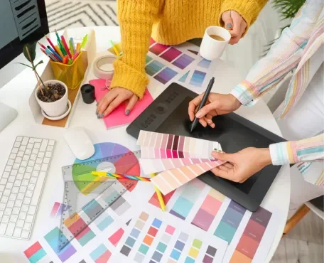
Color has always been a powerful tool in human expression, especially in the realm of decoration. Its significance extends far beyond aesthetics; color influences mood, conveys meaning, and reflects cultural values. Throughout history, the use of color in decoration has been shaped by a variety of factors, including technological advancements, trade, social hierarchies, and religious beliefs. This article delves into the rich historical and cultural tapestry that has influenced the use of color in decor across different epochs and societies.
1.*Ancient Civilizations
1.Egypt
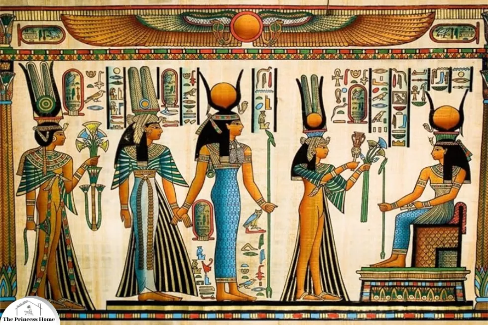
In ancient Egypt, color was imbued with deep symbolic meanings and was used extensively in tomb paintings, pottery, and architecture. The Egyptians associated specific colors with gods, the afterlife, and cosmic order. For instance, blue represented the Nile and the sky, symbolizing creation and rebirth. Green, the color of vegetation, denoted fertility and regeneration. The use of these colors was not arbitrary; it reflected the Egyptians’ worldview and their relationship with nature and the divine.
2.Mesopotamia
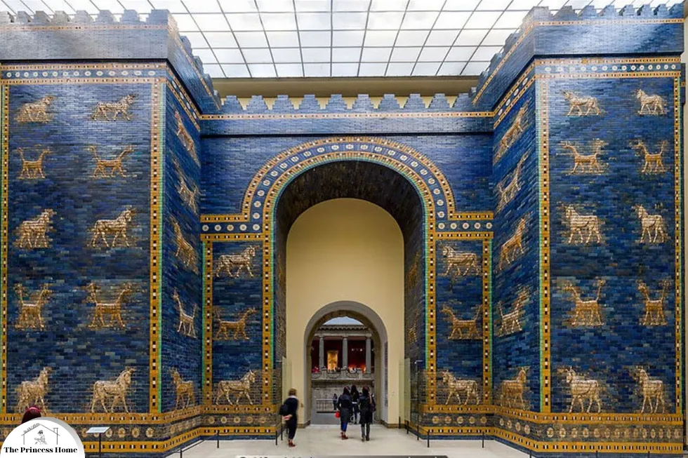
Mesopotamian societies, such as the Sumerians and Babylonians, also employed color in their decorative arts, notably in their glazed brickwork and mosaics. The Ishtar Gate of Babylon, a remarkable example, was adorned with vibrant blue glazed bricks and depictions of animals in yellow and white. These colors were not just decorative but served to project the power and majesty of the empire, as well as to honor their gods.
3.China
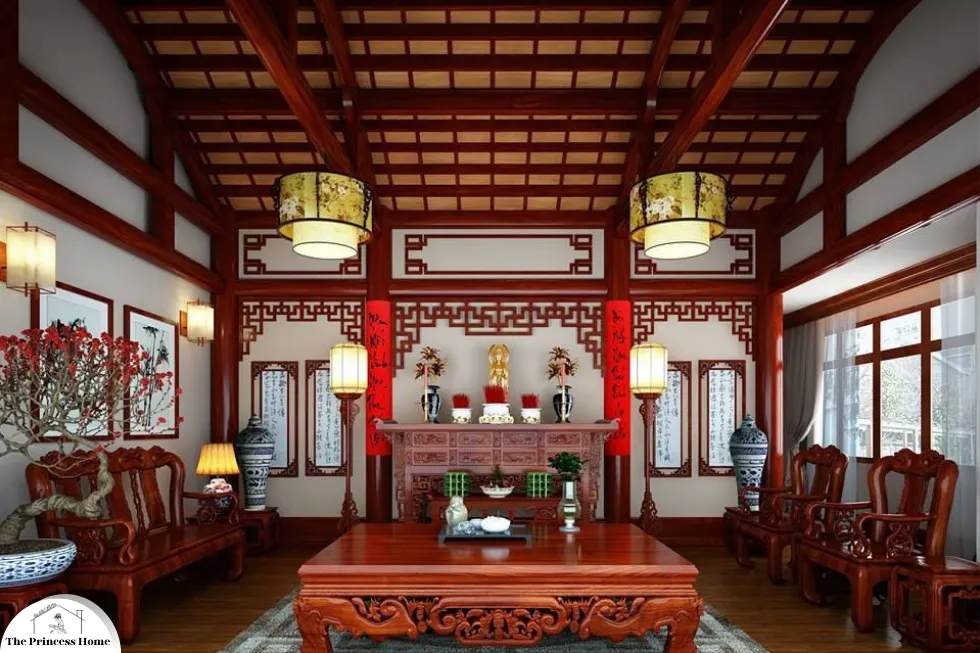
In ancient China, color held profound philosophical and cosmological significance. The five primary colors (red, yellow, blue, white, and black) were associated with the five elements (fire, earth, wood, metal, and water) and directions. Red, in particular, was a color of joy and prosperity and was prominently featured in celebrations and religious ceremonies. The rich use of color in Chinese decorative arts, from lacquerware to silk textiles, reflects these deeply rooted cultural beliefs.
2.*Medieval &Renaissance Europe
1.Medieval Period
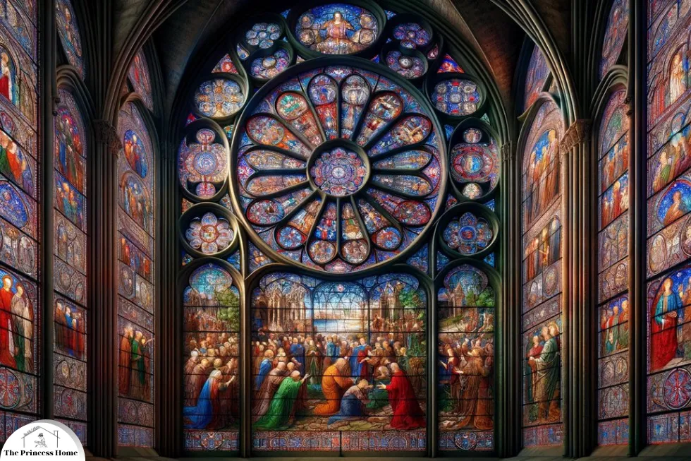
During the medieval period in Europe, color played a crucial role in both religious and secular contexts. In religious art and architecture, colors like gold and blue were used to denote sacredness and divinity. Stained glass windows in cathedrals, for instance, not only told biblical stories but also transformed light into a divine spectacle. Heraldry also utilized color to denote lineage and allegiance, with specific hues and patterns symbolizing different familial and feudal ties.
2.Renaissance
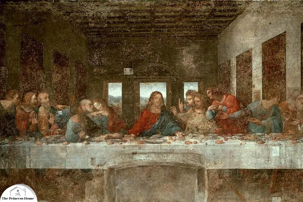
The Renaissance brought a revival of classical antiquity’s color sensibilities and an exploration of new techniques and materials. Artists like Leonardo da Vinci and Michelangelo utilized a broader palette, made possible by advancements in pigment technology. The rediscovery of linear perspective and naturalism allowed for more lifelike and emotionally resonant use of color in decor. Wealthy patrons commissioned works that showcased their status and taste, often employing vivid colors to convey opulence and sophistication.
3.The Baroque &Rococo Eras
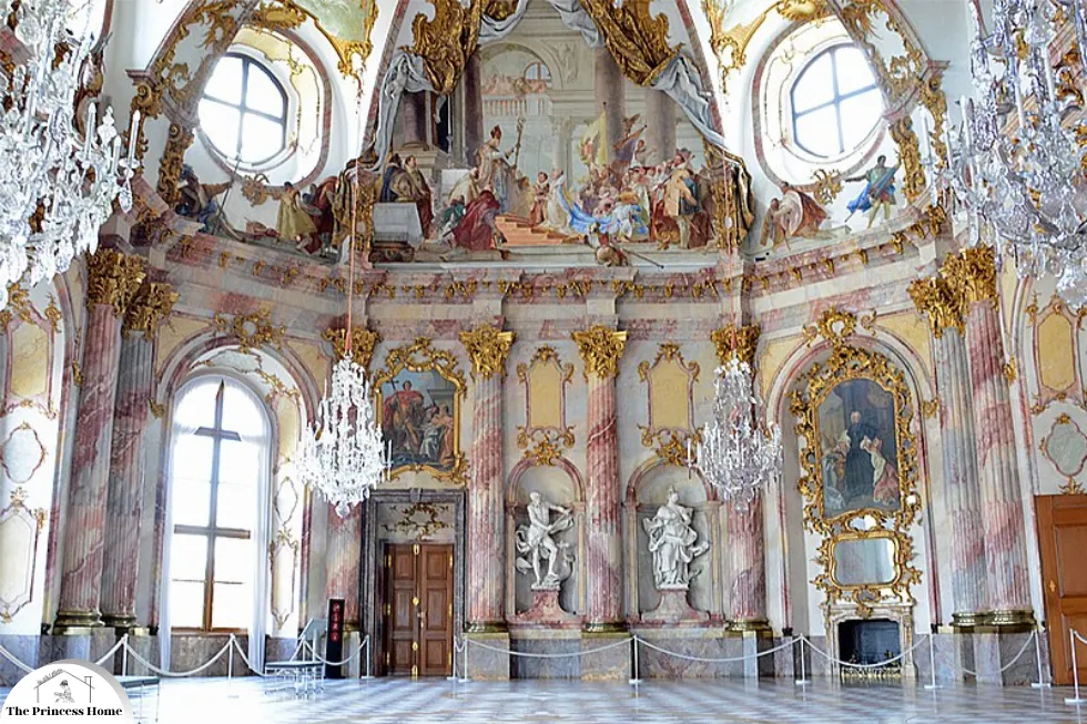
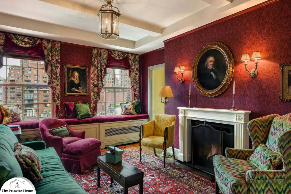
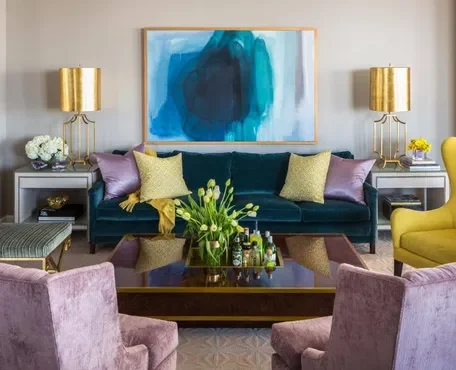
The Baroque period saw a dramatic and exuberant use of color. This era, marked by grandeur and emotional intensity, favored deep, rich colors like crimson, gold, and royal blue. These colors were used in lavishly decorated churches, palaces, and public buildings to evoke awe and reverence. The Rococo era that followed took a lighter, more playful approach to color, with pastels like pink, light blue, and soft green dominating interior decorations and furnishings. This shift reflected changing tastes towards elegance, charm, and intimacy in the domestic sphere.
4.The 19th Century &the Influence of Industrialization
The Industrial Revolution had a profound impact on the availability and use of color in decor. The mass production of synthetic dyes and pigments made vibrant colors more accessible to a broader population. This democratization of color led to diverse and eclectic decorative styles. The Victorian era, in particular, was characterized by a rich and varied use of color in interiors, with dark, saturated hues like burgundy, forest green, and navy blue becoming popular in middle-class homes.
3.*20th Century Modernism &Beyond
Modernism
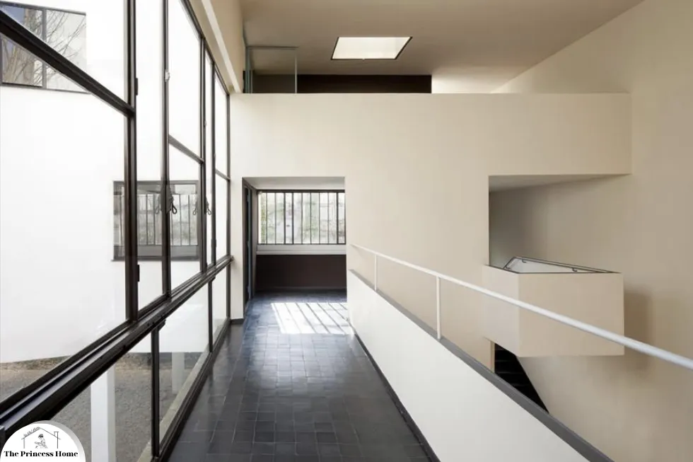
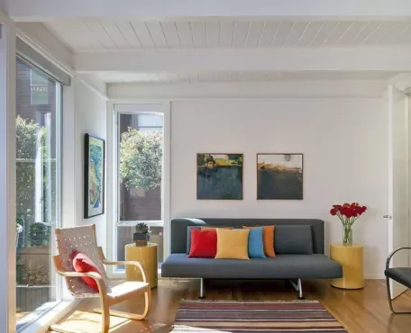
The early 20th century brought about a radical shift in the use of color in decor, driven by the modernist movement. Modernism embraced minimalism and functionalism, often favoring a restrained color palette. Architects and designers like Le Corbusier and the Bauhaus school advocated for the use of neutral colors—white, black, and gray—with occasional bold accents of primary colors. This approach was a reaction against the excesses of the Victorian era and an embrace of the industrial age’s clean lines and forms.
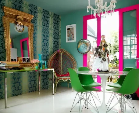
4.*Postmodernism &Contemporary Trends
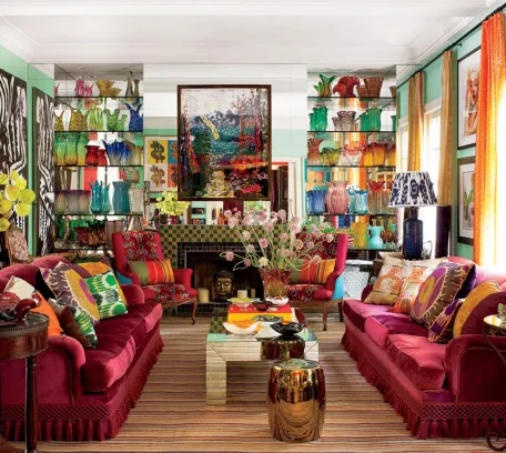
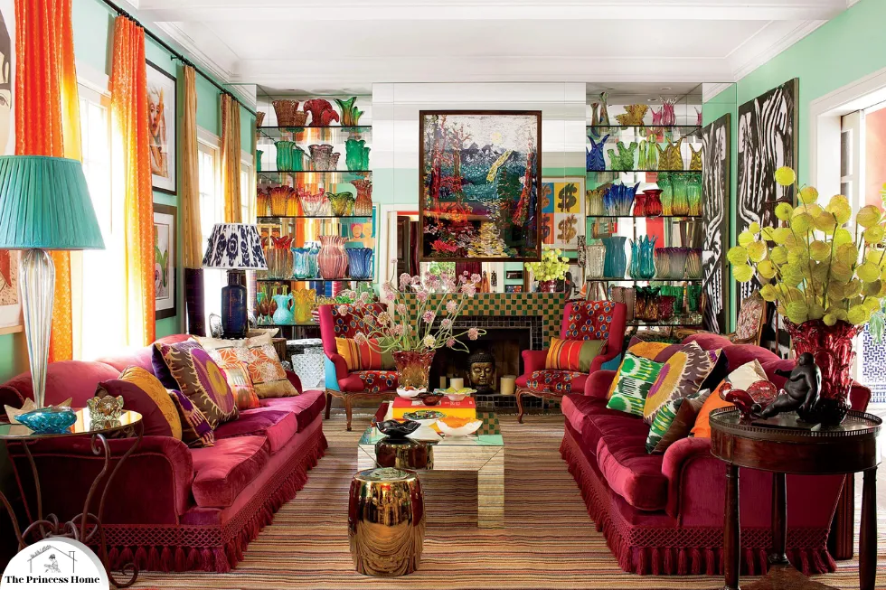
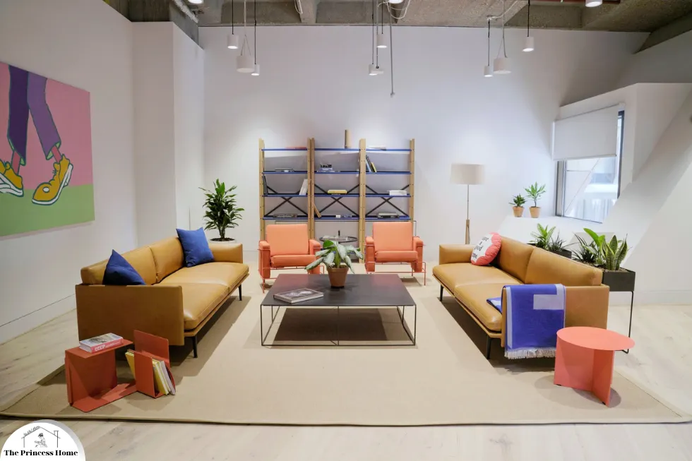
Postmodernism, which arose in the latter part of the 20th century, moved away from the simplicity of modernism, embracing a more playful and eclectic use of color. This era revived historical styles and adopted a mix-and-match approach to decoration. As trends continue to develop, globalization has significantly influenced color choices, leading to a greater appreciation for cultural diversity. This blend incorporates traditional motifs with contemporary aesthetics. Additionally, sustainable and eco-friendly practices are becoming more prevalent, with natural and earth-toned color schemes gaining popularity.
Example:
A modernist living room might feature white walls, a black leather sofa, and a few primary color accents. In contrast, a postmodernist living room could have a mix of patterned wallpaper, a brightly colored vintage armchair, and an eclectic collection of artwork and decorative items from different periods and cultures.
5.*Cultural Influences on Color in Decoration
1.Japan
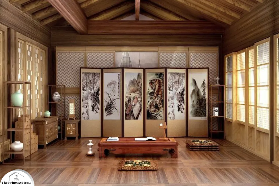
In Japanese culture, color usage in decoration is deeply influenced by Zen philosophy and the concept of wabi-sabi, which values simplicity and imperfection. Traditional Japanese interiors often feature natural materials and a muted color palette, including shades of beige, brown, and gray. These colors create a serene and harmonious environment, reflecting the cultural emphasis on tranquility and nature.
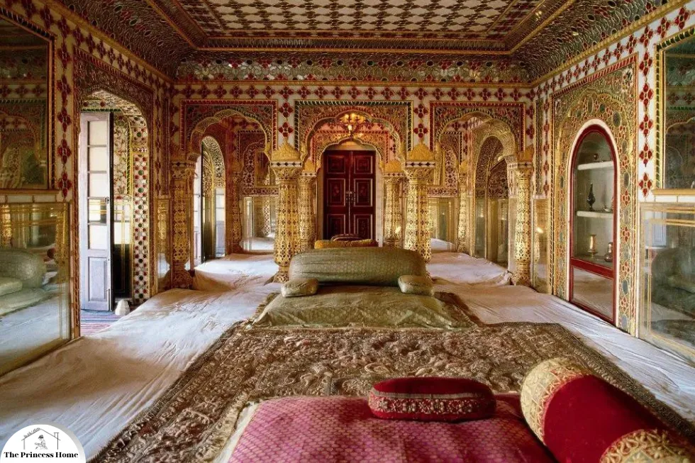
2.India
In contrast, Indian decoration is characterized by its vibrant and bold use of color. This reflects the country’s diverse cultural heritage and its celebration of life. Colors like saffron, indigo, and emerald green are prevalent in Indian textiles, architecture, and festivals.Each color holds specific cultural and religious significance; for instance, red symbolizes purity, and people commonly use it in wedding attire and decorations.
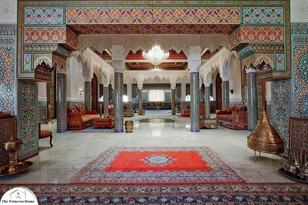
3.Middle East
Middle Eastern decoration often features intricate patterns and a rich color palette that includes blues, golds, and reds. Islamic art and architecture utilize geometric patterns and calligraphy, often highlighted with vibrant tiles and mosaics. These colors and designs are not merely decorative but serve to convey cultural and spiritual meanings.
Conclusion
The use of color in decor is a dynamic interplay of historical, cultural, and technological influences. From the symbolic hues of ancient civilizations to the eclectic palettes of contemporary design, color continues to be a vital element in expressing identity, values, and emotions. Understanding the historical and cultural contexts of color usage enhances our appreciation of the diverse ways in which human societies decorate their spaces, revealing a rich narrative of creativity and meaning woven through time.
Frequently Asked Questions
1. Why was color significant in ancient Egyptian decoration?
Ancient Egyptians used color with deep symbolic meanings in their decoration. For example, blue symbolized creation and rebirth, representing the Nile and the sky, while green denoted fertility and regeneration. These colors reflected the Egyptians’ understanding of nature and the divine, and the Egyptians used them extensively in tomb paintings, pottery, and architecture to convey spiritual and cultural beliefs.
2. How did the use of color in decoration evolve during the Renaissance?
During the Renaissance, there was a revival of classical antiquity’s color sensibilities and an exploration of new techniques and materials. Artists utilized a broader palette thanks to advancements in pigment technology. The rediscovery of linear perspective and naturalism allowed for more lifelike and emotionally resonant use of color in decoration. Wealthy patrons commissioned works that showcased their status, often employing vivid colors to convey opulence and sophistication.
3. What impact did the Industrial Revolution have on the use of color in decoration?
The Industrial Revolution democratized color use in decoration by making synthetic dyes and pigments more accessible. This led to a diverse and eclectic range of decorative styles. During the Victorian era, for example, dark, saturated hues like burgundy, forest green, and navy blue became popular in middle-class homes, reflecting the era’s taste for rich and varied interiors.
4. What are the key characteristics of color use in Japanese decoration?
Zen philosophy and the concept of wabi-sabi, which values simplicity and imperfection, influence Japanese decoration. Traditional Japanese interiors feature natural materials and a muted color palette, including shades of beige, brown, and gray. These colors create a serene and harmonious environment, reflecting the cultural emphasis on tranquility and nature.
5. How does Indian decoration differ in its use of color compared to Japanese decoration?
Indian decoration features vibrant and bold use of color, reflecting the country’s diverse cultural heritage and celebration of life. Colors like saffron, indigo, and emerald green are prevalent in Indian textiles, architecture, and festivals. Each color holds specific cultural and religious significance, with red symbolizing purity and commonly used in wedding attire and decorations.
6. What role do colors play in Middle Eastern decoration?
Middle Eastern decoration often features intricate patterns and a rich color palette that includes blues, golds, and reds. Islamic art and architecture use geometric patterns and calligraphy, highlighted with vibrant tiles and mosaics. These colors and designs convey cultural and spiritual meanings, enhancing the aesthetic appeal while reflecting religious and cultural values.
7. How did Modernism influence the use of color in decoration?
Modernism, emerging in the early 20th century, embraced minimalism and functionalism, favoring a restrained color palette. Architects and designers like Le Corbusier and the Bauhaus school advocated for the use of neutral colors—white, black, and gray—with occasional bold accents of primary colors. This approach was a reaction against the excesses of the Victorian era and reflected the industrial age’s clean lines and forms.
8. What changes did Postmodernism bring to the use of color in decoration?
Postmodernism rejected modernism’s austerity and reintroduced a playful and eclectic approach to color. This period saw a revival of historical styles and a mix-and-match attitude towards decoration. The use of diverse color palettes became more prominent, reflecting a shift towards individual expression and a blend of traditional and contemporary aesthetics.
9. How are contemporary trends shaping the use of color in decoration today?
Contemporary trends in color use are influenced by globalization and an appreciation for cultural diversity. There is a growing trend towards sustainable and eco-friendly practices, with natural and earth-toned palettes gaining popularity. This reflects a broader awareness of environmental issues and a desire to create harmonious and sustainable living spaces.
10. Why is understanding the historical and cultural context of color usage important?
Understanding the historical and cultural contexts of color usage enhances our appreciation of the diverse ways in which human societies decorate their spaces. It reveals a rich narrative of creativity and meaning woven through time, highlighting how color reflects identity, values, and emotions across different cultures and historical periods.


