

When embarking on a project that requires careful budgeting and precise material sourcing, one often overlooked but crucial aspect is color. Whether you’re working on an interior design project, a fashion line, or a marketing campaign, the color palette can significantly impact both the cost and the success of the endeavor. This article delves into how to budget and source materials based on color considerations, offering detailed insights and practical tips for various industries.
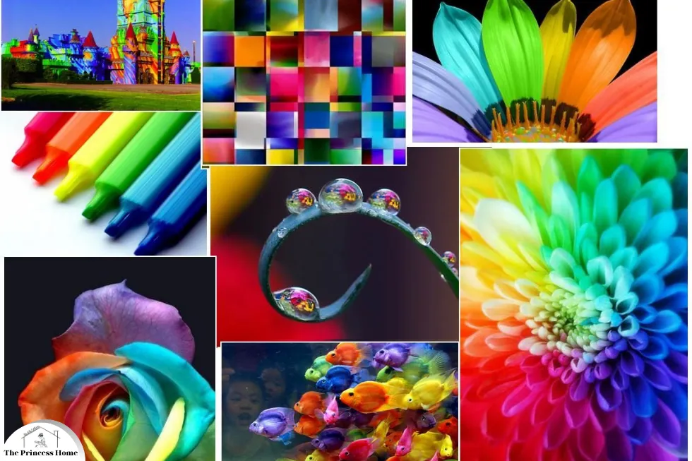
1.*Importance of Color in Projects
The strategic use of color is integral to the success of various types of projects. By understanding the psychological and cultural impacts of color, as well as its practical applications in design and marketing, project managers and designers can create more effective, engaging, and accessible outcomes.
Here are some key points highlighting the importance of color in projects:
1.Psychological Impact
Colors evoke emotions and can influence perceptions and behaviors. For instance, blue often instills a sense of calm and trust, making it popular in corporate and healthcare environments. Red, on the other hand, can stimulate energy and urgency, frequently used in sales and marketing.
2.Brand Identity
Brand Consistency Consistent use of brand colors helps in building a strong and recognizable brand identity. It distinguishes the brand from competitors and reinforces brand recall among consumers.
In branding, consistent color schemes help establish identity and recognition. For example, Coca-Cola’s red is instantly recognizable and contributes to its global brand presence.
Similarly, the color choices in product design can align with brand values and appeal to target demographics. Colors contribute to defining a brand’s personality. For instance, a tech company might use blue to signify professionalism and reliability, while a children’s toy brand might use bright and vibrant colors to appear playful and energetic.
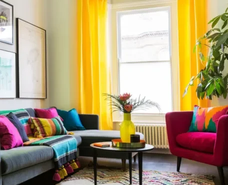
3.Aesthetic Cohesion
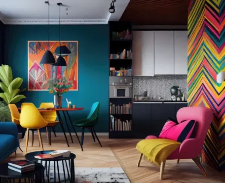
In interior design and fashion, a harmonious color palette ensures aesthetic cohesion, which can elevate a project from ordinary to exceptional. Coordinating colors across various elements creates a unified look that is pleasing to the eye.
The importance of color in projects, whether they are design, marketing, or communication-related, cannot be overstated. Color plays a critical role in influencing perceptions, emotions, and behaviors.
4. Visual Hierarchy
1.Highlighting Information: Colors can be used to create a visual hierarchy, guiding the viewer’s attention to the most important elements first. This is especially useful in web design, presentations, and infographics.
2.Enhancing Readability: Proper color contrast improves readability. For instance, dark text on a light background is easier to read than light text on a light background. This is crucial for accessibility and user experience.
5. Marketing and Sales
1.Influencing Purchasing Decisions: Colors can influence consumer behavior and purchasing decisions. For example, red is often used in clearance sales to create a sense of urgency, while green is associated with eco-friendliness and sustainability.
2.Creating Appeal: Attractive color schemes can make products more appealing. Packaging design, for instance, relies heavily on color to attract potential buyers and convey product attributes.
6. Communication and Clarity
1.Conveying Information: Colors can be used to convey complex information quickly and effectively. For example, traffic lights use color to communicate stop (red), caution (yellow), and go (green).
2.Mood Setting: In environments like interior design, color is used to set the mood and create an ambiance. Warm colors can create a cozy atmosphere, while cool colors can make a space feel calm and serene.
7. User Experience (UX) &Interface Design
1.Enhancing User Interaction: In UX and UI design, colors can enhance user interaction by making interfaces intuitive and user-friendly. Buttons, links, and call-to-action elements often use contrasting colors to stand out and prompt user action.
2.Accessibility: Color choices can impact the accessibility of digital content. Ensuring there is enough contrast between text and background colors is essential for users with visual impairments.
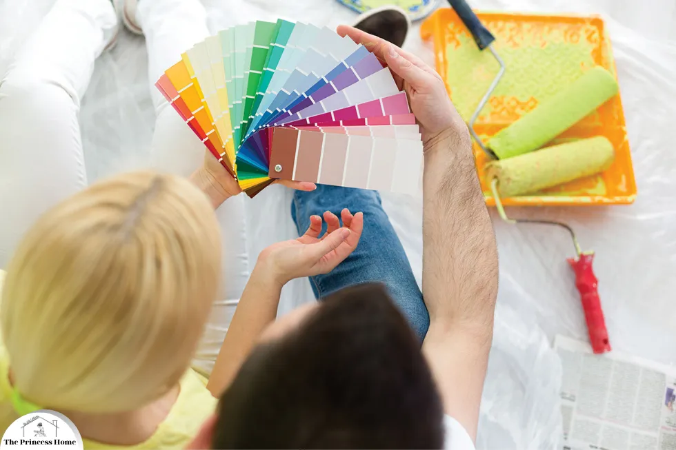
2.*Budgeting for Color-Based Projects
Initial Planning
1.Define the Scope:
Determine the scale of your project and the extent to which color will influence it. A detailed plan should outline every aspect where color is a factor, such as paint, fabrics, or digital assets.
2.Research Costs:
Different colors can have varying costs, especially in materials like paints and dyes. For instance, some pigments are more expensive due to the rarity of raw materials or the complexity of manufacturing.
3.Prioritize:
Identify which areas require the highest quality or specific colors and allocate a larger portion of the budget to these. Less critical areas can use more cost-effective alternatives.
3.*Detailed Budget Breakdown
1.Material Costs:
Calculate the cost of each material needed, considering color-specific variations. For example, vibrant hues in textiles might cost more due to specialized dyeing processes.
2.Labor Costs:
Some colors may require more labor-intensive processes. For example, achieving a perfect white finish on walls might require more coats of paint than a darker color.
3.Contingencies:
Set aside a portion of the budget for unexpected expenses related to color, such as corrections for mismatched shades or additional materials if initial choices are unsatisfactory.

4.*Cost-Saving Strategies
1.Bulk Purchasing: Buying materials in bulk can reduce costs, especially if the project requires large quantities of a specific color.
2.Supplier Negotiations: Establish relationships with suppliers who can offer discounts for repeat business or larger orders.
3.Alternative Sources: Consider second-hand or surplus stores for materials that can be repurposed, which can be particularly useful for one-off projects or smaller budgets.
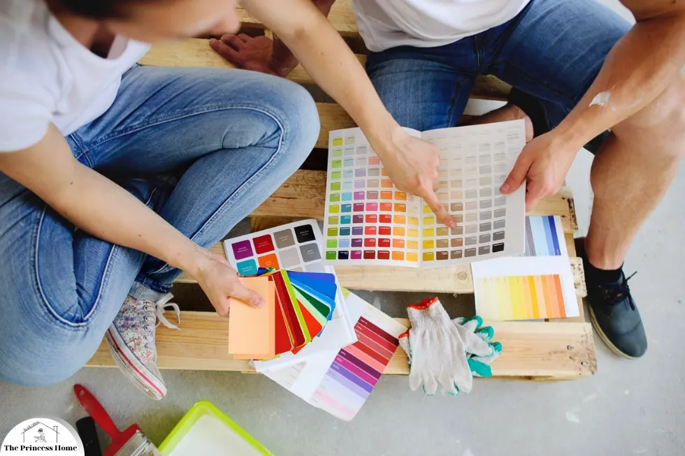
5.*Sourcing Materials Based on Color
Identifying Reliable Suppliers
1.Reputation and Reviews: Look for suppliers with strong reputations and positive reviews, especially regarding color consistency and quality.
2.Sample Testing: Always request samples to verify color accuracy before making large purchases. This is crucial for ensuring that the final product meets your expectations.
3.Certifications: For projects requiring high standards, such as in healthcare or food services, ensure that suppliers have the necessary certifications for safety and quality.
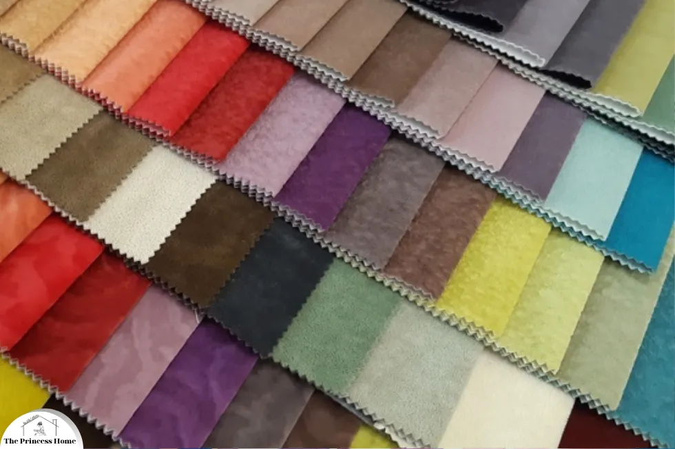
Material Specifics
1.Paints and Coatings: Choose suppliers known for high-quality pigments and long-lasting finishes. Consider environmentally friendly options if sustainability is a priority.
2.Fabrics and Textiles: The dyeing process can significantly affect the final color and texture. Work with suppliers who can provide detailed information about their dyeing processes and offer consistent results.
3.Digital Assets: For digital projects, such as web design or marketing, ensure that your team uses color-calibrated monitors and reliable software to maintain color accuracy across different devices and media.
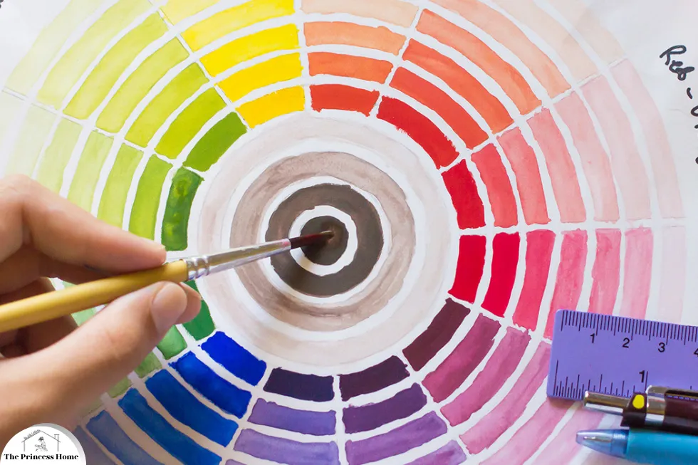
Managing Color Consistency
1.Standardization: Use color standards like Pantone or RAL to communicate exact colors to suppliers. This minimizes the risk of discrepancies between different batches or materials.
2.Quality Control: Implement a rigorous quality control process to check color consistency throughout the project. This may involve regular inspections and adjustments as needed.
3.Documentation: Keep detailed records of all color specifications and supplier communications to ensure traceability and accountability.
6.*Case Studies &Industry Examples
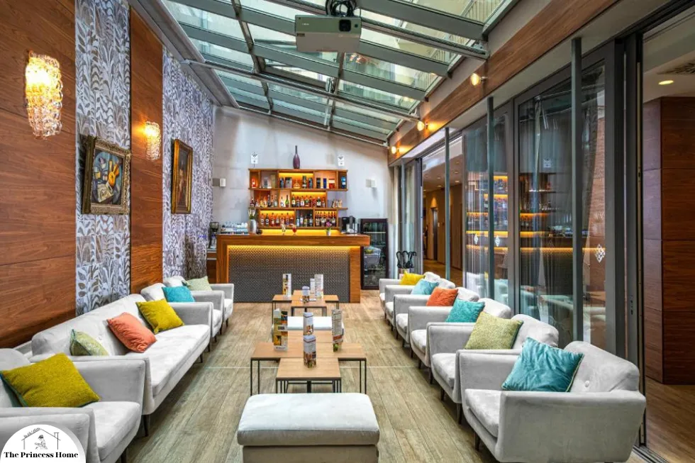
1.Interior Design
An interior design firm working on a boutique hotel needed to create a luxurious atmosphere with a specific color palette. They prioritized high-impact areas like the lobby and guest rooms for premium materials, while common areas used more cost-effective options. By negotiating bulk purchases and sourcing from reputable suppliers, they achieved a cohesive look within budget.
2.Fashion Industry
A fashion brand launching a new collection focused on sustainable materials and vibrant colors. They sourced organic dyes and fabrics from certified suppliers, balancing higher material costs with savings from bulk orders. Consistent color quality was ensured through rigorous testing and standardization.
3.Marketing Campaign
A marketing agency developing a rebranding campaign for a client relied heavily on a new color scheme. They worked closely with printing partners and digital media teams to ensure color accuracy across all platforms. By budgeting for high-quality prints and calibrating digital displays, they successfully launched a cohesive brand identity.
Conclusion
Budgeting and sourcing materials based on color considerations require meticulous planning and strategic decision-making. By understanding the importance of color, accurately budgeting, and sourcing from reliable suppliers, you can ensure that your project’s color palette enhances its overall impact while staying within budget. Whether in interior design, fashion, or marketing, these principles will help you achieve a successful outcome that resonates with your audience.
Frequently Asked Questions (FAQs)
1. Why is color so important in project planning?
Answer: Color is crucial because it affects psychological responses, brand identity, and aesthetic cohesion. It can influence emotions, behaviors, and perceptions, making it a key element in creating a desired atmosphere or conveying a brand’s message.
2. How can I estimate the budget for color-specific materials?
Answer: Start by defining the scope of your project and researching the costs of various materials based on color. Prioritize areas that require specific colors and allocate more budget to them. Include labor costs and set aside a contingency fund for unexpected expenses related to color.
3. What are some cost-saving strategies for sourcing materials based on color?
Answer: Bulk purchasing can reduce costs, as can negotiating with suppliers for discounts on larger orders. Exploring alternative sources like second-hand stores or surplus outlets can also provide cost-effective options for materials.
4. How do I ensure color consistency across different materials and suppliers?
Answer: Use standardized color systems like Pantone or RAL to communicate exact colors to suppliers. Implement a strict quality control process to check color consistency and maintain detailed documentation of all color specifications and supplier communications.
5. What should I consider when choosing suppliers for color-specific materials?
Answer: Look for suppliers with strong reputations and positive reviews, especially regarding color consistency and quality. Always request samples to verify color accuracy and ensure suppliers have the necessary certifications for quality and safety if applicable.
6. How can I manage unexpected costs related to color in my project?
Answer: Include a contingency fund in your budget specifically for unexpected color-related expenses. This fund can cover additional materials, corrections for mismatched shades, or any other unforeseen costs.
7. What are some examples of projects where color played a significant role in budgeting and sourcing?
Answer: Examples include:
- Interior Design: A boutique hotel prioritizing high-impact areas for premium materials while using cost-effective options for common spaces.
- Fashion Industry: A sustainable fashion brand balancing higher costs of organic dyes and fabrics with savings from bulk orders.
- Marketing Campaign: A rebranding campaign ensuring color accuracy across all platforms through close collaboration with printing and digital media partners.
8. Can digital tools help with color management in projects?
Answer: Yes, digital tools like color-calibrated monitors and reliable design software can maintain color accuracy in digital projects. These tools help ensure that the chosen color palette looks consistent across different devices and media.
9. What should I do if the color of the materials delivered doesn’t match my specifications?
Answer: Have a quality control process in place to inspect all materials upon arrival. If there are discrepancies, communicate immediately with the supplier to address the issue. Keeping detailed records of color specifications and supplier agreements can facilitate resolution.
10. How do psychological impacts of color influence material choices in different industries?
Answer: Different industries use color to evoke specific emotions and behaviors. For example, healthcare facilities might use calming blues to create a sense of tranquility, while marketing campaigns might use energetic reds to grab attention and drive urgency. Understanding these psychological impacts helps in selecting materials that align with the desired effect.


