
In the dynamic realm of contemporary design, color usage stands as a pivotal element influencing aesthetics, mood, and functionality. As we navigate through 2024, several notable trends have emerged, reflecting broader cultural shifts, technological advancements, and an evolving appreciation for sustainability. This article delves into the prevailing trends in color usage within modern spaces, examining the underlying factors that shape these choices and their implications on design.
1.*The Rise of Earth Tones &Natural Hues
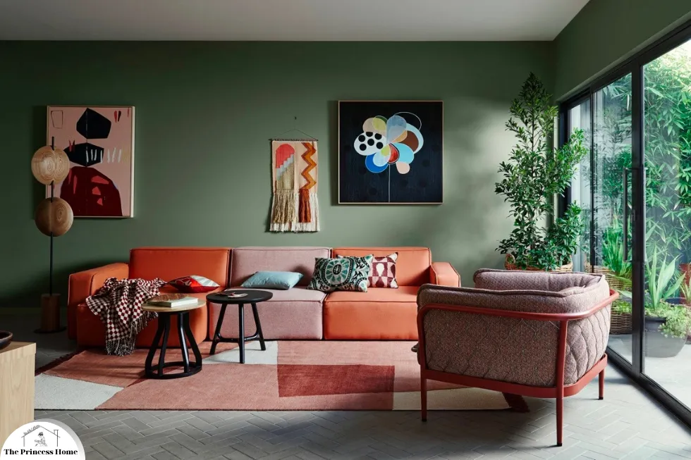
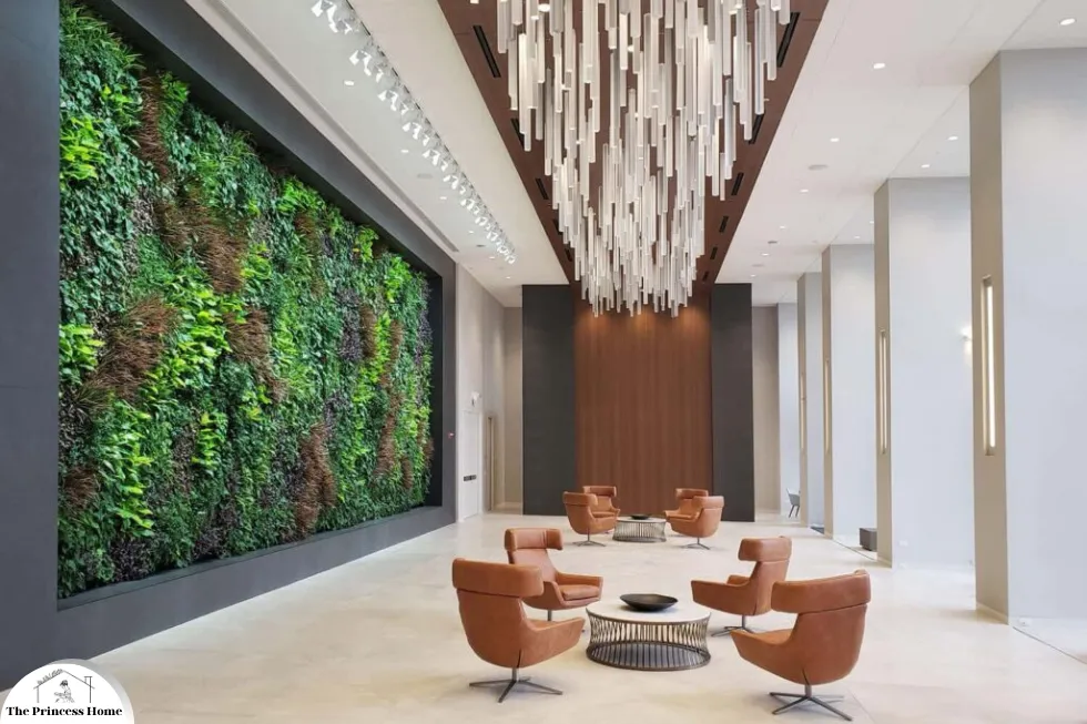
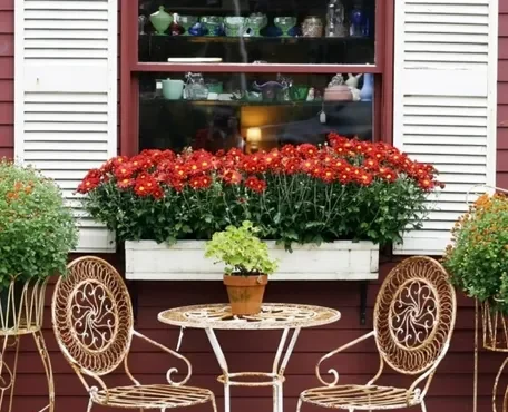
One of the most prominent trends in contemporary color usage is the resurgence of earth tones and natural hues. This shift reflects a growing desire to reconnect with nature and create serene, grounding environments. Colors such as terracotta, sage green, deep ochre, and various shades of brown dominate interior and exterior spaces. These colors not only evoke the tranquility of the natural world but also foster a sense of warmth and comfort.
1.Biophilic Design Influence:
The popularity of biophilic design—a concept that integrates natural elements into built environments—has significantly contributed to the embrace of earthy tones. By incorporating these colors, designers aim to enhance occupants’ well-being, reduce stress, and improve productivity.
1.Enhancing Well-being:
Earthy tones, such as terracotta, sage green, and various shades of brown, mimic the colors found in natural landscapes. Incorporating these colors into interior and exterior spaces can enhance occupants’ well-being by providing a sense of calm and grounding.
2.Reducing Stress:
Natural colors are known to have a soothing effect on the human mind. By using earthy tones, designers can create environments that help reduce stress and anxiety, promoting a more relaxed and comfortable atmosphere.
3.Improving Productivity:
Biophilic design not only improves mental well-being but also boosts productivity. Studies have shown that exposure to natural elements and colors can enhance cognitive function, creativity, and concentration. Earthy tones in workspaces can thus lead to more effective and efficient work environments.
4.Natural Materials:
In addition to color, biophilic design often incorporates natural materials such as wood, stone, and plants. These materials further reinforce the connection to nature, enhancing the overall impact of earthy tones.
5.Sustainable Design:
The use of natural colors and materials aligns with the principles of sustainable design. Eco-friendly paints and materials in earthy shades reduce environmental impact and promote sustainability, catering to the growing demand for environmentally conscious living.
2.Sustainability &Eco-consciousness:
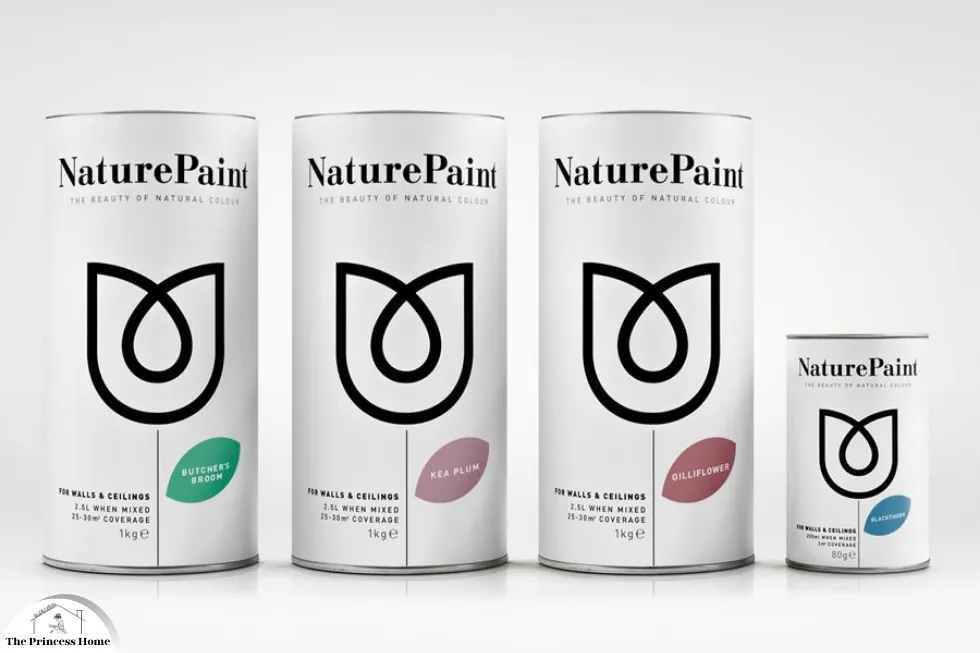
The push towards sustainability has also influenced color trends. Natural dyes and eco-friendly paints in earthy shades are preferred for their lower environmental impact. This aligns with the broader movement towards sustainable living and conscious consumption.
1.Natural Dyes and Eco-friendly Paints:
Lower Environmental Impact: Natural dyes and eco-friendly paints are made from non-toxic, biodegradable ingredients that reduce harm to the environment. Unlike conventional paints, they do not release harmful volatile organic compounds (VOCs) into the air, improving indoor air quality.
Earthy Shades: These sustainable products often come in earthy shades such as ochre, sienna, and olive. These colors are derived from natural sources and reflect the palette of the natural world, promoting a sense of harmony and well-being.
2. Sustainable Living:
Conscious Consumption: Consumers are increasingly aware of the environmental impact of their choices and prefer products that are sustainably produced. This includes opting for paints and dyes that are less harmful to the environment and contribute to healthier living spaces.
Eco-conscious Design: Designers and architects are incorporating sustainability into their projects by choosing materials and finishes that are eco-friendly. This includes using recycled materials, low-impact manufacturing processes, and renewable resources.

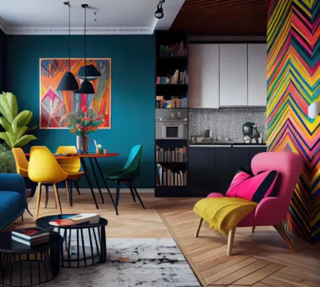
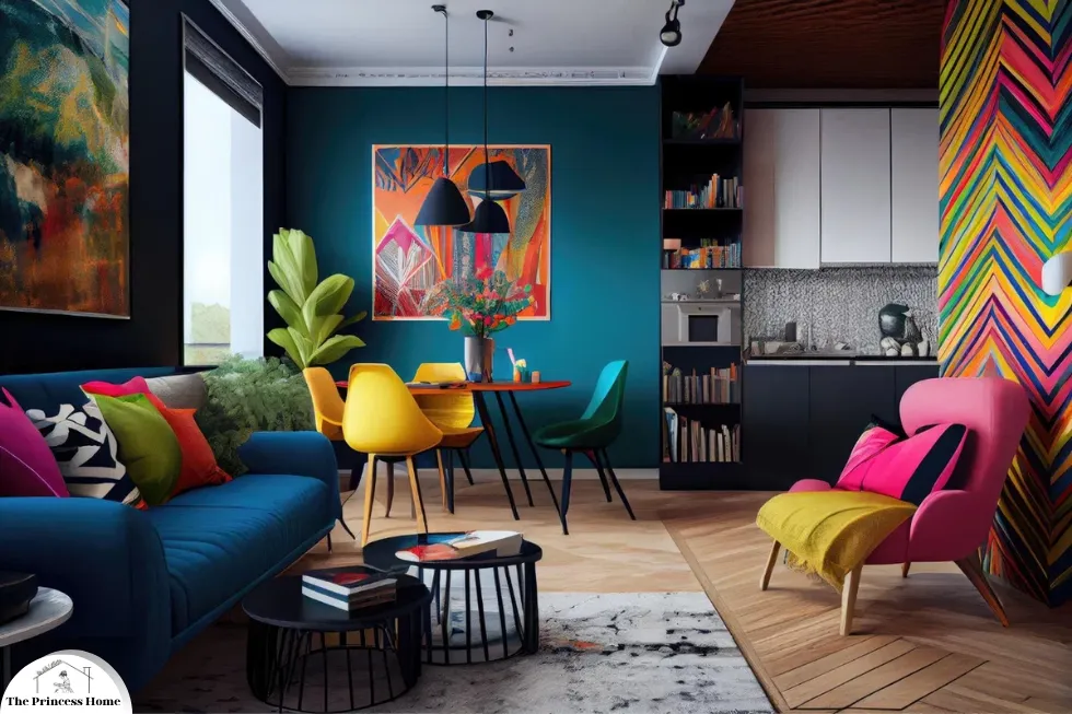
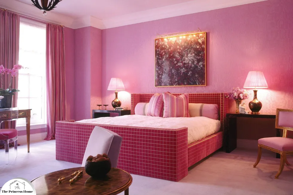
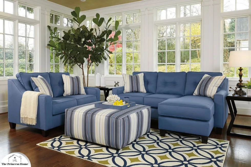
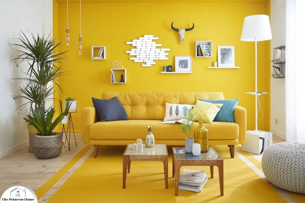
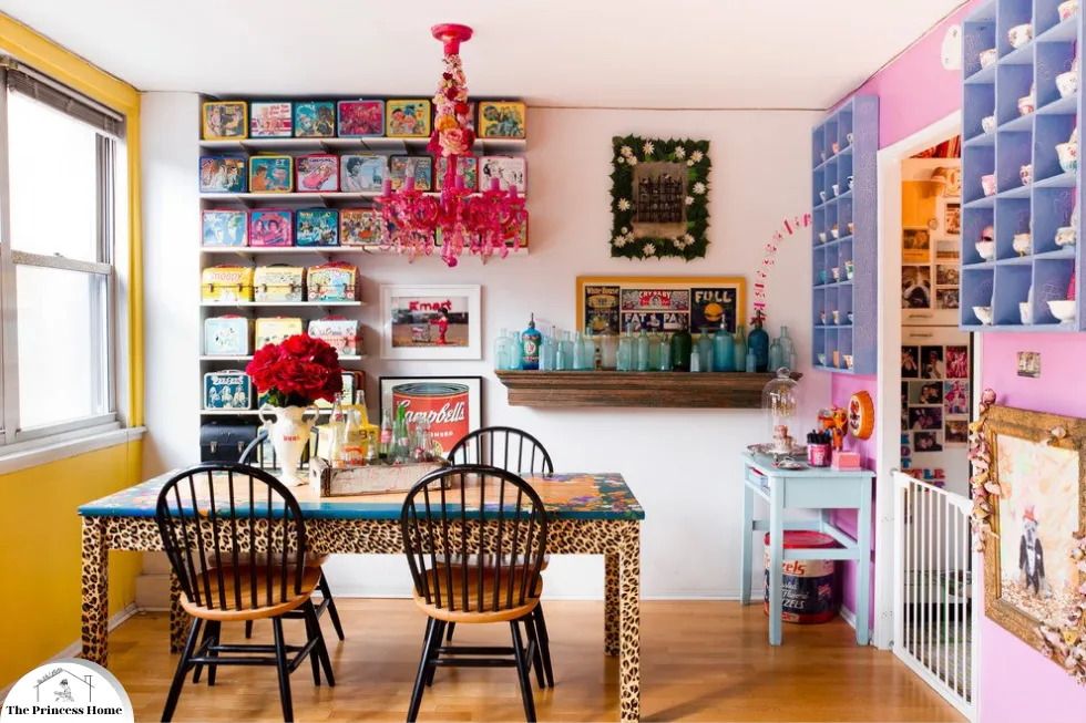
2.*Bold, Vibrant Accents
While earth tones set a calming backdrop, bold and vibrant accents are increasingly used to inject personality and energy into spaces. These bright pops of color, including electric blue, vivid coral, and neon yellow, create striking contrasts and focal points.
1.Personality and Energy:
Injecting Vibrancy: Bold accents such as electric blue, vivid coral, and neon yellow add a sense of liveliness and excitement to spaces. These colors break the monotony of neutral backgrounds and infuse interiors with a playful and energetic vibe.
Expressing Individuality: Bright accents allow for personal expression within a space. They enable designers and homeowners to showcase their unique tastes and preferences, making the space distinctly personal.
2.Striking Contrasts &Focal Points:
Creating Visual Interest: Bold colors draw the eye and create focal points within a room. This technique is used to highlight specific areas or features, such as an accent wall, a piece of furniture, or artwork.
Balancing Design Elements: When used thoughtfully, vibrant accents can balance the more subdued elements of a design. They provide a counterpoint to the calming earth tones, creating a harmonious yet dynamic overall aesthetic.
3.Applications:
Living Rooms: Brightly colored throw pillows, rugs, or decorative objects can liven up a neutral living room, making it more inviting and lively.
Kitchens: Bold colors can be introduced through appliances, backsplashes, or cabinetry, adding a modern and cheerful touch to the kitchen.
Bedrooms: Accent walls in bold hues or brightly colored bedding can add personality and energy to bedrooms without overwhelming the space.
Workspaces: Vibrant accents in home offices or workspaces can boost creativity and productivity, making the environment more stimulating and inspiring.
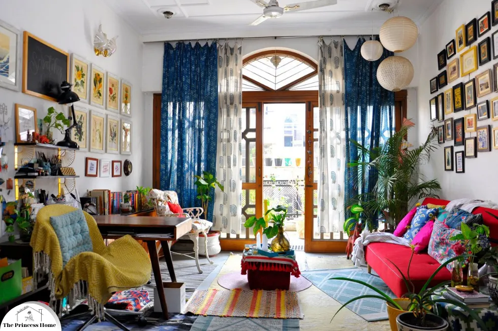
4.Maximalism:
The resurgence of maximalism—a design approach characterized by rich layers, textures, and an abundance of color—encourages the use of vibrant hues. In contrast to minimalist designs, maximalism celebrates eclecticism and individuality, often resulting in spaces that are visually stimulating and uniquely personal.
5.Digital Influence:
The influence of digital culture and social media cannot be overstated. Platforms like Instagram and Pinterest showcase bold, photogenic designs that often feature vibrant colors. These trends are quickly adopted by a digitally-savvy audience eager to create visually captivating and shareable spaces.
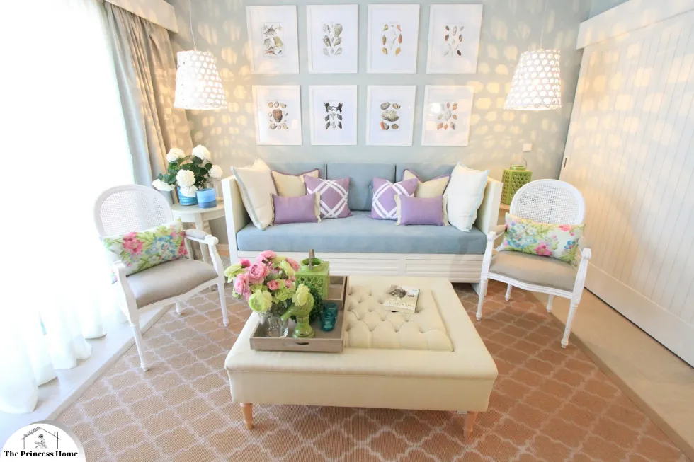
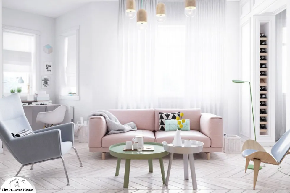
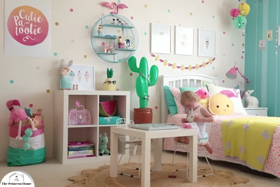
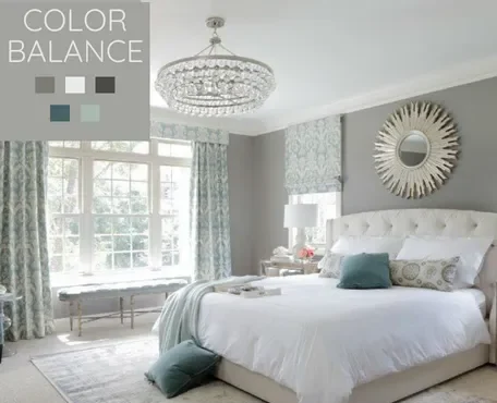
3.*Pastel Palettes &Soothing Shades
In contrast to bold accents, pastel palettes continue to hold sway in contemporary design. Soft shades of pink, lavender, mint, and baby blue are favored for their soothing and approachable qualities. These colors create an inviting and tranquil atmosphere, making them a popular choice for various settings.
Pastel hues are often associated with calmness and serenity, which can help in reducing stress and promoting relaxation. Their gentle tones can make spaces feel more open and airy, providing a sense of lightness and peace. This makes them particularly effective in environments where comfort and ease are paramount, such as living rooms, bedrooms, and nurseries.
Moreover, pastels are versatile and can be seamlessly integrated into a wide range of design styles. Whether paired with neutral tones for a minimalist look or combined with other pastels for a more whimsical feel, these shades can enhance the overall aesthetic without overwhelming the senses.
1.Tranquil Aesthetics :
Pastel colors play a significant role in these minimalist designs. Soft hues like light blues, pale pinks, and muted greens add subtle warmth and visual interest without overwhelming the space. The use of pastels complements the uncluttered aesthetics, creating environments that feel both calm and orderly.
2.Wellness & Mental Health:
1.Impact of Color on Well-being: In contemporary design, the focus on mental health and well-being has significantly influenced color choices. Designers are increasingly aware of how colors can affect mood and emotional states.
2.Calming Effects of Pastels: Pastel colors, known for their soothing and calming effects, are ideal for creating peaceful environments. Light blues, soft greens, gentle pinks, and lavender can reduce stress and promote relaxation.
3.Applications in Relaxation Spaces: Pastels are widely used in spaces dedicated to relaxation and mindfulness, such as:
- Bedrooms: Creating a serene retreat conducive to rest and rejuvenation.
- Nurseries: Offering a peaceful and gentle environment for infants.
- Wellness Centers: Providing a calming atmosphere that supports mental and physical well-being during activities like yoga, meditation, and therapy.
Design for Mental Health: Incorporating pastel colors into interior design is part of a broader trend towards creating spaces that support mental health. This approach involves not only the choice of color but also thoughtful design elements that reduce stress and enhance overall well-being.
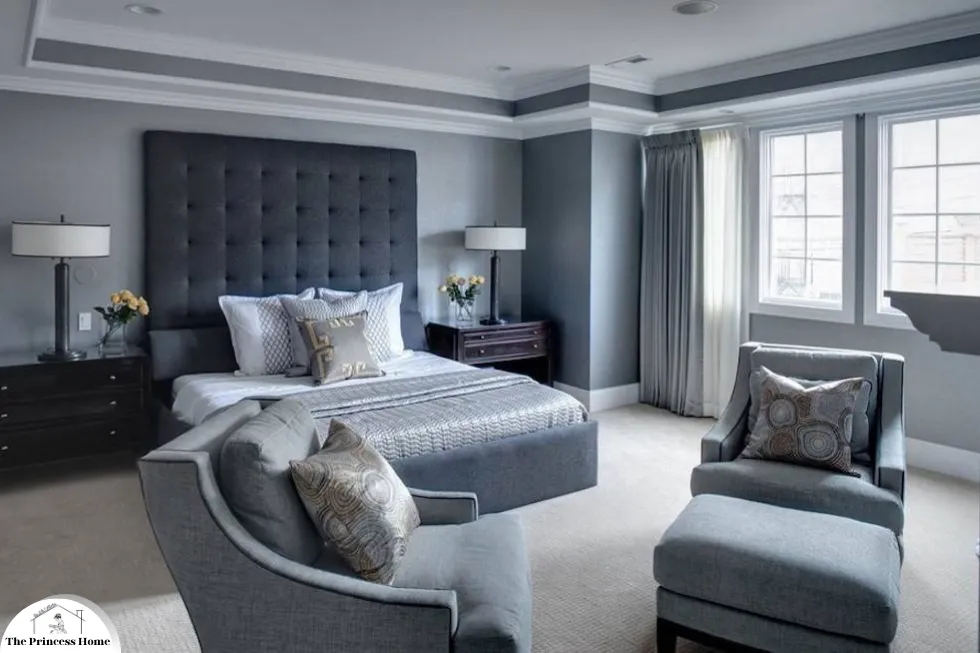
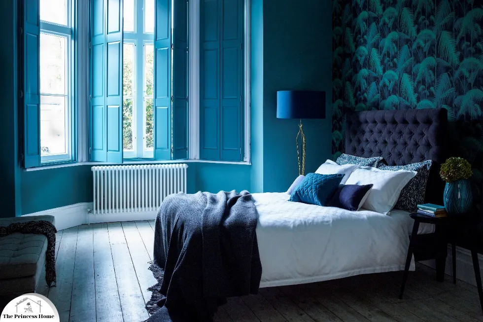
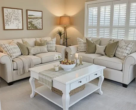
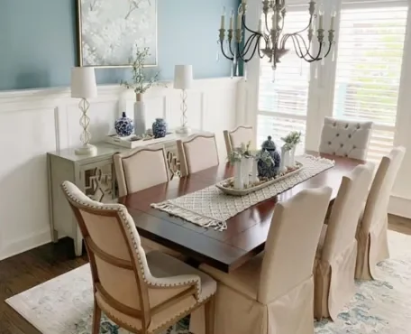
4.*Monochromatic &Tonal Harmony
Monochromatic color schemes, which involve variations of a single color, are gaining popularity in contemporary design. This trend emphasizes creating a harmonious and cohesive look by using different shades, tints, and tones of one color. The key to the success of monochromatic schemes lies in their ability to add depth and interest through texture, materials, and subtle color variations.
1.Harmonious &Cohesive Look:
Unity and Simplicity: A monochromatic palette creates a unified and simple aesthetic. By focusing on one color, designers can achieve a clean, uncluttered look that feels both sophisticated and calming.
Versatility: This approach works well with any color, allowing for a wide range of expressions from serene and understated to bold and dramatic.
2.Emphasis on Texture &Materials:
Textural Contrast: Without the distraction of multiple colors, texture becomes a primary focus. Different materials such as wood, metal, fabric, and stone can be used to add tactile interest and contrast.
Layering Textures: Combining smooth, rough, shiny, and matte surfaces within the same color family creates visual intrigue and richness.
3.Subtle Variations in Tone:
Depth and Dimension: By using various shades and tones of a single color, designers can create a sense of depth and dimension in a space. Lighter tones can make a room feel more expansive, while darker tones can add coziness and intimacy.
Highlighting Features: Subtle changes in tone can be used to highlight architectural features, furnishings, or decor items, adding layers of visual interest without overwhelming the eye.
4.Applications:
Living Rooms: A monochromatic scheme in a living room can create a serene and elegant atmosphere. Different shades of gray, for example, can be used on walls, furniture, and accessories to build a cohesive look.
Bedrooms: In bedrooms, a monochromatic palette can promote relaxation and tranquility. Various tones of blue can be layered through bedding, curtains, and rugs.
Bathrooms: Using a single color such as white or beige in different textures and materials can make a bathroom feel luxurious and spa-like.
Kitchens: A monochromatic kitchen can be both stylish and functional. Black or white kitchens with variations in finishes and materials can appear sleek and modern.
1.Sophistication &Elegance:
Monochromatic designs exude sophistication and timeless elegance. Using shades of one color creates a seamless and visually unified space, often seen in upscale homes, luxury hotels, and corporate offices.
2.Flexibility & Versatility:
Such schemes offer flexibility, allowing for easy updates and personalization. By changing accessories or incorporating different textures, spaces can be refreshed without a complete overhaul.
5.*Color Psychology &Functional Design
Understanding color psychology—the study of how colors affect perceptions and behaviors—has become integral to contemporary design. Colors are now chosen not only for their aesthetic appeal but also for their functional impact on space usage.
1.Productivity and Creativity:
In workspaces, colors like blue and green are used to enhance productivity and creativity. Blue, associated with calm and focus, is ideal for task-oriented areas, while green promotes a sense of balance and innovation.
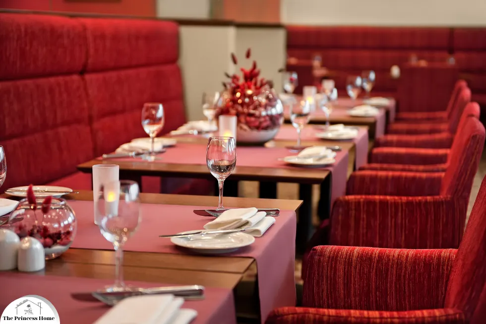
2.Hospitality and Retail:
In hospitality and retail environments, colors play a crucial role in shaping customer experiences. Warm colors such as red and orange can stimulate appetite and create a welcoming atmosphere, while cooler tones like blue and green can impart a sense of luxury and calm.
6.*Technological Integration &Adaptive Color
The integration of technology in design has led to innovative uses of color, including adaptive and responsive color schemes.

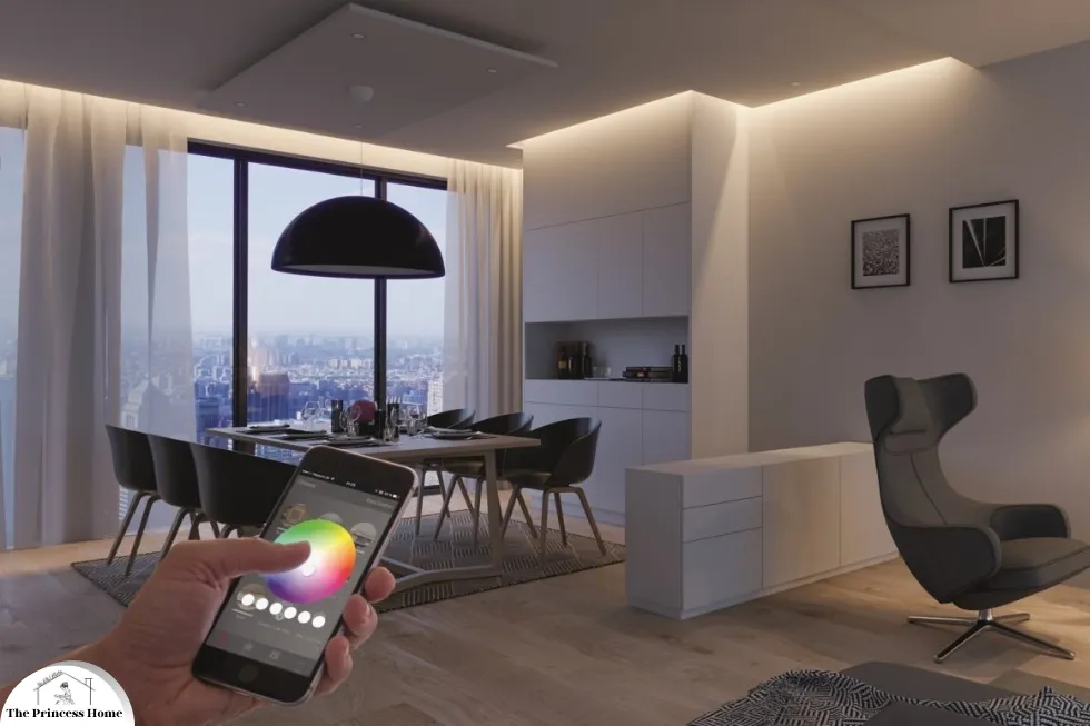
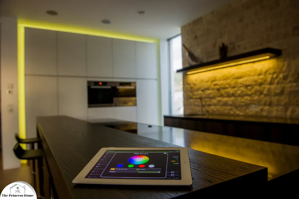
1.Smart Lighting:
Advances in smart lighting allow for dynamic color changes based on time of day, user preference, or activity. This adaptability enhances mood, functionality, and energy efficiency in spaces.
2.Digital Art and Projections:
The use of digital art and projections introduces ever-changing color landscapes into interiors. These dynamic installations can transform spaces, offering endless possibilities for customization and interaction.
7.*Global &Cultural Influences
Globalization has brought a rich tapestry of cultural influences to contemporary design, introducing diverse color palettes and design motifs.
1.Cultural Celebrations:
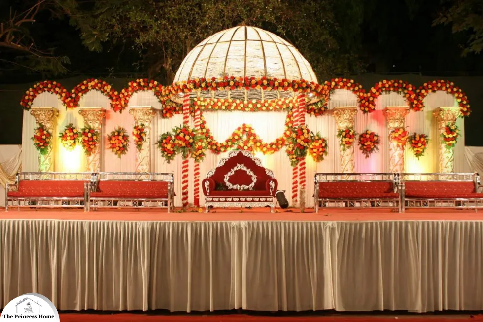
Colors traditionally associated with specific cultures—such as the vibrant hues of Indian festivals, the serene blues of Mediterranean coasts, or the bold reds of East Asian aesthetics—are being integrated into modern designs, creating spaces that celebrate global diversity.
2.Cross-cultural Fusion:
Designers are increasingly blending elements from different cultures, resulting in eclectic and innovative color schemes that resonate with a global audience. This fusion reflects a world that is more interconnected than ever before.
Conclusion
Contemporary spaces are a testament to the evolving nature of design, where color plays a crucial role in shaping experiences and conveying emotions. From the calming influence of earth tones and pastels to the energizing effect of bold accents and the sophistication of monochromatic schemes, color trends in 2024 reflect a blend of tradition, innovation, and cultural awareness. As designers continue to explore the interplay between color, psychology, and functionality, the spaces we inhabit will become increasingly attuned to our needs and aspirations, offering environments that are not only visually stunning but also deeply enriching.
Frequently Asked Questions (FAQs)
1. Why are earth tones and natural hues trending in contemporary design?
Answer: Earth tones and natural hues are trending because they evoke a sense of tranquility, grounding, and connection to nature. This shift aligns with the growing biophilic design movement, which integrates natural elements into built environments to enhance well-being. Additionally, the increasing emphasis on sustainability and eco-consciousness favors the use of natural dyes and eco-friendly paints in these shades.
2. What is the impact of bold and vibrant accents in modern spaces?
Answer: Bold and vibrant accents bring energy and personality to contemporary spaces. They create striking contrasts and focal points, making interiors more dynamic and visually interesting. This trend is influenced by the resurgence of maximalism, which celebrates rich layers and eclecticism, as well as the impact of digital culture and social media that highlight bold, photogenic designs.
3. How do pastel palettes contribute to the design of contemporary spaces?
Answer: Pastel palettes contribute to contemporary design by offering soothing and approachable qualities. These soft shades complement minimalist design philosophies like Scandinavian and Japanese minimalism, creating calm and orderly environments. Pastels are also favored for spaces intended for relaxation and mindfulness due to their calming effects, supporting the trend towards wellness and mental health in design.
4. What are the benefits of using monochromatic and tonal harmony in design?
Answer: Monochromatic and tonal harmony offer several benefits, including a sophisticated and elegant look that is timeless and visually unified. These schemes emphasize texture and subtle variations in tone, adding depth and interest without overwhelming the space. They also provide flexibility, allowing for easy updates and personalization through changes in accessories and textures.
5. How does color psychology influence contemporary design choices?
Answer: Color psychology plays a crucial role in contemporary design by affecting perceptions and behaviors. Designers choose colors based on their functional impact—blue and green, for instance, are used in workspaces to enhance productivity and creativity, while warm colors like red and orange in hospitality and retail settings can stimulate appetite and create a welcoming atmosphere. This understanding helps create environments that support specific activities and experiences.
6. What role does technology play in contemporary color usage?
Answer: Technology has introduced innovative uses of color, including adaptive and responsive color schemes. Smart lighting systems allow for dynamic color changes based on time of day, user preference, or activity, enhancing mood and functionality. Digital art and projections bring ever-changing color landscapes into interiors, offering endless customization possibilities and interactive experiences.
7. How do global and cultural influences shape contemporary color trends?
Answer: Globalization brings diverse cultural influences into contemporary design, introducing varied color palettes and motifs. Designers incorporate colors traditionally associated with different cultures, such as the vibrant hues of Indian festivals or the serene blues of Mediterranean coasts, celebrating global diversity. This cross-cultural fusion results in eclectic and innovative color schemes that resonate with a broader audience, reflecting a more interconnected world.
8. What are the key factors driving the current trends in color usage in contemporary spaces?
Answer: Key factors include the growing emphasis on sustainability and eco-consciousness, the influence of biophilic design, the resurgence of maximalism, the impact of digital culture and social media, and the prioritization of mental health and well-being. Additionally, advances in technology and the integration of global cultural influences significantly shape contemporary color trends.
9. Can contemporary color trends be easily adapted for residential spaces?
Answer: Yes, contemporary color trends can be adapted for residential spaces. Earth tones and pastels can create a serene and welcoming home environment, while bold accents can add personality and vibrancy. Monochromatic schemes offer a sophisticated look that is easy to personalize. Smart lighting and digital art can also be integrated into homes to create dynamic and adaptable spaces.
10. How can one incorporate contemporary color trends without overwhelming a space?
Answer: To incorporate contemporary color trends without overwhelming a space, start with a neutral or earthy base and add bold accents through accessories, artwork, or small furniture pieces. Use pastels in larger areas to maintain a soothing atmosphere. Embrace monochromatic schemes with variations in texture and tone for depth. Consider smart lighting for adaptive color changes and incorporate cultural elements thoughtfully to create a balanced and harmonious design.

