
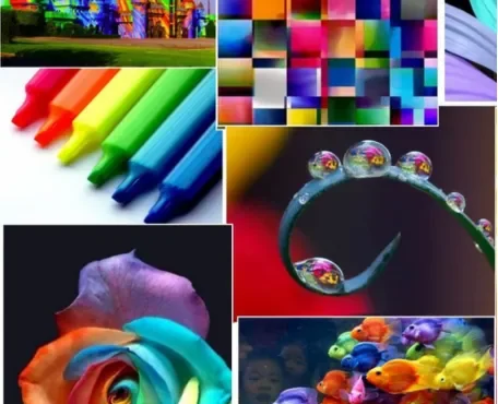
The art of decoration is intrinsically tied to the use of color, a powerful tool that can transform spaces, evoke emotions, and define atmospheres. The significance of color in decoration cannot be overstated, as it is fundamental in setting the tone, influencing perceptions, and enhancing the overall aesthetic appeal of an environment. This article delves into the myriad ways color impacts decoration, exploring its psychological effects, cultural meanings, and practical applications.
**The Psychological Effects of Color
Color psychology is a field of study that examines how different hues affect human behavior and emotions. When it comes to decoration, understanding the psychological implications of color can be incredibly beneficial.
Absolutely! Color psychology is a fascinating field that explores how different colors can influence human behavior, mood, and emotions. When applied to decoration, understanding the psychological implications of color can indeed be incredibly beneficial. Here’s why:
1.Creating the Desired Atmosphere
Mood Enhancement: Certain colors have been found to evoke specific emotions. For example, warm colors like red and orange can create a sense of energy and excitement, while cool colors like blue and green can promote calmness and relaxation. By selecting colors that align with the desired atmosphere of a space, decorators can enhance the overall mood and ambiance.
2.Establishing Visual Impact
Attention and Focus: Bright and vibrant colors can draw attention and stimulate the senses, making them ideal for accent pieces or focal points in a room. On the other hand, softer and more muted colors can create a sense of tranquility and balance, allowing for a more soothing visual experience.
Visual Perception: Understanding how different colors interact with each other and with various textures can help decorators create visually appealing and harmonious color schemes that enhance the overall aesthetic of a space.
3.Reflecting Personal Style &Preferences
Individual Preferences: Personal associations and cultural influences can play a significant role in how colors are perceived and interpreted. By considering the preferences and personality of the occupants, decorators can tailor color choices to reflect their unique tastes and create spaces that feel personalized and inviting.
Brand Identity: In commercial spaces, color psychology can also be used to reinforce brand identity and convey specific messages or values. For example, a restaurant might use warm, inviting colors to enhance the dining experience, while a tech company might opt for cooler, more modern hues to convey innovation and sophistication.
4.Promoting Well-being &Productivity
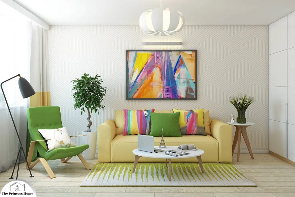
Enhancing Functionality: In work or study environments, color psychology can be leveraged to optimize productivity and concentration. For instance, blue is often associated with focus and productivity, making it a popular choice for office spaces, while green is linked to feelings of tranquility and creativity, making it suitable for creative work environments.
Creating Sanctuary: In residential settings, colors that promote relaxation and comfort can help create a sanctuary where occupants can unwind and recharge after a long day. Soft, soothing colors like pale blue or lavender can be used in bedrooms and living areas to foster a sense of calm and well-being.
By incorporating insights from color psychology into decoration, decorators can create spaces that not only look visually appealing but also promote positive emotions, enhance functionality, and reflect the unique personality and preferences of the occupants. Whether designing a residential or commercial space, understanding the psychological implications of color can be a powerful tool for creating environments that resonate with and enrich the lives of those who inhabit them.
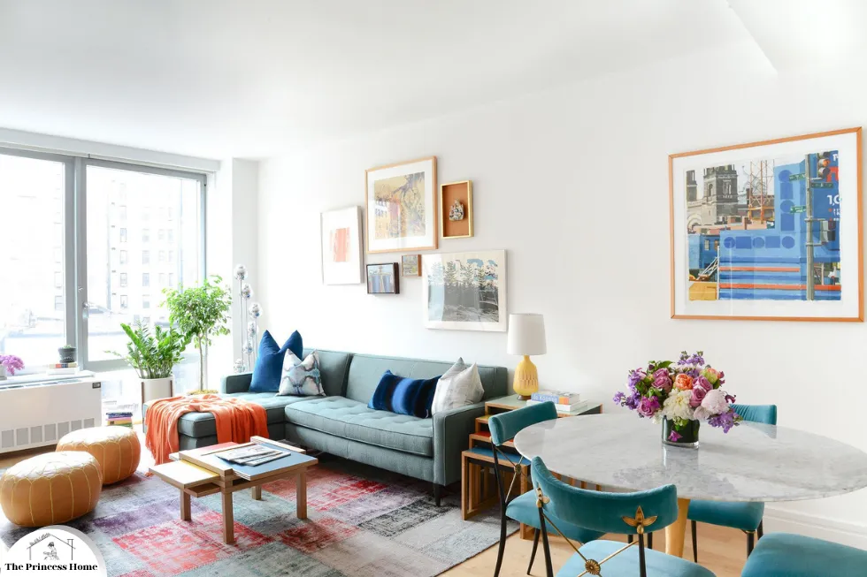
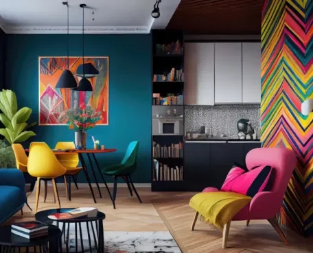
1.*Warm Colors: Energizing &Inviting
*Red color:
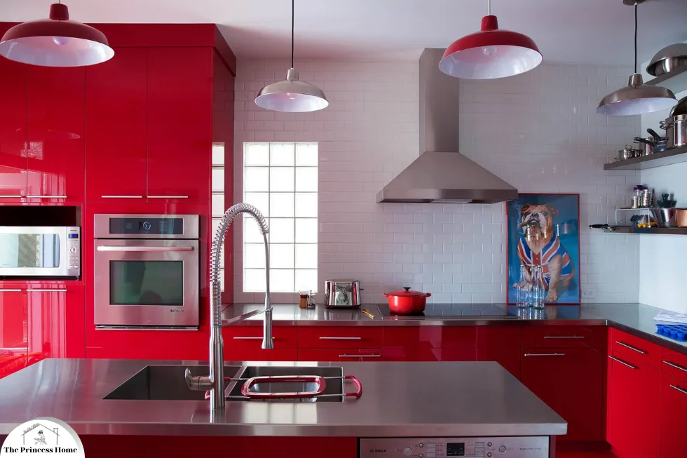
Often associated with passion, energy, and excitement, red can stimulate the senses and increase appetite, making it a popular choice for dining rooms and kitchens. However, its intensity means it should be used sparingly in spaces meant for relaxation.
Red exudes warmth and enthusiasm, making it an excellent choice for creating lively and inviting atmospheres in social areas. Here are some ideas on how to incorporate red effectively in living rooms and playrooms:

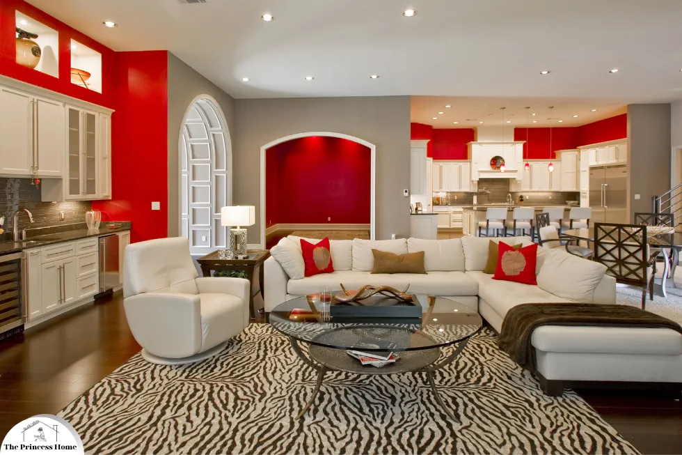
1.Red in Living Rooms
Walls and Accent Walls:
Full Wall: Painting an entire wall red can make a bold statement and become a focal point in the living room. Pair it with neutral furniture and decor to balance the intensity.
Accent Wall: If a full red wall feels too overpowering, consider an accent wall. This can add warmth and energy without overwhelming the space.
Furniture:
Sofas and Chairs: A red sofa or armchair can serve as a striking centerpiece. Balance it with cushions and throws in complementary or neutral colors.
Coffee Tables and Shelving: Red furniture pieces can add a splash of color. Ensure these pieces are not too dominant by surrounding them with neutral tones.
Decor and Accessories:
Pillows and Throws: Red cushions, throws, and blankets can add warmth and comfort to the seating area. They are easy to change out seasonally.
Rugs and Curtains: A red rug can anchor the room and bring all elements together. Red curtains can add warmth but consider using them in lighter fabrics to avoid making the room feel heavy.
Artwork and Decorations:
Paintings and Prints: Red elements in artwork can tie the room together and create a cohesive look.
Vases and Lamps: Smaller decor items like vases, lamps, and picture frames in red can subtly infuse energy and warmth.
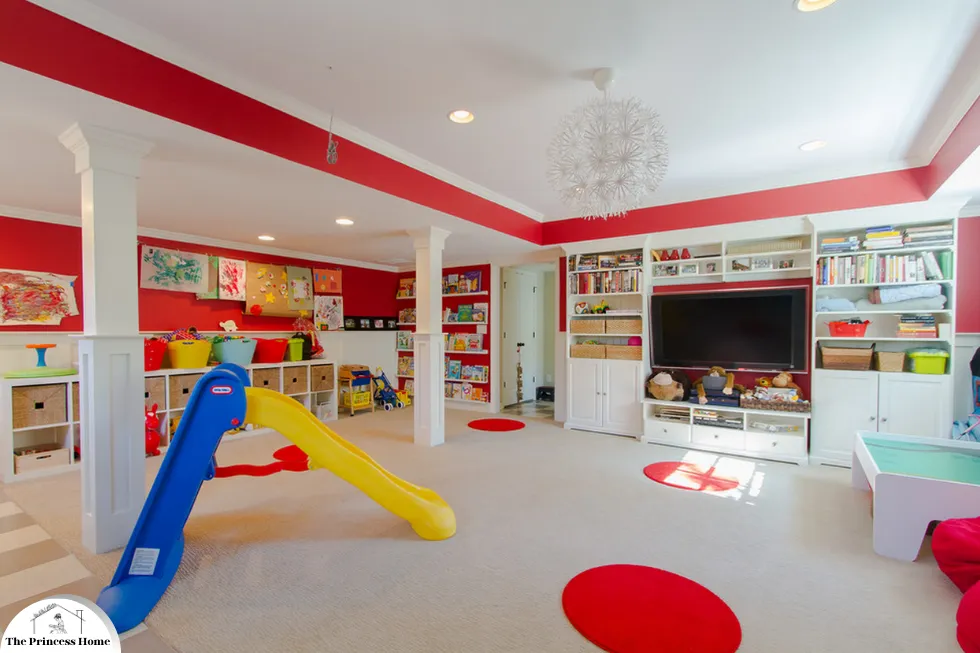
2.Red in Playrooms
Walls and Murals:
Playful Murals: Red can be used in murals or wall decals to create a fun and stimulating environment. Consider combining red with other bright colors for a playful vibe.
Accent Wall: Similar to living rooms, a red accent wall in a playroom can energize the space without overwhelming it.
Furniture:
Play Furniture: Red tables, chairs, and storage units can make the playroom feel more vibrant and inviting.
Soft Seating: Bean bags, cushions, and poufs in red can provide comfortable and colorful seating options for children.
Toys and Storage:
Red Toys: Incorporate toys in red to add splashes of color throughout the playroom.
Storage Bins: Red storage bins and shelves can help organize toys while adding to the room’s color scheme.
Decor and Accessories:
Floor Mats and Rugs: A red play mat or rug can define a play area and add a cozy feel.
Wall Art and Posters: Fun and educational posters with red elements can enhance the room’s decor and stimulate learning.
3.Balancing Red &Other Colors
Neutral Tones: To prevent red from overwhelming a space, balance it with neutral colors like white, beige, grey, or soft pastels.
Complementary Colors: Pair red with complementary colors such as green, or analogous colors like orange and yellow, to create a harmonious look.
Patterns and Textures: Use patterns and textures to break up the solid areas of red and add visual interest.
Psychological Considerations
Energy and Excitement: Red can energize and stimulate, making it ideal for social and active spaces. However, in playrooms, it should be balanced to avoid overstimulation.
Warmth and Comfort: Red’s warm undertones can make living rooms feel cozy and inviting, perfect for gatherings and relaxation.
By thoughtfully incorporating red into living rooms and playrooms, you can create dynamic, welcoming, and stimulating environments that foster social interaction and playfulness.
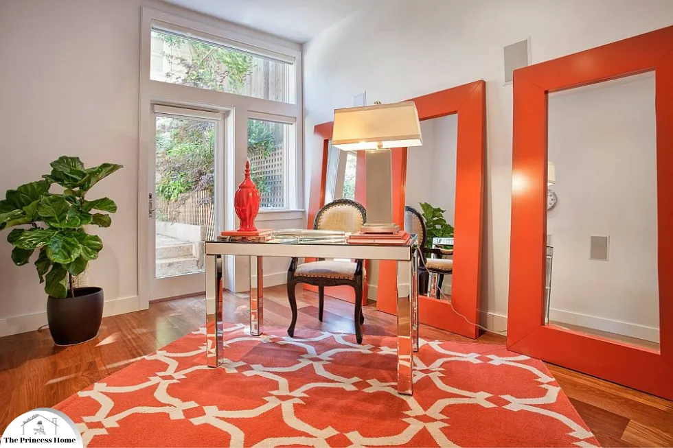
*Orange color:
This color exudes warmth and enthusiasm. It can create a lively atmosphere, making it suitable for social areas like living rooms and playrooms.
You’re describing the color orange! Like red, orange exudes warmth, energy, and enthusiasm. It’s a vibrant hue that can indeed create a lively atmosphere, making it well-suited for social areas such as living rooms and playrooms. Here’s how orange can be effectively used in these spaces:
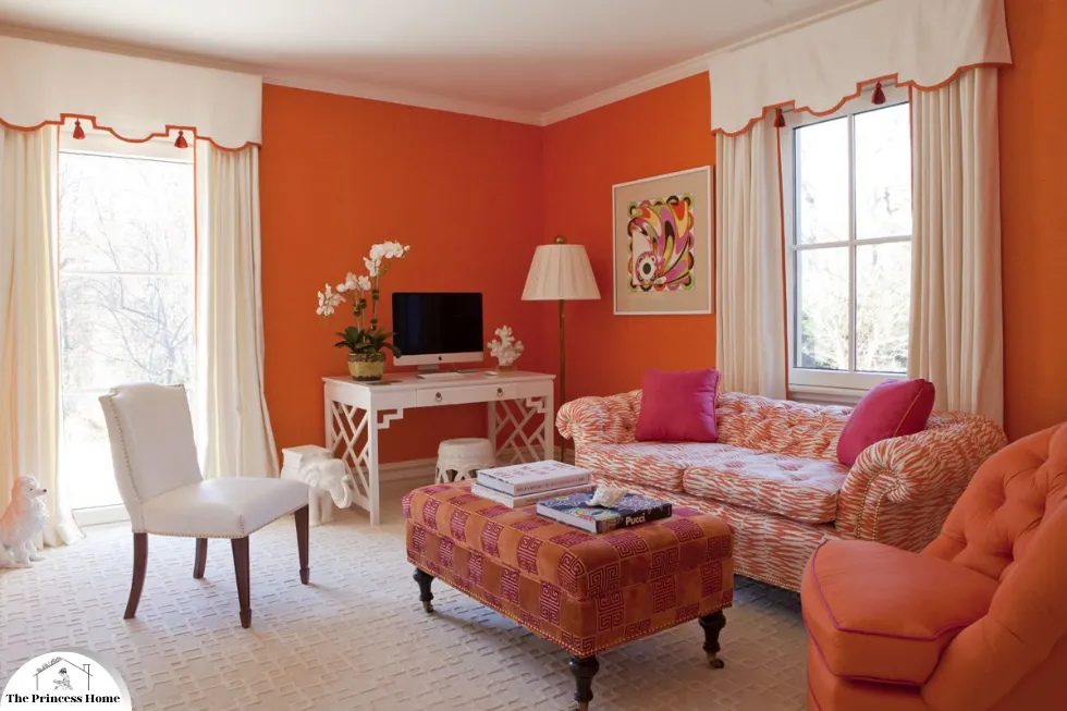
1.Orange in Living Rooms
Walls and Accents:
Feature Wall: Painting one wall in a bold orange can create a focal point and infuse the room with energy.
Accessories: Use orange throw pillows, blankets, or curtains to add pops of color without overwhelming the space.
Furniture:
Statement Pieces: Incorporate orange furniture like sofas, armchairs, or ottomans to inject warmth and personality into the room.
Accent Chairs: A pair of orange accent chairs can add a playful touch to neutral surroundings.
Decor:
Artwork: Hang paintings or prints with orange elements to tie the room together and add visual interest.
Rugs: An orange rug can anchor the seating area and bring warmth to the space.
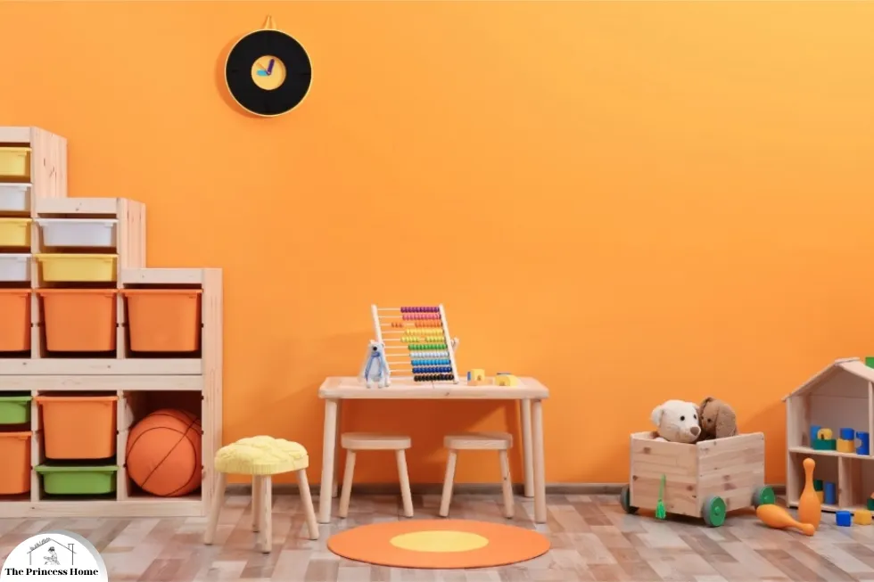
2.Orange in Playrooms
Walls and Decorations:
Colorful Murals: Consider painting murals with vibrant orange elements to stimulate creativity and imagination.
Decals and Wall Art: Use removable decals or posters featuring orange animals, shapes, or characters to create a fun and inviting environment.
Furniture and Accessories:
Playful Furniture: Choose orange chairs, tables, or shelving units to create a cohesive and playful look.
Storage Solutions: Orange storage bins or baskets can add a pop of color while keeping toys organized.
Flooring:
Soft Flooring: Opt for orange carpets or foam mats to provide a comfortable and safe play surface.
Area Rugs: Layer colorful area rugs with orange accents to define play areas and add texture.
3.Balancing Orange &Other Colors
Neutral Background: Pair orange with neutral colors like white, beige, or gray to create a balanced and harmonious space.
Complementary Colors: Combine orange with complementary colors such as blue or purple to create contrast and visual interest.
Subtle Accents: Use orange sparingly as accents to prevent the room from feeling overwhelming.
Psychological Considerations
Warmth and Energy: Orange can create a welcoming and energizing atmosphere, perfect for socializing and play.
Creativity and Stimulation: The vibrant hue of orange can stimulate creativity and imagination, making it ideal for playrooms.
By incorporating orange into your living room or playroom design, you can create vibrant and inviting spaces where people feel comfortable, energized, and inspired to socialize and play.
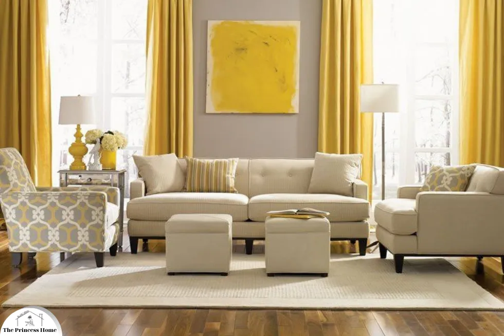
*Yellow color:
Symbolizing happiness and optimism, yellow can brighten up spaces and is excellent for kitchens, bathrooms, and rooms that lack natural light.
You’re describing the color yellow! Yellow indeed symbolizes happiness and optimism, and its bright and cheerful nature makes it perfect for brightening up spaces, especially those that lack natural light. Here’s how yellow can be effectively used in various areas of the home:

1.Yellow in Kitchens
Cabinets &Backsplash:
Yellow Cabinets: Opt for yellow kitchen cabinets to add a burst of color and cheerfulness to the space.
Tile Backsplash: Install a yellow tile backsplash to create a focal point and bring warmth to the kitchen.
Accents and Accessories:
Small Appliances: Incorporate yellow small appliances like toasters, kettles, or stand mixers to add pops of color to the kitchen countertops.
Utensils and Decor: Display yellow utensils, dishware, and decorative items on open shelves or countertops for a playful touch.
Wall Paint or Wallpaper:
Sunny Walls: Paint the kitchen walls in a warm yellow hue to create a bright and inviting atmosphere.
Patterned Wallpaper: Choose yellow-patterned wallpaper to add visual interest and personality to the kitchen.

2.Yellow in Bathrooms
Wall Color:
Light and Airy: Paint bathroom walls in a soft yellow shade to make the space feel bright, airy, and welcoming.
Accent Wall: Create a focal point by painting one wall in a deeper shade of yellow or installing yellow tiles.
Textiles and Decor:
Shower Curtain: Choose a yellow shower curtain to add a pop of color and brightness to the bathroom.
Towels and Rugs: Display yellow towels and bath mats to enhance the cheerful atmosphere.
Accessories and Fixtures:
Hardware: Install yellow cabinet knobs or drawer pulls to add a subtle touch of color to bathroom cabinets.
Decorative Accents: Place yellow vases, candles, or artwork on bathroom shelves or countertops for a cohesive look.
3.Yellow in Rooms in Limited Natural Light
Lighting:
Ambient Lighting: Install warm lighting fixtures to mimic natural sunlight and enhance the brightness of the room.
Task Lighting: Incorporate task lighting such as desk lamps or reading lights to provide focused illumination in specific areas.
Mirrors:
Reflective Surfaces: Hang mirrors strategically to bounce light around the room and create a sense of spaciousness.
Decorative Mirrors: Choose mirrors with yellow frames or accents to add a decorative touch while brightening the space.
Furniture and Decor:
Light-Colored Furniture: Opt for light-colored furniture pieces to prevent the room from feeling heavy or cramped.
Yellow Accents: Introduce yellow accents through throw pillows, rugs, curtains, or artwork to inject warmth and vibrancy into the room.
Psychological Considerations
Happiness and Optimism: Yellow is often associated with positive emotions like happiness and optimism, making it an uplifting choice for interior spaces.
Light and Bright: Yellow has the power to make rooms feel brighter and more spacious, especially in areas with limited natural light.
By incorporating yellow into your kitchen, bathroom, or rooms with limited natural light, you can create cheerful and welcoming spaces that evoke feelings of happiness and warmth.
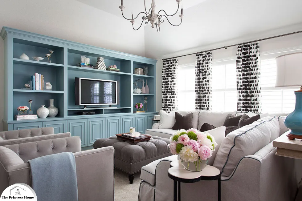
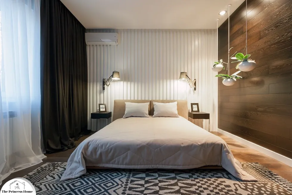
2.*Cool Colors: Calming &Soothing
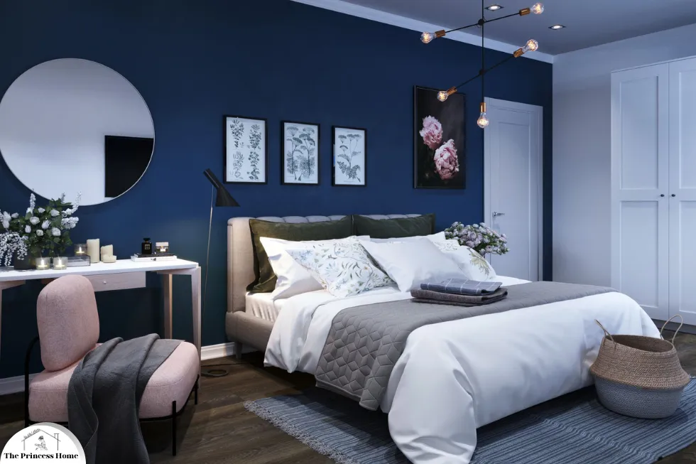
*Blue Color :
Known for its calming effects, blue is ideal for bedrooms and bathrooms, where relaxation is key. Light blues can open up spaces, while darker blues can create a cozy, intimate feel.
Blue is indeed renowned for its calming properties, making it an excellent choice for spaces where relaxation is paramount, such as bedrooms and bathrooms. Here’s how different shades of blue can be utilized effectively in these areas:
1.Blue in Bedrooms
Wall Color:
Soft Blues: Light shades of blue on bedroom walls can create a serene and tranquil atmosphere, promoting relaxation and restful sleep.
Accent Wall: Consider painting one wall in a slightly darker shade of blue to add depth and visual interest without overwhelming the space.
Bedding and Textiles:
Comforters and Sheets: Choose bedding in varying shades of blue to create a cohesive and calming color scheme.
Throw Pillows and Curtains: Incorporate blue throw pillows and curtains to enhance the calming ambiance and tie the room together.
Furniture and Decor:
Furniture Finishes: Opt for bedroom furniture with blue accents or finishes to complement the overall color scheme.
Artwork and Decorations: Hang artwork featuring blue hues or display decorative items like vases or candles in shades of blue to add subtle pops of color.
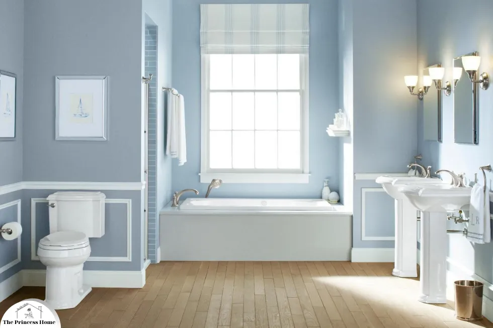
2.Blue in Bathrooms
Wall Tiles and Paint:
Spa-like Retreat: Use blue tiles or paint on bathroom walls to create a spa-like atmosphere, promoting relaxation and tranquility.
Mosaic Accents: Incorporate mosaic tiles in varying shades of blue to add visual interest and texture to the bathroom walls or shower.
Fixtures and Accessories:
Sink and Shower Fixtures: Choose bathroom fixtures like faucets and showerheads in brushed nickel or chrome finishes to complement the calming blue color palette.
Towels and Bath Mats: Display soft blue towels and bath mats to enhance the soothing ambiance and provide comfort.
Decorative Elements:
Plants: Introduce greenery into the bathroom with potted plants or succulents to add a touch of natural beauty and complement the calming blue tones.
Candles and Aromatherapy: Place blue candles or diffusers with calming scents like lavender or eucalyptus to create a spa-like atmosphere and promote relaxation.
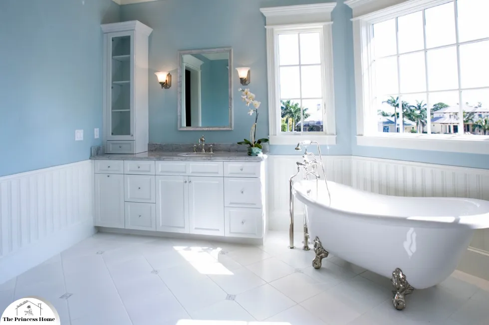
3.Light vs. Dark Blues
Light Blues: Lighter shades of blue can make small bedrooms or bathrooms feel more spacious and airy, contributing to an overall sense of openness and tranquility.
Dark Blues: On the other hand, darker shades of blue can create a cozy and intimate feel, perfect for larger bedrooms or bathrooms where a sense of warmth and comfort is desired.
Psychological Considerations
Calming Effects: Blue is known to have a calming effect on the mind and body, making it an ideal choice for spaces dedicated to relaxation and unwinding.
Promotes Restful Sleep: The serene ambiance created by blue hues can help promote restful sleep in bedrooms, contributing to overall well-being and quality of life.
By incorporating shades of blue into your bedroom and bathroom design, you can create serene and tranquil spaces that promote relaxation, comfort, and rejuvenation.
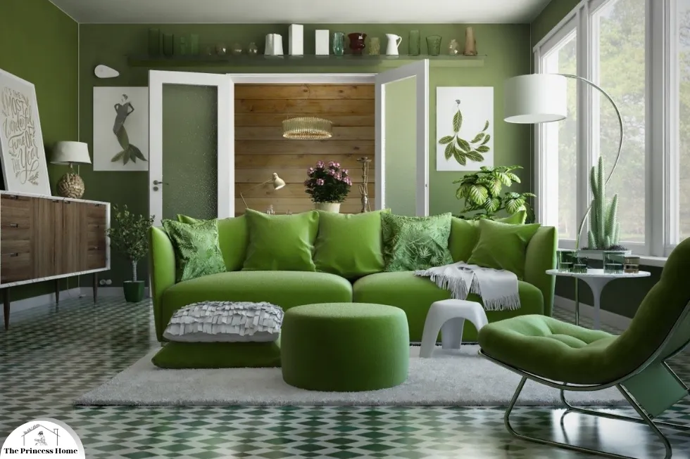
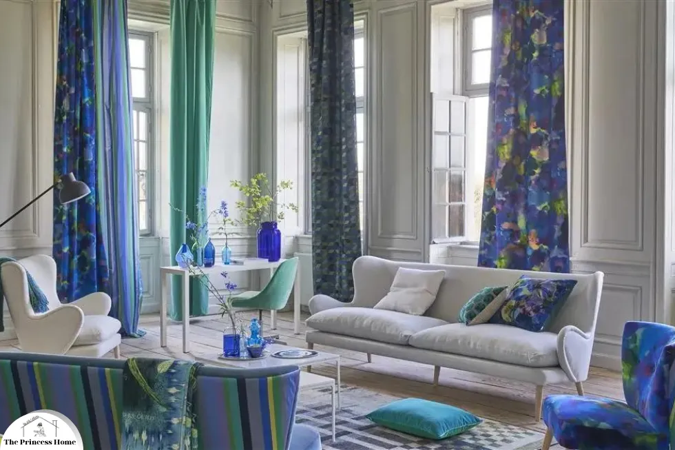
*Green Color:
Evoking the tranquility of nature, green is versatile and can be used in almost any room. It promotes relaxation and harmony, making it perfect for living rooms and bedrooms.
Green, often associated with the tranquility of nature, is indeed a versatile color that can be used effectively in various rooms throughout the home. Here’s how green can promote relaxation and harmony, making it ideal for living rooms and bedrooms:
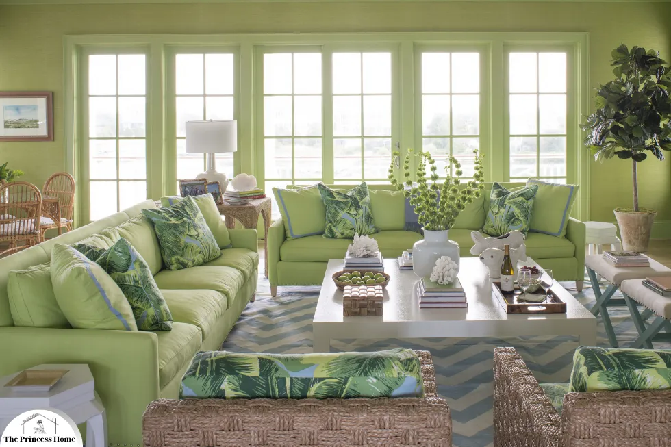
1.Green in Living Rooms
Wall Color:
Natural Greens: Opt for soft, natural shades of green on living room walls to evoke the calming essence of nature.
Accent Walls: Consider painting one wall in a deeper shade of green to create a focal point and add depth to the room.
Furniture and Upholstery:
Sofas and Chairs: Choose upholstery in green fabrics for sofas, armchairs, or ottomans to infuse the space with tranquility and harmony.
Wooden Furniture: Incorporate wooden furniture pieces with natural green finishes to complement the calming color palette.
Decorative Elements:
Throw Pillows and Blankets: Display throw pillows and blankets in various shades of green to add texture and visual interest to the living room seating area.
Plants: Introduce potted plants or hanging greenery to bring the outdoors inside and enhance the natural ambiance of the space.

2.Green in Bedrooms
Bedding and Linens:
Green Bedding: Dress the bed with green sheets, comforters, or duvet covers to create a serene and inviting sleep environment.
Texture and Layering: Layer different shades and textures of green bedding to add depth and dimension to the bedroom decor.
Window Treatments:
Curtains or Drapes: Hang green curtains or drapes to soften the natural light entering the bedroom and create a soothing atmosphere.
Sheer Fabrics: Choose sheer green fabrics for window treatments to maintain privacy while allowing soft, diffused light to filter through.
Accent Furniture and Decor:
Nightstands and Dressers: Incorporate green accent furniture pieces like nightstands or dressers to complement the overall color scheme of the bedroom.
Artwork and Wall Decor: Hang artwork featuring green landscapes or botanical prints to enhance the tranquil ambiance and promote relaxation.
Psychological Considerations
Tranquility and Harmony: Green is known to evoke feelings of tranquility and harmony, making it an ideal choice for living rooms and bedrooms where relaxation is key.
Connection to Nature: The natural associations of green can help create a sense of connection to the outdoors, promoting a peaceful and serene atmosphere in interior spaces.
Versatility of Green
Adaptability: Green is a highly versatile color that can be used in almost any room of the home, from kitchens and bathrooms to home offices and dining rooms.
Complementary Colors: Pair green with complementary colors like beige, white, or earth tones to create a cohesive and harmonious color palette.
By incorporating green into your living room and bedroom design, you can create serene and inviting spaces that promote relaxation, tranquility, and harmony, fostering a sense of well-being and rejuvenation.
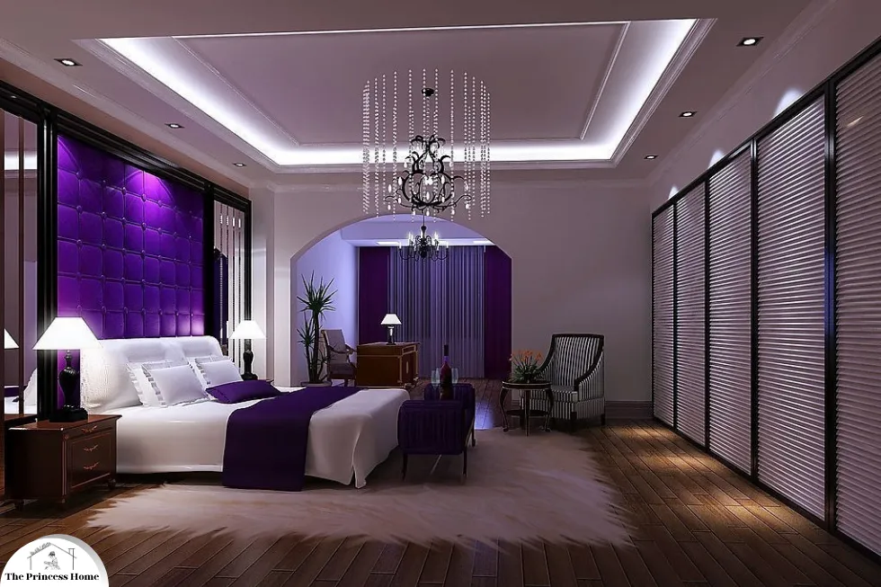
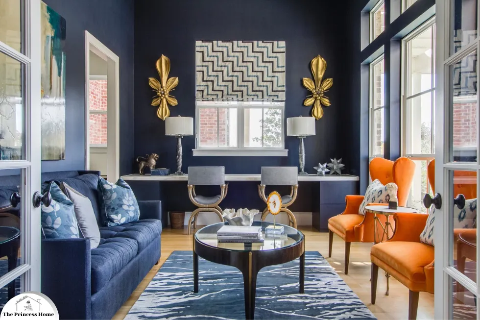
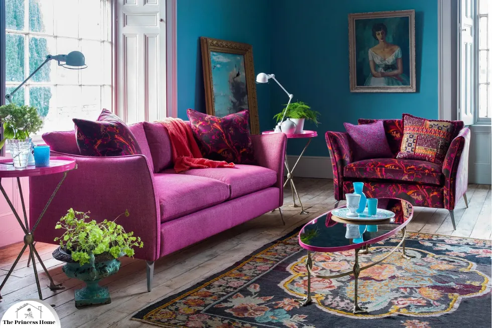
*Purple Color:
Associated with luxury and creativity, purple can add a touch of elegance and sophistication to a space. Lighter shades like lavender are calming, while deeper hues like plum are rich and dramatic.
Purple, with its associations of luxury and creativity, indeed has the power to add an elegant and sophisticated touch to any space. Here’s how different shades of purple can be used to create varying atmospheres:
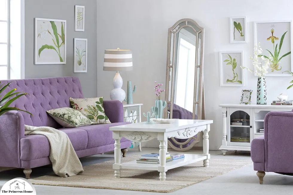
1.Lighter Shades (Lavender &Lilac):
Calming Ambiance: Lighter shades of purple, such as lavender and lilac, can create a serene and calming atmosphere, making them suitable for bedrooms, nurseries, or meditation spaces.
Soft Furnishings: Incorporate lavender or lilac throw pillows, blankets, or curtains to infuse the space with a sense of tranquility and relaxation.
Accent Walls: Paint one wall in a light purple hue to add a subtle pop of color without overwhelming the room.
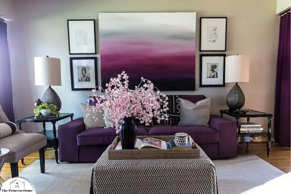
2.Deeper Hues (Plum &Eggplant):
Dramatic Impact: Deeper shades of purple, like plum and eggplant, can add a sense of richness and drama to a space, perfect for living rooms, dining rooms, or home offices.
Statement Pieces: Use plum-colored sofas, armchairs, or accent furniture pieces to create a bold focal point and add a touch of luxury to the room.
Wall Coverings: Consider wallpaper in deep purple tones to create a striking backdrop for artwork or decorative accessories.
Purple as a Complementary Color
Neutral Pairings: Pair purple with neutral colors like white, beige, or gray to create a balanced and sophisticated color palette.
Metallic Accents: Add metallic accents in gold, silver, or bronze to complement the richness of purple and enhance its luxurious appeal.
Contrasting Colors: Combine purple with complementary colors like yellow, green, or turquoise to create vibrant and dynamic interiors.
Psychological Considerations
Luxury and Creativity: Purple is often associated with luxury, creativity, and royalty, making it a versatile choice for adding elegance and sophistication to interior spaces.
Stimulating Creativity: In home offices or creative studios, purple can stimulate creativity and inspire innovative thinking, making it an ideal color choice for fostering a productive environment.
3.Tips for Using Purple
Balance with Neutrals: Balance deeper shades of purple with neutral tones to prevent the space from feeling too dark or overwhelming.
Layer with Textures: Incorporate a variety of textures, such as velvet, silk, or faux fur, to add depth and dimension to a purple-themed room.
Consider Lighting: Pay attention to lighting conditions when choosing purple paint or furnishings, as natural and artificial light can affect how the color appears in the space.
By incorporating purple into your interior design scheme, you can create sophisticated and luxurious spaces that evoke a sense of creativity, elegance, and tranquility, tailored to your personal style and preferences.
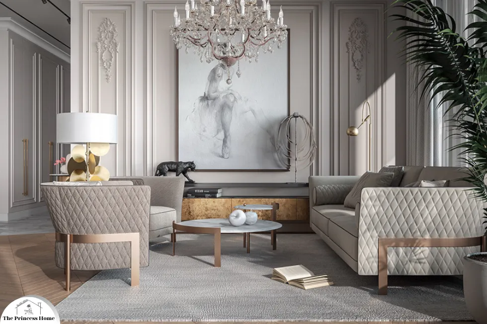
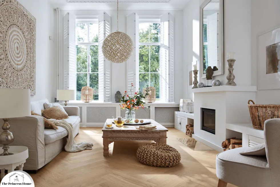
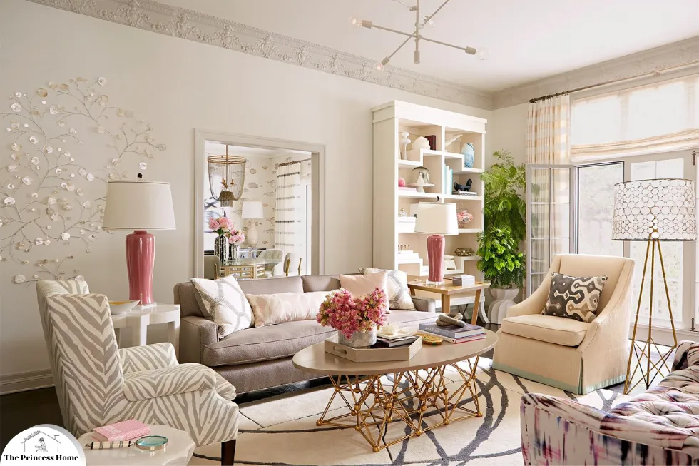
3.*Neutral Colors: Versatile &Timeless
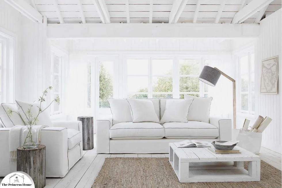
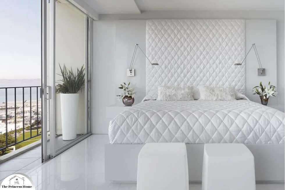
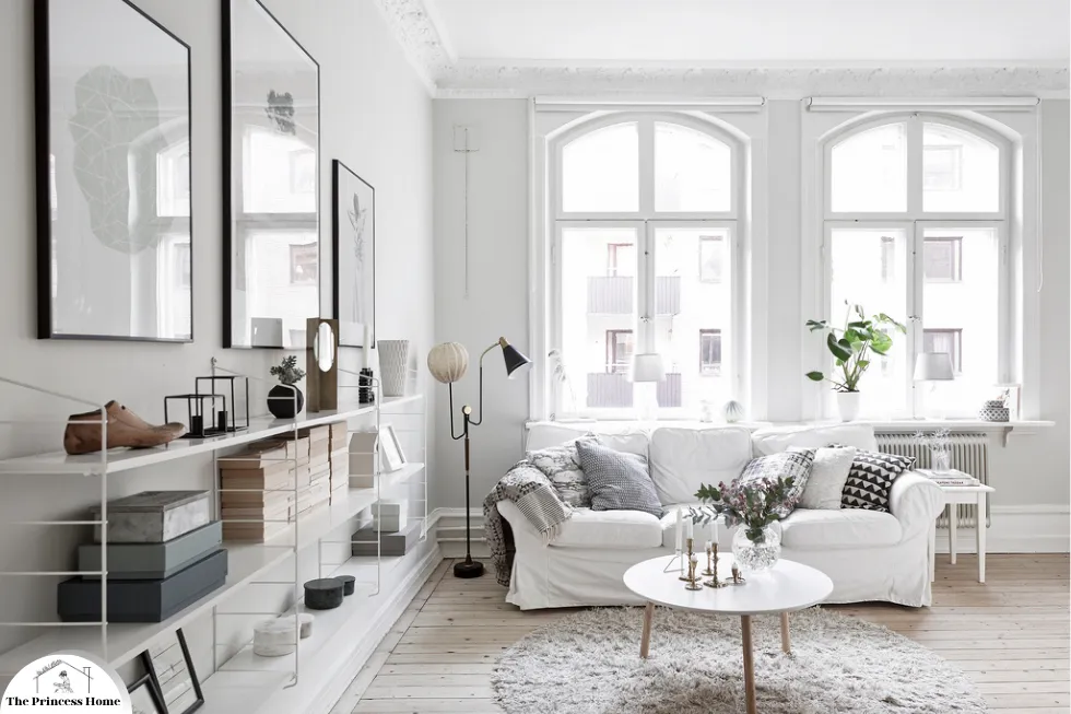
*White Color:
Symbolizing purity and cleanliness, white can make spaces feel larger and more open. It is a popular choice for modern, minimalist designs.
White, with its symbolism of purity and cleanliness, indeed has the power to transform spaces, making them feel larger, more open, and inviting. Here’s how white can be utilized effectively in interior design, particularly in modern and minimalist aesthetics:

1.White in Interior Design
Space Expansion:
Illusion of Space: White reflects light, creating an illusion of spaciousness, making it an excellent choice for smaller rooms or those with limited natural light.
Openness: Using white on walls, ceilings, and floors can visually expand the boundaries of a room, creating a sense of airiness and openness.
Clean &Minimalist Aesthetic:
Simplicity: White is a hallmark of minimalist design, emphasizing clean lines, simplicity, and a clutter-free environment.
Focus on Form: In minimalist interiors, white serves as a neutral backdrop, allowing architectural elements and furnishings to stand out and be appreciated for their form and function.
Versatility and Adaptability:
Blank Canvas: White serves as a blank canvas, providing endless possibilities for personalization and customization with accents of color, texture, or pattern.
Timelessness: White is a timeless and classic choice that transcends trends, ensuring longevity and versatility in interior design schemes.
2.Tips for Using White
Layering and Texture: Incorporate different textures and materials, such as wool, linen, or wood, to add depth and interest to a predominantly white space.
Warmth with Accents: Introduce warmth and personality with accents of color, metallic finishes, or natural elements like plants or artwork.
Consider Lighting: Pay attention to lighting design to prevent a white space from feeling cold or sterile. Use warm lighting fixtures and strategic placement to create ambiance and coziness.
Psychological Considerations
Cleanliness and Purity: White is often associated with cleanliness and purity, creating a sense of freshness and tranquility in interior spaces.
Psychological Effects: White can have a calming effect on the mind, promoting clarity, focus, and a sense of well-being, making it an ideal choice for spaces where relaxation and concentration are paramount.
3.White in Different Rooms
Living Rooms: White can create a serene and inviting atmosphere in living rooms, allowing furniture and decor to take center stage.
Kitchens: White kitchens are timeless and versatile, offering a clean and bright environment for cooking and entertaining.
Bathrooms: White bathrooms evoke a spa-like ambiance, enhancing relaxation and cleanliness.
By incorporating white into your interior design, you can create visually stunning and harmonious spaces that promote a sense of purity, openness, and tranquility, while also allowing for personalization and expression of style.

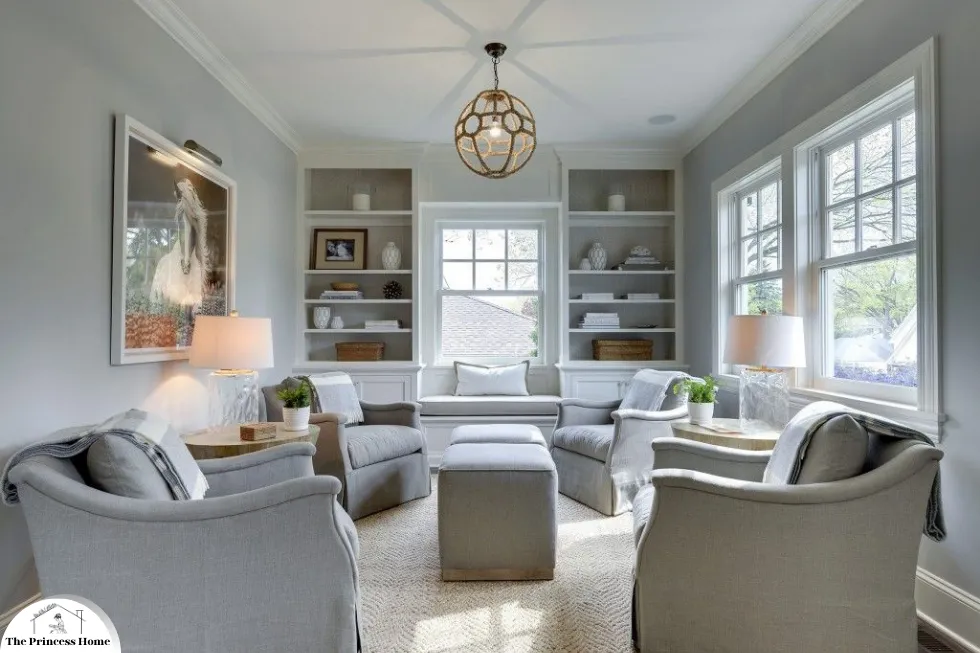
*Gray Color:
A versatile and sophisticated neutral, gray can be both warm and cool, making it suitable for any room. It pairs well with bolder colors and adds a touch of elegance.
Gray, with its versatility and sophistication, is indeed a fantastic neutral choice for interior design. Here’s how gray can be utilized effectively in various rooms, adding both warmth and coolness to the space while maintaining an elegant ambiance:
1.Gray in Interior Design
Versatility:
Neutral Base: Gray serves as an excellent neutral base that complements a wide range of colors, styles, and decor schemes.
Adaptability: Whether warm or cool, light or dark, gray can adapt to different design aesthetics, from modern and minimalist to traditional and eclectic.
Sophistication and Elegance:
Timeless Appeal: Gray exudes a timeless elegance that adds sophistication to any room, creating a refined and polished look.
Subtle Glamour: Metallic accents like silver, chrome, or brushed nickel pair beautifully with gray, adding a touch of glamour and luxury to the space.
Enhanced by Bolder Colors:
Contrast: Gray serves as an excellent backdrop for bolder colors, allowing them to pop and stand out against the neutral backdrop.
Balance: When paired with vibrant hues or rich tones, gray helps create a balanced and harmonious color scheme, preventing the space from feeling overwhelming.
2.Tips for Using Gray
Mixing Shades: Experiment with different shades of gray, from light and airy to dark and moody, to create depth and dimension in the space.
Texture and Layering: Incorporate various textures and materials, such as wool, velvet, or metallic finishes, to add visual interest and tactile appeal.
Accent Colors: Introduce accent colors in accessories, artwork, or furnishings to enhance the gray palette and infuse the space with personality.
Lighting Considerations: Pay attention to lighting design to ensure that gray spaces feel warm and inviting rather than cold and dreary. Use a combination of natural and artificial lighting sources to create ambiance and depth.
Psychological Considerations
Stability and Balance: Gray is often associated with stability and balance, creating a sense of calmness and tranquility in interior spaces.
Sophistication and Serenity: Gray exudes sophistication and serenity, making it an ideal choice for creating elegant and peaceful environments.
3.Gray in Different Rooms
Living Rooms: Gray living rooms can be both cozy and chic, offering a versatile backdrop for various design styles and color palettes.
Bedrooms: Gray bedrooms evoke a sense of tranquility and relaxation, providing a serene retreat for rest and rejuvenation.
Home Offices: Gray home offices promote focus and concentration, providing a neutral and calming environment for work and productivity.
By incorporating gray into your interior design, you can create versatile, sophisticated, and inviting spaces that exude elegance and charm while offering endless possibilities for personalization and expression of style.
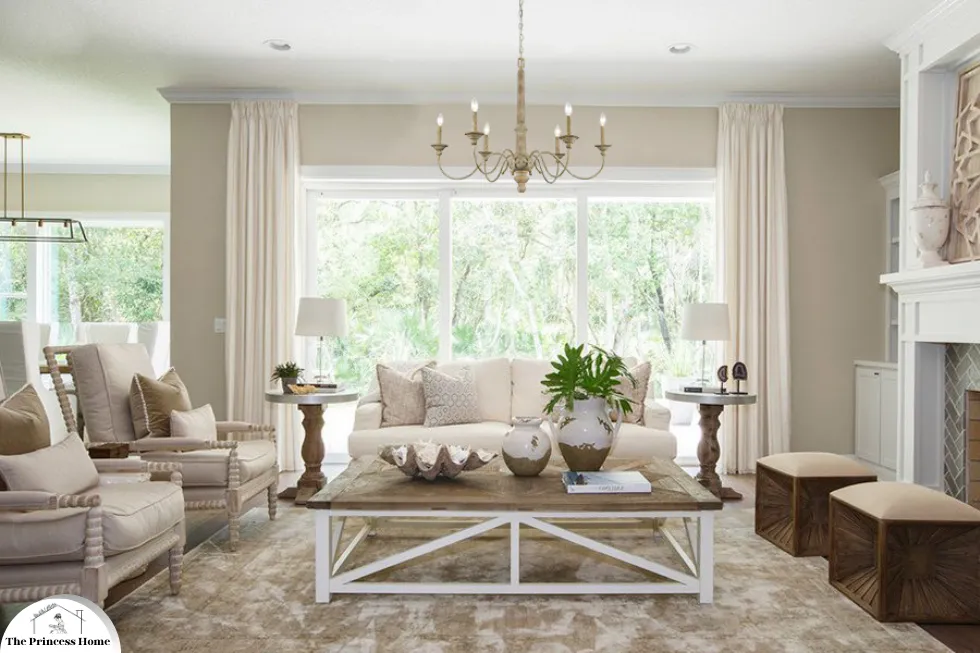
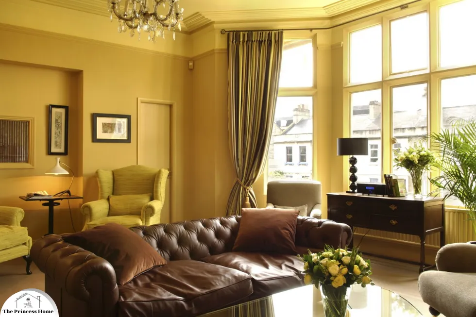
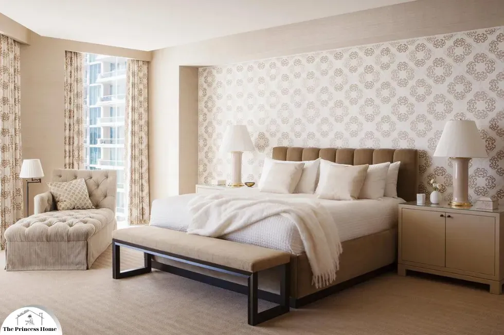
*Beige Color:
Warm and inviting, beige is a classic choice that adds coziness without overwhelming a space.
Beige, with its warm and inviting qualities, is indeed a classic choice in interior design. Here’s how beige can enhance the coziness of a space without overwhelming it:
1.Beige in Interior Design
Warmth and Comfort:
Neutral Base: Beige serves as a versatile neutral base that creates a warm and inviting atmosphere in any room.
Soft and Subtle: Beige has a soft and subtle appearance that adds coziness to the space without dominating or overpowering other design elements.
Timeless Elegance:
Classic Appeal: Beige is a timeless and classic choice that never goes out of style, making it suitable for both traditional and contemporary interiors.
Sophisticated Aesthetic: Beige exudes an understated elegance that enhances the overall aesthetic of the space, creating a sense of refinement and sophistication.
Versatility and Flexibility:
Complementary Palette: Beige pairs well with a wide range of colors, textures, and patterns, allowing for endless possibilities in decor and styling.
Adaptable to Any Room: Whether used as wall paint, flooring, upholstery, or furnishings, beige is versatile enough to suit any room in the home, from living rooms and bedrooms to kitchens and bathrooms.
2.Tips for Using Beige
Layering with Textures: Incorporate various textures and materials, such as linen, wool, or wood, to add depth and visual interest to a predominantly beige space.
Accent Colors: Introduce accent colors in accessories, artwork, or furnishings to complement the beige palette and add personality to the room.
Lighting Considerations: Pay attention to lighting design to prevent a beige space from feeling dull or flat. Use a combination of natural and artificial lighting sources to create ambiance and warmth.
Psychological Considerations
Comfort and Serenity: Beige is often associated with comfort and serenity, creating a sense of relaxation and tranquility in interior spaces.
Timeless Charm: Beige exudes a timeless charm that evokes feelings of familiarity and nostalgia, making it a comforting and reassuring choice in home decor.
3.Beige in Different Rooms
Living Rooms: Beige living rooms offer a cozy and inviting atmosphere, providing a neutral backdrop for various design styles and color palettes.
Bedrooms: Beige bedrooms promote relaxation and restfulness, offering a serene retreat for unwinding and rejuvenation.
Bathrooms: Beige bathrooms exude a spa-like ambiance, enhancing cleanliness and tranquility.
By incorporating beige into your interior design, you can create warm, inviting, and comfortable spaces that exude timeless elegance and charm, while also offering flexibility and versatility in decor and styling options.
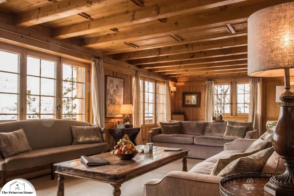
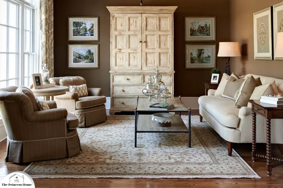
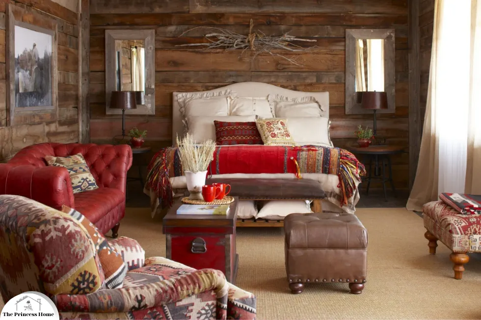
*Brown color:
Brown, often associated with stability, comfort, and reliability, is a versatile and grounding color in interior design. Understanding the psychological implications of brown can help create warm, inviting, and cohesive spaces. Here’s how brown can be effectively utilized in decoration:
Psychological Implications of Brown
Stability and Comfort: Brown evokes a sense of stability and security, making spaces feel grounded and dependable. It also adds warmth and coziness, creating a comforting atmosphere.
Versatility: As a neutral color, brown pairs well with a variety of colors and styles, fitting seamlessly into both traditional and contemporary designs.
Natural Connection: Brown’s natural undertones make it ideal for creating an organic and harmonious look, often used to bring elements of the outdoors inside.
1.Tips for Using Brown
Walls:
Warm Tones: Use warm shades of brown on walls to create a cozy and inviting environment.
Accent Walls: Choose a deeper brown for an accent wall to add depth and interest without overwhelming the space.
Furniture and Upholstery:
Wood Furniture: Incorporate natural wood furniture to bring rich, organic tones of brown into the space.
Leather and Fabrics: Use brown leather or fabric upholstery for a sophisticated and comfortable seating area.
Flooring:
Wood or Laminate: Opt for wooden or laminate flooring in brown tones for a warm foundation.
Rugs and Carpets: Add brown rugs or carpets to enhance coziness and tactile appeal.
Decorative Elements:
Accents: Introduce brown accents through cushions, throws, and decor to complement and unify the color scheme.
Natural Elements: Use wicker, rattan, and natural stone to emphasize the organic qualities of brown.

2.Brown in Different Rooms
Living Rooms: Create a warm, welcoming environment with brown furniture, wood finishes, and earthy decor.
Bedrooms: Promote relaxation with brown bed frames, bedside tables, and soft furnishings.
Kitchens: Add warmth and richness with wooden cabinets, countertops, and flooring.
Home Offices: Foster productivity and focus with brown elements in home offices.
By incorporating brown into your interior design, you can create warm, inviting, and cohesive spaces that exude stability, comfort, and a connection to nature.
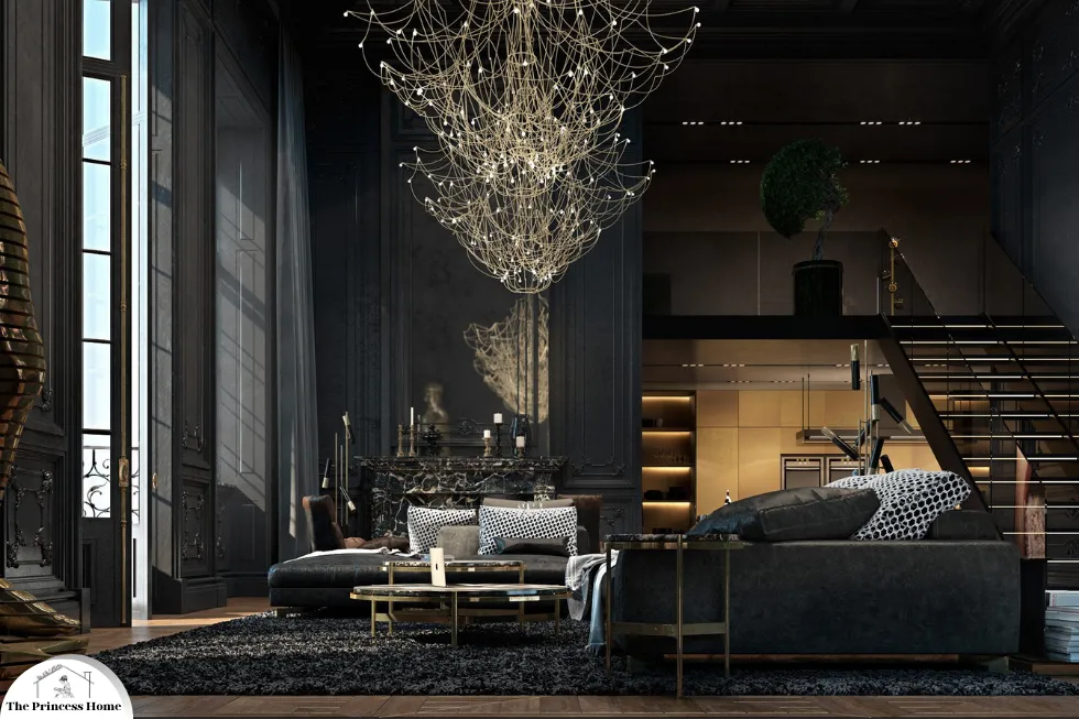
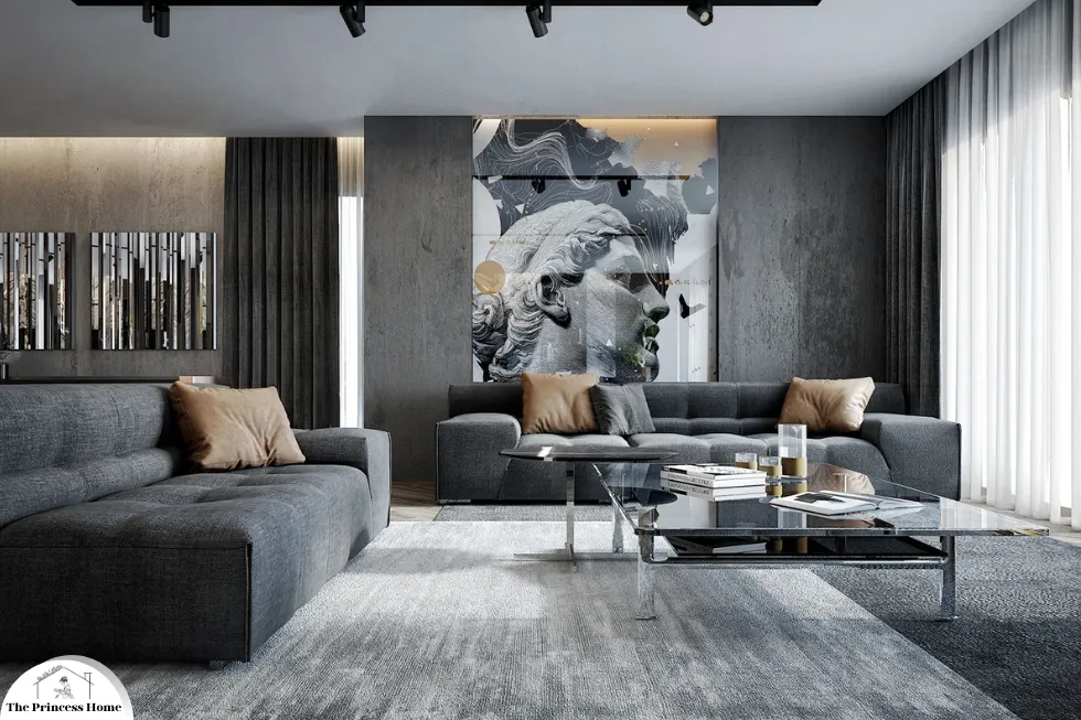
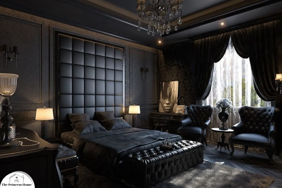
*Black color:
Black, with its bold and dramatic presence, can make a striking statement in interior design. Here’s how black can be utilized effectively to create various atmospheres:
Black in Interior Design
Dramatic Focal Points:
Accent Walls: Painting one wall in black can create a dramatic focal point in the room, adding depth and visual interest.
Statement Furniture: Incorporating black furniture pieces, such as sofas, tables, or cabinets, can anchor the space and create a sense of sophistication.
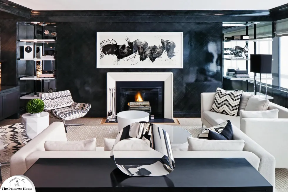
1.Contrast &Depth:
High Contrast: Black creates a striking contrast when paired with lighter colors, such as white or beige, adding depth and dimension to the space.
Texture and Pattern: Black can enhance the texture and pattern of furnishings and decor elements, providing visual intrigue and complexity.
Modern Elegance:
Contemporary Aesthetic: Black is often associated with modern and minimalist design aesthetics, conveying a sense of sleekness and sophistication.
Luxurious Accents: Incorporating black accents, such as metallic finishes or glossy surfaces, can add a touch of luxury and opulence to the space.
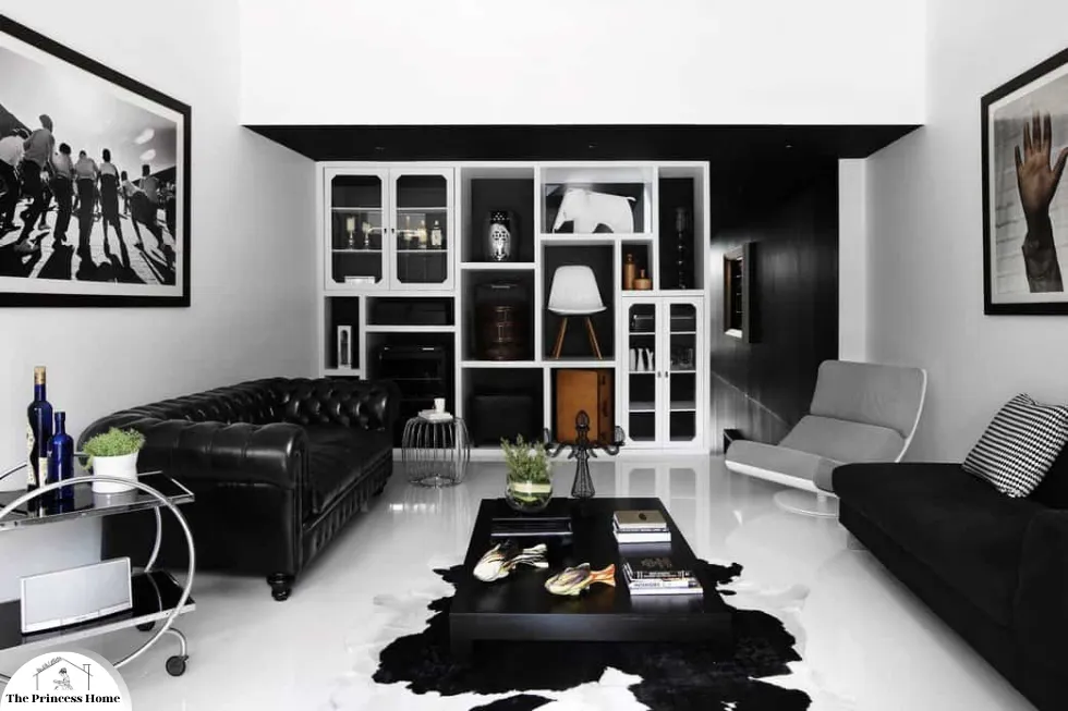
2.Tips for Using Black
Balance with Lighter Colors: Pair black with lighter colors to prevent the space from feeling too dark or overwhelming. Use white or other neutrals as a counterbalance to create visual harmony.
Strategic Placement: Use black strategically as an accent color or focal point rather than covering large surfaces entirely to avoid creating a heavy or oppressive atmosphere.
Consider Lighting: Ensure adequate lighting in the space to prevent black from absorbing too much light and making the room feel dim. Use lighting fixtures strategically to highlight black elements and create ambiance.
Psychological Considerations
Strength and Sophistication: Black is often associated with strength, power, and sophistication, making it a bold choice in interior design.
Mystery and Intrigue: Black can evoke feelings of mystery and intrigue, adding an element of drama and allure to the space.
3.Black in Different Rooms
Living Rooms: Black accents, such as throw pillows, rugs, or artwork, can add drama and sophistication to living room decor.
Bedrooms: Black can create a cozy and intimate atmosphere in bedrooms when used in bedding, curtains, or accent walls.
Bathrooms: Black fixtures and accessories, such as faucets, mirrors, or storage containers, can add a touch of elegance and luxury to bathroom design.
By incorporating black into your interior design, you can create bold and stylish spaces that exude sophistication and modernity, while also adding depth and visual interest to the room.
4.Cultural Meanings of Color
Cultural context plays a crucial role in how colors are perceived and used in decoration. Different cultures attach various meanings and significance to colors, which can influence design choices.
1.Western Cultures
Black: Often associated with sophistication and formality, black is used in elegant and modern designs. However, it can also represent mourning and sadness.
White: Symbolizes purity and simplicity, commonly used in weddings and minimalist designs. It can also signify sterility and emptiness in some contexts.
Red: Represents passion and energy but is also associated with danger and warning.
2.Eastern Cultures
Red: In many Asian cultures, red is a symbol of luck, prosperity, and happiness. It is frequently used in celebrations and ceremonies.
White: Often associated with mourning and funerals, unlike in Western cultures where it represents purity.
Yellow: In China, yellow is a royal color, representing power and wealth.
3.Middle Eastern Cultures
Green: A sacred color in Islam, symbolizing paradise and prosperity. It is often used in religious contexts.
Blue: Seen as protective and is used in various designs to ward off evil spirits.
Practical Applications of Color in Decoration
Applying color effectively in decoration involves more than just picking favorite hues. It requires a thoughtful approach to how colors interact with each other, the space, and the lighting.
Color Schemes
Monochromatic: Uses variations in lightness and saturation of a single color. This creates a cohesive and harmonious look, perfect for modern and minimalist designs.
Analogous: Combines colors that are next to each other on the color wheel. This scheme is pleasing to the eye and often found in nature, creating serene and comfortable designs.
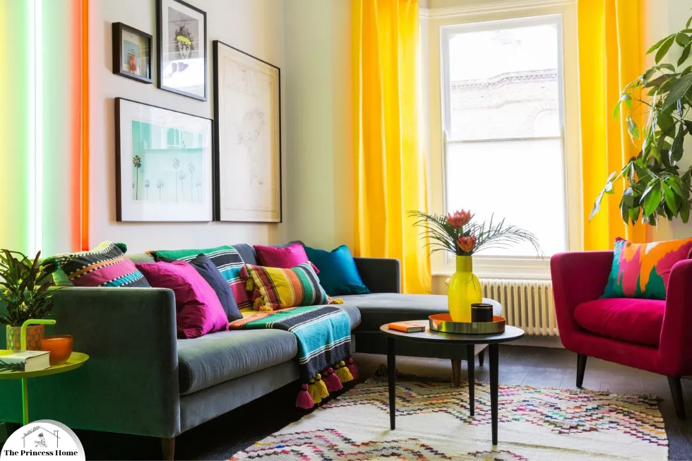
Complementary: Pairs colors opposite each other on the color wheel, creating a vibrant and high-contrast look. This scheme is dynamic and can make elements pop.
Triadic: Uses three colors evenly spaced around the color wheel. It offers a balanced and vibrant palette, suitable for playful and energetic spaces.
1.Accent Colors
Using accent colors is a strategic way to introduce vibrancy and interest without overwhelming a space. Accents can be incorporated through accessories, artwork, textiles, and furniture. A neutral base with bold accent colors can create focal points and add character to a room.
2.Lighting &Color Interaction
Lighting significantly affects how colors appear. Natural light brings out the true colors, while artificial lighting can alter their perception. Warm lighting enhances warm colors, making spaces feel cozier, while cool lighting can make colors appear sharper and more vibrant. Understanding the interaction between lighting and color can help in choosing the right shades for different times of the day and various lighting conditions.
3.Texture and Color
Texture adds another layer of depth to color in decoration. Matte and glossy finishes reflect light differently, impacting how colors are perceived. Textured surfaces like wood, fabric, and stone introduce complexity and richness to color schemes, creating a more dynamic and engaging environment. Texture plays a crucial role in interior design, adding depth, visual interest, and tactile appeal to color schemes.
Here’s how different textures can enhance the perception and impact of colors in decoration:
1.Matte &Glossy Finishes
Reflection of Light: Matte finishes absorb light, creating a soft and muted appearance, while glossy finishes reflect light, resulting in a brighter and more vibrant look.
Perceived Color Intensity: The way light interacts with matte and glossy surfaces can influence how colors are perceived. Glossy finishes may intensify colors, while matte finishes can make colors appear more subdued.
Contrast and Balance: Combining matte and glossy finishes can create contrast and balance in a room, adding visual interest and depth to the color scheme.
2.Textured Surfaces
Complexity and Richness: Textured surfaces like wood, fabric, stone, or brick introduce complexity and richness to color schemes, enhancing the overall aesthetic of the space.
Tactile Appeal: Textured surfaces not only add visual interest but also provide tactile appeal, inviting touch and interaction, which can contribute to a more dynamic and engaging environment.
Natural Elements: Incorporating natural textures like wood or stone brings elements of the outdoors inside, adding warmth, authenticity, and a sense of connection to nature to the space.
3.Application in Decoration
Wall Treatments: Textured wall treatments, such as wallpaper, textured paint, or decorative panels, can add dimension and character to a room, enhancing the visual impact of color.
Furniture and Upholstery: Textured fabrics, such as velvet, linen, or wool, can add softness and warmth to furniture pieces, complementing the color palette and adding tactile interest.
Flooring: Textured flooring materials, such as hardwood, laminate, or natural stone, can anchor the space and provide a solid foundation for the color scheme, adding depth and visual richness to the room.
4.Psychological Impact
Sensory Experience: Texture stimulates the senses, creating a multi-sensory experience that enhances the overall ambiance of the space.
Emotional Response: Different textures can evoke different emotions and moods. Soft, plush textures may create a sense of comfort and coziness, while rough or rugged textures may evoke a more rustic or organic feel.
By incorporating a variety of textures into decoration, you can elevate the impact of colors, adding depth, richness, and complexity to the overall design scheme, and creating a more dynamic and engaging environment.
Conclusion
Color is a fundamental element of decoration that goes beyond mere aesthetics. Its power to influence mood, convey cultural meanings, and define spaces makes it an essential consideration in any design project. By understanding the psychological effects of colors, their cultural significances, and practical applications, one can harness the full potential of color to create harmonious, vibrant, and meaningful spaces. Whether aiming for a calm sanctuary, a lively social hub, or an elegant retreat, the thoughtful use of color can transform any space into a reflection of personal style and desired ambiance.
Frequently Asked Questions about the Importance of Color in Decoration
1. How does color affect the mood of a room?
Colors can have a profound impact on the mood and atmosphere of a room. Warm colors like red, orange, and yellow tend to energize and evoke feelings of warmth and coziness. Cool colors like blue, green, and purple are calming and can create a sense of tranquility. Neutral colors like white, gray, and beige offer versatility and can either calm or energize depending on their use in the overall color scheme.
2. What is color psychology, and why is it important in decoration?
Color psychology studies how different colors influence human emotions and behaviors. In decoration, understanding color psychology is important because it helps in selecting hues that can enhance the desired mood and functionality of a space. For example, blue is often used in bedrooms to promote relaxation, while red might be used in dining rooms to stimulate appetite and conversation.
3. How do cultural differences impact the use of color in decoration?
Cultural differences significantly impact color perception and use in decoration. For instance, in Western cultures, white often symbolizes purity and is commonly used in weddings, while in some Eastern cultures, it is associated with mourning. Understanding these cultural meanings can guide more appropriate and respectful design choices, especially in multicultural or globally-inspired designs.
4. What are some effective color schemes for home decoration?
Effective color schemes include:
- Monochromatic: Variations of a single color, creating a cohesive and harmonious look.
- Analogous: Colors next to each other on the color wheel, providing a serene and comfortable design.
- Complementary: Colors opposite each other on the color wheel, offering a vibrant and dynamic look.
- Triadic: Three evenly spaced colors on the color wheel, creating a balanced and vibrant palette.
5. How can accent colors be used in decoration?
Use accent colors to add vibrancy and interest to a space without overwhelming it. Incorporate them through accessories, artwork, textiles, and furniture. For example, give a neutral room a fresh look with bold accent pillows, rugs, or vases. The key is to use accents sparingly to create focal points and add character.
6. What role does lighting play in color perception in decoration?
Lighting plays a crucial role in how colors are perceived. Natural light shows true colors, while artificial lighting can change their appearance. Warm lighting enhances warm colors, making spaces feel cozy, while cool lighting sharpens cool colors, making them appear more vibrant. It’s important to consider the type of lighting when choosing colors to ensure they look as intended in different conditions.
7. How can texture affect the use of color in decoration?
Texture adds depth and dimension to color in decoration. Matte and glossy finishes reflect light differently, affecting how colors are seen. Textured surfaces such as wood, fabric, and stone introduce complexity and richness, making color schemes more dynamic. Combining textures with color can create a more engaging and visually interesting space.
8. Can the same color have different effects in different rooms?
Yes, the same color can have different effects depending on the room’s function, lighting, and surrounding colors. For example, blue in a bedroom can be calming, promoting sleep. However, blue in a kitchen might feel too cold and uninviting. Therefore, the context of the room and its use significantly influence how a color is perceived and felt.
9. What are some tips for choosing the right colors for a small space?
For small spaces, light and neutral colors can make the room feel larger and more open. Additionally, mirrors and reflective surfaces can also enhance this effect. Furthermore, using a monochromatic color scheme can create a seamless look that visually expands the space. Finally, introducing pops of color through accents can add interest without overwhelming the area.
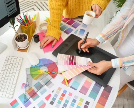
10. How can I test colors before committing to them in my decoration project?
To test colors before committing:
- Use paint samples and apply them to small sections of walls to see how they look in different lighting.
- Consider digital tools and apps that allow you to visualize colors in your space.
- Use fabric swatches and color boards to compare different shades and finishes.
- Live with the test colors for a few days to see how they feel at different times of the day and in various lighting conditions.

