

Designing room layouts is not just about arranging furniture and decor; it’s about creating harmonious spaces that evoke specific moods and emotions. One crucial aspect of interior design that often gets overlooked is color balance. Color has the power to transform a room, affecting its atmosphere, perception of space, and even the occupants’ well-being.
In this article, we delve into the intricate art of designing room layouts with a keen emphasis on achieving optimal color balance
1.Understanding Color Theory:
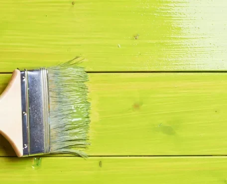
Before diving into the specifics of room layout design, it’s essential to grasp the fundamentals of color theory. The color wheel, comprising primary, secondary, and tertiary colors, serves as the foundation for understanding color relationships. Colors can be categorized into warm (e.g., red, orange, yellow) and cool (e.g., blue, green, purple), each evoking distinct feelings and associations. Complementary, analogous, and triadic color schemes are commonly used to create visually appealing compositions.
Understanding the Color Wheel
Understanding color theory is paramount in creating visually appealing and harmonious room layouts. At its core lies the color wheel, a fundamental tool that categorizes colors into primary, secondary, and tertiary hues. By comprehending the relationships between these colors, designers can effectively manipulate them to achieve desired effects.
Primary, Secondary, and Tertiary Colors
The color wheel typically consists of twelve hues, with primary colors—red, blue, and yellow—at its core. These primary colors cannot be created by mixing other colors and serve as the building blocks for all other hues. When combined in various proportions, primary colors give rise to secondary colors—green, orange, and purple. These secondary colors sit equidistant between their respective primary colors on the wheel.
Tertiary Colors
Expanding upon this foundation, tertiary colors emerge from the mixture of primary and secondary hues. For example, combining red and orange yields red-orange, a tertiary color situated between the two on the color wheel. This process continues, resulting in a spectrum of colors that form the basis of color theory.
Warm and Cool Tones
Beyond categorization, colors can also be classified into warm and cool tones based on their perceptual qualities. Warm colors, including reds, oranges, and yellows, evoke feelings of warmth, energy, and vibrancy. In contrast, cool colors such as blues, greens, and purples convey a sense of calmness, serenity, and relaxation.
Application in Room Layout Design
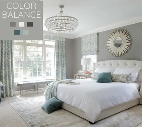
Understanding the emotional and psychological associations linked with warm and cool colors is vital for effective room layout design. Warm hues can create an inviting and stimulating atmosphere, making them suitable for areas where socialization and activity are encouraged, such as living rooms or kitchens. On the other hand, cool tones promote tranquility and reflection, making them ideal for spaces dedicated to relaxation, like bedrooms or reading nooks.
Color Schemes
In addition to understanding individual colors, designers must grasp the concept of color schemes, which dictate how colors interact with one another within a composition. Complementary colors, positioned opposite each other on the color wheel (e.g., red and green), create dynamic contrast and visual interest when paired together. Analogous colors, found adjacent to each other on the wheel (e.g., blue, blue-green, and green), offer a harmonious and cohesive palette suitable for creating serene environments. Triadic color schemes, formed by selecting three colors equidistant from one another on the wheel (e.g., red, blue, and yellow), strike a balance between contrast and harmony.
By leveraging the principles of color theory and understanding the interplay between hues, designers can craft room layouts that resonate with occupants on both a visual and emotional level. Whether aiming to create a cozy retreat or an energetic social hub, mastery of color theory is essential for achieving impactful and memorable interior spaces.
2.The Impact of Color on Room Layouts:
Color profoundly influences how we perceive and experience interior spaces. It can alter the perceived size and shape of a room, as well as affect mood and behavior. For instance, warm colors tend to make spaces feel cozy and intimate, while cool colors create a sense of tranquility and spaciousness. By strategically incorporating color into room layouts, designers can manipulate these effects to achieve desired outcomes.
Balancing Color in Room Layouts:
Achieving balance is key to successful room layout design, and this extends to color selection and distribution.
Here are some strategies for achieving optimal color balance in room layouts:
Establish a Dominant Color:
Choose a dominant color that sets the tone for the room. This color will serve as the foundation upon which other hues are layered. Consider factors such as the room’s function, desired ambiance, and existing decor when selecting the dominant color. Establishing a dominant color is a crucial step in room layout design, as it sets the tone and serves as the foundation for the entire color scheme.
Here’s how to effectively choose a dominant color for your room:
1.Consider the Room’s Function:
The function of the room plays a significant role in determining the appropriate dominant color. For example, in a bedroom intended for relaxation and rest, you might opt for soothing and calming hues like soft blues or muted greens. In contrast, for a lively and energetic space like a home office or playroom, you might choose more vibrant and stimulating colors like yellows or oranges.
2.Think About Desired Ambiance:
The ambiance you wish to create in the room will influence your choice of dominant color. Are you aiming for a cozy and intimate atmosphere? Consider warm and inviting tones such as earthy browns or warm grays. For a fresh and airy feel, lighter shades like soft blues or pale greens can be effective. Take into account how different colors can impact the mood and overall vibe of the space.
3.Take Existing Decor Into Account:
Consider the existing decor and furnishings in the room when selecting the dominant color. Your chosen color should complement the existing elements rather than clash with them. Look at the colors present in larger furniture pieces, flooring, and architectural features like trim or molding. Choose a dominant color that harmonizes with these elements to create a cohesive and unified look.
4.Evaluate Natural Light:
The amount of natural light in the room can also influence your choice of dominant color. Rooms with ample natural light can accommodate deeper and richer hues without feeling too dark or overwhelming. Conversely, in rooms with limited natural light, lighter shades can help to brighten the space and create a more airy feel. Consider how different colors will interact with the lighting conditions in the room.
5.Sample Colors Before Committing:
Before settling on a dominant color, it’s essential to test out different options to see how they look in the space. Paint swatches on the walls or use large fabric samples to get a sense of how the colors will appear in different lighting conditions throughout the day. This will help you make an informed decision and ensure that the dominant color achieves the desired effect in the room.
By carefully considering factors such as the room’s function, desired ambiance, existing decor, natural light, and sampling colors before committing, you can choose a dominant color that sets the perfect tone for your room layout design.
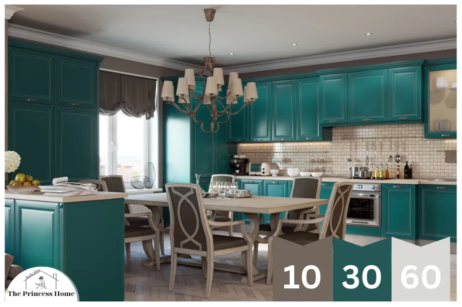
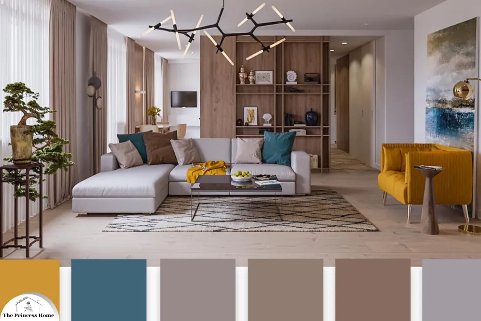
Use the 60-30-10 Rule:
This rule provides a simple yet effective framework for balancing colors in a room. Allocate 60% of the room’s color to the dominant hue, 30% to a secondary color that complements the dominant one, and 10% to an accent color that adds visual interest.
The 60-30-10 rule is a fantastic guideline for creating harmonious color schemes in any space.
Let’s break it down:
60% Dominant Hue: This is the primary color that sets the tone for the room. It should cover the majority of the space and serve as the backdrop for everything else. Whether it’s the walls, large furniture pieces, or flooring, this hue establishes the overall mood.
30% Secondary Color: This color complements the dominant hue and adds depth and interest to the space. It can be used for furniture upholstery, curtains, rugs, or even an accent wall. By choosing a secondary color that harmonizes with the dominant one, you create visual balance and cohesion.
10% Accent Color: This is where you get to inject personality and flair into the room. The accent color should be used sparingly but strategically to draw attention to specific elements like throw pillows, artwork, decorative objects, or small furniture pieces. It’s the pop of color that adds vibrancy and visual interest without overwhelming the space.
By following the 60-30-10 rule, you ensure that your room’s color palette is well-balanced, visually appealing, and cohesive. Whether you’re designing a living room, bedroom, or any other space, this simple formula can help you achieve a harmonious look that feels intentional and polished.

Consider Color Psychology:
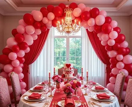
Take into account the psychological effects of color when designing room layouts. For example, blue is often associated with calmness and serenity, making it ideal for bedrooms and bathrooms. In contrast, vibrant hues like red and orange can stimulate energy and excitement, making them suitable for social spaces like living rooms and dining areas. incorporating color psychology into room design can greatly influence the atmosphere and mood of a space.
Here’s how you can apply it:
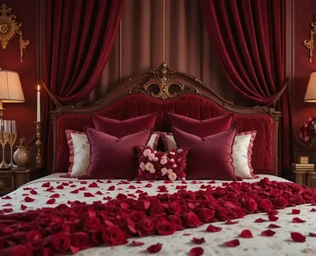
1.Blue: As you mentioned, blue is known for its calming and serene qualities. It can help reduce stress and promote relaxation, making it an excellent choice for bedrooms and bathrooms where tranquility is desired. Soft shades of blue can create a soothing environment conducive to rest and rejuvenation.
2.Green: Green is often associated with nature, growth, and renewal. It has a refreshing and revitalizing effect, making it suitable for spaces where you want to promote harmony and balance. Consider using green in areas like home offices or reading nooks to foster concentration and creativity.
3.Yellow: Yellow is a cheerful and uplifting color that evokes feelings of warmth and happiness. It can brighten up any room and create a sense of optimism and energy. Yellow is perfect for kitchens, dining areas, or any space where you want to encourage socialization and lively conversation.
4.Red and Orange: These vibrant hues are stimulating and energizing. They can increase excitement and enthusiasm, making them ideal for social spaces like living rooms, dining areas, or entertainment rooms. However, it’s essential to use them in moderation as they can be overwhelming if used excessively.
5.Neutral Colors: Shades like beige, gray, and white provide a versatile backdrop for any room. They create a sense of openness and flexibility, allowing you to accentuate other elements in the space. Neutral colors are perfect for creating a timeless and sophisticated look that can easily adapt to changing decor styles.
By understanding the psychological effects of color, you can intentionally select hues that align with the purpose and function of each room, creating environments that promote well-being and comfort.
Create Visual Flow:
Ensure that color is distributed evenly throughout the room to create a sense of visual harmony. Use color to guide the eye from one area of the room to another, drawing attention to focal points and architectural features. Creating visual flow through color distribution is essential for maintaining harmony and coherence in a room.
Here’s how you can achieve it:
1.Color Continuity: Choose a consistent color palette that flows seamlessly throughout the room. This doesn’t mean every surface needs to be the same color, but there should be a cohesive theme tying everything together. Consider using variations of your dominant and secondary colors to create depth while maintaining unity.
2.Focal Points: Use color strategically to highlight focal points or architectural features in the room. For example, if you have a fireplace or a feature wall, consider painting or accenting it with a bold color to draw attention. This not only creates visual interest but also helps anchor the room’s design.
3.Balance and Contrast: Balance the distribution of color to create visual interest without overwhelming the space. Pair lighter and darker shades to create contrast and depth. For instance, if you have a predominantly light-colored room, introduce pops of a darker hue through accessories or furniture to add dimension.
4.Flow Lines: Use color to establish flow lines that guide the eye naturally through the room. This can be achieved by arranging furniture and accessories in a way that creates a visual path, with color serving as markers along the way. Consider the layout of the room and how you can use color to enhance the sense of movement and continuity.
5.Transitions: Pay attention to how colors transition between different areas of the room or between adjoining rooms. Aim for smooth transitions by using complementary or coordinating colors that complement each other well. This helps create a sense of cohesion and fluidity throughout the space.
By carefully considering the distribution of color and its role in guiding the eye, you can create a visually pleasing environment where every element feels connected and purposeful.
Experiment with Texture and Finish:
Texture and finish can significantly impact how color is perceived within a space. Matte finishes absorb light and can make colors appear deeper and richer, while glossy finishes reflect light and can make colors appear brighter and more vibrant. Consider incorporating a variety of textures and finishes to enhance the visual interest of the room. experimenting with texture and finish is a great way to add depth and visual interest to a room, while also influencing how colors are perceived.
Here’s how you can leverage texture and finish to enhance your color scheme:
1.Matte Finishes:
Matte finishes have a soft, non-reflective surface that absorbs light, giving colors a more subdued and velvety appearance. They work well for creating a cozy and intimate atmosphere, particularly in spaces where you want to evoke a sense of warmth and comfort, such as bedrooms or reading nooks. Consider using matte paint on walls or matte upholstery fabrics for furniture to add a touch of elegance and sophistication.
2.Glossy Finishes:
Glossy finishes, on the other hand, have a reflective surface that bounces light, making colors appear brighter and more vibrant. They are perfect for adding a sense of glamour and luxury to a room, especially in areas like kitchens or bathrooms where you want to create a sleek and polished look. Incorporate glossy tiles, lacquered furniture, or metallic accents to introduce shine and visual impact.
3.Textured Surfaces:
Introducing texture to walls, floors, and furnishings can add tactile interest and dimension to a room. Textured surfaces can range from rough and tactile to smooth and polished, offering a wide variety of options to suit different design styles and preferences. Consider incorporating elements like exposed brick walls, textured wallpaper, woven rugs, or wood grain finishes to add richness and character to the space.
4.Mixing Textures &Finishes:
Don’t be afraid to mix and match different textures and finishes within the same space. Combining matte and glossy surfaces, as well as contrasting smooth and rough textures, can create a dynamic interplay of light and shadow, adding visual intrigue and complexity to the room. Just be sure to maintain balance and cohesion by sticking to a cohesive color palette and overall design theme.
By carefully considering the interplay of texture and finish alongside your chosen color scheme, you can create a multi-dimensional and visually captivating space that feels both inviting and sophisticated.
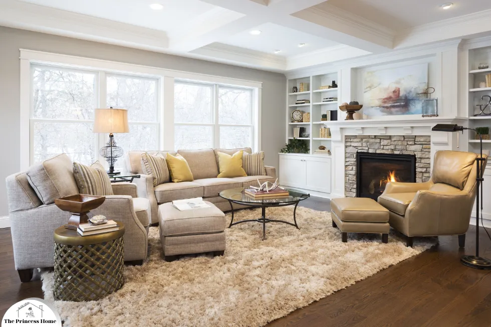
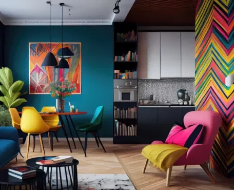
Case Study:
A Balanced Room Layout:
To illustrate these principles in action, let’s consider a hypothetical living room design. The dominant color is a soft neutral beige, which covers the walls and large furniture pieces such as the sofa and area rug. A secondary color, such as muted blue, is introduced through accent pillows, artwork, and decorative accessories. Finally, an accent color like mustard yellow is sparingly used in small doses, such as throw blankets or lampshades, to add pops of visual interest.
Conclusion:
Designing room layouts with a focus on color balance is an art form that requires careful consideration of various factors, including color theory, psychology, and spatial planning. By understanding how color influences perception and mood, designers can create spaces that are both visually stunning and functional. Whether aiming to evoke a sense of tranquility in a bedroom or promote sociability in a living room, mastering the art of color balance is essential for achieving harmonious interior environments.
Here are some frequently asked questions
Q1: How do I determine the dominant color for a room?
A: Selecting the dominant color for a room depends on several factors, including the room’s function, desired ambiance, and existing decor. Consider whether you want the room to feel cozy and intimate (warm colors like red or orange), tranquil and spacious (cool colors like blue or green), or vibrant and energetic (bold colors like yellow or purple). Take cues from the room’s purpose and the overall aesthetic you wish to achieve to determine the dominant color.
Q2: What is the 60-30-10 rule, and how do I apply it to room design?
A: The 60-30-10 rule is a guideline for balancing colors in a room’s design. It suggests allocating 60% of the room’s color to the dominant hue, 30% to a secondary color that complements the dominant one, and 10% to an accent color for visual interest. To apply this rule, start by choosing your dominant color, then select a secondary color that harmonizes with it, and finally, add pops of an accent color sparingly throughout the room to create balance and visual appeal.
Q3: Can you explain how texture and finish impact color perception in a room?
A: Texture and finish play a significant role in how color is perceived within a space. Matte finishes absorb light, resulting in colors appearing deeper and more saturated. On the other hand, glossy finishes reflect light, making colors appear brighter and more vibrant. By incorporating a variety of textures and finishes into your room design, you can enhance the visual interest and depth of color, ultimately influencing the overall mood and ambiance of the space.
Q4: How can I ensure that color is distributed evenly throughout a room?
A: To ensure that color is distributed evenly throughout a room, consider the layout and placement of furniture, decor, and architectural elements. Use color to create a sense of visual flow by strategically incorporating it into various areas of the room, such as walls, furniture, accessories, and artwork. Pay attention to the balance of color and avoid clustering too much of one hue in a single area. Additionally, consider the room’s focal points and architectural features, using color to draw attention to these elements and create a cohesive design scheme.
Q5: Are there any specific color combinations or palettes that work best for certain rooms?
A: While there are no hard and fast rules for color combinations, certain palettes tend to work well in specific rooms based on their function and desired ambiance. For example, calming hues like blues and greens are often used in bedrooms and bathrooms to promote relaxation and tranquility. Warm, inviting tones such as earthy neutrals or soft pastels can create a cozy atmosphere in living rooms and dining areas. Ultimately, the best color palette for a room depends on individual preferences, the room’s purpose, and the overall design scheme you wish to achieve.

