
Color Harmony: Color is one of the most powerful elements in design, capable of evoking emotions, setting moods, and influencing perceptions. Understanding how colors interact and harmonize with each other is crucial for designers across various disciplines, from graphic design to interior decoration. In the vast realm of color theory, there are several principles governing the relationships between colors, among which complementary, analogous, and triadic schemes stand out.
In this article, we delve into these fundamental concepts.
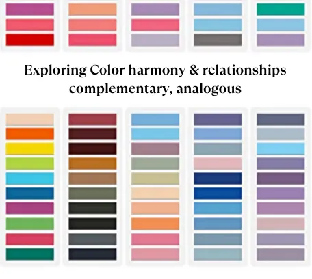
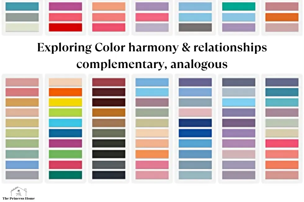
Understanding Color Harmony:
Color harmony refers to the pleasing arrangement of colors in a design that creates a sense of balance and cohesion. Achieving harmony involves selecting colors that work well together, whether they contrast or blend seamlessly. While individual preferences and cultural associations play a role in determining what constitutes harmonious color combinations, certain principles provide a framework for understanding and creating harmony.
1.Analogous Colors:
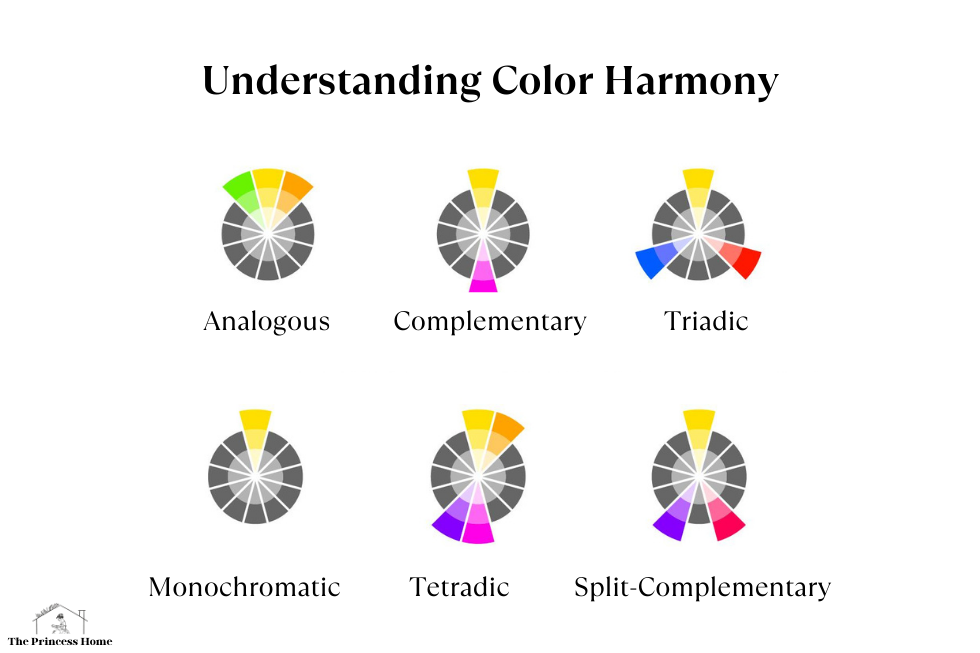
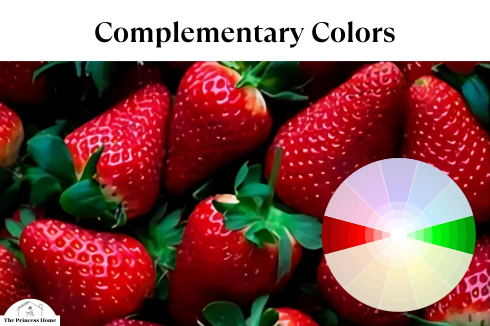
Complementary colors are pairs of colors that sit opposite each other on the color wheel. Examples include red and green, blue and orange, yellow and purple. When placed together, complementary colors create maximum contrast and vibrancy, making each other appear more intense. This contrast can be used to draw attention, create focal points, or add visual interest to a design. However, using complementary colors in equal proportions can be overwhelming, so it’s often advisable to use one color as dominant and the other as an accent.
2.Complementary Colors:
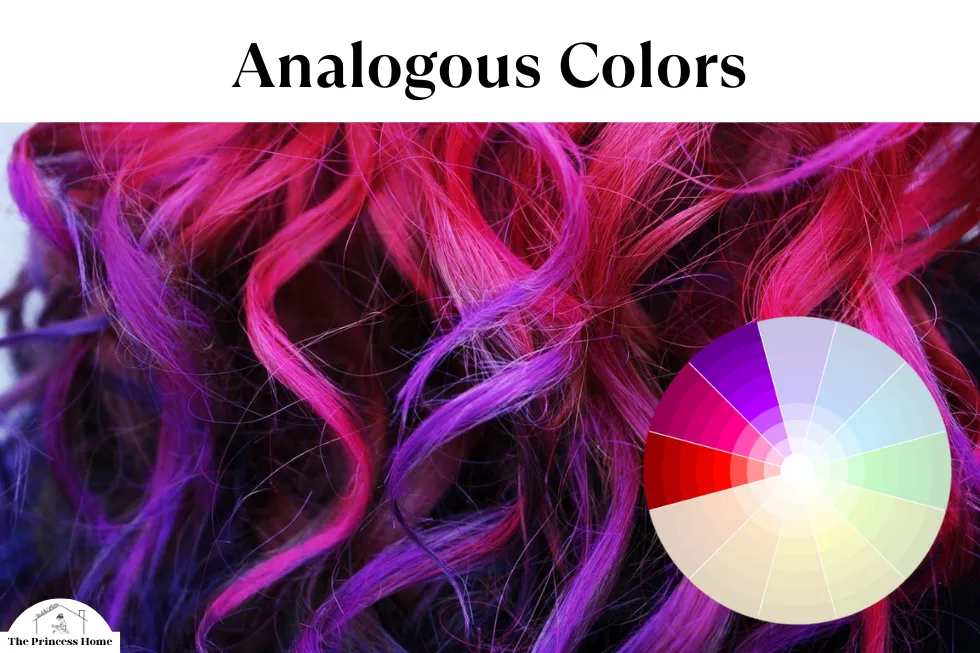
Analogous colors are groups of colors that are adjacent to each other on the color wheel. These colors share similar undertones and often evoke a sense of harmony and unity. For example, a palette of yellow, orange, and red creates a warm and inviting atmosphere, while a combination of blue, green, and teal exudes a cool and tranquil vibe. Analogous color schemes are versatile and can be used to create subtle transitions or bold statements, depending on the saturation and intensity of the chosen hues.
3.Triadic Colors:
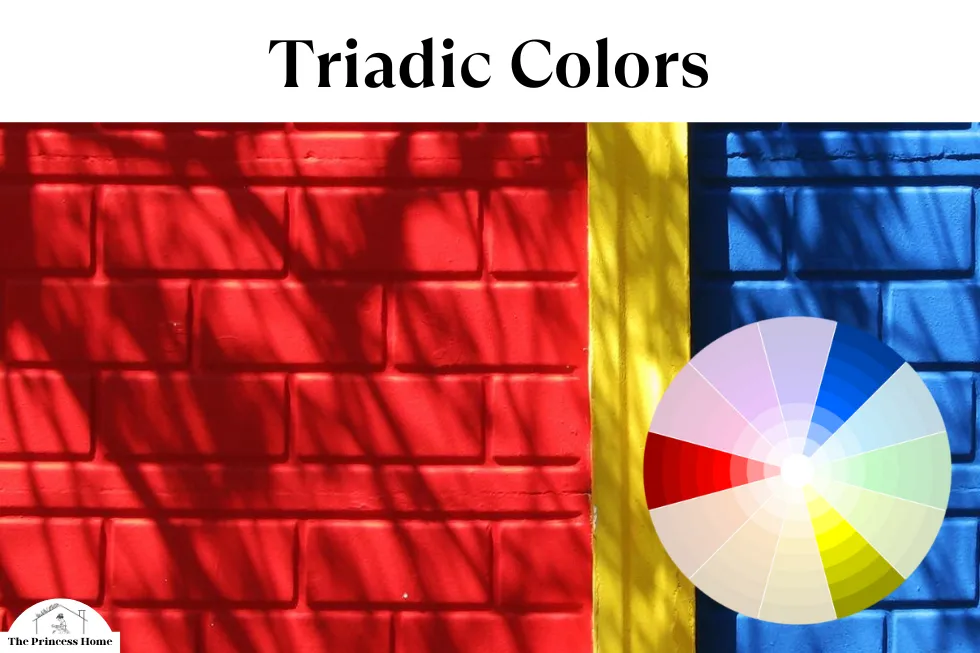
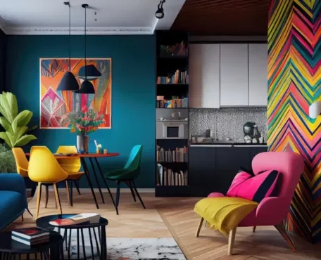
Triadic colors consist of three colors evenly spaced around the color wheel, forming an equilateral triangle. This creates a balanced and dynamic relationship between the colors, offering both contrast and harmony. Popular triadic combinations include red, yellow, and blue, or orange, green, and purple. Triadic schemes are inherently vibrant and can be used to create lively and energetic designs. However, balancing the intensity of each color is crucial to prevent overwhelming the viewer.
4.Monochromatic colors
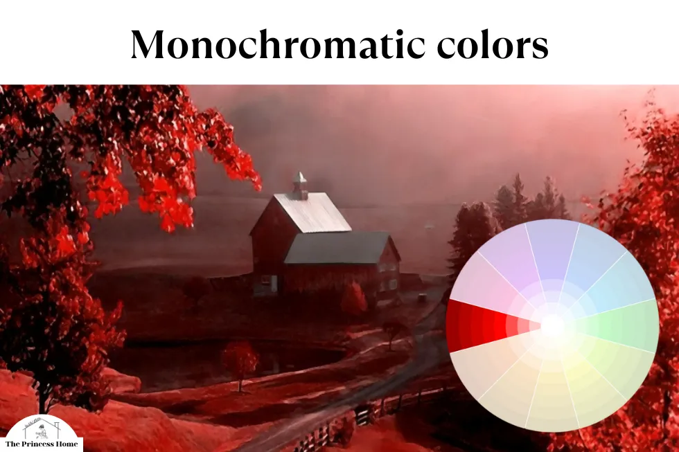
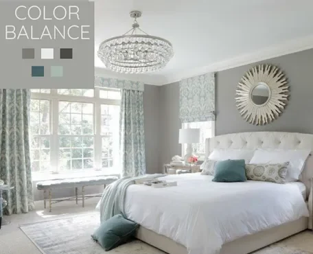
Monochromatic colors refer to colors that are shades, tints, or tones of a single hue. In simpler terms, they are variations of one color. This color scheme is created by taking a single base hue and then adjusting its brightness or saturation. Monochromatic color schemes are often used in design and art to create a cohesive and harmonious look. They can be visually appealing and are relatively easy to work with because all the colors stem from one base hue.
5.Tetradic Colors:
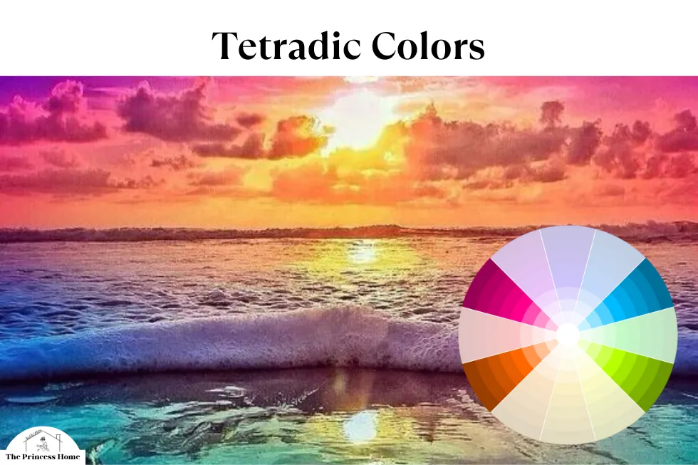
Tetradic colors, also known as double complementary or rectangular colors, involve four colors arranged into two complementary pairs. This scheme offers a high degree of contrast while still maintaining harmony. Designers can choose to use one color as dominant and the others as accents, or they can strive for a more balanced distribution of all four colors. Tetradic color schemes provide ample opportunities for creativity and experimentation, allowing for complex and visually engaging designs.
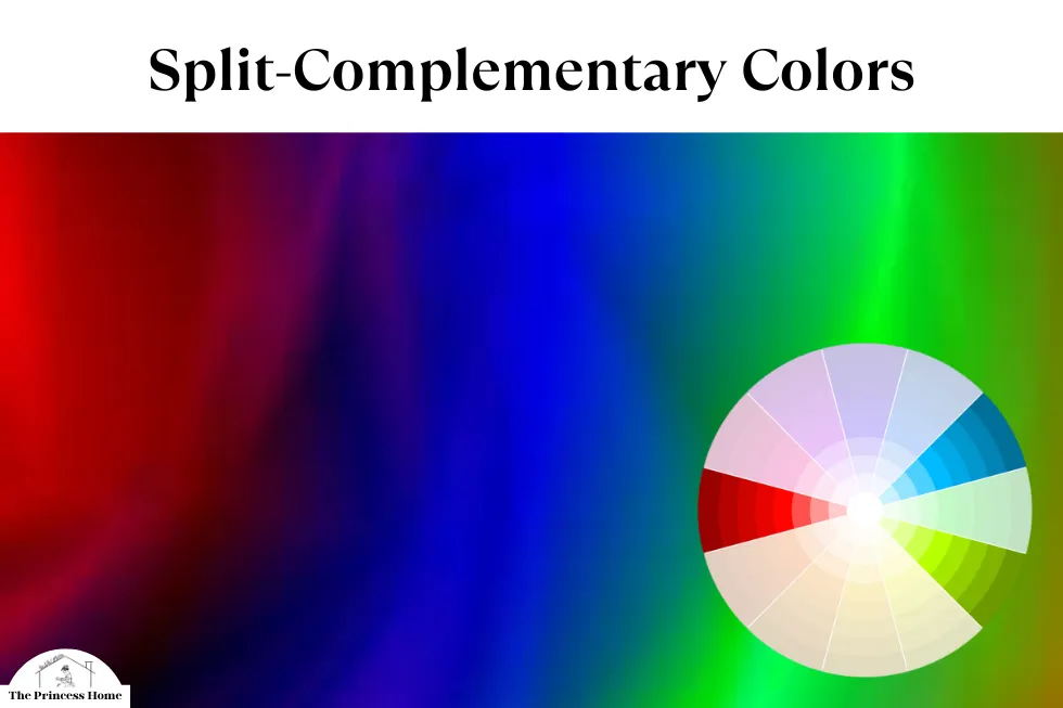
6.Split-Complementary Colors:
Split-complementary colors are a variation of the complementary scheme that offers a more subtle contrast. Instead of choosing the direct opposite of a base color, split-complementary schemes use two adjacent colors to the complement. For example, pairing blue with yellow-orange and yellow-green. This creates a harmonious yet visually striking combination that is less intense than traditional complementary colors.
Conclusion:
Color harmony is an essential aspect of design, influencing how we perceive and interact with visual compositions. By understanding the principles of complementary, analogous, triadic, and other color relationships, designers can create compelling and impactful designs that resonate with their audience. Whether aiming for bold contrasts or subtle transitions, mastering color harmony opens up a world of creative possibilities, allowing designers to express their vision with clarity and finesse.
Frequently Asked Questions About Color Harmony and Relationships:
1. What is color harmony, and why is it important in design?
- Color harmony refers to the pleasing arrangement of colors in a design that creates balance and cohesion. It’s important in design because it influences how people perceive and interact with visual compositions. Harmonious color combinations can evoke emotions, set moods, and enhance the overall effectiveness of a design.
2. How do complementary colors work, and when should I use them in my designs?
- Complementary colors are pairs of colors that sit opposite each other on the color wheel. They create maximum contrast and vibrancy when placed together. Complementary colors are useful for drawing attention, creating focal points, or adding visual interest to a design. However, it’s essential to balance the use of complementary colors to prevent overwhelming the viewer.
3. What are analogous colors, and how can I use them effectively?
- Analogous colors are groups of colors that are adjacent to each other on the color wheel. They share similar undertones and evoke a sense of harmony and unity. Analogous color schemes are versatile and can be used to create subtle transitions or bold statements, depending on the saturation and intensity of the chosen hues.
4. Can you explain the concept of triadic colors and provide examples of their usage?
- Triadic colors consist of three colors evenly spaced around the color wheel, forming an equilateral triangle. This creates a balanced and dynamic relationship between the colors, offering both contrast and harmony. Examples of triadic color combinations include red, yellow, and blue, or orange, green, and purple. Triadic schemes are vibrant and energetic and can be used to create lively designs.
5. What are split-complementary colors, and how do they differ from traditional complementary colors?
- Split-complementary colors are a variation of the complementary scheme that offers a more subtle contrast. Instead of choosing the direct opposite of a base color, split-complementary schemes use two adjacent colors to the complement. This creates a harmonious yet visually striking combination that is less intense than traditional complementary colors.
6. How do I effectively use tetradic colors in my designs, and what are some considerations to keep in mind?
- Tetradic colors, also known as double complementary or rectangular colors, involve four colors arranged into two complementary pairs. Designers can choose to use one color as dominant and the others as accents, or they can strive for a more balanced distribution of all four colors. It’s essential to balance the intensity of each color to prevent overwhelming the viewer while still maintaining harmony.
7. Are there other color schemes beyond the ones mentioned in the article?
- Yes, there are numerous other color schemes beyond complementary, analogous, triadic, split-complementary, and tetradic. These include monochromatic schemes, which involve variations of a single hue, and neutral color schemes, which rely on shades of black, white, gray, and brown. Designers can also incorporate accent colors or use color psychology to evoke specific emotions and responses from the viewer.


