


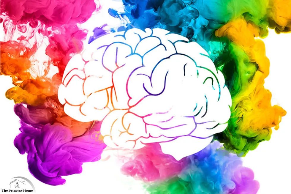
Choosing and applying color is an art and a science that can significantly impact the aesthetics, functionality, and emotional appeal of any space or design. However, the process is fraught with potential mistakes that can undermine the intended effect. This article delves into the most common mistakes in color choices and applications, providing insights and tips to help you avoid them.
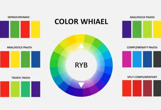
1.*Ignoring Color Theory:
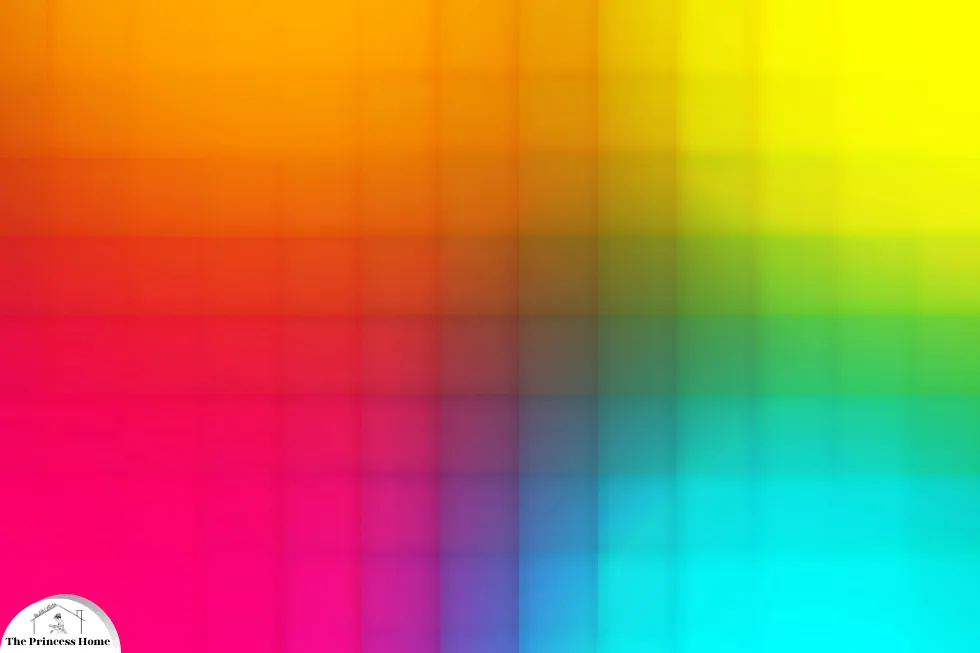
One of the fundamental mistakes in color selection is ignoring color theory. Understanding basic principles like complementary colors, analogous colors, and color harmonies can greatly enhance the effectiveness of your design. Without this knowledge, you may end up with clashing color combinations or designs that lack cohesion.
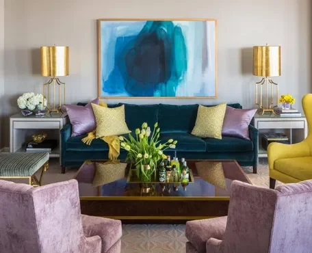
Color theory serves as the backbone of effective color selection in design. It provides a framework for understanding how colors interact with each other and how they can be combined to create visually pleasing compositions.
Complementary colors, for instance, are pairs of colors that are opposite each other on the color wheel. When used together, they create strong contrast and can make elements stand out. Analogous colors, on the other hand, are colors that are next to each other on the color wheel and create a sense of harmony and unity when used together.
Understanding these concepts allows designers to make informed decisions about color choices, ensuring that their designs are visually appealing and convey the desired message or mood. Without this knowledge, designers may inadvertently create designs that are jarring or lack coherence, ultimately diminishing the effectiveness of their work.
2.*Overlooking Color Psychology:
Color psychology plays a significant role in how people perceive and respond to designs. Different colors evoke different emotions and associations. For example, red is often associated with passion and energy, while blue conveys calmness and trust. Ignoring the psychological impact of color can result in designs that fail to resonate with the intended audience.
Color psychology is a crucial aspect of design that shouldn’t be overlooked. Colors have the power to evoke emotions, convey messages, and influence behavior. Understanding the psychological impact of color allows designers to create designs that effectively communicate with their target audience.
For instance, warm colors like red, orange, and yellow tend to evoke feelings of energy, excitement, and warmth, while cool colors like blue, green, and purple can evoke feelings of calmness, serenity, and trust. Additionally, cultural and individual associations with colors can also play a significant role in how they are perceived.
By taking color psychology into account, designers can create designs that resonate with their audience on a deeper level, eliciting the desired emotional response and effectively communicating the intended message. Failure to consider color psychology may result in designs that fail to connect with viewers or even evoke unintended emotions, ultimately diminishing the impact of the design.
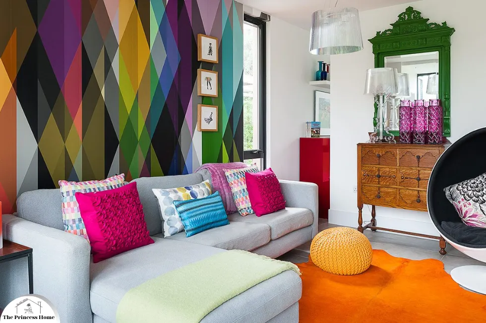
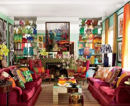
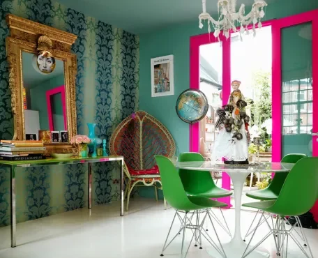
3.*Using Too Many Colors:
Another common mistake is using too many colors in a design. While it may be tempting to incorporate a wide range of hues, this can overwhelm the viewer and dilute the message of the design. It’s often more effective to stick to a limited color palette and use variations in shade and tone to create visual interest.
Using too many colors in a design can indeed be overwhelming and distracting for the viewer. A limited color palette not only creates a more cohesive and harmonious design but also helps to emphasize key elements and convey a clearer message.
By sticking to a few carefully chosen colors, designers can create visual consistency and unity throughout their designs. This doesn’t mean that the design has to be bland or lacking in variety; variations in shade, tone, and saturation within the chosen color palette can still create depth and visual interest.
Furthermore, a limited color palette can also help to reinforce branding and create a strong visual identity for a product, service, or brand. Consistently using the same colors across different materials and platforms can help to establish recognition and reinforce brand associations in the minds of consumers.
Overall, while it may be tempting to use a wide range of colors, it’s often more effective to exercise restraint and carefully select a limited color palette that enhances the overall impact and message of the design.

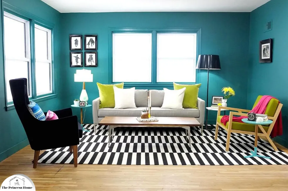
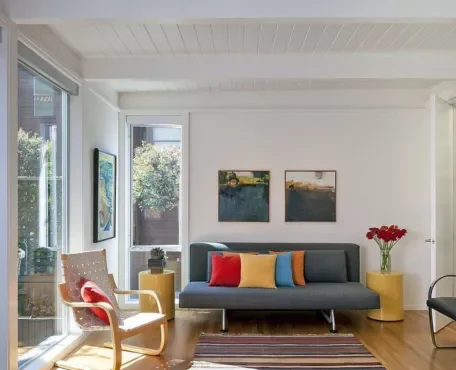
4.*Poor Contrast:
Contrast is essential for creating visual hierarchy and ensuring readability in designs. However, many designers overlook this aspect and end up with low-contrast color combinations that are difficult to read or distinguish. It’s important to ensure sufficient contrast between text and background colors, as well as between different elements within the design.
Poor contrast can significantly hinder the effectiveness of a design, especially when it comes to readability and visual hierarchy. Insufficient contrast between text and background colors, as well as between different elements within the design, can make it difficult for viewers to read and understand the content.
For text-based designs, such as websites, advertisements, or presentations, it’s crucial to ensure that there is enough contrast between the text and the background to ensure readability, especially for people with visual impairments. This often means using dark text on a light background or vice versa to maximize legibility.
Similarly, in designs with multiple elements or layers, sufficient contrast between different elements is essential for creating visual hierarchy and guiding the viewer’s attention to the most important elements. This can be achieved through variations in color, size, shape, or other visual properties.
By paying attention to contrast, designers can improve the clarity and effectiveness of their designs, ensuring that they are both visually appealing and easy to understand. Ignoring this aspect can result in designs that are difficult to read or navigate, ultimately diminishing their impact and effectiveness.

5.*Neglecting Accessibility:
Accessibility should always be a priority in design, and color plays a crucial role in ensuring that designs are accessible to all users, including those with visual impairments. Using color combinations that are difficult to perceive for color-blind individuals or failing to provide alternative means of conveying information can exclude a significant portion of the audience.
Neglecting accessibility in design is a critical oversight that can exclude a significant portion of users from accessing and understanding the content. Color plays a crucial role in accessibility, particularly for individuals with visual impairments or color blindness.
For users with color vision deficiencies, such as red-green color blindness, certain color combinations may be difficult to perceive or distinguish. Therefore, it’s essential for designers to choose color combinations that maintain sufficient contrast and readability for all users. This often involves avoiding relying solely on color to convey important information and instead using additional visual cues, such as icons, patterns, or text labels, to ensure clarity and comprehension.
Furthermore, providing alternative means of conveying information, such as text descriptions for images or audio descriptions for videos, can also enhance accessibility for users with disabilities.
By prioritizing accessibility in design, designers can create more inclusive and user-friendly experiences that can be accessed and enjoyed by a broader audience. Neglecting accessibility not only limits the reach of the design but also perpetuates barriers to access for individuals with disabilities.

6.*Failing to Consider Cultural Differences:
Colors can have different meanings and associations in different cultures. What may be perceived as positive or neutral in one culture could be interpreted negatively in another. Failing to consider cultural differences when selecting colors can lead to misunderstandings or offend the target audience.
Considering cultural differences is crucial when selecting colors for designs, as colors can carry different meanings and associations across various cultures. What may be perceived as positive, neutral, or even celebratory in one culture could have entirely different connotations in another.
For example, while white is often associated with purity and weddings in Western cultures, it can symbolize mourning and death in some Eastern cultures. Similarly, the color red may represent luck and prosperity in Chinese culture, but it can signify danger or warning in other contexts.
By taking cultural differences into account, designers can ensure that their designs resonate with and respect the cultural sensitivities of their target audience. This may involve conducting research on color symbolism in different cultures, consulting with individuals familiar with the target culture, or simply being mindful of potential cultural interpretations when selecting colors.
Failure to consider cultural differences when choosing colors can lead to misunderstandings, misinterpretations, or even offense among the intended audience. By embracing cultural diversity and sensitivity in design, designers can create more inclusive and meaningful experiences that resonate with a global audience.
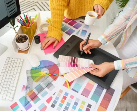
7.*Not Testing Colors in Various Contexts:
Colors can look different depending on the medium and lighting conditions in which they are viewed. Failing to test colors in various contexts, such as different screens or print materials, can result in unexpected outcomes. It’s essential to consider how colors will appear in different environments to ensure consistency and effectiveness across all platforms.
Testing colors in various contexts is essential to ensure consistency and effectiveness across different mediums and environments. Colors can appear differently depending on factors such as screen calibration, lighting conditions, and printing processes.
For digital designs, it’s important to test how colors appear on different screens, including monitors, tablets, and smartphones, as variations in screen resolution and color settings can impact color accuracy. Additionally, considering factors like ambient lighting and viewing angles can also affect how colors are perceived by users.
For print materials, designers should test colors using the specific printing process and substrate that will be used for the final product. Colors may appear differently when printed on different types of paper or with different printing techniques, such as offset printing versus digital printing.
By testing colors in various contexts, designers can identify any discrepancies or inconsistencies and make adjustments as needed to ensure that the colors accurately convey the intended message and maintain visual coherence across all platforms. This proactive approach helps to minimize the risk of unexpected outcomes and ensures a more polished and professional final result.

8.*Following Trends Blindly:
Blindly following design trends without considering their relevance and appropriateness for a specific project can indeed lead to design failures. While it’s essential to stay updated with current trends to remain competitive and relevant in the design industry, it’s equally important to approach trends with a critical eye and consider how they align with the goals and objectives of the project.
What may be trendy today may quickly become outdated tomorrow, so relying solely on fleeting trends can result in designs that feel stale or irrelevant in the long run. Instead, designers should focus on timeless design principles and adapt trends selectively to suit the unique needs and context of each project.
By understanding the underlying principles of design and considering the specific requirements of the project, designers can create designs that are not only visually appealing but also effective in communicating the intended message and achieving the desired objectives. This approach allows for greater flexibility and creativity while ensuring that the design remains relevant and impactful over time.

Conclusion:
Color is a vital element in design, but its effective use requires careful consideration and planning. By avoiding common mistakes such as ignoring color theory, overlooking color psychology, using too many colors, poor contrast, neglecting accessibility, failing to consider cultural differences, not testing colors in various contexts, and following trends blindly, designers can create more impactful and successful designs. With a solid understanding of color principles and thoughtful application, designers can harness the power of color to enhance their creations and connect with their audience on a deeper level.e designs that resonate with their audience and convey the intended message.
Frequently Asked Questions (FAQs) about Color Choices and Applications
1. Why is color psychology important in design?
Color psychology is crucial because colors significantly impact human emotions and behaviors. For instance, blue can induce calmness, red can stimulate energy, and green can promote relaxation. Understanding these effects helps in selecting colors that align with the intended purpose of a space, enhancing its functionality and emotional appeal.
2. How does lighting affect color appearance?
Lighting conditions, both natural and artificial, can alter the perception of color. A color that looks vibrant in natural daylight may appear dull under artificial lighting. Testing colors in the actual space and observing them at different times of the day ensures that the chosen color will look as intended under various lighting conditions.
3. What is color harmony, and why is it important?
Color harmony refers to the pleasing arrangement and combination of colors. It is important because harmonious colors create a balanced and visually appealing environment. Using the color wheel and understanding color relationships, such as complementary and analogous schemes, helps achieve color harmony
4. Can I use bold colors in small spaces?
Yes, you can use bold colors in small spaces, but they should be used sparingly to avoid overwhelming the area. Accent walls or bold accessories can add vibrancy without making the space feel cluttered. Balancing bold colors with neutral tones can create a dynamic yet harmonious look
5. How do I choose colors that complement existing elements in a room?
Consider the colors of existing furniture, flooring, and fixtures when selecting your palette. Choose colors that either complement or coordinate with these elements to create a cohesive look. Using color swatches and samples can help visualize how new colors will interact with the existing elements.
6. What colors are best for creating a relaxing environment?
Colors like soft blues, greens, and neutrals are ideal for creating a relaxing environment. These colors are known for their calming effects and are often used in bedrooms and living spaces to promote tranquility and relaxation
7. Should I follow current color trends?
It’s beneficial to consider current color trends for a modern and updated look, but it’s also important to balance them with your personal preferences. Incorporate elements of trends that you genuinely like and blend them with your style to create a timeless and personal space.
8. How can I ensure consistent color application throughout a space?
Plan your color scheme thoroughly before starting and stick to a cohesive palette. Repeat colors strategically throughout the space to create a sense of continuity. Using a mood board or color plan can help visualize the overall look and maintain consistency.
9. What role do neutral colors play in a color scheme?
Neutral colors are essential for balancing and grounding a color palette. They provide a backdrop that allows other colors to stand out and can create a sophisticated look. Incorporating neutrals helps in achieving a harmonious and visually appealing design
10. How do I choose the right paint finish for different surfaces?
Select paint finishes based on the function of the room and the surface. Matte or eggshell finishes are good for walls to hide imperfections, while semi-gloss or gloss finishes are suitable for trim and high-traffic areas due to their durability and ease of cleaning. Consider the desired look and maintenance requirements when choosing a finish.
11. Can I use the same color throughout an entire home?
While using the same color throughout an entire home can create a cohesive look, it can also make spaces feel monotonous. Consider using varying shades of the same color or incorporating complementary colors to add interest and define different areas within the home.
12. How can I test colors before committing to them?
Purchase small samples of the colors you are considering and apply them to test areas on your walls. Observe these test patches at different times of the day and under various lighting conditions. This will help you see how the colors look in the actual space and make an informed decision before committing to a full paint job


