
Choosing the right colors for home décor can be both an exciting and daunting task. Colors have the power to transform spaces, influence moods, and reflect personal style. However, selecting the wrong colors can lead to a discordant and unappealing environment. Here are the most common mistakes people make in color choices for home décor and how to avoid them.
1. Ignoring the Room’s Function
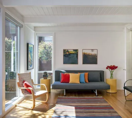
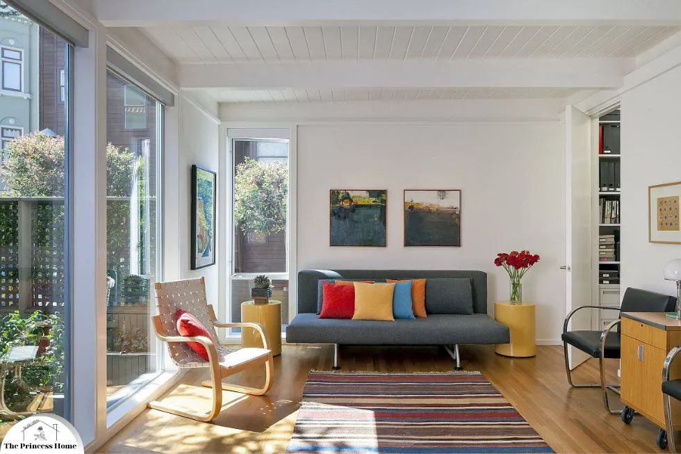
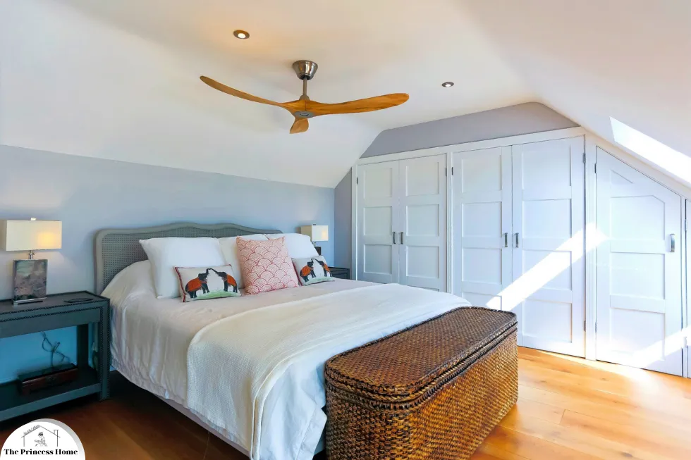
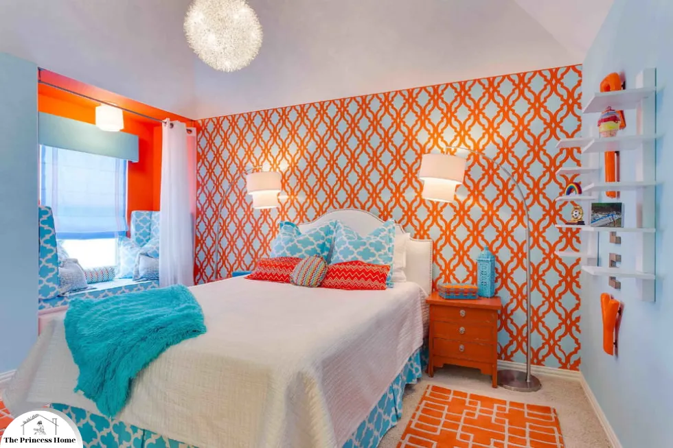
Each room in a home serves a different purpose, and the colors used should reflect that function. One of the most frequent mistakes is not considering the room’s use when selecting colors. For instance, vibrant, energetic colors like red or orange might be great for a living room or kitchen where activity and social interaction are common, but they can be overwhelming in a bedroom or study, where calm and relaxation are key.
Solution: Consider the purpose of the room before choosing a color palette. Calming colors such as blues, greens, and neutrals work well in bedrooms and bathrooms, while brighter and warmer tones can enhance more active spaces.
2. Overlooking Natural Light
Natural light greatly affects how colors appear in a room. A color that looks perfect under artificial light might seem completely different in natural daylight. Not accounting for the natural light a room receives is a common oversight that can lead to disappointing results. To avoid this, it’s essential to consider the orientation of the room, the amount of natural light it receives throughout the day, and how this light affects the color’s appearance. Testing paint samples in different areas of the room and observing them at various times can help ensure that the chosen color looks just as desired in both artificial and natural light.
Solution: Observe how natural light enters the room at different times of the day. Test paint samples on the walls and see how they change with the shifting light. South-facing rooms benefit from warm colors, while north-facing rooms might need lighter, cooler shades to balance the natural light.
3. Disregarding the Color Undertones
Every color has an undertone, which can be cool, warm, or neutral. Not recognizing these undertones can lead to mismatched colors that don’t harmonize well together. Undertones can significantly affect how a color appears and interacts with other colors in a space. For example, a beige with a pink undertone may clash with a yellow-toned wall. To create a cohesive look, it’s important to identify the undertones of your chosen colors and ensure they complement each other. Testing paint samples and observing them in different lighting conditions can help you better understand their undertones and how they will work together in your space.
Solution: When selecting colors, compare them side by side and observe their undertones. Use paint chips and samples to see how they interact with each other and with existing elements in the room like furniture, flooring, and fixtures.
4. Following Trends Blindly
Trends in home décor change frequently, and what’s fashionable today might not be in a few years. Choosing colors solely based on current trends can lead to a home that feels dated quickly. Instead, it’s wise to focus on colors that you genuinely love and that complement your personal style and the architecture of your home. Classic and timeless colors, or those that hold personal significance, are more likely to provide lasting satisfaction and avoid the need for frequent redecorating. By balancing timeless choices with a few trendy accents that are easy to update, you can create a stylish yet enduring home interior.
Solution: While it’s fine to incorporate trends, ensure the base color scheme is timeless. Use trendy colors as accents through easily changeable elements like throw pillows, artwork, and accessories.
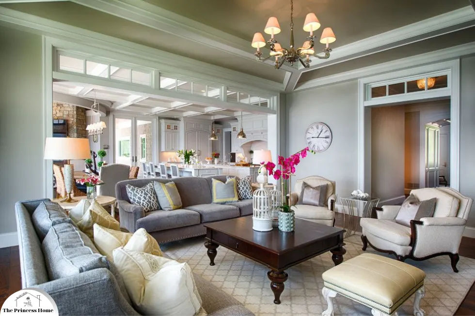
5. Ignoring the Home’s Overall Color Scheme
Each room should complement the overall color scheme of the home to create a cohesive look. Ignoring this can result in a disjointed and chaotic appearance. To ensure a harmonious flow throughout your home, consider a unifying color palette that subtly transitions from one room to the next. This doesn’t mean every room must be the same color, but rather that the colors should relate to each other in a way that ties the entire home together. Using shades and tones that complement each other across different spaces helps maintain a unified and aesthetically pleasing environment.
Solution: Develop a color palette for the entire home. Choose a few main colors and several accent colors that can be used throughout different rooms. This approach ensures harmony and flow from one room to the next.
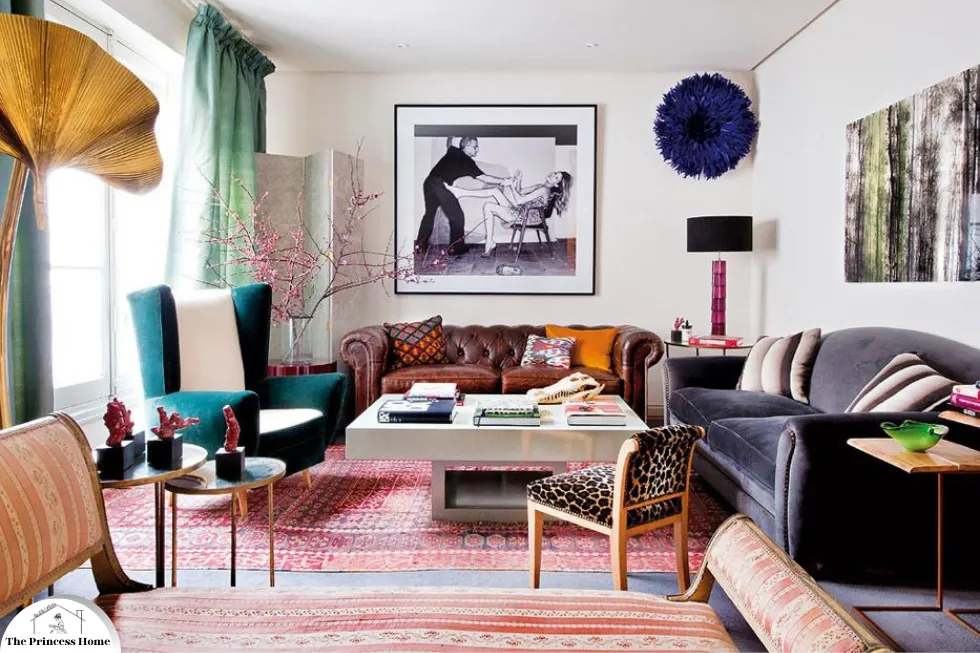
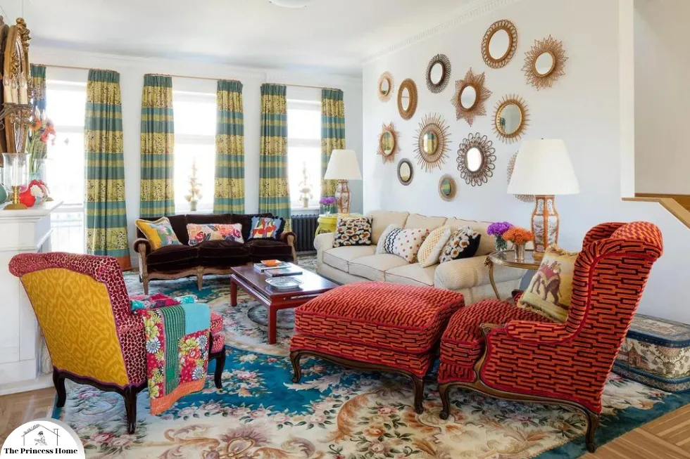
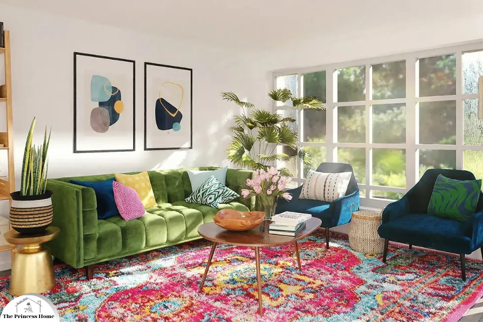
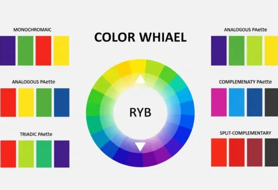
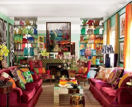
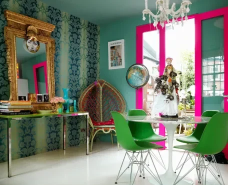
6. Using Too Many Colors
Too many different colors can make a space feel cluttered and overwhelming. A common mistake is incorporating too many hues, which can compete for attention and create visual chaos. To achieve a more cohesive and harmonious look, it’s best to stick to a balanced color palette. This typically involves choosing a dominant color, a secondary color, and one or two accent colors. This approach ensures that the different elements in the room complement each other rather than clash, creating a more visually appealing and organized space.
Solution: Stick to a simple color palette. The 60-30-10 rule is a helpful guideline: 60% of the room should be a dominant color, 30% a secondary color, and 10% an accent color. This rule helps maintain balance and cohesion in the décor.
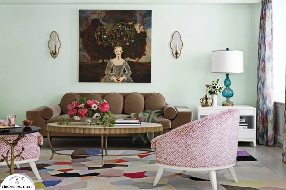
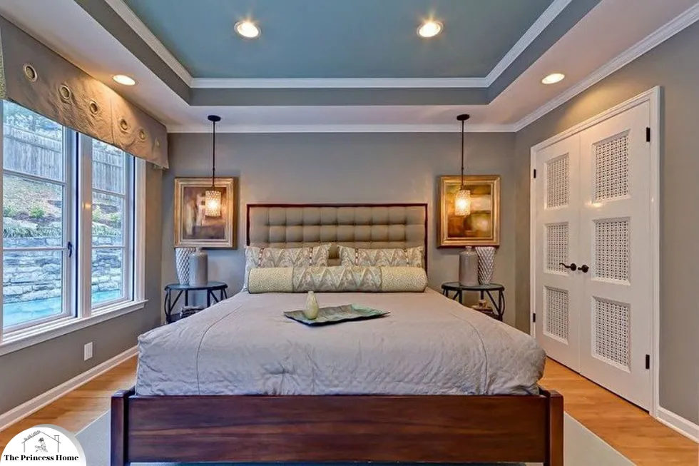
7. Neglecting the Ceiling
The ceiling, often referred to as the fifth wall, is frequently overlooked in color schemes. A stark white ceiling can sometimes clash with the rest of the room’s décor, disrupting the overall harmony. Instead, consider using a softer shade of the wall color, a complementary hue, or even a bold contrast to enhance the room’s design. Thoughtfully choosing a ceiling color can add depth, warmth, and cohesiveness to the space, making it feel more intentionally designed and visually appealing.
Solution: Consider painting the ceiling a complementary color. Light colors can make the ceiling feel higher and the room more spacious, while darker colors can create a cozier, more intimate atmosphere.
8. Choosing Colors in Isolation
Selecting colors without considering the existing elements in the room—such as furniture, flooring, and artwork—is a common mistake. This oversight can result in colors that clash with the existing décor, creating a disjointed and unappealing look. To ensure a harmonious design, it’s essential to take into account the colors and styles of the room’s permanent fixtures and furnishings. By choosing paint colors that complement these elements, you can create a cohesive and visually pleasing environment that enhances the overall aesthetic of the space.
Solution: Take a holistic approach when choosing colors. Gather samples of your furniture, fabrics, and other elements to see how the colors will look together. This ensures a harmonious and well-coordinated design.
9. Not Testing Paint Samples
Many people choose paint colors based on small swatches or online images without testing them in the actual space, which can lead to unexpected and often disappointing results. The way a color looks can change dramatically depending on the room’s lighting, the size of the area, and the surrounding furnishings. To avoid this, it’s important to test paint samples on the walls and observe them at different times of the day to see how they interact with the room’s natural and artificial light. This approach helps ensure that the chosen color will look just as desired in the actual living space.
Solution: Always test paint samples on the walls before committing to a color. Paint small sections of the wall and observe how the color looks at different times of the day and under different lighting conditions.
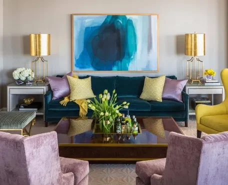
10. Underestimating the Impact of Neutrals
Neutrals are often seen as safe and easy choices, but they can be boring if not used correctly. Overusing neutrals without any accents can lead to a bland and uninspiring space. To avoid this, it’s important to incorporate a mix of textures, patterns, and pops of color through accessories, artwork, and furniture. This approach adds depth and interest to the room, preventing it from feeling monotonous while still maintaining the versatility and elegance that neutrals provide.
Solution: Use neutrals as a backdrop and introduce pops of color through accessories, artwork, and textiles. This approach adds interest and personality to the room while maintaining a balanced and cohesive look.
Conclusion
Avoiding these common mistakes can help you create a harmonious and visually appealing home. By considering the function of each room, the impact of natural light, the undertones of colors, and the overall color scheme of your home, you can make informed and successful color choices. Testing colors in the actual space and incorporating a balanced mix of neutrals and accents will further enhance your home décor, making your living space both beautiful and comfortable.
Frequently Asked Questions (FAQs) on Common Mistakes in Color Choices for Home Décor
1. How do I choose the right color for a small room?
For small rooms, lighter colors are generally preferable as they can make the space feel larger and more open. Soft shades of white, light blues, and pastels are great choices. Additionally, using mirrors and strategically placing lighting can enhance the sense of space.
2. What is the 60-30-10 rule in home décor?
The 60-30-10 rule is a timeless decorating principle that helps create a balanced color scheme. It suggests that 60% of the room should be a dominant color (usually walls), 30% a secondary color (upholstery), and 10% an accent color (accessories). This rule helps maintain visual balance and interest in a room.
3. How does natural light affect paint color choices?
Natural light can significantly alter the appearance of paint colors. Rooms with abundant natural light can handle darker and bolder colors, while rooms with limited natural light might benefit from lighter, reflective colors to enhance brightness. It’s crucial to test paint samples in different lighting conditions to see how they look throughout the day.
4. What are color undertones, and why are they important?
Color undertones are the subtle hues beneath the main color that can be either warm (yellow, red, orange) or cool (blue, green, purple). Recognizing undertones is essential because they affect how colors complement each other and interact with other elements in the room. A mismatch in undertones can lead to a disharmonious look.
5. Is it okay to follow color trends in home décor?
While it’s fine to incorporate trendy colors, it’s advisable to use them sparingly in accents rather than main color schemes. Trends can change quickly, and relying too heavily on them can date your décor. A timeless base with trendy accents ensures your home remains stylish yet flexible.
6. How can I ensure a cohesive color scheme throughout my home?
Develop a color palette for your entire home that includes a few main colors and several accent colors. Use these colors consistently in different rooms to create a sense of flow and unity. You can vary the shades and intensities to add interest while maintaining harmony.
7. What should I do if the color I chose looks different than expected?
If a chosen color looks different than expected, consider factors like lighting and surrounding elements. Try painting a larger sample area or observe it at different times of the day. If it still doesn’t work, consult with a color expert or interior designer to find a more suitable shade.
8. How can I avoid making a room feel too monochromatic or bland?
To avoid a monochromatic or bland look, incorporate various textures, patterns, and accent colors. Use accessories, artwork, and textiles in complementary hues to add depth and interest. Even within a neutral palette, varying textures can make the space visually dynamic
9. Should the ceiling always be painted white?
The ceiling doesn’t have to be white. Depending on the effect you want, you can choose different colors. Light colors can make the ceiling feel higher and the room more spacious, while darker colors can create a cozy, intimate atmosphere. Consider the room’s height and lighting when choosing a ceiling color.
10. Can I use dark colors in a small room?
Yes, dark colors can be used in small rooms to create a dramatic and cozy atmosphere. However, balance them with lighter elements to avoid making the room feel cramped. Use ample lighting and reflective surfaces to enhance the sense of space.
These FAQs should help address common concerns and provide guidance on making informed color choices for home décor.


