
Color is a powerful tool in the hands of any designer or artist. It has the ability to evoke emotions, set moods, and convey messages without uttering a single word. Whether you’re designing a website, creating a piece of art, or decorating a room, understanding how to effectively use color swatches and samples can make a significant difference in the outcome of your project.
In this article, we’ll delve into the nuances of color selection, the importance of using color .
1.Understanding Color Theory:
Before delving into the practical aspects of using color swatches and samples, it’s essential to have a basic understanding of color theory. Color theory encompasses the principles and guidelines regarding the use of color in art and design. It includes concepts such as the color wheel, color harmony, and color psychology.
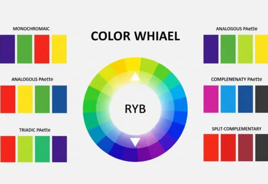
2.The Color Wheel:
The color wheel is a fundamental tool in understanding how colors relate to each other. It consists of primary colors (red, blue, and yellow), secondary colors (orange, green, and purple), and tertiary colors (created by mixing primary and secondary colors). By understanding the relationships between these colors, designers can create visually appealing compositions.
3.Color Harmony:
Color harmony refers to the pleasing arrangement of colors in a design. There are various color harmony schemes, including complementary, analogous, triadic, and monochromatic. Each scheme has its own unique properties and can be used to evoke different emotions and convey different messages.
4.Color Psychology:
Color psychology explores how different colors can affect human behavior and emotions. For example, red is often associated with passion and energy, while blue conveys calmness and trust. Understanding these associations can help designers choose the right colors to achieve their desired outcomes.
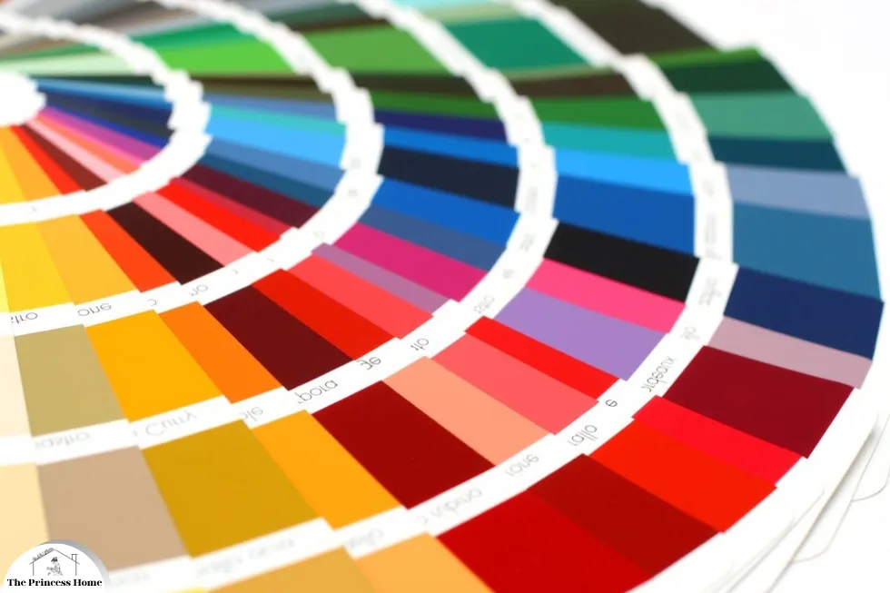
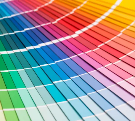
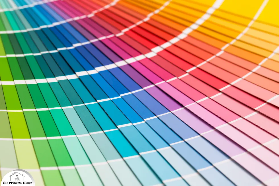
5.Importance of Color Swatches:
Color swatches and samples are essential tools for any designer or artist. They provide a tangible representation of colors, allowing for easier comparison and selection. Additionally, they enable designers to see how colors interact with each other in real-world situations, such as different lighting conditions and materials.
1.Facilitating Comparison and Selection:
Color swatches and samples provide a tangible representation of colors, allowing for easier comparison and selection.
2.Visualizing Color Interactions:
By presenting colors in physical form, swatches and samples empower designers to visualize how different hues interact with one another.
3.Understanding Real-World Contexts:
This interaction becomes particularly significant when considering real-world contexts, where variables such as lighting conditions and material surfaces can profoundly influence color perception.
4.Insights through Experimentation:
Through experimentation with swatches and samples, designers gain invaluable insights into how colors manifest in various environments.
5.Engaging Multiple Senses:
Moreover, the tactile nature of color swatches and samples enhances the design process by engaging multiple senses.
6.Deeper Understanding of Color Nuances:
The act of physically handling these materials fosters a deeper understanding of color nuances and textures.
7.Encouraging Exploration and Experimentation:
This hands-on approach encourages exploration and experimentation, ultimately fostering creativity and innovation in design endeavors.
8.Indispensable Companions for Designers:
In essence, color swatches and samples serve as indispensable companions for designers and artists on their creative journey.
9.Inspiration and Creativity:
Beyond their practical utility, these tools inspire exploration, foster creativity, and empower individuals to transform their artistic visions into tangible realities.
10.Symbols of Meticulous Attention to Detail:
As such, they stand as enduring symbols of the profound impact that meticulous attention to detail can have on the pursuit of aesthetic excellence

6.Practical Tips for Using Swatches:
1.Start with a Mood Board:
Before diving into color selection, create a mood board to gather inspiration and ideas. Include images, textures, and colors that reflect the mood and aesthetic you want to achieve. Use this as a reference when selecting color swatches and samples.
2.Consider the Context:
When choosing colors for a project, consider the context in which they will be used. For example, the color scheme for a website aimed at children may differ from one targeted at professionals. Think about the audience, purpose, and environment of the project.
3.Test in Different Lighting:
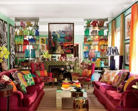
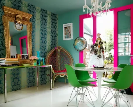
Colors can appear differently under various lighting conditions. Before finalizing your color choices, test them in different lighting environments to ensure they maintain their intended appearance. This is especially important for interior design projects where natural and artificial lighting can impact color perception.
4.Experiment with Texture and Material:
Colors can look different on different materials and textures. When selecting color samples, consider how they will appear on the intended surface. Experiment with different materials and finishes to find the perfect combination for your project.
5.Don’t Overlook Neutrals:
While bold colors can make a statement, neutrals play an equally important role in design. They provide balance and allow other colors to stand out. Experiment with different shades of white, gray, and beige to find the perfect backdrop for your color scheme.
6.Trust Your Instincts:
At the end of the day, trust your instincts when selecting colors. If a combination feels right to you, it’s likely to resonate with others as well. Don’t be afraid to experiment and take risks with color – it’s often the unexpected combinations that yield the most striking results.
Conclusion:
Color swatches and samples are invaluable tools for any designer or artist. By understanding color theory, considering the context of your project, and experimenting with different combinations, you can create visually stunning compositions that resonate with your audience. Whether you’re designing a website, painting a masterpiece, or decorating a room, mastering the art of using color swatches and samples effectively can elevate your work to new heights.
Frequently Asked Questions about Using Color Swatches and Samples
1.Why are color swatches and samples important in design?
Color swatches and samples provide a tangible representation of colors, allowing designers to easily compare and select the right hues for their projects. They also help in understanding how colors interact with different materials and lighting conditions, ensuring the desired visual impact.
2.How can I effectively use color swatches and samples in my design process?
Start by creating a mood board to gather inspiration and ideas. Consider the context of your project and test colors in different lighting environments. Experiment with texture and material to see how colors appear on various surfaces. Trust your instincts and don’t be afraid to take risks with color combinations.
3.What are some common color harmony schemes, and how do they work?
Common color harmony schemes include complementary, analogous, triadic, and monochromatic. Complementary colors are opposite each other on the color wheel and create a vibrant contrast. Analogous colors are adjacent to each other and create a harmonious blend. Triadic colors are evenly spaced around the color wheel, while monochromatic colors consist of variations of the same hue.
4.How do I choose the right colors for my project?
Consider the audience, purpose, and environment of your project. Think about the emotions and messages you want to convey and choose colors accordingly. Test different combinations using color swatches and samples and trust your instincts to find the perfect palette.
5.Why is it important to test colors in different lighting conditions?
Colors can appear differently under various lighting conditions, so it’s essential to test them in different environments. Natural and artificial lighting can affect color perception, so testing ensures that colors maintain their intended appearance in any setting.
6.What role do neutrals play in color schemes?
Neutrals provide balance and allow other colors to stand out. They serve as a backdrop for bolder hues and can create a sense of sophistication and elegance in a design. Experiment with different shades of white, gray, and beige to find the perfect neutral for your color scheme.
7.How can I ensure that my chosen color scheme resonates with my audience?
Consider the preferences and demographics of your target audience when selecting colors. Pay attention to cultural associations and psychological effects of different colors. Testing your color scheme with focus groups or surveys can also provide valuable feedback on its effectiveness.


