
Color is a fundamental element of design, wielding immense power to evoke emotions, convey messages, and influence perceptions. In the realm of graphic design, understanding color theory and mastering the art of color combinations are crucial skills. However, exploring and discovering unique and harmonious color palettes can be a challenging yet rewarding endeavor.
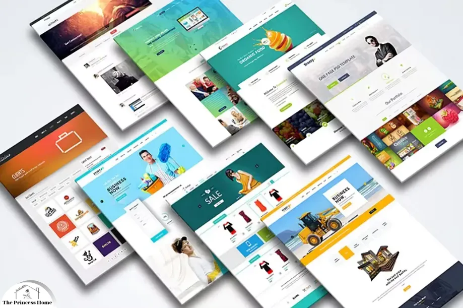
Mock-up designs serve as invaluable tools for designers to visualize their ideas and experiment with various elements, including colors. By immersing oneself in the process of mock-up design, designers can push the boundaries of creativity and unearth new possibilities for captivating visual compositions.
This article delves into the exciting world of experimenting with color combinations through mock-up designs, exploring techniques, tips, and insights to inspire designers on their creative journey.

1.*Understanding Color Theory:
Before embarking on the exploration of color combinations, it is essential to grasp the fundamentals of color theory. Color theory encompasses the principles governing the interaction of colors and their perceptual effects on the human eye.
The three primary colors – red, blue, and yellow – form the foundation of all other colors through mixing. Secondary colors, such as green, orange, and purple, emerge from combinations of primary colors. Additionally, tertiary colors result from mixing a primary color with a secondary color.
Beyond the basic color wheel, understanding concepts like hue, saturation, and brightness is crucial. Hue refers to the actual color, saturation denotes the intensity or purity of a color, and brightness pertains to the lightness or darkness of a color.
2.*Experimentation with Mock-Up Designs:
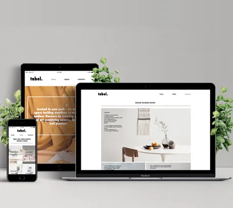
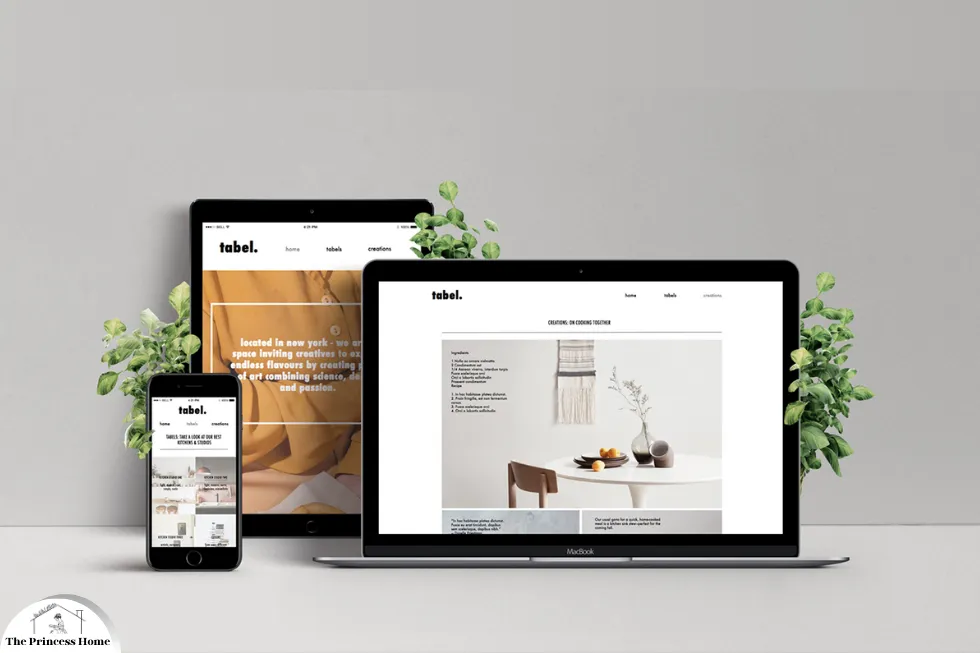
Mock-up designs provide a canvas for designers to experiment freely with color combinations without the constraints of finality. Whether designing a website, a logo, or a poster, mock-ups allow for iterative exploration and refinement of color palettes.
1.Exploration Phase:
Begin by brainstorming ideas and concepts for your design project. Consider the target audience, brand identity (if applicable), and desired emotional impact. With a clear vision in mind, start experimenting with different color combinations using digital tools or traditional methods like color swatches.
2.Color Psychology:
Delve into the realm of color psychology to understand the subconscious associations and emotions linked with various colors. For instance, blue often conveys trust and professionalism, while red evokes passion and excitement. By leveraging color psychology, designers can align color choices with the intended message or tone of their design.
3.Contrast and Balance:
Experiment with contrasting and complementary colors to create visual interest and hierarchy within your design. Contrast can be achieved through differences in hue, saturation, or brightness, while balance ensures harmony and coherence. Play with the placement of colors to guide the viewer’s attention and emphasize key elements.
4.Feedback and Iteration:
Solicit feedback from peers, clients, or focus groups to gain diverse perspectives on your color combinations. Iterate on your mock-up designs based on feedback, refining colors, proportions, and overall composition. Embrace the iterative nature of design, recognizing that each iteration brings you closer to the optimal solution.
5.Cross-Media Compatibility:
Consider the adaptability of your color combinations across different media and platforms. Colors may appear differently on various screens or in print, necessitating adjustments for optimal visibility and consistency. Test your mock-up designs across different devices and environments to ensure compatibility and accessibility.
6.Embrace Serendipity:
Sometimes, the most captivating color combinations emerge serendipitously through experimentation and spontaneity. Allow yourself to embrace unexpected discoveries and happy accidents during the design process. These serendipitous moments often lead to innovative solutions and fresh perspectives.

3.*Case Studies and Examples:
To illustrate the principles of experimenting with color combinations through mock-up designs, let’s explore a few case studies and examples across different design disciplines:
1.Website Design:
Imagine designing a vibrant e-commerce website for a boutique fashion brand. Experiment with a palette of bold and playful colors to evoke a sense of creativity and individuality. Use mock-ups to visualize how color combinations enhance the user experience and reinforce brand identity.
2.Logo Design:
Consider creating a sleek and modern logo for a tech startup specializing in renewable energy solutions. Explore minimalist color schemes with subtle gradients to convey innovation and sustainability. Mock-up designs enable you to test how colors interact with different logo variations and backgrounds.
3.Poster Design:
Suppose you’re tasked with designing an eye-catching poster for a music festival. Experiment with dynamic color combinations that capture the energy and excitement of live performances. Mock-ups allow you to assess the legibility of text against vibrant backgrounds and fine-tune color contrasts for maximum impact.
Conclusion:
Experimenting with color combinations through mock-up designs is a dynamic and iterative process that fuels creativity and innovation in graphic design. By understanding the principles of color theory, embracing experimentation, and leveraging mock-ups as creative tools, designers can unlock endless possibilities for captivating visual compositions.
Whether designing websites, logos, posters, or any other visual communication, the journey of exploring color combinations is as enriching as it is rewarding. Embrace the creative challenge, dare to experiment boldly, and let your imagination soar as you paint with the vibrant palette of colors available to you. In the colorful tapestry of design, each hue and combination tells a unique story waiting to be discovered.
FAQs on Experimenting with Color Combinations through Mock-Up Designs
Q1: How important is color theory in the process of experimenting with color combinations?
A: Color theory serves as the foundation for understanding how colors interact and influence perception. It’s crucial in guiding designers’ choices and ensuring harmonious combinations. By grasping concepts like hue, saturation, and contrast, designers can create visually appealing compositions that resonate with viewers.
Q2: How can mock-up designs aid in the experimentation process?
A: Mock-up designs provide a visual platform for testing and refining color combinations within the context of a specific project. Designers can iterate quickly, try out different palettes, and assess how colors impact the overall aesthetics and user experience. Mock-ups offer a low-risk environment to explore creative ideas before finalizing designs.
Q3: What role does color psychology play in selecting color combinations?
A: Color psychology explores the subconscious associations and emotions linked with different colors. By aligning color choices with the intended message or tone of a design, designers can evoke specific feelings or responses from viewers. For example, warm colors like red and orange might convey energy and excitement, while cool colors like blue and green evoke calmness and trust.
Q5: How do you ensure color consistency across different media and platforms?
A: Achieving color consistency across various media requires careful consideration and testing. Designers can use color management tools and techniques to ensure colors appear accurately on different screens and in print. It’s essential to calibrate devices, choose appropriate color profiles, and test designs across a range of environments to maintain consistency and accessibility.
Q6: Can you provide tips for creating contrast and balance in color combinations?
A: Contrast and balance are essential for creating visual interest and hierarchy in designs. Designers can achieve contrast by using colors with differing hues, saturations, or brightness levels. Balance ensures harmony and coherence by distributing colors evenly and considering their visual weight. Experimenting with proportions, placement, and texture can help strike the right balance in color combinations.
Q7: How do you handle feedback during the experimentation process?
A: Feedback is invaluable for refining color combinations and improving designs. Designers should solicit feedback from peers, clients, or focus groups to gain diverse perspectives. It’s essential to listen actively, consider constructive criticism, and remain open to new ideas. Iterating based on feedback allows designers to fine-tune color choices and create more effective visual compositions.
Q8: Are there any risks associated with experimenting with color combinations?
A: While experimentation is essential for creativity, there are risks associated with choosing inappropriate or jarring color combinations. Designers should be mindful of cultural connotations, accessibility considerations, and brand guidelines when selecting colors. Conducting thorough research and testing designs can help mitigate potential risks and ensure that color choices resonate positively with the intended audience.

