
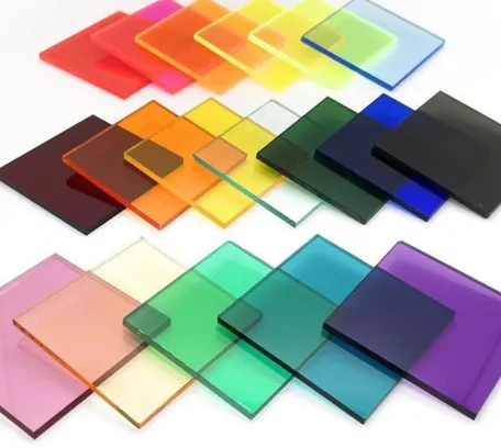
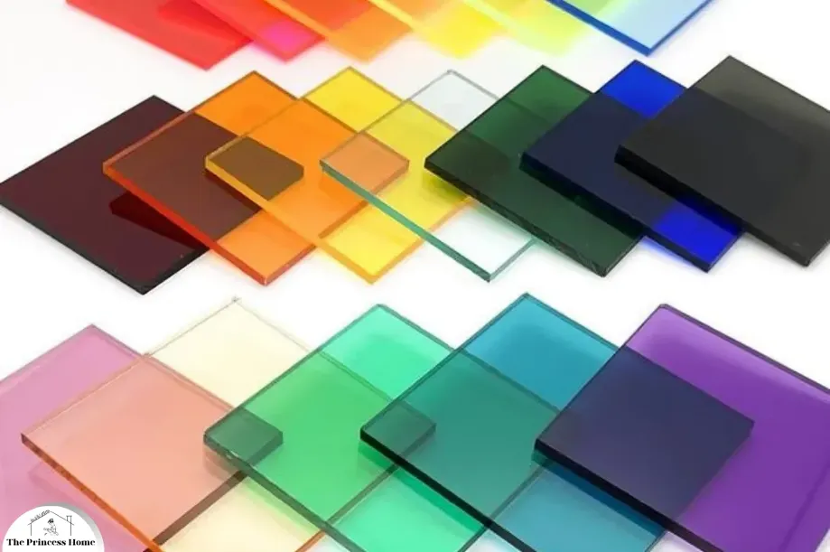
Color is not merely a visual attribute; it is a powerful tool that influences our emotions, perceptions, and behaviors in profound ways. From the serene blue of a clear sky to the vibrant red of a ripe apple, colors have the ability to evoke a spectrum of feelings and associations. When applied to various surfaces such as walls, floors, ceilings, and furniture, colors can transform spaces, shaping our experiences and interactions within them. In this article, we delve into the intricate relationship between color and surfaces, exploring how different hues impact our environments and the psychology behind their effects.

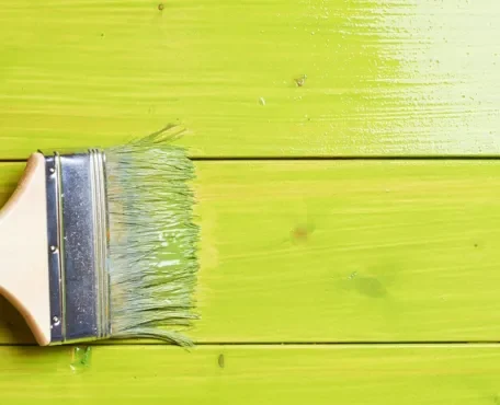
1*.Color and Walls:
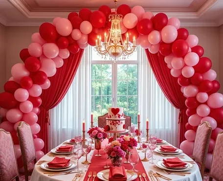
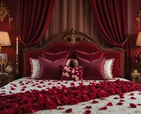
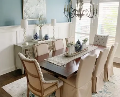
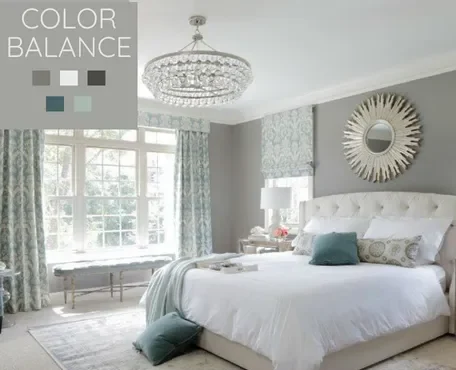
Walls serve as the canvas upon which the palette of a room is painted. The color of walls can dictate the mood and atmosphere of a space, influencing occupants on both conscious and subconscious levels. For instance, warm tones like reds, oranges, and yellows can create a cozy and inviting ambiance, perfect for social areas like living rooms and dining spaces. Conversely, cooler hues such as blues and greens are often associated with tranquility and relaxation, making them well-suited for bedrooms and bathrooms.
Moreover, the perceived size of a room can be altered by the color of its walls. Lighter shades tend to visually expand spaces, making them feel more open and airy, while darker colors have the opposite effect, creating a sense of intimacy and enclosure. This principle is especially useful in interior design, where the strategic use of color can optimize the perceived dimensions of a room.
Color has a profound impact on the perception and ambiance of any space, whether it’s applied to walls, floors, ceilings, or other surfaces.
Let’s delve into the significance of color on walls specifically:
1.Emotional Response:
Different colors evoke various emotional responses. For instance, warm colors like reds, oranges, and yellows tend to energize and stimulate, making them suitable for areas where activity and social interaction are desired, such as dining rooms or kitchens. On the other hand, cool colors like blues, greens, and purples have a calming effect, making them ideal for spaces where relaxation and concentration are important, like bedrooms or offices.
2.Perception of Space:
Color can visually alter the perception of space. Light colors tend to make a room feel more spacious and airy, while dark colors can create a sense of coziness and intimacy. In small rooms, using lighter shades on the walls can help open up the space and make it appear larger, while darker hues can make larger rooms feel more intimate and inviting.
3.Architectural Features:
Strategic use of color can highlight or downplay architectural features. Bold or contrasting colors on accent walls can draw attention to interesting architectural elements like alcoves, columns, or fireplace surrounds, adding visual interest to the space. Conversely, using the same color throughout can create a sense of continuity and harmony, minimizing the focus on individual architectural details.
4.Lighting Effects:
The interaction between color and light is crucial. Natural light can enhance or mute the intensity of colors, while artificial lighting can create different moods depending on the color temperature and intensity of the light sources. It’s essential to consider how the color will appear under various lighting conditions throughout the day and night.
5.Cultural and Personal Preferences:
Cultural associations and personal preferences play a significant role in color choices. Certain colors may carry specific cultural meanings or symbolism, so it’s essential to consider the cultural context when selecting colors for a space. Additionally, individuals may have personal associations or memories attached to particular colors, influencing their emotional response to those colors in a given environment.
Overall, the choice of color for walls can significantly impact the ambiance, functionality, and visual appeal of a space. It’s essential to consider factors such as emotional response, perception of space, architectural features, lighting effects, and cultural and personal preferences when selecting colors for walls.

2*.Color and Floors:
The color of flooring not only contributes to the aesthetic appeal of a room but also plays a crucial role in setting the overall tone and style. Light-colored floors, such as those in shades of beige or light wood, can brighten a space and lend it an air of sophistication and modernity. Conversely, darker flooring options like espresso hardwood or charcoal tiles can imbue rooms with a sense of luxury and elegance, especially when paired with complementary furnishings and decor.
Furthermore, the choice of flooring color can influence the perceived cleanliness and maintenance requirements of a space. Lighter floors tend to mask dirt and debris more effectively than darker ones, making them a popular choice for high-traffic areas such as kitchens and entryways. However, darker floors can add drama and contrast to a room, particularly in contemporary and minimalist designs.
Color plays a crucial role in defining the character and atmosphere of a room when applied to floors.
Here’s a breakdown of the impact of color on floors:
1.Visual Perception of Space:
Similar to walls, the color of the floor can influence the perceived size of a room. Light-colored floors, such as white, beige, or light wood tones, tend to create an illusion of space and airiness, making them ideal for small rooms or areas where you want to maximize the feeling of openness. Conversely, dark-colored floors, like deep browns or charcoal grays, can make a room feel cozier and more intimate but may also visually shrink the space.
2.Mood and Atmosphere:
Just like walls, the color of the floor can contribute to the overall mood and atmosphere of a room. Warm-toned floors, such as honey-colored woods or earthy terracottas, can evoke a sense of warmth, comfort, and hospitality, making them well-suited for areas like living rooms or dining areas where you want to create a welcoming ambiance. Cooler-toned floors, such as gray tiles or cool-toned woods like ash or maple, can create a more contemporary and serene atmosphere, suitable for spaces like offices or bathrooms.
3.Practical Considerations:
In addition to aesthetics, practical considerations also come into play when choosing the color of flooring. Light-colored floors can show dirt and stains more easily, requiring more frequent cleaning and maintenance, while dark-colored floors can help camouflage dirt but may show scratches and dust more visibly. It’s essential to strike a balance between the desired aesthetic and the practicalities of maintenance when selecting flooring colors.
4.Visual Continuity:
Flooring color can also contribute to visual continuity and flow within a space. Using the same flooring color throughout an open floor plan can create a sense of unity and cohesion, visually connecting different areas of the home. Alternatively, using different flooring colors or materials to delineate separate zones can help define distinct functional areas within a larger space.
5.Contrast and Accents:
Flooring color can be used to create contrast and highlight other design elements within a room. For example, a dark hardwood floor can provide a dramatic contrast against light-colored walls or furnishings, drawing attention to architectural features or decorative accents. Conversely, a patterned or brightly colored floor can serve as a focal point in an otherwise neutral room, adding visual interest and personality.
Ultimately, the color of the floor significantly influences the visual impact, mood, practicality, and overall design of a space. Whether you opt for light or dark tones, warm or cool hues, it’s essential to consider the desired atmosphere, practical considerations, and design cohesion when selecting flooring colors.
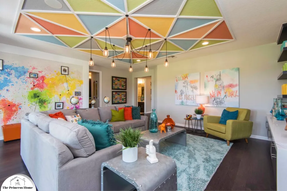
3*.Color and Ceilings:
Often overlooked in interior design, the color of ceilings can have a significant impact on the overall look and feel of a room. While white remains a popular choice for ceilings due to its ability to reflect light and create a sense of height, designers are increasingly experimenting with bolder hues to add visual interest and depth to spaces. Painting ceilings in a darker color than the walls can create a cozy and enveloping atmosphere, especially in rooms with high ceilings where a sense of intimacy is desired.
Additionally, the use of color on ceilings can be employed to visually define different areas within an open-concept floor plan. By painting the ceiling above a dining area or conversation pit in a contrasting color, designers can delineate zones without the need for physical barriers, enhancing the flow and functionality of the space.
When it comes to interior design, the color of the ceiling often gets overlooked, but it can have a significant impact on the overall look and feel of a space.
Here’s how color influences ceilings:
1.Perception of Height:
Ceiling color can affect how tall or low a room feels. Light-colored ceilings, such as white or pale shades, tend to make ceilings appear higher, creating a sense of spaciousness and airiness in the room. On the other hand, dark-colored ceilings can make a room feel more intimate and cozy but may visually lower the height of the ceiling. This effect is especially noticeable in rooms with low ceilings, where lighter colors can help visually lift the ceiling and make the space feel more expansive.
2.Visual Continuity or Contrast:
Ceilings can either blend in with the walls or stand out as a contrasting element. Painting the ceiling the same color as the walls creates a seamless, monochromatic look that can make a room feel more cohesive and expansive. Conversely, painting the ceiling a different color creates contrast and draws the eye upward, adding visual interest to the space. Using a darker or bolder color on the ceiling can create a striking focal point, especially in rooms with neutral or light-colored walls.
3.Mood and Atmosphere:
Like walls and floors, ceiling color can influence the mood and atmosphere of a room. Light-colored ceilings contribute to a bright and airy ambiance, making them ideal for spaces where you want to maximize natural light and create a sense of openness, such as living rooms or kitchens. Dark-colored ceilings can create a more intimate and cocoon-like atmosphere, suitable for cozy spaces like bedrooms or media rooms.
4.Architectural Details:
Ceiling color can highlight or downplay architectural details, such as moldings, beams, or tray ceilings. Painting these elements a different color than the ceiling can draw attention to them and add visual interest to the room. For example, painting crown moldings or beams a contrasting color can enhance their architectural significance and create a sense of depth in the space.
5.Lighting Effects:
The color of the ceiling can affect how light is distributed throughout the room. Light-colored ceilings reflect more light, helping to illuminate the space and create a bright, open feel. In contrast, dark-colored ceilings absorb more light, which can create a more intimate and subdued ambiance. It’s essential to consider how the ceiling color will interact with natural and artificial light sources in the room.
Overall, the color of the ceiling plays a crucial role in shaping the visual impact, mood, and atmosphere of a space. Whether you opt for light or dark tones, matching or contrasting colors, it’s essential to consider the desired effect, architectural features, lighting conditions, and overall design aesthetic when choosing ceiling colors.

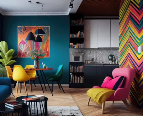
4*.Color and Furniture:
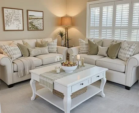
Furniture serves as both functional pieces and decorative elements within a room, and the color choices for these pieces can significantly impact the overall aesthetic and mood. Neutral-colored furniture, such as beige sofas or white dining chairs, offers a versatile backdrop that homeowners can easily update with accessories and accents to match changing tastes and trends. Conversely, furniture in bold colors or patterns injects personality and flair into a space, serving as focal points around which designers craft the rest of the room.
Moreover, the color of furniture can influence the perceived size and scale of a room. Light-colored pieces tend to visually expand spaces, making them ideal for small rooms or apartments where maximizing space is paramount. Conversely, darker furniture can anchor a room and create a sense of coziness and intimacy, particularly in larger, more expansive spaces.
Color coordination between furniture and the surrounding surfaces, including walls, floors, and ceilings, is fundamental in interior design.
Here’s how the color of furniture interacts with different surfaces:
1.Harmony and Cohesion:
Coordinating the c3.olors of furniture with the surrounding surfaces creates a sense of harmony and cohesion in the space. Matching or complementing the hues of furniture with the walls, floors, and ceilings establishes a unified look that ties the room together seamlessly. For example, if the walls are painted in a soft blue hue, choosing furniture in complementary shades of blue or neutral tones can create a cohesive and visually pleasing environment.
2.Contrast and Emphasis:
Alternatively, contrasting the colors of furniture with the surrounding surfaces can add visual interest and emphasis to the space. For instance, pairing dark furniture with light-colored walls, floors, or ceilings creates a striking contrast that draws attention to the furniture pieces, making them focal points in the room. Similarly, using brightly colored or patterned furniture against neutral backgrounds can create a vibrant and dynamic aesthetic.
3.Visual Balance:
Balancing the colors of furniture with the surrounding surfaces is essential for achieving visual equilibrium in the space. If the walls, floors, or ceilings feature bold or dominant colors, it’s often advisable to opt for furniture in complementary or subdued tones to prevent visual overload. Conversely, in spaces with neutral or monochromatic surfaces, incorporating furniture in varied colors and textures can add depth and visual richness to the room.
4.Mood and Atmosphere:
The colors of furniture contribute significantly to the mood and atmosphere of the space. Warm-toned furniture, such as pieces in shades of red, orange, or yellow, can create a cozy and inviting ambiance, particularly when paired with warm-colored walls or flooring. In contrast, cool-toned furniture, like blues, greens, or grays, imparts a sense of calmness and serenity, which complements cool-colored surfaces such as light blue walls or gray flooring.
5.Personal Style and Preferences:
Ultimately, the choice of furniture colors should reflect the homeowner’s personal style and preferences. Whether opting for bold, vibrant hues or understated, neutral tones, selecting furniture colors that resonate with one’s aesthetic sensibilities ensures a space that feels authentic and reflective of individual taste.
In summary, coordinating the colors of furniture with surrounding surfaces is key to achieving a cohesive, visually appealing, and harmonious interior design scheme. Whether aiming for harmony or contrast, it’s essential to consider factors such as visual balance, mood, and personal style when selecting furniture colors for a space.
Conclusion:
In conclusion, the impact of color on various surfaces within a space cannot be overstated. From walls and floors to ceilings and furniture, the choice of color shapes the mood, atmosphere, and functionality of our environments in profound ways. By understanding the psychological effects of different hues and their interactions with different surfaces, designers and homeowners alike can create spaces that not only look visually stunning but also feel harmonious and inviting. Whether aiming to evoke a sense of calm and serenity or make a bold statement, harnessing the power of color is essential in the art of interior design.
Here are some frequently asked questions related to the impact of color:
Q1: How does the color of walls affect the mood of a room?
A: The color of walls can significantly impact the mood of a room. Warm tones like reds, oranges, and yellows can create a cozy and inviting ambiance, perfect for social areas like living rooms and dining spaces. Cool hues such as blues and greens are often associated with tranquility and relaxation, making them well-suited for bedrooms and bathrooms. Lighter shades tend to visually expand spaces, while darker colors create a sense of intimacy and enclosure.
Q2: What flooring colors are best for small spaces?
A: Light-colored flooring, such as shades of beige or light wood, are ideal for small spaces as they can make rooms appear larger and more spacious. Light floors also tend to reflect more light, brightening the space and creating an airy feel. Additionally, lighter floors can help conceal dirt and debris, making them easier to maintain in high-traffic areas.
Q3: Can the color of the ceiling affect the perceived height of a room?
A: Yes, the color of the ceiling can influence the perceived height of a room. Painting the ceiling in a lighter color than the walls can create the illusion of a higher ceiling, making the space feel more open and expansive. Conversely, painting the ceiling in a darker color can make the room feel cozier and more intimate, especially in rooms with high ceilings where a sense of warmth is desired.
Q4: How can furniture color impact the overall aesthetic of a room?
A: The color of furniture can significantly impact the overall aesthetic of a room. Neutral-colored furniture serves as a versatile backdrop that homeowners can easily update with accessories and accents to match changing tastes and trends. Meanwhile, bold colors or patterns in furniture inject personality and flair into a space, serving as focal points around which designers craft the rest of the room.Light-colored furniture can visually expand spaces, while darker furniture can anchor a room and create a sense of coziness and intimacy.
Q5: What are some common mistakes to avoid when choosing colors for surfaces in a room?
A: Some common mistakes to avoid when choosing colors for surfaces in a room include neglecting to consider the overall mood and atmosphere you want to create, failing to test paint samples in different lighting conditions, and ignoring the impact of existing elements such as furniture and decor. It’s also important to avoid using too many bold colors or conflicting color schemes, as this can overwhelm the space and create visual chaos. Additionally, be mindful of how colors interact with each other and the psychological effects they may have on occupants.
