
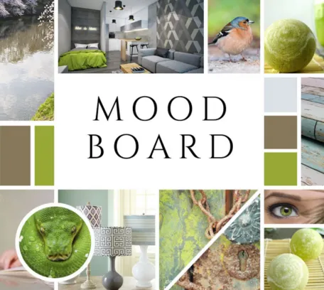

Mood boards serve as powerful tools for designers, artists, marketers, and anyone seeking to convey a specific atmosphere or emotion through visuals. They amalgamate various elements like images, textures, typography, and color schemes to evoke a particular mood or concept. Among these elements, color plays a pivotal role, as it has the ability to evoke emotions, set the tone, and convey messages without words.
In this article, we delve into the art of creating mood boards based on different color schemes, exploring their psychological impact and practical applications.
Understanding Color Psychology:
Before diving into the creation process, it’s essential to grasp the basics of color psychology. Colors evoke specific emotions and associations, which can vary depending on cultural, personal, and contextual factors. For instance, warm tones like red and orange often evoke feelings of energy, passion, and warmth, while cooler tones like blue and green are associated with calmness, serenity, and nature. Understanding these associations lays the foundation for effectively utilizing color in mood boards.
Exploring Different Color Schemes:
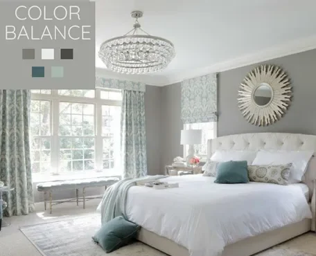
Monochromatic:
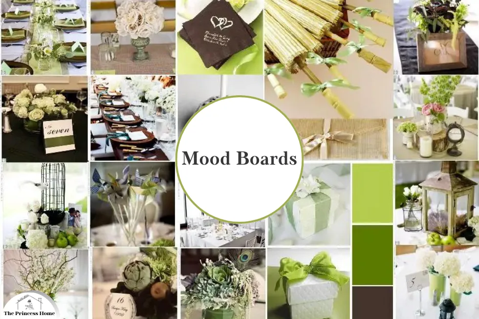
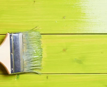
Monochromatic color schemes involve using variations of a single hue along with its tints, shades, and tones. This scheme creates a sense of harmony and simplicity, making it ideal for minimalist designs or conveying a cohesive mood without overwhelming the viewer with too much visual information.
Analogous:
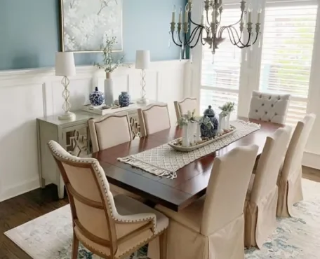
Analogous color schemes consist of colors that are adjacent to each other on the color wheel. This scheme offers a balanced yet dynamic palette, making it suitable for creating visual interest while maintaining harmony. Analogous schemes often evoke a sense of unity and fluidity, making them ideal for conveying a cohesive theme or mood.
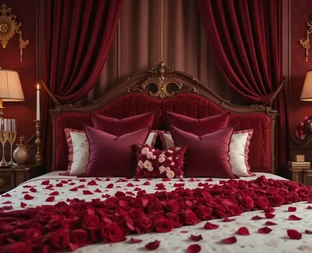
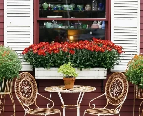
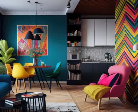
Complementary:
Complementary color schemes involve colors that are opposite each other on the color wheel. This scheme creates a high-contrast palette that grabs attention and adds vibrancy to mood boards. However, using complementary colors requires careful balance to avoid visual discordance. When executed effectively, complementary schemes can evoke excitement, tension, and dynamism.
Triadic:
Triadic color schemes consist of three colors that are evenly spaced around the color wheel, forming a triangle. This scheme offers a diverse range of colors while maintaining visual balance and harmony. Triadic schemes are versatile and can evoke various moods depending on the chosen colors. They offer a balance between contrast and harmony, making them suitable for conveying complexity and diversity in mood boards.

Creating Mood Boards Based on Color Schemes:
Now that we’ve explored different color schemes, let’s delve into the practical process of creating mood boards using these schemes. Creating mood boards based on color schemes can be a fun and creative process.
Here’s a step-by-step guide to help you get started:
1.Choose Your Color Scheme:
Decide on the color scheme you want to work with. Common color schemes include monochromatic, analogous, complementary, split-complementary, triadic, and tetradic.
2.Gather Inspiration:
Collect images, photographs, textures, patterns, and objects that inspire you and fit within your chosen color scheme. You can find inspiration from nature, art, fashion, interior design, or any other source that resonates with you.
3.Create a Digital or Physical Board:
Decide whether you want to create a digital mood board using software like Canva, Adobe Photoshop, or Pinterest, or if you prefer a physical board using a bulletin board, poster board, or even a scrapbook.
4.Organize Your Materials:
Arrange your collected materials according to your color scheme. Group similar colors together to create a cohesive look.
5.Experiment with Layout:
Play around with the layout of your materials. You can arrange them in a grid pattern, overlap them creatively, or scatter them organically across the board. Consider factors like balance, symmetry, and focal points as you arrange your elements.
6.Add Text and Annotations (Optional):
If you’re creating a digital mood board, you can include text annotations to explain your choices, provide context, or add quotes that capture the mood you’re trying to convey.
7.Refine and Edit:
Step back and take a look at your mood board as a whole. Make any necessary adjustments to ensure that it effectively communicates the mood and theme you’re aiming for. You might need to remove or replace certain elements to achieve the desired effect.
8.Finalize and Share:
Once you’re satisfied with your mood board, finalize it by making any last-minute tweaks and adjustments. Then, if you’re creating a digital mood board, you can easily share it online with others for feedback or inspiration.
Remember, the goal of a mood board is to visually convey a mood, theme, or concept through the careful selection and arrangement of images and other visual elements. Have fun experimenting with different color schemes and letting your creativity shine!
1.Define the Concept:
Before selecting colors, clarify the concept or mood you want to convey through the mood board. Whether it’s a serene landscape, a vibrant celebration, or a futuristic theme, having a clear concept will guide your color choices and overall design direction. Defining the concept is essential before selecting colors for a mood board because it sets the foundation for the entire visual composition.
Here’s a breakdown of what defining the concept entails:
1.Identify the Mood or Theme:
Determine the overarching mood, theme, or message you want your mood board to convey. Is it tranquil and peaceful, energetic and lively, nostalgic and romantic, or perhaps modern and minimalist? Clarifying the mood or theme will provide a clear direction for your color choices and design elements.
2.Consider the Audience or Purpose:
Think about who will be viewing the mood board and why. Is it for a client presentation, a personal project, or inspiration for a creative endeavor? Understanding the audience and purpose will help tailor the concept to resonate with its intended viewers.
3.Gather Inspiration & References:
Research and gather visual references that align with your concept. Look for images, artwork, photographs, and designs that evoke the desired mood or theme. Pay attention to color schemes, textures, shapes, and overall aesthetics that capture the essence of your concept.
4.Define Key Elements &Visual Components:
Identify key elements or visual components that are integral to your concept. These could include specific motifs, symbols, imagery, or cultural references that enhance the overall narrative. Consider how these elements can be incorporated into your mood board cohesively.
5.Sketch or Brainstorm Ideas:
Take time to sketch or brainstorm ideas for your mood board layout and composition. Experiment with different arrangements, styles, and compositions to see what best communicates your concept visually. This preliminary stage allows for exploration and refinement before finalizing the design.
6.Select Colors Based on Conceptual Significance:
Once you have a clear concept in mind, choose colors that align with and enhance the desired mood or theme. Consider the psychological associations of different colors and how they can evoke specific emotions or convey particular meanings. Select a color palette that resonates with your concept and reinforces its narrative.
By defining the concept before selecting colors, you establish a cohesive vision for your mood board and ensure that every design choice serves to enhance the overall message or mood you want to convey. This thoughtful approach leads to more impactful and engaging visual presentations.

2.Choose a Color Scheme:
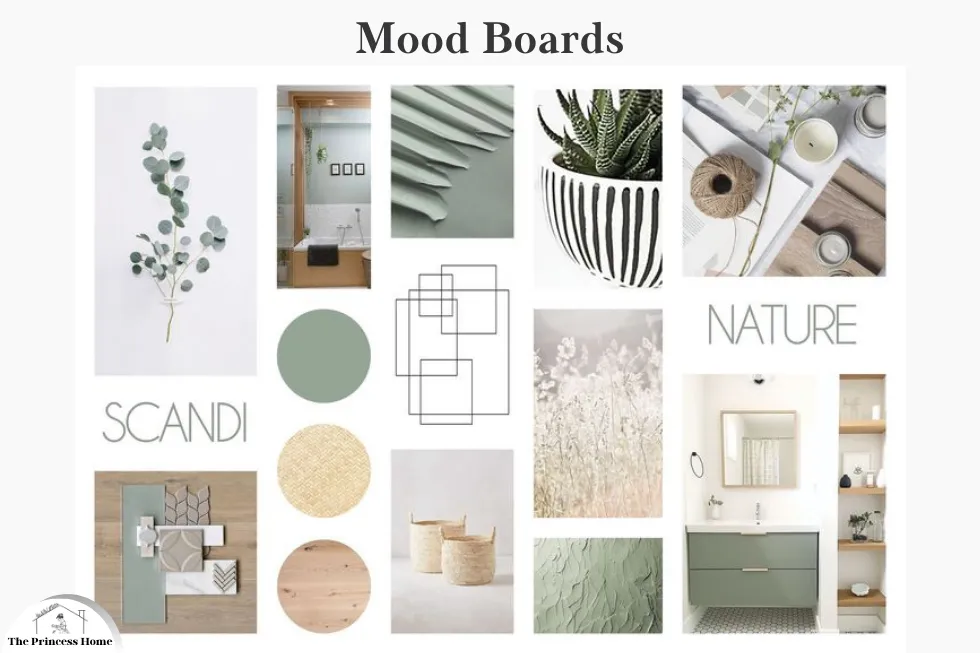
Based on the desired mood or concept, select a color scheme that aligns with your vision. Consider the emotions you want to evoke and the message you want to convey. Referencing color psychology can help in making informed decisions about which scheme best suits your objectives. Let’s say our desired mood or concept is “serene and calming nature retreat.” We want to evoke feelings of tranquility, peace, and connection with nature. Based on this concept, we can choose a color scheme that aligns with these objectives and references color psychology to enhance the overall mood.
Here’s a suggested color scheme:
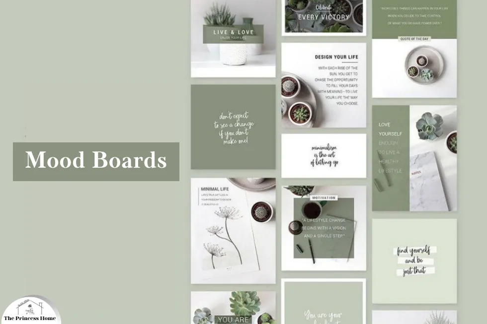
Color Scheme: Monochromatic (Shades of Green)
1.Explanation:
Green: As the dominant color, green is strongly associated with nature, growth, and harmony. It symbolizes renewal, balance, and tranquility, making it an ideal choice for evoking a sense of calmness and connection with nature. Different shades of green can be used to create depth and variation while maintaining visual coherence.
2.Color Psychology:
Green is known to have a calming and soothing effect on the mind, promoting feelings of relaxation and harmony. It is also associated with balance, stability, and renewal, aligning perfectly with the desired mood of a serene nature retreat.
3.Additional Considerations:
Accents: To complement the monochromatic green palette, subtle accents of earthy tones like browns and tans can be incorporated to evoke the natural textures of wood, stone, and earth.
Texture: Consider incorporating textural elements such as soft fabrics, natural fibers, and organic patterns to enhance the tactile and sensory experience of the mood board.
By selecting a monochromatic color scheme dominated by shades of green, we can effectively convey the serene and calming nature retreat concept while leveraging the psychological associations of color to evoke the desired emotions and mood.
3.Gather Visual Inspiration:
Collect images, textures, patterns, and typography that resonate with your chosen color scheme and concept. Look for diverse sources of inspiration, including photography, artwork, nature, fashion, and architecture. Aim for a balance of elements that capture the essence of your desired mood or theme. Let’s gather some visual inspiration that resonates with our chosen color scheme of monochromatic shades of green and our concept of a serene nature retreat.
Here’s a selection of images, textures, patterns, and typography to inspire our mood board:
1.Photography:
- Images of lush green landscapes, serene forests, and tranquil gardens
- Close-up shots of leaves, ferns, and other botanical elements
- Pictures of peaceful lakes, flowing streams, and gentle waterfalls
2.Artwork:
- Paintings or illustrations featuring verdant scenery and natural landscapes
- Artwork depicting peaceful scenes of meditation, yoga, or mindfulness in nature
- Abstract art with organic shapes and soothing green hues
3.Nature-Inspired Textures:
- Textures of grass, moss, and foliage
- Close-up textures of tree bark, branches, and twigs
- Textiles with botanical prints or leaf patterns
4.Patterns:
- Geometric patterns inspired by natural elements like leaves or waves
- Repeat patterns of ferns, vines, or floral motifs
- Organic patterns resembling ripples on water or dappled sunlight filtering through trees
5.Typography:
- Clean and minimalist fonts that evoke a sense of simplicity and tranquility
- Handwritten or script fonts with a natural and organic feel
- Typography that incorporates subtle green accents or botanical motifs
6.Fashion and Accessories:
- Clothing and accessories in shades of green, such as forest green, sage, or olive
- Textures and fabrics inspired by nature, such as linen, cotton, or sustainable materials
- Jewelry or accessories featuring natural elements like leaves, feathers, or gemstones
7.Architecture &Design:
- Examples of eco-friendly architecture blending seamlessly with the natural environment
- Interior design featuring biophilic elements like indoor plants, green walls, and natural materials
- Sustainable design principles that prioritize harmony with nature and environmental stewardship
By gathering visual inspiration from diverse sources, we can capture the essence of our chosen color scheme and concept while ensuring a rich and varied mood board that resonates with our desired mood of a serene nature retreat.
4.Curate and Arrange:
Arrange your collected visuals on a digital or physical board, paying attention to composition, balance, and hierarchy. Experiment with different layouts and juxtapositions to create visual interest and coherence. Ensure that the chosen colors are prominently featured and harmonize with the overall composition.
Certainly! Let’s curate and arrange our collected visuals on a digital mood board, paying attention to composition, balance, and hierarchy. We’ll experiment with different layouts and juxtapositions to create visual interest and coherence while ensuring that our chosen monochromatic shades of green are prominently featured and harmonize with the overall composition.
Digital Mood Board: Serene Nature Retreat
1.Background:
- Use a soft, muted green color or a subtle texture resembling foliage as the background to set the tone for the mood board.
2.Central Image:
- Place a captivating photograph of a tranquil forest or verdant landscape in the center as the focal point. This image will anchor the mood board and convey the essence of a serene nature retreat.
3.Surrounding Images:
- Surround the central image with smaller photographs and artwork depicting scenes of nature, such as trees, leaves, and water bodies, in varying shades of green.
- Intersperse the images with close-up shots of natural textures like moss, ferns, and bark to add depth and visual interest.
4.Textures and Patterns:
- Incorporate subtle textures and patterns inspired by nature, such as leaf motifs, organic shapes, and gentle ripples, throughout the mood board. These elements can be overlaid on images or used as background accents.
5.Typography:
- Add minimalist typography in a neutral color or a shade of green to complement the visuals. Use clean and simple fonts to convey any text elements, such as inspirational quotes or descriptive captions, that enhance the mood board’s narrative.
6.Balance and Harmony:
- Ensure a balanced composition by distributing visual elements evenly across the mood board. Pay attention to visual hierarchy, with the central image commanding attention while smaller images and accents support the overall theme.
- Experiment with different arrangements and layouts to find the most visually appealing and coherent presentation.
7.Final Touches:
- Review the mood board as a whole and make any necessary adjustments to refine the composition and enhance visual coherence. Consider adding subtle transitions or overlays to create a seamless flow between images and elements.
By curating and arranging our collected visuals thoughtfully, we can create a digital mood board that effectively captures the essence of a serene nature retreat while showcasing our chosen monochromatic color scheme in a harmonious and visually compelling way.
5.Refine and Iterate:
Review your mood board critically, considering how effectively it communicates the desired mood or concept. Make adjustments to color balance, visual elements, and overall composition as needed. Iteration is key to refining your mood board until it accurately reflects your vision and resonates with your audience.
Absolutely, refinement and iteration are crucial steps in the mood board creation process. Let’s review our digital mood board for the serene nature retreat concept and make necessary adjustments to ensure it effectively communicates the desired mood and concept.
Refinement Process:
1.Color Balance:
Check the balance of shades of green throughout the mood board. Ensure that there is enough variation to create visual interest without overwhelming the viewer.
Adjust the saturation and brightness of the green hues if needed to maintain a harmonious and soothing color palette.
2.Visual Elements:
Evaluate the selection of images, textures, and patterns to ensure they align with the serene nature retreat concept. Remove any elements that feel out of place or detract from the overall mood.
Consider adding additional visual elements, such as subtle botanical illustrations or watercolor accents, to enhance the nature-inspired theme.
3.Composition:
Review the composition of the mood board to ensure a balanced and cohesive layout. Experiment with rearranging the elements to improve flow and visual hierarchy.
Pay attention to spacing and alignment to create a polished and professional presentation.
4.Typography:
Double-check the typography used for any text elements on the mood board. Ensure that fonts are legible and complement the overall aesthetic without overpowering the visuals.
Consider adjusting font sizes, styles, and placements to achieve optimal readability and visual balance.
5.Feedback & Iteration:
Seek feedback from colleagues, friends, or other stakeholders to gain fresh perspectives on the mood board. Consider their input and suggestions for improvement.
Iterate on the design based on feedback received, making refinements and adjustments as necessary until the mood board accurately reflects the vision and resonates with the intended audience.
6.Final Review:
Conduct a final review of the refined mood board to ensure that it effectively communicates the serene nature retreat concept and evokes the desired mood of tranquility and connection with nature.
Make any last-minute tweaks or refinements to polish the presentation before sharing it with others.
By undergoing the refinement and iteration process, we can fine-tune our mood board to accurately reflect our vision and effectively communicate the desired mood and concept to our audience. This iterative approach ensures that the final mood board resonates with viewers and effectively serves its intended purpose.

Practical Applications:
Mood boards based on different color schemes find diverse applications across various industries and creative disciplines:
- Graphic Design: Designers use mood boards to explore color palettes, typography, and visual styles for branding, marketing campaigns, and digital interfaces.
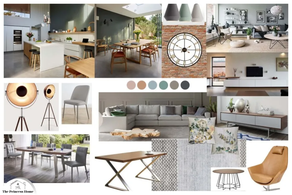
- Interior Design: Interior designers utilize mood boards to conceptualize color schemes, furniture arrangements, and decor elements for residential and commercial spaces.
- Fashion Design: Fashion designers create mood boards to develop color stories, fabric choices, and overall aesthetics for clothing collections and runway presentations.
- Marketing and Advertising: Marketers and advertisers use mood boards to brainstorm creative concepts, visual themes, and color schemes for campaigns, product launches, and brand identities.
Conclusion:
Creating mood boards based on different color schemes is both an art and a science, requiring a balance of creativity, intuition, and strategic thinking. By understanding color psychology and exploring diverse color schemes, designers can craft mood boards that effectively convey emotions, tell stories, and inspire action. Whether you’re designing a brand identity, planning an interior space, or conceptualizing a marketing campaign, mastering the art of mood boards can elevate your creative process and captivate your audience.
Here are some frequently asked questions:
Q1: What is a mood board?
A: A mood board is a visual tool used by designers, artists, and marketers to convey a specific mood, concept, or idea through a collage of images, textures, typography, and color schemes.
Q2: Why are color schemes important in mood boards?
A: Color schemes play a crucial role in mood boards as they evoke emotions, set the tone, and convey messages without words. Different color schemes can evoke different moods and associations, allowing designers to effectively communicate their intended message or concept.
Q3: What is color psychology, and how does it relate to mood boards?
A: Color psychology is the study of how colors influence human emotions, perceptions, and behaviors. It relates to mood boards as designers often use color to evoke specific emotions or convey particular messages. Understanding color psychology helps designers make informed decisions when selecting color schemes for their mood boards.
Q4: What are some common color schemes used in mood boards?
A: Some common color schemes used in mood boards include monochromatic, analogous, complementary, and triadic. Each scheme offers different effects and associations, allowing designers to create diverse visual compositions that evoke various moods and themes.
Q5: How can I choose the right color scheme for my mood board?
A: When choosing a color scheme for your mood board, consider the mood or concept you want to convey, as well as the emotions you want to evoke. Referencing color psychology can help you select colors that align with your objectives and resonate with your audience.
Q6: What are some practical applications of mood boards?
A: Mood boards find practical applications across various industries and creative disciplines, including graphic design, interior design, fashion design, and marketing. They are used to explore visual concepts, develop color palettes, and communicate ideas in a visually compelling way.
Q7: How do I create a mood board?
A: To create a mood board, start by defining the concept or mood you want to convey. Then, choose a color scheme that aligns with your vision and gather visual inspiration from diverse sources. Curate and arrange your collected visuals on a digital or physical board, paying attention to composition and balance. Refine and iterate your mood board until it accurately reflects your vision and resonates with your audience.
