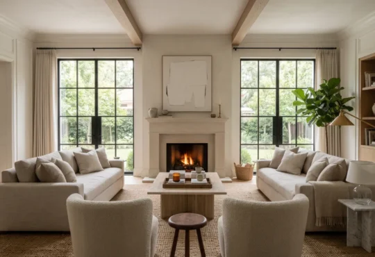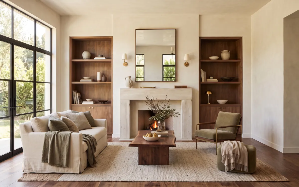
There is a quiet moment that happens before a room truly comes to life. Sunlight drifts across a wall, fabrics reveal their texture, and every surface begins speaking to the colors around it. Sometimes the result feels calm without effort. Other times, even beautiful furniture and expensive finishes seem strangely disconnected.
Color choices often shape that invisible atmosphere long before individual design elements are noticed. The most common color mistakes are rarely about choosing the wrong shade. More often, they stem from how color interacts with light, materials, and proportion, influencing how a space feels as much as how it looks.
Interior Color Harmony
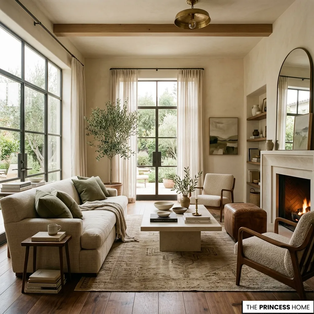
A color rarely exists alone. The soft olive that appeared comforting in a showroom may feel muted beside cool marble, while a warm ivory can suddenly appear yellow beneath evening lighting. The mistake is rarely the paint color itself.
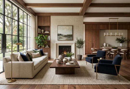
More often, it is the relationship between paint colors, materials, and light that quietly transforms the entire experience. Well-composed interiors reveal a subtle dialogue between every finish. Walls borrow warmth from timber floors. Upholstery softens the crispness of stone.
Metal accents catch changing daylight, altering the perception of surrounding colors throughout the day. When these conversations are overlooked, a room can feel fragmented despite using individually attractive colors.
A harmonious interior color scheme is less about finding a perfect single shade and more about creating continuity between walls, flooring, cabinetry, furniture, and textiles.
The most successful rooms often rely on a restrained family of related tones, allowing texture and material ariation to provide richness rather than introducing unrelated colors in every element.This is why thoughtfully considered color choices feel effortless.
They create continuity rather than competition, allowing every surface to belong to the same visual story.
💡 BACK TO BASICS:
Master the primary rules of space and color with our comprehensive Free Interior Design Course Learn the Skills to Design Your Home.
Lighting Color Effects
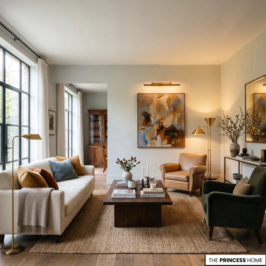
Paint samples often appear convincing because they are viewed in isolation. A small card held beneath store lighting cannot predict how an entire room will transform from morning brightness to afternoon softness and evening shadows.
Natural daylight reveals undertones differently than artificial illumination. A neutral gray may quietly lean blue at sunrise before becoming almost taupe under warm lamps. Cream can appear serene in one orientation and unexpectedly rich in another.
North-facing rooms tend to emphasize cooler undertones, while south-facing spaces often intensify warmth. Open-plan interiors add another layer of complexity because colors are experienced from multiple angles simultaneously, making transitions between connected spaces especially important.
As light shifts across the day, colors evolve with it. Rooms that feel visually balanced usually acknowledge this constant movement instead of assuming a single appearance.
Whether in compact city apartments, contemporary homes, or expansive interiors, this changing relationship between light and color becomes one of the defining characteristics of the finished space.
💡 READ NEXT:
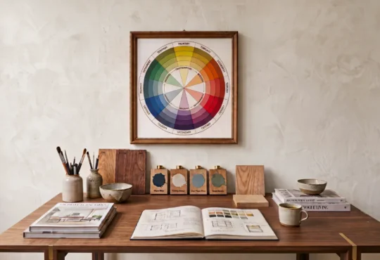
Understand how spectral undertones interact on the traditional wheel in Understanding the Color Wheel Primary & Secondary Colors.
Accent Color Balance
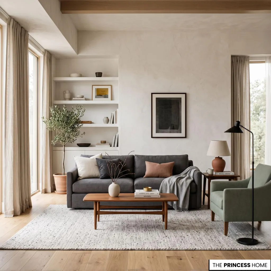
A memorable interior rarely asks every surface to compete for attention. Large surfaces establish rhythm before accent colors introduce personality. Walls create the emotional backdrop. Flooring provides visual stability. Upholstery adds depth. Decorative objects complete the composition through carefully measured contrast.
Difficulties often appear when every element demands equal attention. Strong cabinet colors meet dramatic flooring, bold artwork competes with patterned textiles, and statement furniture struggles beside equally dominant accessories.
None of these pieces are unsuccessful individually, yet together they interrupt visual harmony. Dark colors carry more visual weight than pale tones, which is why a charcoal sofa can become the dominant feature of a room even when the walls are richly colored.
In smaller apartment spaces, concentrating the darkest tones near the floor often creates a greater sense of stability, while lighter upper surfaces help maintain openness and perceived height. The most inviting rooms allow emphasis to move naturally from one focal point to another without overwhelming the eye.
💡 EXPLORE MORE:
Learn how to frame and position high-impact focal points correctly in Accent walls and feature Colors adding visual interest to a space.
Paint Color Undertones
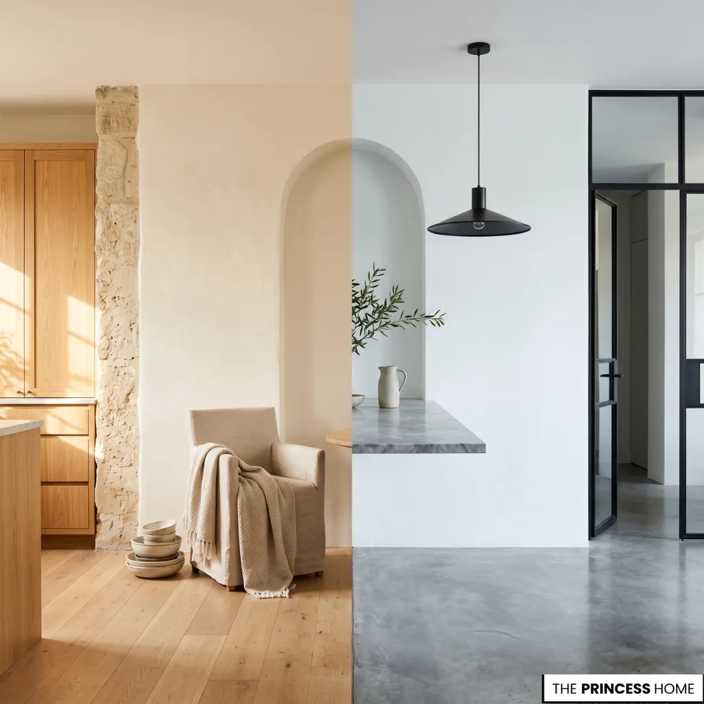
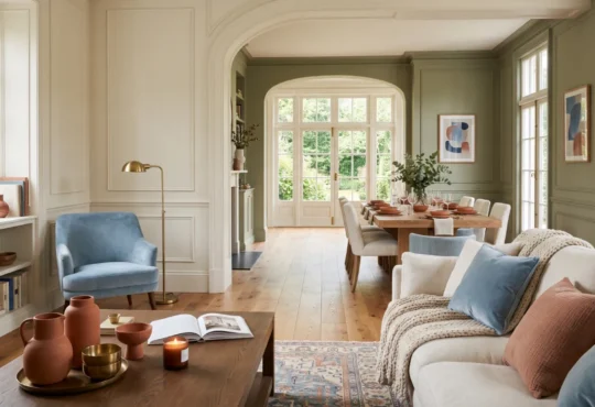
Two white paint shades may appear identical until they stand side by side. One carries a gentle warmth that complements oak and limestone. Another reflects cool blue notes that enhance polished concrete or dark metals. Similar subtle differences exist in beige, gray, green, and nearly every neutral color family.
Undertones create hidden connections across an interior. They influence how cabinetry relates to flooring, how curtains soften surrounding walls, and how natural stone feels beside painted architectural surfaces.
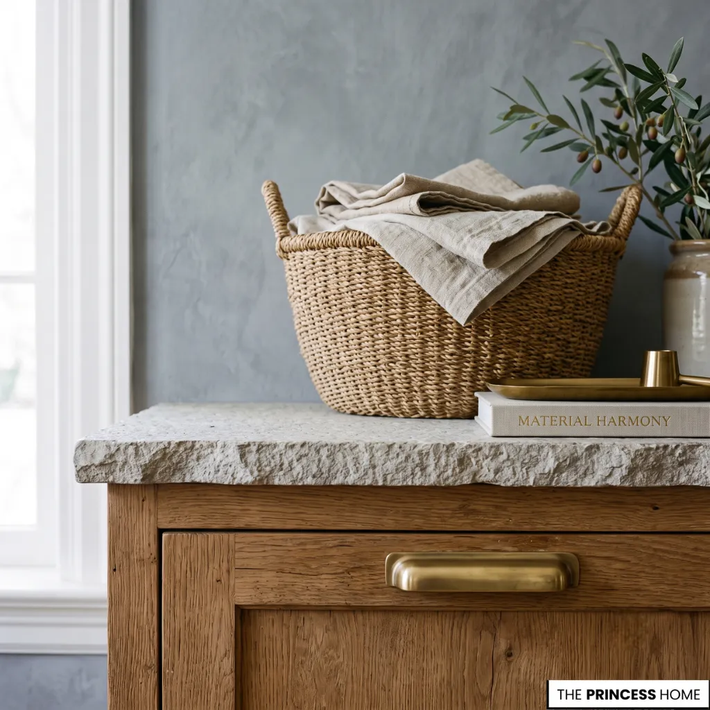
Warm and cool color palettes can coexist beautifully, but they usually require a deliberate bridging element such as natural wood, woven fibers, or softly aged metals. Without that connection, the contrast between warm and cool undertones can feel accidental rather than intentional.
When undertones quietly agree with one another, the room feels composed without announcing why. When they conflict, even carefully selected furnishings may appear unrelated.
Wall Color Textures
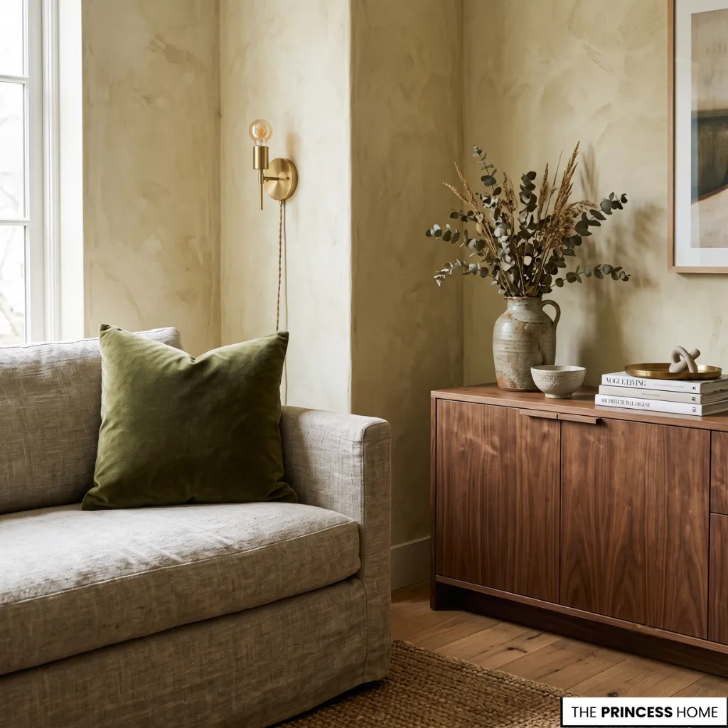
Walls are only one voice within a much larger composition. Velvet absorbs color differently than linen. Matte plaster diffuses light while glossy ceramic reflects it. Walnut introduces natural richness that cannot be replicated by paint, and brushed brass contributes warmth even without introducing another obvious color.
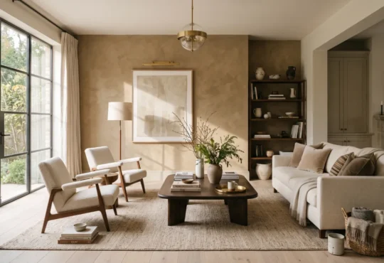
As interior textures become more layered, colors develop greater depth. A restrained color palette begins to feel sophisticated because variation comes from tactile surfaces rather than constant shifts in hue. Furniture finishes, upholstery, and cabinetry colors are all part of this material conversation.
A pale sofa against pale walls creates softness and continuity, while a darker upholstered piece introduces grounding and spatial contrast. Cabinetry, shelving, and large furniture elements often occupy enough visual area to function almost like architectural surfaces, making their relationship to wall color especially significant.
This tactile richness explains why interiors built around natural materials often appear visually calm while remaining deeply interesting.
💡 DEEP DIVE:
Discover how specific tones and textures evoke lasting emotional calm in Color And Psychology How Different Colors Evoke Emotions.
Interior Color Contrast
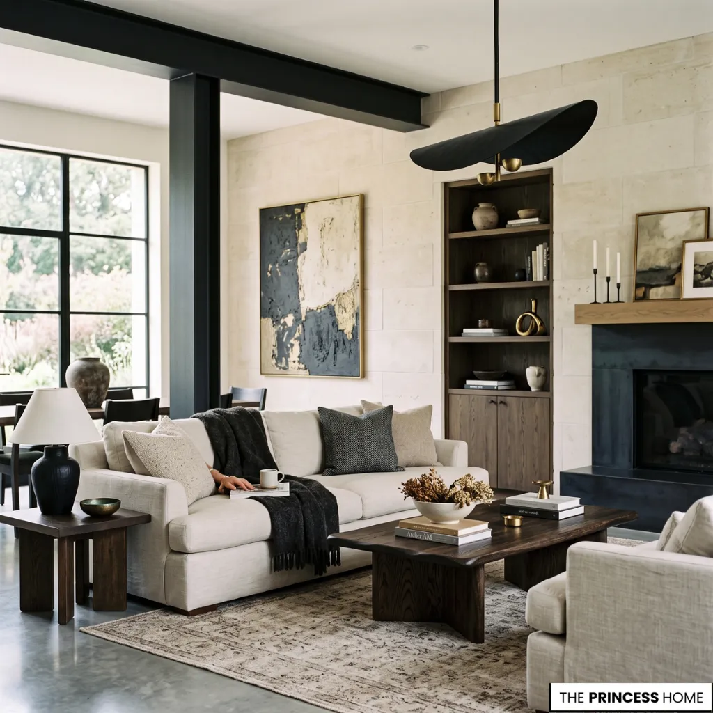
Contrast gives a room rhythm, but its influence extends beyond appearance. Gentle transitions between neighboring tones encourage stillness. Strong color contrasts create movement, definition, and visual hierarchy. Dark architectural details frame lighter surfaces, while pale textiles soften heavier furniture pieces.
Neither approach is universally better. Each shapes a different emotional atmosphere. A monochromatic color scheme built from closely related tones feels quiet and expansive, while a high-contrast composition creates sharper visual energy and stronger focal points.
Modern minimalist interiors often favor restrained tonal variation, whereas traditional or layered spaces may rely on deeper contrasts to emphasize architectural detail and craftsmanship. The most successful interiors understand that contrast is not simply a matter of black against white.
It lives within texture, finish, shadow, reflection, and subtle shifts between neighboring colors that slowly reveal themselves throughout the day.
Timeless Interior Colors
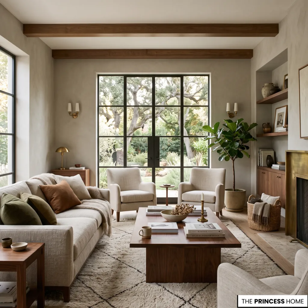
Color trends arrive with remarkable confidence, often promising an entirely new aesthetic through a single fashionable shade. Yet the most compelling rooms rarely depend on trend alone. They feel connected to their architecture, their natural light, and the people who inhabit them.
A modern apartment may embrace muted greens because they echo nearby landscapes rather than because they dominate current design conversations. A traditional home may favor layered neutrals that quietly reinforce craftsmanship already present in the architecture.
In large luxury spaces with tall ceilings and generous natural light, deeper colors can feel enveloping rather than heavy, while compact room layouts benefit from subtle tonal transitions that preserve openness. In each case, color becomes part of a broader atmosphere instead of the room’s entire identity.
Timeless Color Design
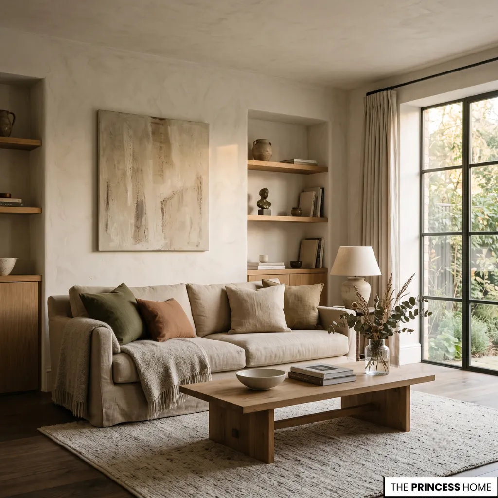
Long after leaving a beautifully designed room, most people struggle to remember the exact paint color on the walls. What stays with them is the feeling. The softness of afternoon light against textured plaster. The warmth reflected from timber beneath linen upholstery.
The calm created when every material seems naturally connected. Thoughtful color choices are never simply about selecting attractive shades. They shape the relationships between light, texture, architecture, furniture, and everyday living, ultimately defining how a room is experienced.
When those relationships feel balanced across different types of spaces, the room gains a quiet confidence that remains beautiful regardless of changing seasons or trends.
💡 DESIGN INSPIRATION:
See how classic schemes outlast passing fads in our guide to Color Trends: Timeless Palettes for Modern Living.
FAQ
What are the most common color choices mistakes in interior design?
The most common mistakes include ignoring lighting, mixing conflicting undertones, overusing bold colors, and choosing shades without considering surrounding materials and furniture.
How do you choose the right color palette for a room?
Start with the room’s natural light, then build a cohesive palette that connects walls, flooring, furniture, and textiles through related tones and balanced contrast.
Which color choices work best in small spaces?
Soft neutrals, light earthy tones, and restrained color palettes help small spaces feel brighter, more open, and visually connected without overwhelming the room.
Why do paint colors look different throughout the day?
Natural and artificial light change how undertones appear, causing paint colors to shift in warmth, depth, and intensity from morning to evening.
Can warm and cool color choices work together?
Yes. Warm and cool colors can coexist successfully when connected by natural materials, layered textures, or transitional finishes that create visual harmony.
What colors work best with natural materials?
Warm whites, soft greiges, muted greens, gentle taupes, and earthy neutrals complement wood, stone, linen, and other natural materials while creating a timeless interior.
How can you avoid common color choices mistakes?
Test colors in different lighting conditions, consider undertones, coordinate materials and furniture, and create a balanced palette before making final design decisions.
Final Thoughts
The most successful interiors are not defined by a single beautiful paint color but by the relationships between light, materials, texture, and proportion. Thoughtful color choices create harmony that feels effortless, allowing every surface to contribute to a cohesive atmosphere that remains timeless, balanced, and inviting for years to come.