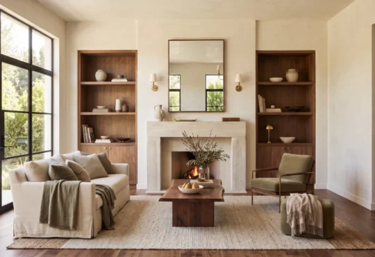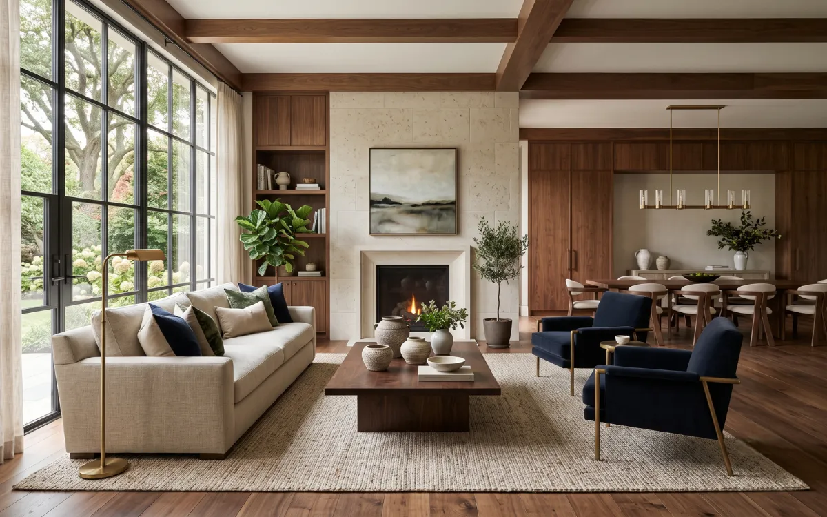
The feeling often arrives before the color itself. Morning light drifts across a wall, soft shadows settle into textured fabrics, and suddenly a room feels quieter, warmer, or unexpectedly alive. Color trends are rarely about chasing what is new for its own sake.
They reflect changing moods, evolving lifestyles, and a shared desire to create spaces that feel personal. More than seasonal shifts, color trends reveal how contemporary interiors evolve through changing palettes, materials, and light.
As these palettes move from season to season, they quietly influence the atmosphere of homes, making familiar rooms appear refreshed without altering their character.
Color Trend Evolution
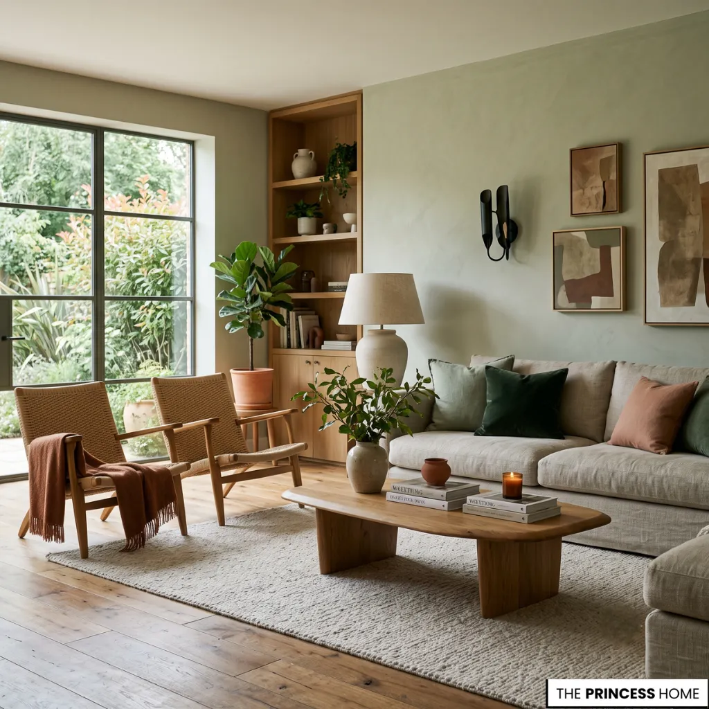
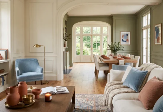
Every year introduces new color palettes, yet the most memorable color trends do something deeper than capture attention. They mirror the way people want to live. A gentle green can recall the calm of a forest after rain. A softened terracotta carries the warmth of sunlit clay.
A rich blue invites stillness at the end of a busy day. This subtle relationship between color and emotion explains why color trends continue to evolve without feeling entirely unfamiliar. Rather than replacing timeless shades, they reinterpret them through changing light, natural materials, and contemporary interiors.
A modern apartment, a restored townhouse, a spacious family home, or a compact city flat may all embrace the same palette while expressing completely different personalities.
💡 BACK TO BASICS:
Build your overall design foundation with our comprehensive guide to the Free Interior Design Course Learn the Skills to Design Your Home.
Nature Color Palettes

Nature remains one of the quietest influences behind today’s color movements. Earth-inspired neutrals, botanical greens, mineral blues, warm stone hues, and rich organic browns appear less as decorative statements than as gentle companions to everyday living.
These palettes rarely exist alone. Linen softens painted walls. Natural wood deepens muted greens. Brushed metals catch changing daylight and subtly alter surrounding tones, while textiles, cabinetry, and decorative objects extend the palette beyond the walls.
Together they create interiors that feel layered instead of decorated, allowing every surface to participate in the overall composition. The result is an environment that feels collected over time rather than assembled all at once.
💡 EXPLORE MORE:
Learn how to frame natural and organic shades on focal walls in Accent walls and feature Colors adding visual interest to a space.
Trending Paint Colors
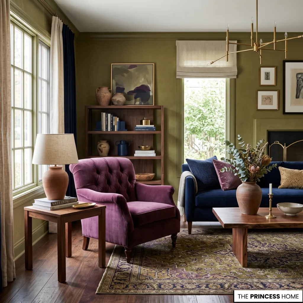
For many years, pale neutrals dominated contemporary interiors. While they remain timeless, today’s color trends have welcomed richer shades back into living spaces with greater confidence.
Deep olive, plum, smoky charcoal, chocolate brown, saturated navy, and warm clay tones appear alongside softer neutrals, offering palettes that feel both current and enduring. These deeper colors introduce visual weight without overwhelming a room.
Their presence is balanced by generous daylight, tactile fabrics, lighter architectural finishes, and thoughtful furniture placement that prevent darker palettes from feeling heavy.
Whether used throughout a large luxury space or as a defining feature inside a smaller apartment, they create intimacy while maintaining visual balance.
💡 READ NEXT:
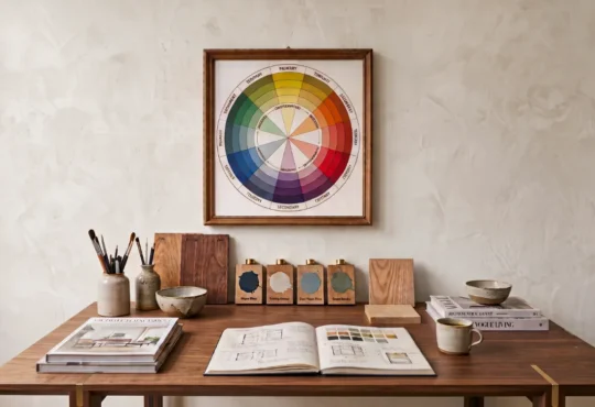
Discover how primary and secondary hues interact on the spectrum in Understanding the Color Wheel Primary & Secondary Colors.
Warm Neutral Colors
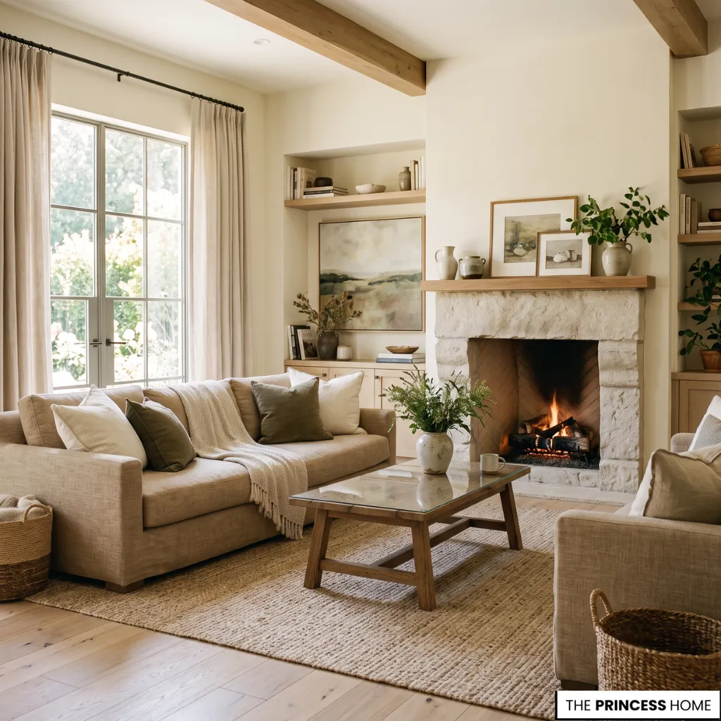
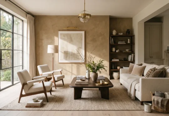
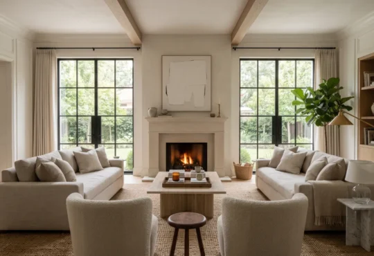
White continues to play an important role, yet its character has become noticeably softer. Instead of bright, clinical finishes, contemporary palettes lean toward creamy ivory, warm sand, gentle oatmeal, subtle limestone, and muted beige.
These nuanced neutrals respond gracefully to changing daylight. Morning light reveals delicate warmth, afternoon sunlight introduces gentle brightness, and evening illumination adds quiet depth. Their flexibility allows furniture, artwork, flooring, and natural materials to become more expressive without competing for attention.
Whether found in expansive family homes, open-plan interiors, or compact urban apartments, these softer foundations establish a calm visual rhythm that feels welcoming throughout the year.
Interior Color Textures
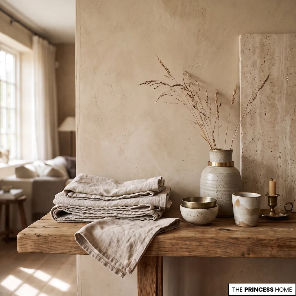
No palette is experienced as paint alone. The same shade appears entirely different across velvet, woven linen, polished stone, matte plaster, ceramic, unfinished oak, or brushed metal.
Texture gives color movement. It catches shadows, reflects changing light, and introduces subtle variation throughout the day. A muted clay wall beside brushed wood feels richer than either material alone. A deep green becomes softer when surrounded by natural fibers, handcrafted ceramics, and layered textiles.
This relationship between color, material, and finish explains why thoughtfully designed interiors often feel more complex than the individual shades suggest.
💡 DEEP DIVE:
Explore how specific textures and tones elicit quiet emotional responses in Color And Psychology How Different Colors Evoke Emotions.
Balanced Color Contrast
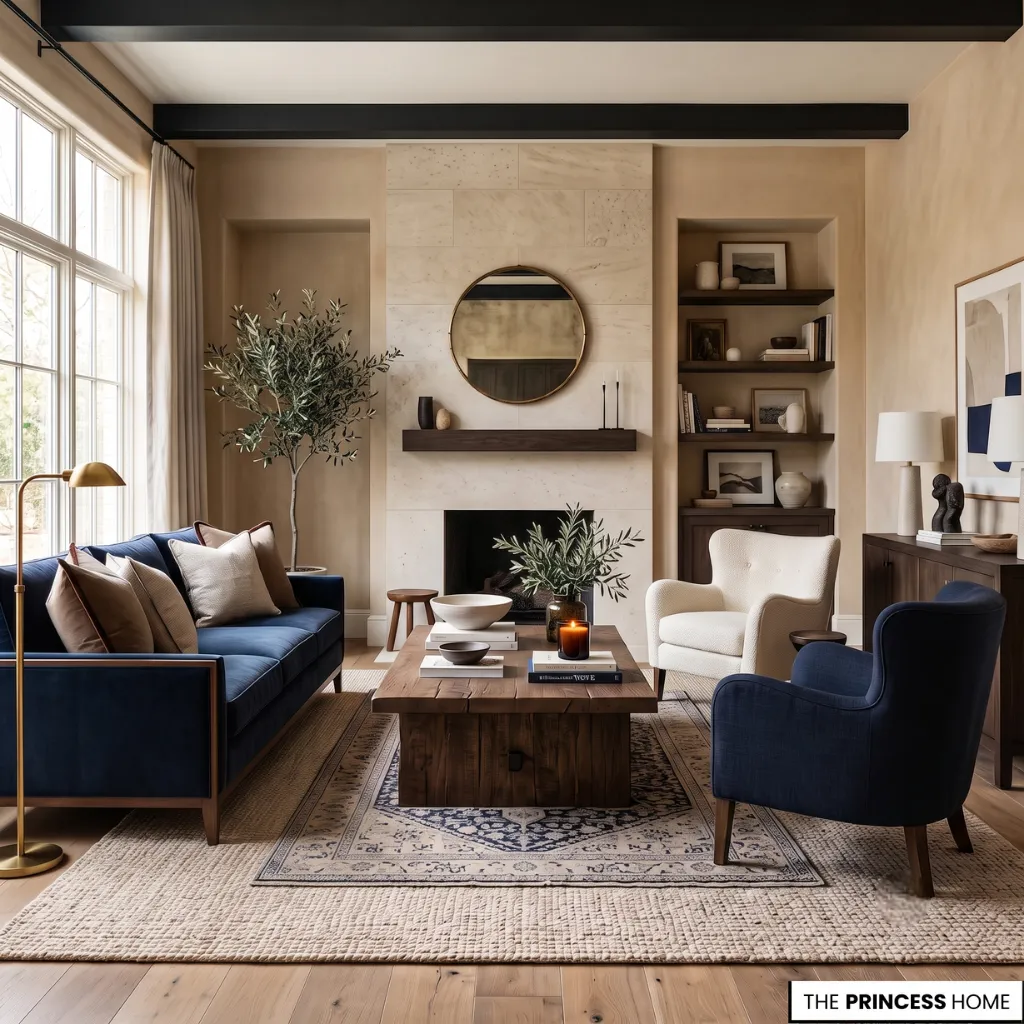
Some of the most elegant interiors rely on contrast that whispers rather than shouts. Warm and cool tones exist together without conflict. Dark elements anchor lighter surroundings. Gentle color transitions replace abrupt visual changes, allowing seasonal palettes and timeless shades to coexist naturally.
Rather than creating dramatic focal points, these combinations allow the eye to move naturally through a room. Architecture, furnishings, textiles, decorative accessories, and lighting become connected by a shared atmosphere instead of competing for attention.
The effect feels effortless, even though every relationship between color and material has been carefully considered.
Timeless Color Trends
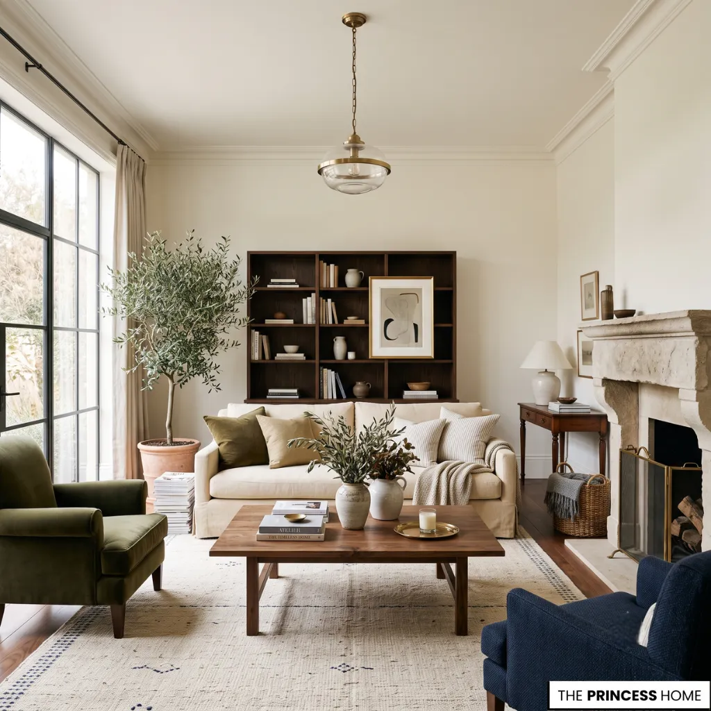
While annual color forecasts introduce fresh palettes, lasting interiors rarely depend on one year’s fashionable colors alone. Some trends emerge as reflections of broader cultural moods, while others quietly become enduring classics because they adapt naturally to changing homes, lifestyles, and architectural styles.
Warm neutrals may soften contemporary spaces, while richer palettes introduce depth to traditional interiors. Together they demonstrate that timeless design often grows from thoughtful balance rather than constant change.
Seen this way, color trends become less about following fashion and more about noticing subtle shifts in how beauty is expressed inside the spaces people return to every day.
💡 INSIDER TIPS:
Avoid common palette mistakes and undertone blunders with our detailed breakdown on Color Choices The Most Common Mistakes in Interior Design.
Personal Color Style
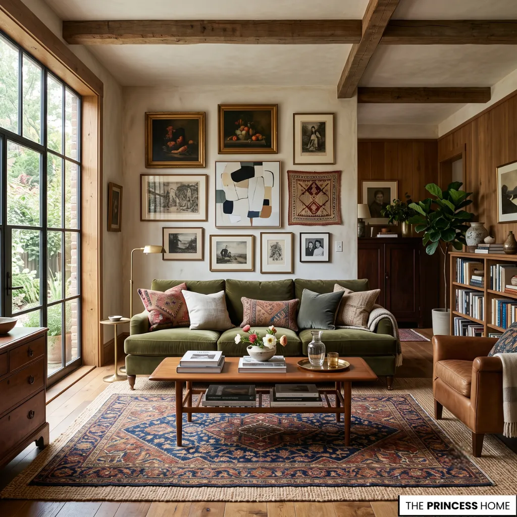
The most memorable interiors are seldom defined by a single trending shade. Instead, they are shaped by thoughtful relationships between light, texture, architecture, furniture, and carefully balanced color palettes that evolve naturally over time.
When colors are chosen for the atmosphere they create rather than the attention they attract, they bring a quiet sense of continuity to everyday living. Trends may introduce fresh inspiration, but the spaces that remain meaningful are those where color feels effortless, lived-in, and deeply connected to the people who call them home.
FAQ
What are color trends?
Color trends are evolving palettes that reflect changing lifestyles, design preferences, and cultural influences while shaping the atmosphere of modern interiors.
How do color trends influence home design?
They guide the mood of a space by influencing wall colors, furnishings, textiles, lighting, and decorative finishes that work together as a cohesive palette.
Which color trends are popular for modern interiors?
Warm neutrals, earthy greens, rich blues, soft clay tones, botanical shades, and layered natural palettes remain among today’s most enduring choices.
Can color trends work in small apartments?
Yes. Light, warm palettes create openness, while deeper accent colors add depth without overwhelming compact spaces when balanced with natural light.
What colors work best for timeless interiors?
Soft whites, warm beige, stone gray, muted greens, deep navy, and earthy browns offer lasting appeal that adapts to changing styles over time.
Is following color trends necessary?
No. The most successful interiors combine timeless colors with selected trend-inspired accents to create spaces that feel personal and enduring.
How can you start using color trends at home?
Begin with a balanced palette, then layer color through paint, furniture, textiles, artwork, and accessories while considering natural light and the character of each room.
Final Thoughts
Color trends are more than seasonal inspiration—they reveal how light, materials, and thoughtfully chosen palettes shape spaces that feel welcoming, timeless, and uniquely personal. Rather than replacing classic design, they offer fresh ways to express it, allowing every home to evolve naturally while maintaining its own lasting character.