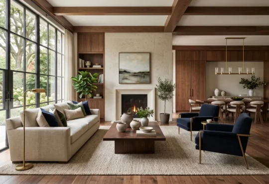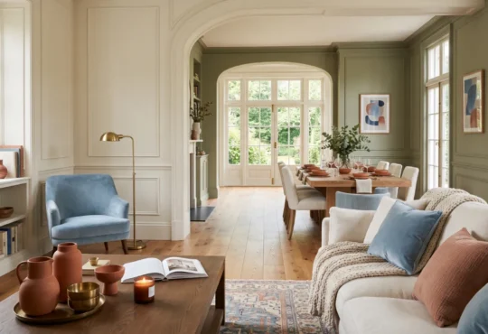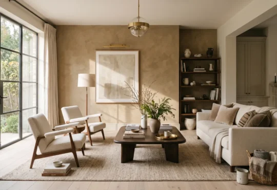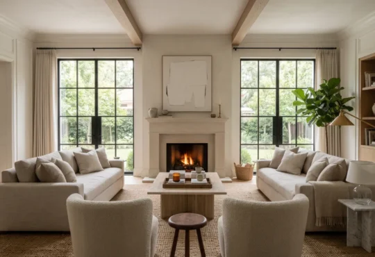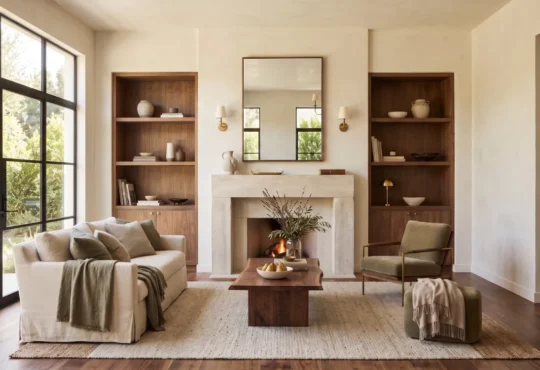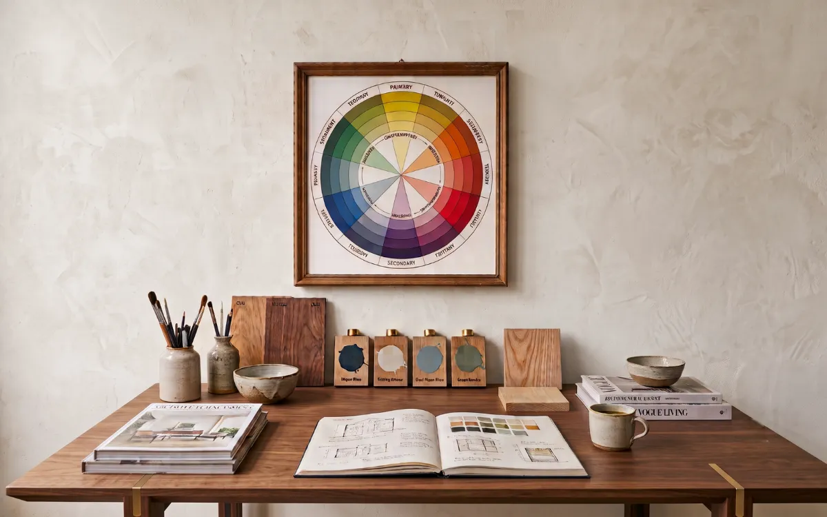
The color wheel is a visual language that helps colors relate to one another with clarity, depth, and effortless harmony. More than a simple spectrum, it is the foundation of color theory, revealing how primary, secondary, and tertiary colors connect to create balanced compositions.
Across art, illustration, branding, digital design, and interior spaces, the color wheel provides a timeless framework for understanding color relationships and building meaningful visual experiences. Harmony is rarely created by a single shade.
More often, it emerges from the conversation between many colors. This transforms ordinary compositions into expressive environments that feel intentional, balanced, and alive.
Primary Color Basics
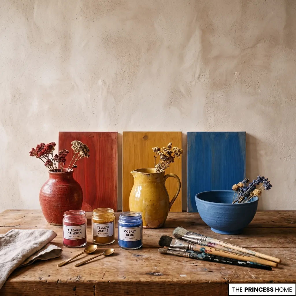
Primary colors—red, yellow, and blue—form the foundation of the traditional color wheel and the starting point of countless creative disciplines. They cannot be created by mixing other hues, yet every secondary and tertiary color ultimately grows from their interaction.
Whether introducing bold accents in a small apartment, defining the character of a modern home, or establishing visual anchors within a spacious luxury interior, these fundamental colors provide clarity, structure, and lasting visual identity.
💡 BACK TO BASICS:
Start your journey from the top with our foundational guide to the Free Interior Design Course Learn the Skills to Design Your Home.
Secondary Color Mixing
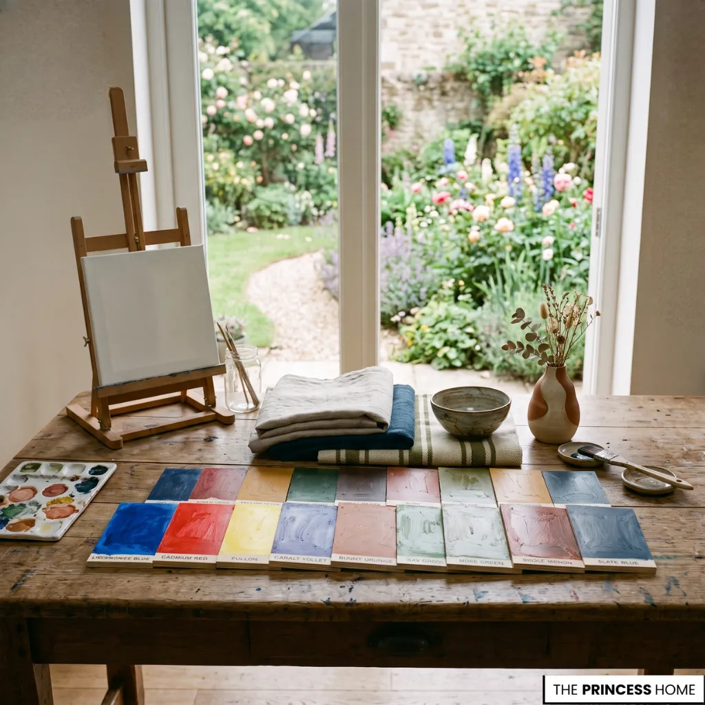
Secondary colors emerge when two primary hues meet in equal balance, producing orange, green, and purple. Between each primary and secondary color, tertiary hues create softer transitions that enrich the spectrum with greater subtlety and depth.
This natural progression allows palettes to move effortlessly from one tone to another. It supports everything from expressive artwork and fashion collections to thoughtfully layered interiors. In these spaces, materials, light, and furnishings work together as a unified composition.
💡 READ NEXT:
Learn how to frame and accentuate secondary hues on focal walls in Accent walls and feature Colors adding visual interest to a space.
Color Harmony Types
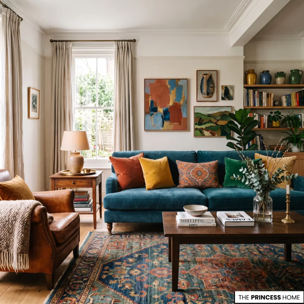
The true strength of the color wheel lies in the relationships between colors rather than the colors themselves. Color harmony develops through well-established arrangements including complementary, analogous, triadic, monochromatic, and split-complementary schemes.
Each offers a distinct balance of contrast, rhythm, and visual continuity. These relationships guide how color is experienced across different scales. They bring intimacy to compact living spaces, maintain cohesion in contemporary homes, and create layered sophistication within expansive architectural environments.
Modern Color Systems
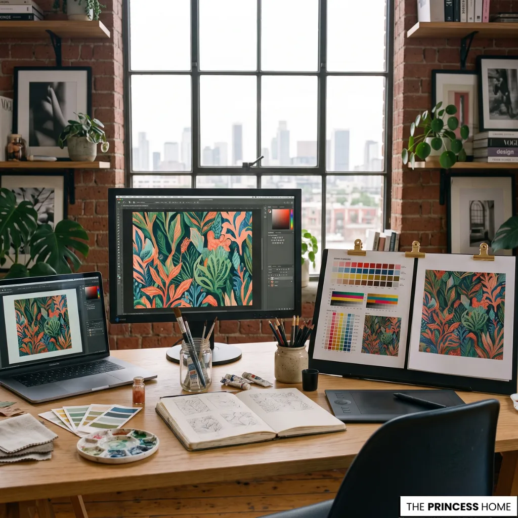
Although the traditional RYB color wheel remains central to painting, illustration, and interior styling, modern creative practice also relies on RGB for digital displays and CMYK for professional printing. Each system serves a different medium while sharing the same objective:
translating color with consistency and intention. Understanding these parallel frameworks allows visual ideas to move naturally from digital concepts and brand identities to printed materials and carefully designed physical spaces without losing their character.
💡 DEEP DIVE:
Explore how different spectrum choices evoke specific emotional responses in Color And Psychology How Different Colors Evoke Emotions.
Color Harmony Principles
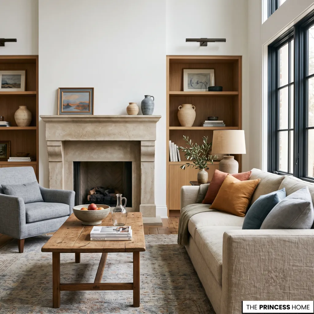
Mastering color harmony is less about following strict formulas than recognizing how color, light, texture, and proportion influence one another. Warm hues tend to create intimacy and energy, while cool tones introduce openness and calm. This allows the same room to feel entirely different through color alone.
Whether furnishing a compact apartment, refining a contemporary residence, or designing a grand luxury home, a thoughtfully composed palette creates continuity between architecture, furniture, materials, and atmosphere.
The result is an environment where every element feels connected. The color wheel quietly shapes spaces that remain timeless long after individual trends begin to fade.
💡 INSIDER TIPS:
Prevent accidental color clashes and tone mismatches with our breakdown on Color Choices The Most Common Mistakes in Interior Design.
💡 DESIGN INSPIRATION:
See how classic wheel combinations turn into enduring schemes in Color Trends: Timeless Palettes for Modern Living.
FAQ
What is a color wheel?
A color wheel is a visual guide that organizes colors to show how primary, secondary, and tertiary hues relate, helping create balanced and harmonious color combinations.
How does the color wheel work?
The color wheel arranges colors in a circular sequence, making it easy to understand relationships such as complementary, analogous, and triadic color schemes.
What are the primary colors on a color wheel?
The traditional color wheel begins with three primary colors—red, yellow, and blue—which combine to create all secondary and tertiary colors.
Which color harmony works best for modern interiors?
Complementary, analogous, and monochromatic color schemes are among the most popular choices because they create balance, contrast, or a calm visual flow.
Can the color wheel work in small spaces?
Yes. The color wheel helps select harmonious palettes that make small apartments feel brighter, more cohesive, and visually spacious.
Why is the color wheel important in design?
The color wheel helps designers build harmonious color relationships for interiors, branding, artwork, fashion, and digital design with greater confidence and consistency.
How do you choose colors using a color wheel?
Start with a main color, then use the color wheel to select complementary or harmonious shades that suit the mood, space, and overall design style.
Final Thoughts
The color wheel remains one of the most valuable tools in creative design because it transforms individual colors into intentional relationships. Whether designing a modern home, creating artwork, or developing a visual brand, understanding how colors interact leads to compositions that feel balanced, timeless, and naturally expressive.