
Colors are one of the most powerful elements of design. They influence mood, perception, and behavior, often without people realizing it. Whether you’re designing a brand identity, decorating a home, building a website, or creating marketing materials, the right color scheme can determine how your audience feels and responds. This guide will take you through everything you need to know about choosing a color scheme: from the basics of the color wheel to advanced palette strategies, psychology, tools, and industry applications.
This guide covers the essentials of choosing a color scheme from color wheel basics to psychology, strategies, tools, and practical applications.
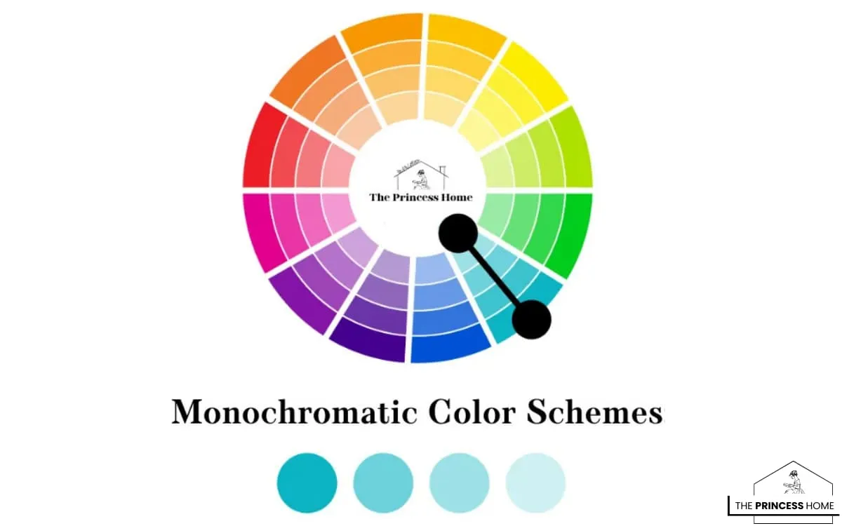
1.Monochromatic Color
Monochromatic color schemes are a foundational concept in the world of color theory and design. Stemming from a single base hue, monochromatic schemes offer a harmonious and elegant aesthetic by utilizing variations in saturation and brightness. This approach creates a palette that is cohesive and visually appealing, making it a popular choice for a wide range of design projects.
The Power of Monochromatic Color Schemes
Monochromatic color schemes are valued for their simplicity, versatility, and natural harmony. By using different shades, tints, and tones of a single hue, designers can create unity, sophistication, and depth without overwhelming the viewer. These schemes enhance visual interest and dimensionality through light and dark variations, making them ideal for minimalist, modern, and cohesive designs.
They also provide ease of use and consistency, which is especially beneficial in branding, web design, and identity projects where a unified look is essential. Designers can adapt monochromatic palettes to achieve various effects—calming blues, energizing reds, or elegant neutrals—depending on the mood they want to convey.
Beyond aesthetics, monochromatic schemes offer practical benefits by simplifying the design process and providing a clear framework for color selection. This makes them a reliable choice for both beginners and professionals seeking professional, timeless, and impactful designs.
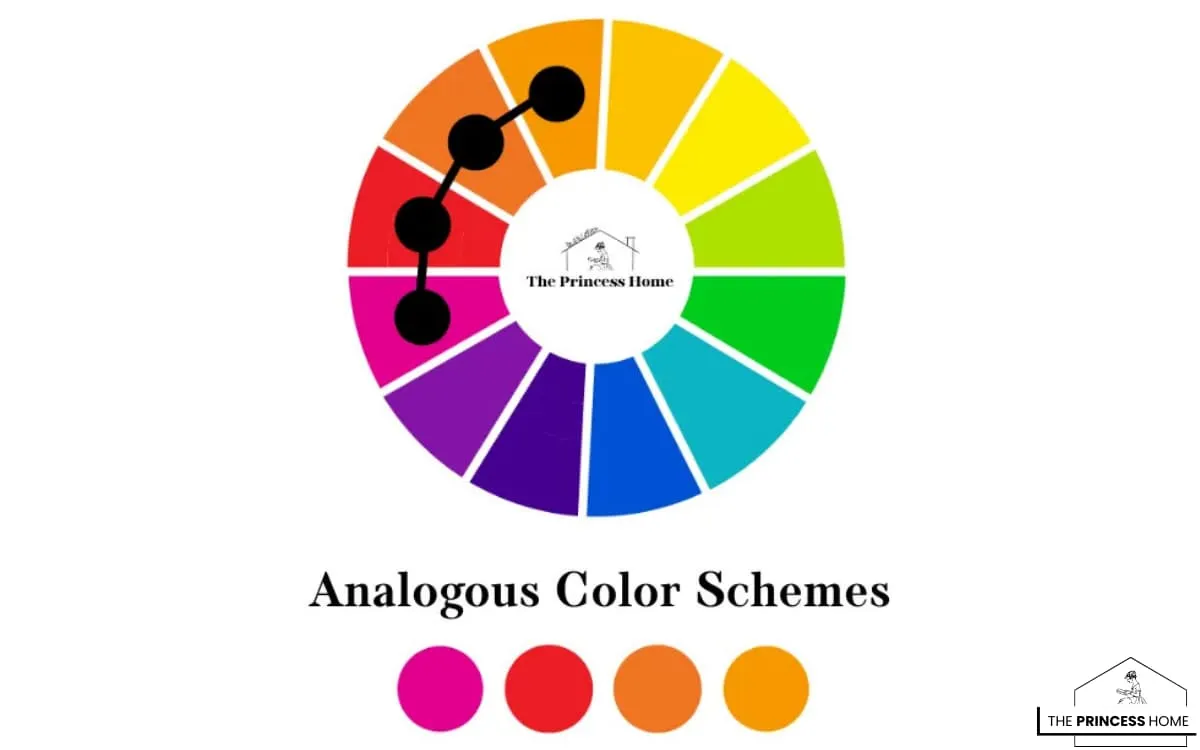
2. Analogous Color
Analogous color schemes are a fundamental aspect of color theory and design, offering a harmonious and visually pleasing approach to color combinations. These schemes are characterized by colors that are adjacent to each other on the color wheel, creating a seamless transition between hues. Analogous colors share similar undertones, resulting in a sense of unity and cohesion within the palette.
The Power of Analogous Color Schemes
Analogous color schemes are known for their harmony, balance, and natural flow. By choosing colors next to each other on the color wheel, designers create cohesive and visually appealing palettes that feel organic and unified. These schemes are especially effective in branding, interior design, and illustration, where consistency and elegance are essential.
Their versatility allows for a wide range of moods—greens and blues can inspire calmness and tranquility, while oranges and yellows bring warmth and energy. Unlike high-contrast palettes, analogous schemes achieve subtle sophistication while maintaining visual interest.
Often inspired by nature’s harmony, such as sunsets, foliage, or oceans, analogous color schemes feel timeless and relatable, making them a powerful tool for creating designs that connect with audiences and leave lasting impressions.
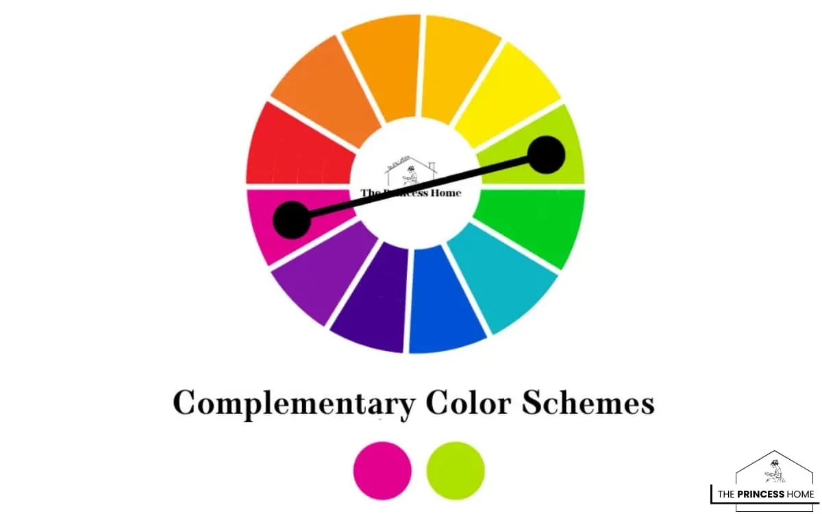
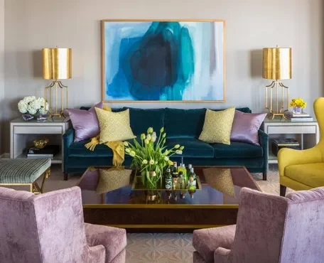
3.Complementary Color
Complementary color schemes are a dynamic and impactful approach to color combinations, based on colors that are opposite each other on the color wheel. This type of scheme creates a high level of contrast and visual interest, making it a popular choice for designs that aim to grab attention and make a bold statement.
The Power of Complementary Color Schemes
Complementary color schemes are defined by the contrast of opposite hues on the color wheel—such as red and green, blue and orange, or yellow and purple. This sharp contrast creates vibrant, energetic, and visually striking designs that immediately capture attention, making them ideal for advertising, branding, and impactful visuals.
By balancing color intensity, saturation, and placement, designers can achieve harmony despite the bold contrast. These schemes generate excitement, drama, and strong focal points, ensuring the design leaves a lasting impression.
Complementary palettes also allow for creative flexibility—warm pairs like red and orange can evoke energy and warmth, while cooler pairs like blue and green bring a sense of calm and balance. However, they require careful consideration to avoid overwhelming the viewer, often using neutral tones to soften intensity.
Overall, complementary color schemes provide a dynamic and powerful tool for designers, delivering bold statements that are both memorable and versatile across digital, print, and interior design.
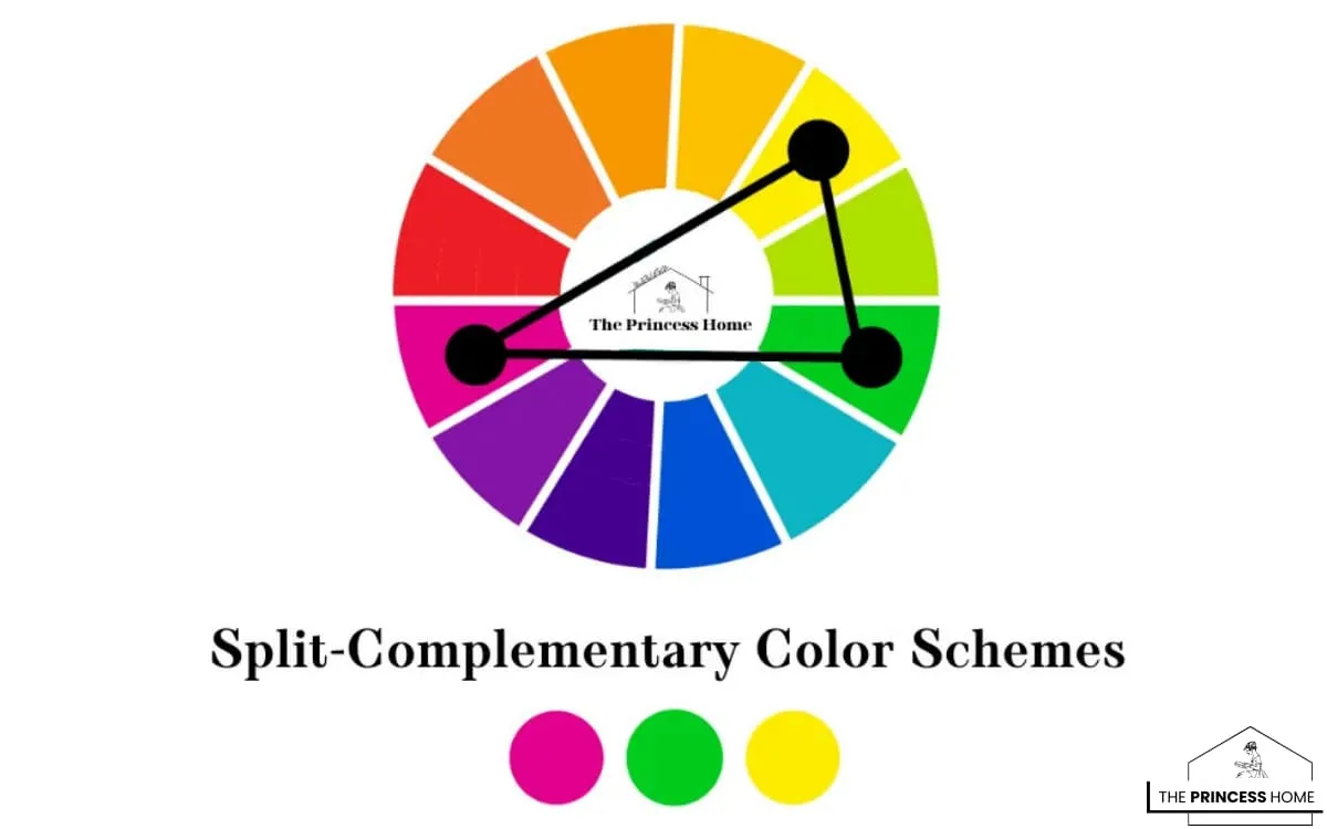
4.Split Complementary Color
Split-complementary color schemes offer a balanced and harmonious approach to color combinations, providing an alternative to the stark contrast of complementary schemes. In this type of scheme, instead of pairing a color with its direct opposite on the color wheel, designers select a base color and then pair it with two colors adjacent to its complement. This creates a palette that maintains the vibrancy and contrast of complementary colors while offering a softer and more nuanced aesthetic.
The Power of Split-Complementary Color Schemes
Split-complementary color schemes offer the perfect balance of contrast and harmony. By pairing a base color with the two hues adjacent to its complement, designers can achieve dynamic yet cohesive palettes that provide more flexibility than traditional complementary schemes.
This approach brings versatility—a warm base like red combined with cool split complements such as blue-green and blue-violet creates a vibrant, energetic composition. At the same time, the related hues maintain a sense of unity and balance, making this scheme ideal for branding, interior design, and visual storytelling.
Split-complementary palettes also add visual interest and depth, enhancing complexity without overwhelming the viewer. However, success requires careful consideration of saturation, intensity, and proportion, often balanced with neutral tones for harmony.
Overall, split-complementary color schemes are a creative and adaptable tool for designers, delivering cohesive, engaging, and memorable visuals across digital and print design.
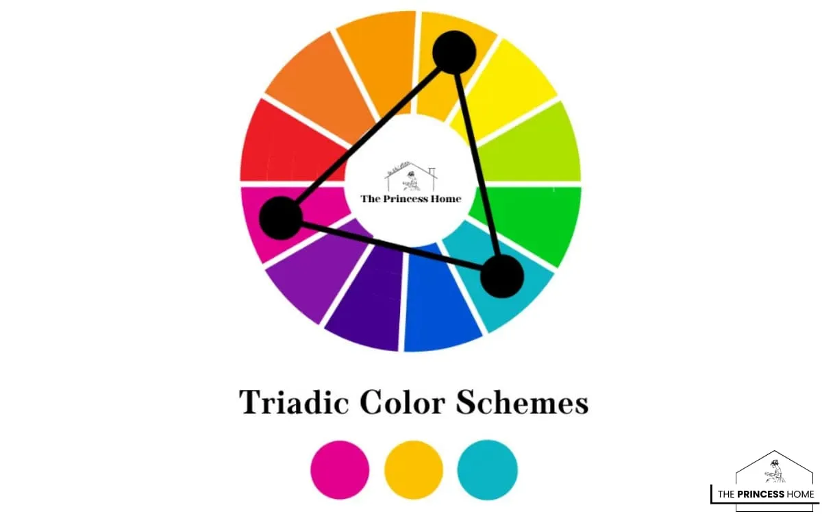
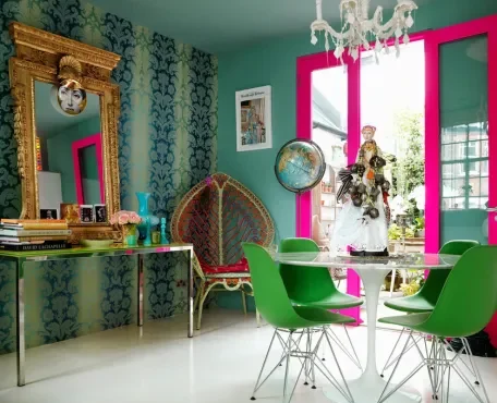
5.Triadic Color
Triadic color schemes are a dynamic and vibrant approach to color combinations, involving the selection of three colors that are evenly spaced around the color wheel. This type of scheme creates a balanced and visually appealing palette that offers a high level of contrast and interest.
The Power of Triadic Color Schemes
Triadic color schemes are defined by three hues evenly spaced on the color wheel, creating a palette that feels both balanced and harmonious. This arrangement allows colors to complement one another without overpowering, making it an excellent choice for branding, web design, and interior projects that require unity and visual appeal.
One of their greatest strengths is the ability to produce visually striking compositions without heavy contrast. Designers can explore endless creative possibilities, from warm triads like red, yellow, and orange for energy and vibrancy, to cool triads like blue, green, and purple for calmness and sophistication.
However, achieving success with triadic schemes requires careful consideration of intensity, saturation, and placement. Balancing proportions or adding neutral tones can prevent the palette from feeling overwhelming, ensuring the design remains polished and effective.
Overall, triadic color schemes offer versatility, balance, and creative freedom, making them a powerful tool for designers looking to craft cohesive yet dynamic visuals.
Why Color Choice Matters
Before diving into the technical side of design, it’s essential to understand why colors matter so much. Colors influence emotions, with blue creating a sense of calm, red evoking urgency, and green reflecting nature. They also carry strong cultural associations — for example, red symbolizes luck in China but represents danger in Western road signs. Beyond psychology, colors play a vital role in brand recognition, with studies showing that consistent use of color can boost recognition by up to 80%.
In terms of user experience, the right color choices can make a significant difference: in web design, a button’s color can increase click-through rates, while in interior design, the right tones can make a room feel larger or smaller. Ultimately, choosing the right color scheme is about finding the perfect balance between aesthetics, functionality, and psychology.
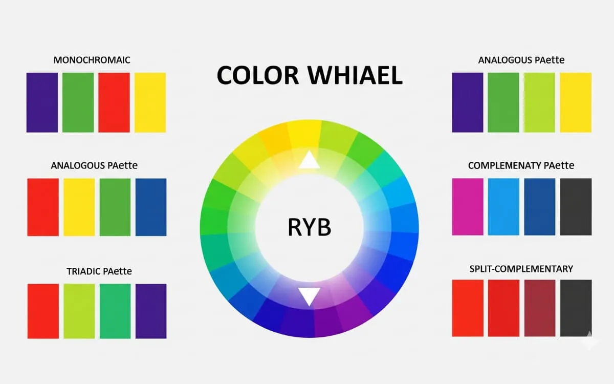
2. The Basics: The Color Wheel
- The color wheel is the foundation for building schemes. It shows relationships between colors:
- Primary Colors: Red, blue, yellow.
- Secondary Colors: Orange, green, purple (from mixing primaries).
- Tertiary Colors: Red-orange, blue-green, etc.
- Understanding relationships on the wheel is key: adjacent colors feel harmonious, opposite colors feel bold and contrasting.
3. Major Types of Color Schemes
Monochromatic Color Scheme
A monochromatic color scheme is built from variations of a single hue, using different tints, tones, and shades to create depth. This approach delivers an elegant, minimal, and unified look that feels cohesive across design elements. However, it can sometimes appear flat or monotonous if not enhanced with textures, patterns, or contrasting materials. Monochromatic palettes are best suited for modern branding, creative portfolios, and clean interior designs, where simplicity and sophistication are the main goals.
Analogous Color Scheme
An analogous color scheme uses hues that sit directly next to each other on the color wheel, creating a natural, harmonious, and soothing effect. This palette often mirrors the combinations found in nature, which makes it feel balanced and visually pleasing. While analogous schemes promote unity, they may lack strong contrast, sometimes resulting in a softer, less dynamic look. They are ideal for nature-inspired designs, wellness brands, and relaxing interior spaces where calmness and flow are essential.
Complementary Color Scheme
A complementary color scheme pairs two colors that sit directly opposite each other on the color wheel, such as blue and orange or red and green. This combination creates a bold, high-contrast, and attention-grabbing effect that instantly draws the eye. While highly effective for impact, overusing complementary colors can sometimes feel harsh or overwhelming if not balanced with neutrals. This scheme works best for sports logos, marketing campaigns, advertisements, and dynamic visuals that aim to stand out and capture attention.
Split-Complementary Color Scheme
A split-complementary color scheme is built around one base color and the two colors adjacent to its direct complement on the color wheel. This approach provides strong visual contrast but with less tension than a strict complementary pairing, making it more versatile and balanced. It offers variety while remaining visually appealing, which makes it especially effective in fashion design, digital art, and branding projects that require both contrast and harmony.
Triadic Color Scheme
A triadic color scheme uses three colors evenly spaced around the color wheel, such as red, blue, and yellow. This palette creates a balanced yet vibrant look, offering strong contrast while maintaining harmony. However, when all three hues are used at full saturation, the scheme can feel overly playful or overwhelming. Triadic combinations are best suited for children’s products, creative industries, and artistic projects where energy, fun, and bold expression are key.
Tetradic (Double-Complementary) Color Scheme
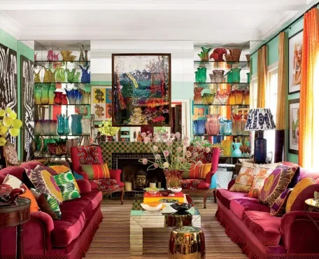
The tetradic, or double-complementary, color scheme is built from two complementary pairs, making four colors in total. This palette is highly dynamic, versatile, and visually complex, offering endless possibilities for creative expression. However, balancing all four hues can be challenging, and the design usually works best when one color is chosen as dominant while the others support. Tetradic schemes are ideal for interior design, festival themes, and artistic projects where richness, diversity, and bold energy are desired.
Neutral + Accent Color Scheme
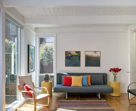
A neutral + accent color scheme combines a base palette of neutrals such as white, black, gray, or beige with a single bold highlight color. This approach creates a timeless, professional, and highly flexible look that adapts easily across different styles. The neutral foundation ensures sophistication, while the accent color adds energy and focus without overwhelming the design. This scheme is especially effective for websites, office environments, luxury branding, and minimalist interiors where elegance and clarity are essential.
4. Color Psychology: Choosing by Emotion
Color choices go beyond beauty — they create emotional responses:
- Red: Excitement, energy, urgency.
- Blue: Trust, peace, security.
- Yellow: Optimism, warmth, happiness.
- Green: Nature, growth, wealth.
- Purple: Royalty, creativity, mystery.
- Black: Power, elegance, authority.
- White: Simplicity, purity, minimalism.
👉 Always ask: What do I want my audience to feel?
5. Factors to Consider When Choosing
When selecting a color scheme, there are several important factors to keep in mind. First, consider the purpose of your design—whether you’re creating a playful kids’ brand, a professional corporate office identity, or a modern fashion label, your colors should align with the brand’s message. Next, think about your audience: younger people are often drawn to bold contrasts and vibrant tones, while professionals usually prefer more muted, sophisticated palettes.
The medium also makes a difference, since colors can appear differently in print, on screens, or in physical spaces. Prioritize accessibility by ensuring strong contrast for readability and usability, especially in digital design. Finally, balance trends versus timelessness; while trendy neon shades may capture attention now, a versatile and enduring palette will keep your design relevant for years to come.
6. The 60-30-10 Rule
A simple guideline for balance:
- 60% → Dominant color (background, walls, brand base).
- 30% → Secondary color (supporting elements, furniture, sections).
- 10% → Accent (buttons, accessories, highlights).
This rule keeps palettes visually organized and professional.
7. Tools to Help You Choose
- 🎨 Adobe Color → Explore and create schemes.
- 🎨 Coolors.co → Auto-generate palettes.
- 🎨 Canva Color Palette Generator → Extract colors from photos.
- 🎨 Paletton → Experiment with advanced schemes.
- 🎨 Material Palette → Ideal for UI designers.
8. Common Mistakes to Avoid
- ❌ Using too many colors (cluttered and confusing).
- ❌ Ignoring contrast (hurts readability).
- ❌ Forgetting cultural meanings.
- ❌ Distributing all colors equally (creates chaos).
- ❌ Blindly following trends without purpose.
9. Step-by-Step Guide to Picking Your Scheme
- Define your goal → Calm, energetic, luxurious, etc.
- Choose your base color → The foundation of your identity.
- Select a scheme type → Monochromatic, analogous, complementary, etc.
- Apply the 60-30-10 balance.
- Test in real context → Website mockups, room renders, product samples.
- Check contrast & accessibility.
- Get feedback and refine.
10. Final Thoughts
Choosing a color scheme isn’t just about creating something visually appealing—it’s about purpose, psychology, and balance. By understanding how colors interact and how they influence emotions, you can design a palette that strengthens brand identity, improves readability and user experience, evokes the right emotional response, and stands the test of time. Remember, color harmony is both an art and a science, and the most effective designers know how to master both to achieve impactful and timeless results.
Conclusion:
Triadic color schemes offer a balanced and vibrant approach to color combinations, providing a wide range of creative possibilities for designers. By selecting three colors that are evenly spaced around the color wheel, designers can create compositions that feel harmonious, dynamic, and visually appealing. Whether used in graphic design, illustration, or interior design, triadic color schemes have the ability to captivate viewers and create lasting impressions.
Here are some frequently asked questions related to the article :
1. What are color schemes, and why are they important in design?
Color schemes are combinations of colors chosen to create a specific visual effect or mood in design. They are important because they help establish the overall aesthetic, mood, and impact of a design, whether it’s in graphic design, interior design, fashion, or any other creative field.
2. How do I choose the right color scheme for my project?
Choosing the right color scheme depends on factors such as the message you want to convey, the emotions you want to evoke, and the overall aesthetic you’re aiming for. Consider the purpose of your project, your target audience, and any existing branding guidelines if applicable.
3. What is the difference between monochromatic and analogous color schemes?
Monochromatic color schemes involve variations of a single hue, while analogous color schemes consist of colors that are adjacent to each other on the color wheel. Monochromatic schemes offer a more subtle and harmonious look, while analogous schemes provide a bit more variety and contrast.
4. Can I use complementary colors in equal proportions in my design?
Yes, you can use complementary colors in equal proportions, but it’s important to balance them appropriately to avoid overwhelming the viewer. Consider factors such as color intensity, saturation, and placement within the composition to achieve a visually pleasing result.
5. How do I create a split-complementary color scheme?
To create a split-complementary color scheme, start with a base color and then select the two colors adjacent to its complement on the color wheel. This creates a palette that maintains the vibrancy and contrast of complementary colors while offering a softer and more nuanced aesthetic.
6. Are triadic color schemes suitable for all types of designs?
Triadic color schemes offer versatility and can be used in a wide range of designs, but they may not be suitable for every project. Consider the message, mood, and audience of your design to determine whether a triadic scheme is appropriate.
7. How do I ensure that my chosen color scheme works well together?
To ensure that your chosen color scheme works well together, consider factors such as color harmony, contrast, and balance. Experiment with different combinations, and consider using tools like color wheels or color theory principles to guide your decisions. Additionally, test your color scheme in different contexts and lighting conditions to see how it performs in real-world settings.


