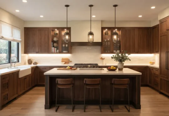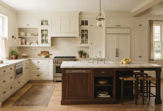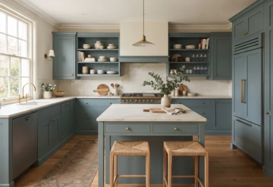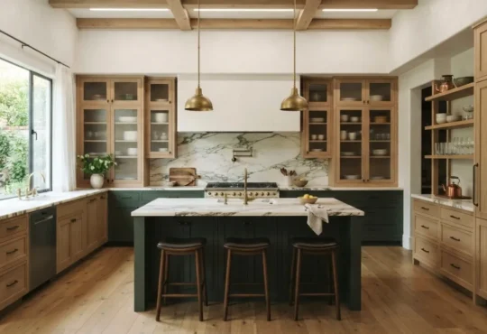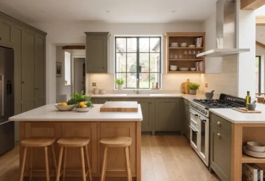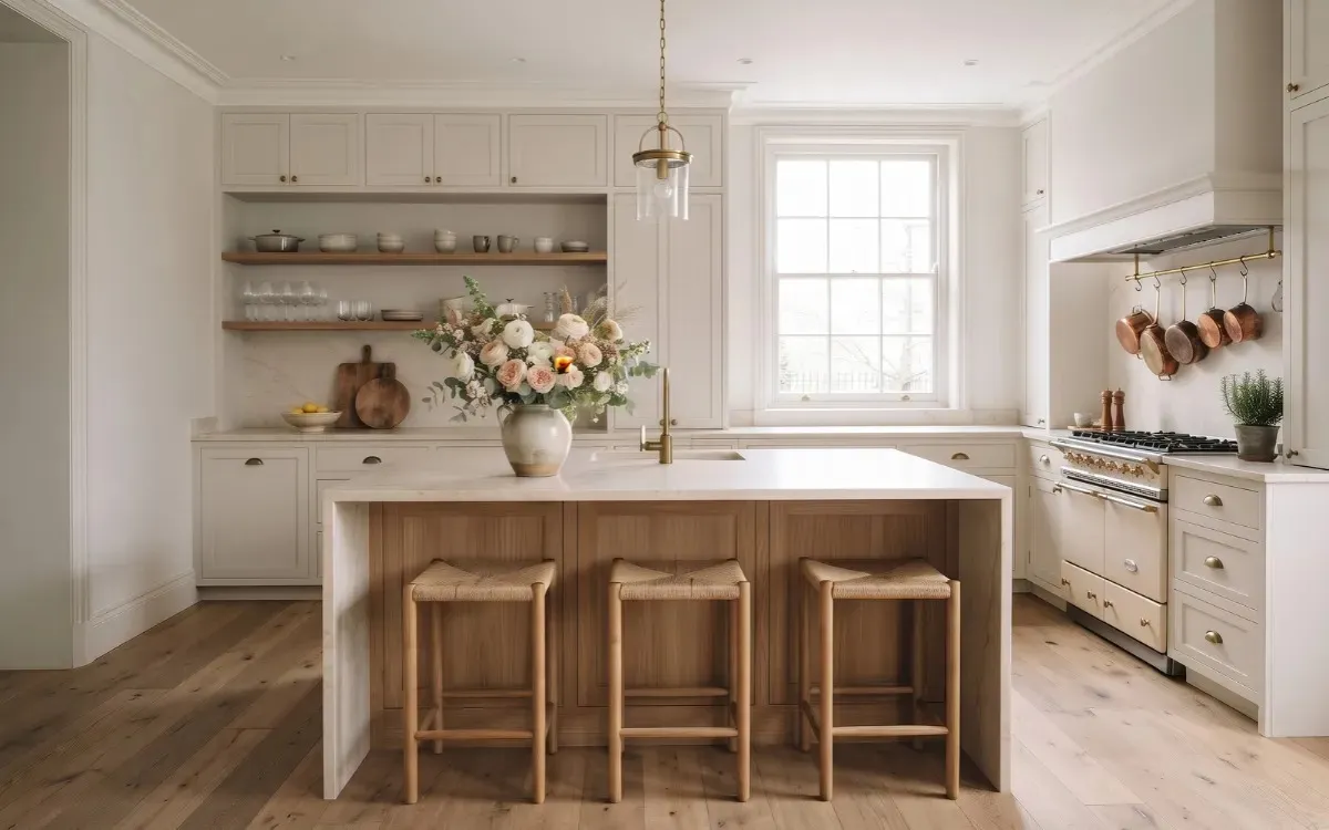
Choosing kitchen colors involves more than selecting attractive cabinet or wall shades. The colors of cabinetry, countertops, backsplashes, and flooring need to work together, while natural and artificial lighting influence how each shade appears.
Understanding these relationships makes it easier to create a coordinated palette that suits the kitchen’s existing finishes, available light, and overall design.
This guide explains how to choose kitchen colors, combine different finishes, compare popular palettes, and test your selections before committing to a renovation or decorating project.
Assess Your Kitchen
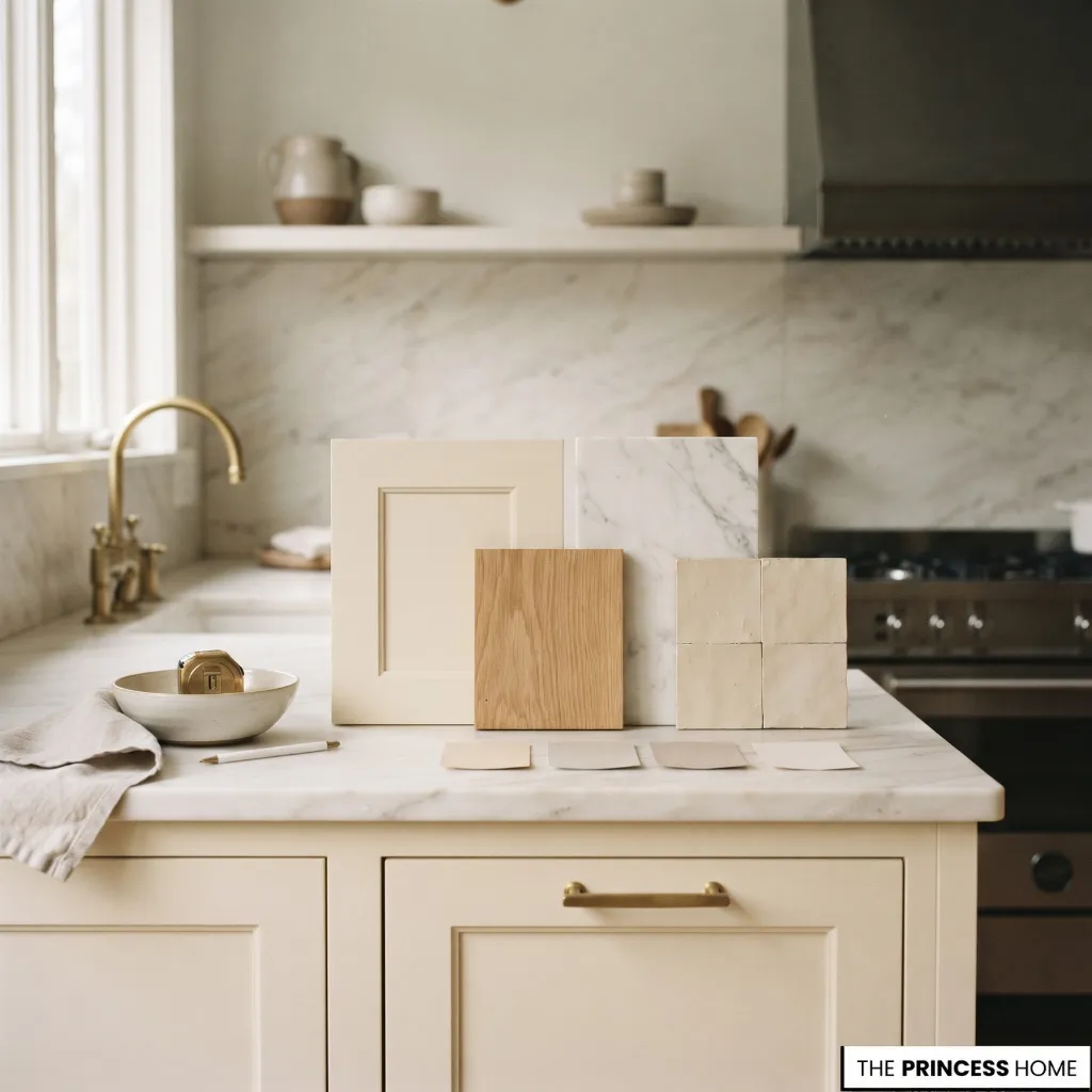
Before choosing kitchen colors, identify the finishes and features that will influence your decisions. Existing countertops, flooring, cabinetry, and backsplashes may already contain colors that need to remain part of the palette.
Start by separating permanent features from elements you can change. Countertops, flooring, and existing cabinets may be expensive to replace, while wall paint, hardware, and some backsplash finishes are easier to update.
When major surfaces are staying, choose colors that complement them rather than treating each new finish as an independent decision. Pay attention to the following elements:
Cabinetry: Identify its main color, undertone, and wood characteristics. Large cabinet surfaces often establish the kitchen’s dominant color.
Countertops: Examine their background color, veining, and pattern. Natural stone and some engineered surfaces may contain several colors that can guide the rest of the palette.
Flooring: Consider whether the floor has warm wood tones, cool gray undertones, or noticeable natural variation.
Backsplash: Check how its color and pattern relate to the countertop and cabinets.
Walls: Identify the amount of visible wall space and whether an existing paint color needs to remain.
Lighting: Observe how much daylight enters the kitchen and how its colors appear under the artificial lighting used in the evening.
Also consider the kitchen’s relationship with adjoining rooms. In an open-plan home, colors do not need to match the living or dining areas exactly, but repeating a wood tone, neutral shade, or accent color can help create continuity.
Once you understand the existing finishes, you can establish a palette that works with the actual kitchen rather than relying entirely on an inspiration photograph.
For more ideas: Kitchen Design: Beautiful and Functional Tips for Every Style
Build Color Palettes
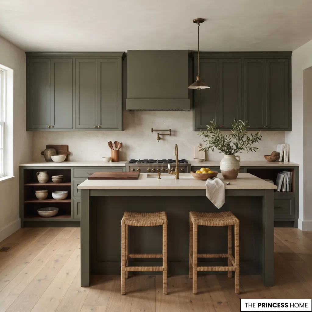
A successful kitchen color palette combines a dominant color with supporting shades and carefully selected accents. The objective is to create relationships between surfaces while allowing enough variation to keep the room visually balanced. A useful starting point is to identify three color roles.
Dominant color: This establishes the main direction of the kitchen. It often appears on cabinetry, walls, or another large surface.
Supporting color: This complements the dominant shade and connects different finishes. Countertops, flooring, and backsplashes frequently provide this role.
Accent color: This introduces contrast through an island, hardware, lighting fixtures, accessories, or a smaller architectural feature.
The familiar three-color approach can help organize a palette, but it is not a strict rule. Natural materials introduce additional tones through wood grain, stone veining, and surface variation.
When deciding which color should dominate, consider both the size of each surface and how noticeable it is from the main viewpoints in the kitchen. Cabinetry often has a strong influence because it covers a large area, but a distinctive countertop or backsplash can also become visually prominent.
A smaller accent does not need to occupy much space to attract attention, especially when its color contrasts strongly with the surrounding finishes.
Understand Undertones
Undertones are important because two colors can appear similar individually but look noticeably different when placed beside each other.
Warm colors often contain yellow, red, or orange undertones. Cool colors may lean toward blue, green, or violet. Some neutral shades sit between these groups, although their underlying tones can still influence how they look beside other finishes.
For example, a warm white cabinet may work naturally with cream-colored stone and honey-toned oak. A cooler white may look more appropriate beside pale gray stone and cooler metal finishes.
Gray also varies considerably. Some grays contain blue or green undertones, while others have warmer brown or beige qualities. Similarly, beige can lean toward yellow, pink, or gray.
When comparing colors, place samples beside one another rather than evaluating each shade separately. This helps reveal undertones that may be less noticeable when a color is viewed alone.
Balance Contrast
Contrast helps distinguish different surfaces and gives the kitchen visual structure. A light countertop against darker cabinetry creates a different effect from a pale cabinet paired with a similar light surface.
The amount of contrast should depend on the kitchen’s existing materials, available light, and desired appearance.
For example, dark green cabinetry can be paired with a pale stone countertop to create a clear distinction between the two surfaces. Alternatively, cream cabinetry and warm beige stone can produce a more continuous palette with less visual separation.
Neither approach is universally better. The important consideration is whether the selected finishes work together without making one surface compete unnecessarily with another.
Color contrast also depends on two qualities: value and saturation. Value describes how light or dark a color appears, while saturation describes how intense or muted it looks.
A pale sage and a deep olive may belong to the same green family, but their different values create different levels of contrast. A muted blue can also feel less dominant than a highly saturated blue, even when both have a similar depth.
These differences help when choosing between several shades of the same color. If you want a noticeable distinction without introducing another strong color, changing the value may be enough. If you prefer a softer palette, choosing less saturated shades can help reduce visual competition between large surfaces.
Combine Natural Materials
Wood, stone, and textured finishes contribute additional color variation without requiring more painted surfaces.
Natural oak can introduce a warm tone into a kitchen with white or green cabinetry. A marble countertop may connect several shades through its veining, while textured tiles can add variation without introducing a strong contrasting color.
The goal is not to make every material identical. It is to establish enough shared qualities, such as undertone, warmth, or contrast, for the complete palette to feel coordinated.
Coordinate Kitchen Finishes
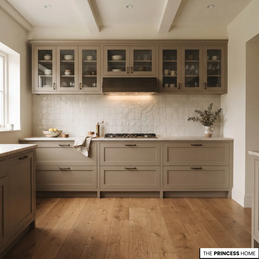
Once you establish the overall palette, decide how each color will appear across the kitchen’s main surfaces. Cabinetry, countertops, backsplashes, walls, and flooring occupy different amounts of visual space, so their colors need to be considered together.
Choose Cabinet Colors
Cabinetry often occupies a substantial part of the kitchen, making its color an important starting point when planning the palette.
Light cabinets, including warm white, cream, and pale beige, can work with many countertop and flooring finishes. They offer flexibility when introducing natural wood, patterned stone, or more distinctive backsplash colors.
Medium tones such as sage green, muted blue, mushroom, and natural oak provide more color definition while remaining adaptable to different materials.
Dark cabinetry in navy, forest green, charcoal, or deep brown creates stronger contrast. These shades can work particularly well when balanced with lighter countertops, suitable wall colors, or natural wood.
Two-tone cabinetry offers another approach. For example, upper cabinets in warm white can be paired with lower cabinets in sage green or natural wood. This introduces color variation while keeping the overall palette connected.
A kitchen island can also carry a different color from the surrounding cabinetry. A muted blue or deep green island can become a focal point without requiring every cabinet to use the same shade.
When selecting cabinet colors, consider the countertop and flooring first. A cabinet shade that looks attractive on its own may appear too yellow, gray, or cool when placed beside the existing materials.
Coordinate Countertops
Countertops should complement the cabinet color while maintaining a suitable relationship with the backsplash and flooring.
Light countertops in white, cream, or pale gray can balance darker cabinetry. They may also help connect different colors in a two-tone kitchen.
Warm beige and cream countertops work well with natural wood, warm white cabinets, and earthy palettes. Gray and cooler stone tones can complement blue cabinetry, cooler whites, and selected metal finishes.
Patterned surfaces require additional consideration. Natural stone may contain veining in several shades, so examine its background and secondary colors before choosing surrounding finishes.
If the countertop has prominent movement or strong veining, simpler cabinetry and backsplash colors can prevent competing patterns. If the countertop is relatively plain, the backsplash or cabinetry can carry more visual interest.
Match Walls and Backsplash
Wall and backsplash colors should support the dominant finishes rather than introduce unrelated shades.
A neutral wall color can connect cabinetry and countertops, particularly when the kitchen already contains several different materials. Warm white, ivory, and soft beige are useful options when their undertones complement the existing finishes.
The backsplash can either blend with the countertop or introduce controlled contrast. A similar shade creates continuity, while a different color or tile finish can define the space between the upper and lower cabinets.
For example, sage green cabinetry can be paired with a warm white backsplash and pale stone countertops. Alternatively, a neutral kitchen can use a muted green or blue tile as a more distinctive accent.
Consider the visible area of the backsplash before choosing a strong color or pattern. A small backsplash may accommodate more variation than a large continuous tiled surface, depending on the rest of the palette.
Consider Flooring
Flooring provides another large surface that influences the overall color balance.
Natural wood flooring introduces grain patterns and warm or cool tones depending on the species and finish. When pairing wood floors with painted cabinets, compare their undertones to avoid an unintended clash.
For example, honey-toned oak flooring may work well with cream cabinetry, while a cooler wood finish may suit selected gray or muted blue palettes.
Stone and porcelain flooring offer different possibilities, including warm beige, gray, ivory, and darker finishes. Their color should relate to the countertops and cabinetry without requiring an exact match.
Hardware and metal finishes can complete the palette. Brass, bronze, chrome, and stainless steel introduce different visual qualities, but their selection should also consider the other visible finishes in the room.
For more ideas: Kitchen Cabinet Ideas How to Choose the Right Styles & Finishes
Explore Kitchen Schemes
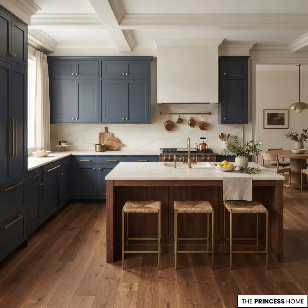
Kitchen color schemes provide useful starting points when selecting a palette. Each combination creates a different relationship between cabinetry, surfaces, and natural materials. The following examples demonstrate how different color families can be coordinated and adapted to existing kitchens.
1. Warm White and Natural Wood
Warm white cabinetry paired with natural oak or walnut creates a balanced combination of light surfaces and visible wood grain.
Use warm white on the main cabinets, then introduce wood through an island, open shelving, or flooring. Cream or softly veined stone can connect the two materials without introducing a strong color contrast.
This palette works particularly well when the kitchen already contains warm wood finishes. It also allows smaller accents, such as brass hardware or dark lighting fixtures, to provide definition.
2. Sage Green and Cream
Sage green offers a muted alternative to traditional neutral cabinetry. Its subdued color works with cream, warm white, pale stone, and selected natural wood finishes.
Use sage green on the lower cabinets or throughout the kitchen, depending on the amount of contrast desired. Cream walls and a pale countertop can keep the combination balanced.
This scheme is particularly useful when introducing color without relying on a highly saturated shade. Check the green’s undertone before choosing the surrounding whites, since some sage shades lean toward gray while others appear warmer or more yellow.
3. Navy Blue and Warm White
Navy cabinetry creates a defined contrast with warm white surfaces. The combination can work on full cabinet runs or through a contrasting island.
Pair navy with a lighter countertop and backsplash to prevent the darker cabinetry from dominating every visible surface. Natural wood flooring or selected brass details can introduce additional warmth.
This palette suits kitchens where a stronger cabinet color is desired, particularly when the room has sufficient lighting and the surrounding materials support the contrast.
4. Beige and Walnut
Beige and walnut create a warm palette based on related earthy tones. Beige cabinetry can provide a lighter background, while walnut introduces darker wood grain and visual definition.
A warm stone countertop or backsplash can connect the two finishes. To maintain variation, choose materials with slightly different tones rather than matching every surface exactly. This combination is suitable for kitchens where natural materials play an important role in the overall design.
5. Olive Green and Natural Stone
Olive green has a stronger earthy character than pale sage. It works with cream, warm beige, limestone, and natural wood when their undertones are compatible.
Use olive on cabinetry or a kitchen island, then introduce lighter stone finishes to balance its depth. Natural wood can soften the contrast and connect the palette with the flooring or adjoining rooms.
Because olive shades vary considerably, compare samples with the actual stone and wood before selecting a final combination.
6. Dusty Blue and Pale Stone
Dusty blue introduces color without the intensity of a saturated navy. Its softer appearance can work with pale stone, warm white, and selected natural wood tones.
Use it on cabinetry or an island, with a pale countertop and relatively simple backsplash. A warm supporting finish can prevent the palette from appearing excessively cool.
Check whether the selected blue leans toward gray or green, as this will influence which neutral shades complement it.
7. Charcoal and Light Stone
Charcoal cabinetry creates a strong contrast with pale stone surfaces. The combination can provide definition without relying on several different accent colors.
Choose a countertop in ivory, cream, or pale gray according to the undertone of the cabinetry. Natural wood flooring or warm metallic hardware can introduce another layer of variation.
This palette benefits from careful lighting assessment, particularly when dark cabinetry covers a large portion of the kitchen.
8. Cream and Terracotta
Cream and terracotta create a warm palette with a more noticeable accent color. Terracotta can appear through backsplash tiles, selected painted surfaces, or a smaller architectural feature.
Keep the larger surfaces relatively restrained so the terracotta remains a deliberate part of the scheme. Natural wood and warm stone can connect the different materials.
The exact shade matters: muted clay tones offer a softer contrast than saturated orange-red finishes.
9. Two-Tone Green and Wood
Combining green cabinetry with natural wood introduces two distinct finishes while maintaining a connection through their earthy qualities.
One approach is to use green on the lower cabinets and oak on the upper cabinets or open shelving. Another is to use a green island against surrounding wood cabinetry.
Keep the countertop and backsplash relatively simple when both cabinetry and wood grain are visually prominent. This allows each finish to remain recognizable without making the kitchen feel crowded.
10. Deep Green and Marble
Deep green cabinetry paired with pale marble creates a stronger contrast while retaining a natural relationship between the colors.
Choose a marble or stone finish with veining that complements the green rather than introducing several unrelated shades. Brass or bronze hardware can provide a supporting accent.
This combination works best when the cabinet color, stone background, and surrounding light have been evaluated together. A very cool white stone may produce a different result from a warmer ivory surface.
Understand Kitchen Lighting
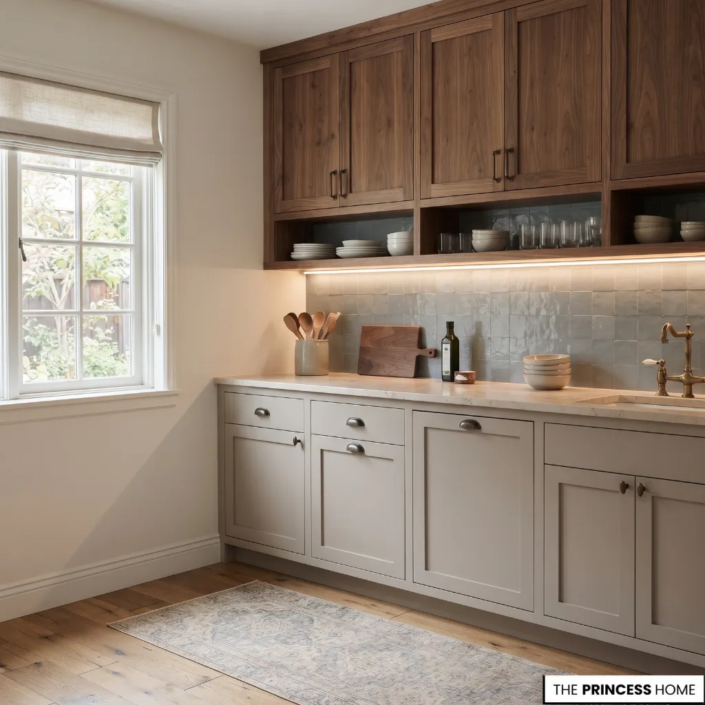
Lighting influences how kitchen colors appear, so a shade that looks suitable in a showroom or online photograph may look different once installed.
Natural daylight changes throughout the day, while artificial lighting introduces additional color influences. Surface finishes also affect how light reflects across cabinetry, countertops, and backsplashes.
Evaluate Natural Light
The direction and amount of daylight entering the kitchen can influence which undertones become more noticeable. North-facing rooms in the Northern Hemisphere often receive cooler, less direct daylight, which can emphasize blue or gray qualities in some colors.
South-facing rooms generally receive more direct sunlight, which can make warm shades appear more pronounced. Actual results also depend on windows, surrounding buildings, trees, and the season. Morning and afternoon light can produce different appearances even within the same room.
For this reason, do not select a kitchen color based on a single daytime observation. A pale gray that appears neutral in the morning may look noticeably cooler later, while a cream finish may appear more yellow under warm evening lighting.
Check Artificial Lighting
Artificial lighting affects the appearance of kitchen colors after daylight fades. Warm light sources can emphasize yellow, beige, and reddish qualities. Cooler light sources may make some whites and grays appear more blue or neutral.
The effect also depends on the light source, its color characteristics, intensity, and position. Color rendering is another consideration: some light sources reveal the differences between nearby shades and material colors more accurately than others.
When comparing lighting options, look for a good color-rendering specification and assess the actual light in the kitchen rather than relying on the bulb’s color temperature alone. Consider the lighting already installed in the kitchen, including:
- General ceiling lighting.
- Pendant lights above an island.
- Under-cabinet task lighting.
- Lighting directed toward countertops and backsplashes.
Under-cabinet lighting deserves particular attention because it illuminates surfaces that may otherwise remain in shadow. A backsplash can look different when illuminated directly than when viewed under general room lighting.
Evaluate color samples with the kitchen’s usual lights switched on. If the lighting itself will change during the project, test the colors under the intended lighting conditions.
Consider Surface Finishes
The finish of a material affects how its color is perceived. Matte surfaces generally reflect less direct light and tend to show a softer appearance. Glossy surfaces reflect more light and may produce noticeable highlights, particularly on large cabinet doors or polished tiles.
Natural stone also varies according to its finish. Polished stone reflects more light than honed stone, even when both have similar underlying colors.
Texture introduces further variation. Wood grain, handmade tiles, and textured stone create small differences across the surface that can make a single color appear less uniform.
When coordinating finishes, compare both color and sheen. Two materials with similar shades may look noticeably different when one is matte and the other highly reflective.
For more ideas: Kitchen Lighting Ideas How to Choose and Layer the Right Lighting
Adapt Kitchen Colors
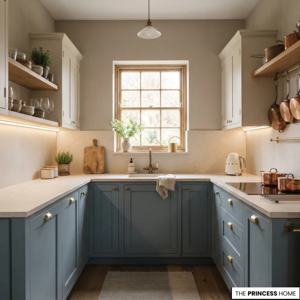
The same color palette does not suit every kitchen in exactly the same way. Room size, available light, adjoining spaces, and existing finishes all influence how colors should be distributed.
Small Kitchens
Small kitchens do not have to rely entirely on white or pale colors. The more important consideration is how the colors relate across the available surfaces.
Using related shades on cabinets, walls, and backsplashes can reduce abrupt visual divisions. For example, warm white cabinetry with a similar wall color and pale stone surfaces creates greater continuity than several strongly contrasting finishes.
A darker color can still be introduced through lower cabinets, an island, or selected accents. The key is to consider how much visual area it occupies and whether the surrounding finishes provide enough balance.
Reflective finishes can also influence the appearance of the space, but they should be selected for their suitability and maintenance requirements rather than treated as a guaranteed way to make a small kitchen appear larger.
Dark Kitchens
Kitchens with limited daylight require more careful color evaluation, but they are not automatically restricted to pale finishes.
Start by identifying which surfaces receive the most available light. A lighter countertop or backsplash can provide contrast against darker cabinetry, while warm wall colors may help connect the finishes.
If using dark cabinets, compare several shades rather than assuming that black or charcoal will produce the same result in every room. Deep green, muted navy, and warm brown may offer different alternatives.
Also consider artificial lighting and reflective surfaces. The objective is to create a palette that remains comfortable and visually clear under the lighting conditions the kitchen actually receives.
Open-Plan Kitchens
Open-plan kitchens need to coordinate with the living and dining areas because several rooms are visible together. Repeating selected materials or colors can connect the spaces without making them identical.
For example, natural oak in the kitchen can relate to wood furniture in the adjoining living area, while a shared warm neutral can provide continuity across the walls. A kitchen island can introduce a more distinctive color while remaining connected to the wider interior palette.
Consider the view between the rooms before finalizing the colors. A cabinet shade that looks balanced within the kitchen alone may appear different when seen beside a contrasting living-room wall or floor finish.
Limited Budgets
A coordinated kitchen color scheme does not always require replacing every visible surface. When working with an existing kitchen, identify the finishes that remain attractive and build the new palette around them.
Repainting suitable cabinetry, changing wall colors, or updating a backsplash may provide a more practical route than replacing large permanent elements.
Prioritize changes according to their visual impact:
- Retain attractive countertops and flooring when possible.
- Repaint suitable cabinets if their condition and construction allow it.
- Introduce a new accent color through an island or selected cabinet sections.
- Update wall paint to connect existing finishes.
- Replace smaller visible details only when they contribute meaningfully to the overall result.
An alternative should still work with the kitchen’s existing design. For example, replacing natural wood with an unrelated finish simply because it costs less may weaken the palette. Adapting the existing wood through suitable refinishing or retaining it as a supporting material may produce a more coherent result.
For more ideas: Dream Kitchen: Expert Tips to Make Your Vision a Reality
Test Kitchen Colors
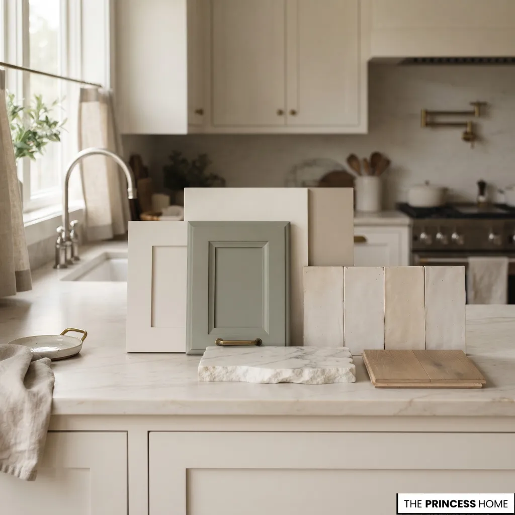
Before purchasing paint or committing to permanent finishes, test the complete palette in the actual kitchen. Color samples are especially important because photographs, showroom displays, and small paint cards cannot reproduce the exact lighting and material relationships found in an individual room.
Collect Physical Samples
Gather samples of the main finishes, including cabinet colors, countertop materials, backsplash tiles, flooring, and wall paint.
Place them together so you can compare their undertones and overall appearance. A color that looks attractive on its own may become less suitable when placed beside the actual countertop or flooring.
For stone with noticeable veining, examine a representative sample large enough to show its natural variation. A small piece may not reveal the full pattern of the finished surface.
Test Paint in Place
Paint samples on movable boards or suitable sample surfaces rather than relying only on small color cards. Place the samples near the cabinetry, countertop, and backsplash. If the kitchen has several lighting conditions, move the boards between different areas to see how the color changes.
Vertical samples are particularly useful because wall and cabinet colors are normally viewed vertically, while countertops and floors receive light differently.
Compare Throughout the Day
Observe the samples in morning, afternoon, and evening light. Switch on the regular kitchen lighting during the evening comparison. Pay attention to whether whites become too yellow, grays appear too blue, or darker colors lose their distinction.
Also consider the view from different positions. A cabinet color may look balanced when viewed directly but appear different from the adjoining dining area.
Review the Complete Palette
Before making a final decision, place the samples together and evaluate the entire combination. Check that the dominant color, supporting finishes, and accents have a clear relationship. Consider whether any one material introduces an unexpected undertone or pattern.
If a combination looks inconsistent, change one element at a time. This makes it easier to identify which finish is causing the problem.
A final review under realistic lighting is more useful than choosing each color separately and hoping the completed kitchen will look coordinated.
Avoid Color Mistakes
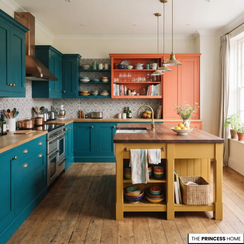
Even attractive kitchen colors can produce an unbalanced result when selected without considering the other finishes. Understanding common mistakes helps prevent unnecessary changes and expensive corrections.
Choosing wall paint first: Selecting paint before examining countertops, flooring, and cabinetry can limit the available options. Establish the permanent finishes first, then choose wall colors that complement them.
Ignoring undertones: Two whites or grays may look similar on separate samples but clash when placed together. Compare them directly with the actual materials to identify their underlying warmth or coolness.
Using too many strong colors: Several competing cabinet, wall, backsplash, and countertop colors can make the kitchen feel visually fragmented. Establish one dominant direction and introduce stronger shades selectively.
Overlooking lighting: A color chosen under showroom lighting may appear different at home. Test samples in the actual kitchen under daylight and the artificial lighting used regularly.
Copying online photographs: Screen settings, image editing, photography, and the lighting of the original kitchen can change how colors appear. Use inspiration images to understand combinations, but rely on physical samples for final decisions.
Choosing finishes separately: A cabinet color may work well with the countertop but not with the flooring or backsplash. Evaluate the complete group of materials before approving any individual selection.
Following trends without considering the space: Popular colors can provide inspiration, but their suitability depends on the kitchen’s architecture, light, and existing finishes. Choose a palette that works with these conditions rather than adopting a trend without adaptation.
Conclusion
Successful kitchen color selection depends on how cabinetry, countertops, walls, backsplashes, flooring, and lighting work together. Start with the finishes that will remain, identify their undertones, and build a palette with a clear dominant color and complementary supporting shades.
Most importantly, test the complete combination in the actual kitchen before making permanent decisions. This approach helps create a coordinated color scheme that suits the space, its materials, and the way it is used.