
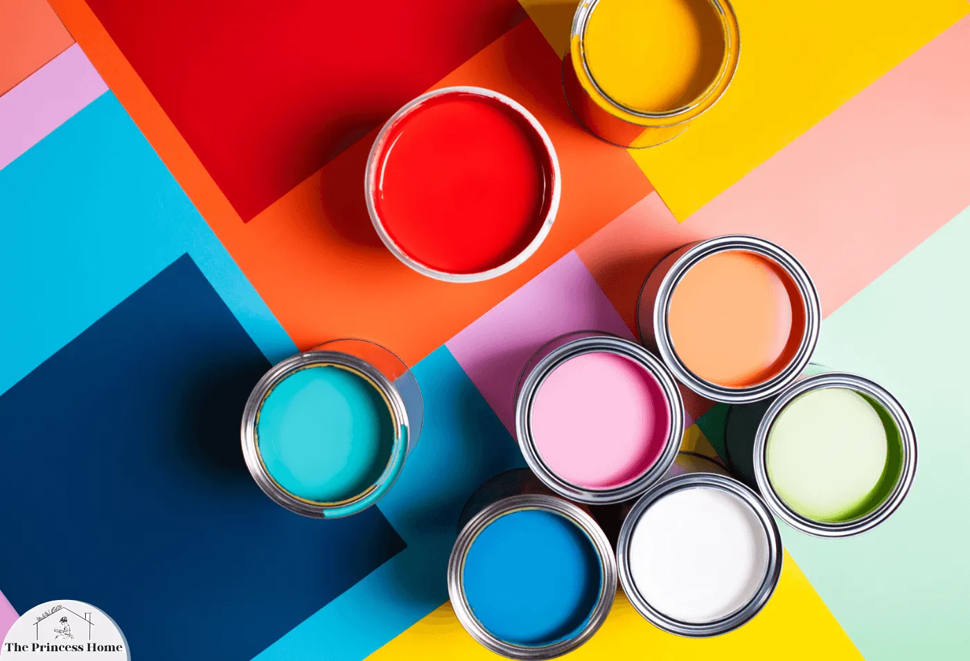
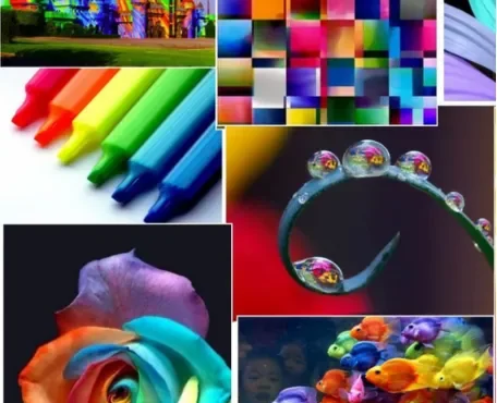
Color trends 2024: are influenced by various factors, including cultural shifts, fashion, technology, and global events. Companies like Pantone, Sherwin-Williams, Benjamin Moore, and others often release annual color forecasts or trend reports.
In 2024, interior design is taking a transformative turn with the emergence of the Renewed Comfort color trends 2024 Collection. This collection embodies a softened touch that aims to create spaces that feel both familiar and rejuvenating.
HGTV Home by Sherwin-Williams Color Trends 2024:
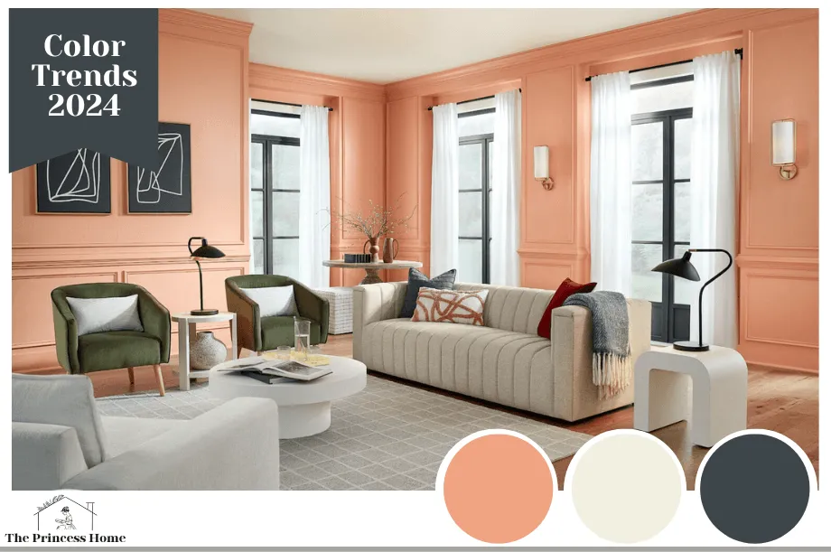
1.Persimmon: A Refreshing Earthy Shade:
Anyone drawn to warm, vibrant hues will appreciate HGTV Home by Sherwin-Williams’s color trends 2024 of the Year, Persimmon (HGSW6339). According to Ashley Banbury, HGTV Home by Sherwin-Williams color marketing manager, “Persimmon balances the energy of tangerine with grounded neutral undertones, making it perfect for spaces like living rooms and kitchens as it promotes positive relationships and conversation.”
This earthy terracotta shade is both grounding and comforting, offering a sense of upliftment and refreshment. The full palette can be explored here.
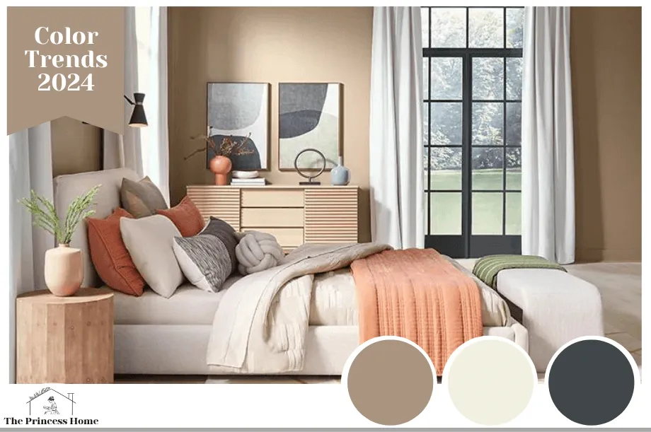
2.Return to the Cocoon with Utaupeia:
The Renewed Comfort Color Collection advocates for relaxation and unwinding with its Utaupeia shade (HGSW9088). Imagine plush, upholstered bedframes, headboards, and gently curved benches, all contributing to the soothing ambiance of a personal sanctuary.
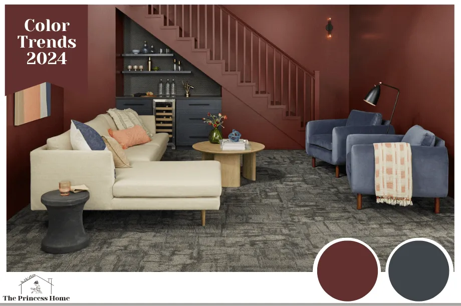
3.Create Space for Gathering:
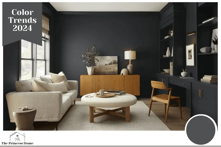
The collection recognizes the importance of socializing spaces, emphasizing the idea that if you carve out a space in deep charcoal (Dark Auburn – HGSW6034) and envelope it in a rich burgundy (Cyberspace – HGSW7076), people will naturally gather. Social nooks become places of inspiration where friends and family come together, fostering connection in a cozy and inviting environment.
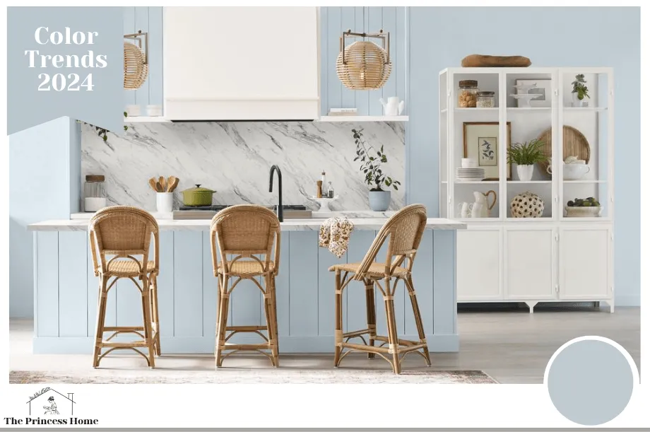
4.Embrace Curves for Softness and Comfort:
Renewed Comfort design embraces a departure from sharp angles, favoring curves. Softer Tan and Pearly White, Traditional gold tones with Persimmon, creating quietly colorful contours. This design philosophy invites an air of softness and comfort into spaces, creating a harmonious balance of elegance and relaxation.
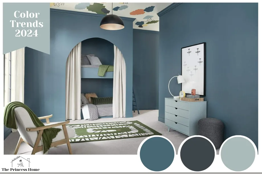
5.Play with Personality in Design:
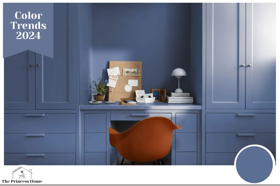
Finding one’s sense of self in design is crucial for achieving a high level of comfort. The Renewed Comfort color trends 2024 Collection encourages this by offering complementary hues of blues interrupted with playful moments of personality on the floor and ceiling. Waterloo (HGSW9141), Cyberspace (HGSW7076), and Stardew (HGSW9138) come together to create a dynamic and engaging visual experience.
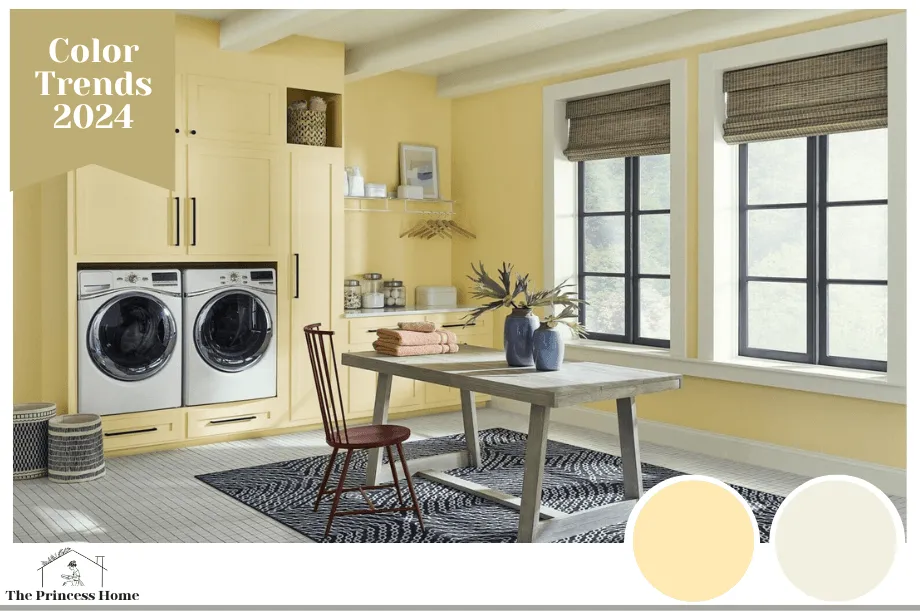
6.Infuse Joy into Workspaces:
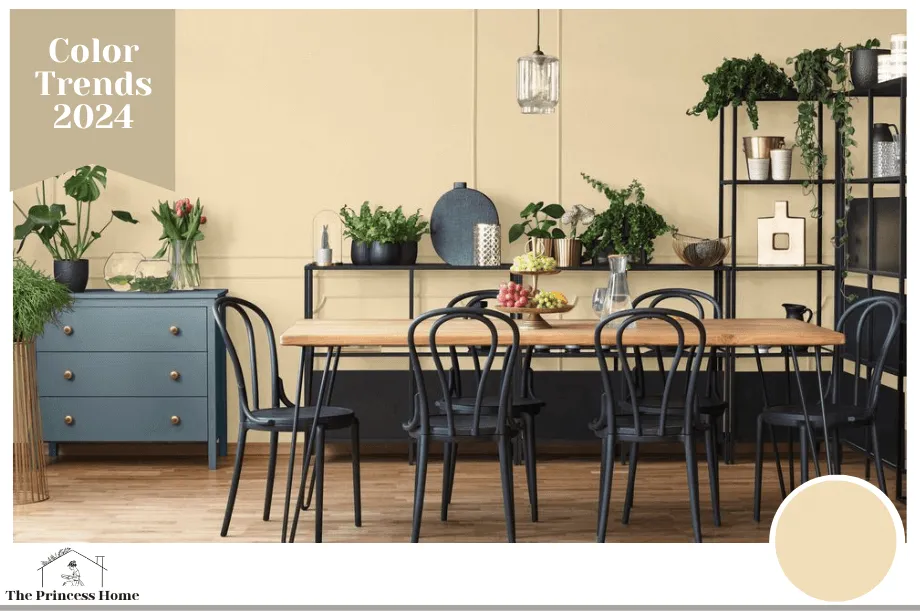
Even utility spaces deserve attention, and the 2024 Renewed Comfort Collection recognizes this by using Friendly Yellow (HGSW6680) paired with Pearly White (HGSW7009) to create a vibrant and positive atmosphere, enhancing productivity and enjoyment in workspaces.

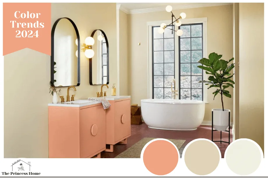
1.Pantone color trends 2024 of the Year:
Peach Fuzz
Pantone chose Peach Fuzz (Pantone 13-1023) as its 2024 Color of the Year, a soft, heartfelt hue expressing a desire for kindness. This light shade, marking Pantone’s 25th anniversary in the Color of the Year program, sits delicately between pink and orange. Laurie Pressman, vice president of the Pantone Color Institute, shared this insight with House Beautiful.
2.Benjamin Moore Color Trends 2024:
Blue Nova
Inspired by exploration, Benjamin Moore named Blue Nova (825) its 2024 Color of the Year.
When using Blue Nova in your home, the possibilities are limitless. Additionally, the paint brand suggests juxtaposing the grounding blue with dynamic, contrasting colors like orange for an ethereal atmosphere. Moreover, it can be used to create a statement-making painted ceiling or cover every wall of a powder room.
3.Behr Color Trends 2024:
Cracked Pepper
Behr’s 2024 Color of the Year, Cracked Pepper (PPU18-01), is a soft black that grounds any space while remaining timeless. Described by Sarah Fishburne, The Home Depot’s director of trend and design, as an approachable segue into the darker side of paint, it seamlessly melds into various design styles.
Exclusive to The Home Depot, Cracked Pepper is an excellent paint choice for both interiors and exteriors. Fishburne herself has incorporated Cracked Pepper throughout her own brick home on the gutters and interior doors.
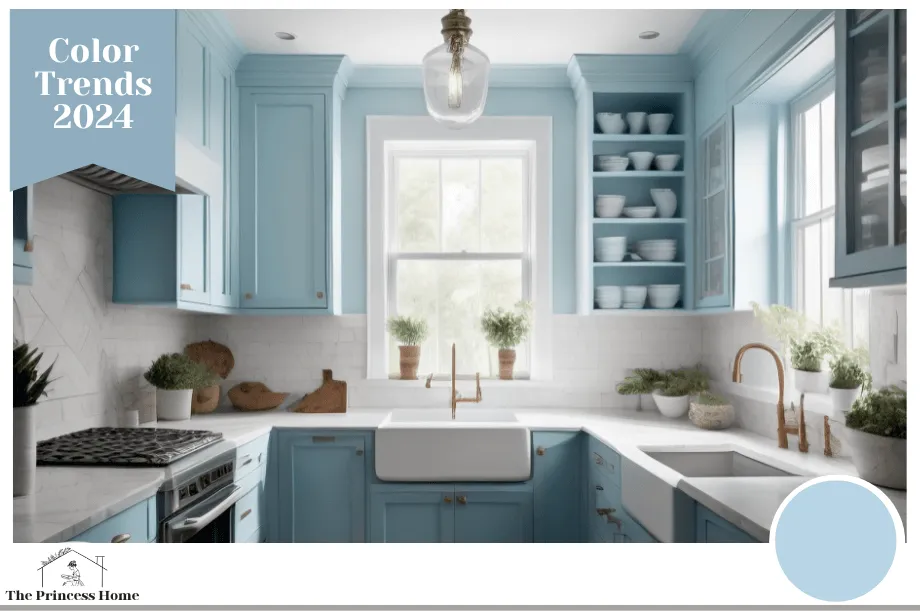
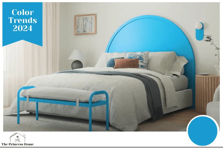
4.Sherwin-Williams Color Trends 2024:
Upward
Sherwin-Williams named Upward (SW 6239) as its 2024 Color of the Year, embodying the sensation of a slow breath of crisp air. Sue Wadden, director of color marketing at Sherwin-Williams, explained in a press release that it brings carefree, sunny day energy, evoking contentment and peace.
The light blue with gray undertones is ideal for crafting a coastal chic design style.
5.Glidden Color Trends 2024:
Limitless
Glidden paint by PPG has named Limitless (PPG1091-3) its 2024 Color of the Year. Described as a honey beige hue “anything but yellow,” it combines the stamina of a primary color with the versatility of a neutral. Consumers, she noted, are using color in more unconventional ways, requiring a versatile palette for both new and existing decor.
Glidden color experts recommend using Limitless “anywhere and everywhere.” Whether covering kitchen cabinets or painting ceilings with this warm neutral, it is a versatile choice for various applications.
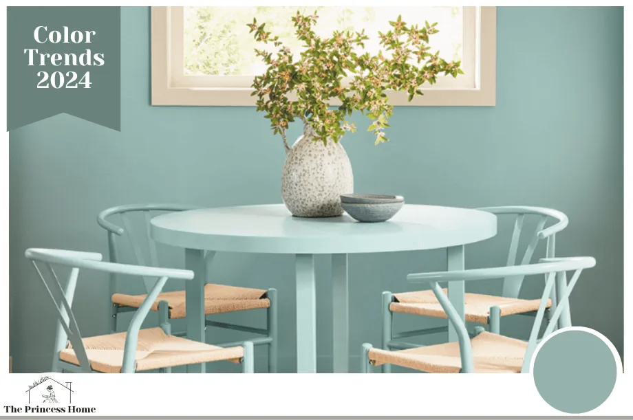
6.C2 Paint Color of the Year:
Thermal
C2 Paint’s 2024 Color of the Year is Thermal (#752), a refreshing blue encouraging an uplifting and energizing year ahead. Reminiscent of the sky on a clear day, the color brings a calming feel to any space.
Philippa Radon, interior designer and C2 Paint color specialist, shared in a press release, “This bespoke pale yet punchy blue is poised for adventure .
7.Valspar Color of the Year:
Renew Blue
Valspar marked the 15th anniversary of its Color of the Year launch by introducing Renew Blue (8003-37D) as its 2024 hue. Sue Kim, Valspar’s director of color marketing, highlighted in a press release, “Inspired by fleeting elements like fog, mist, clouds, and glacier lakes, Renew Blue elevates the everyday mood, encourages self-expression, and evokes a feeling of balance and calm, with a twist of unique spontaneity.”
Kim emphasized that blue has become a contemporary neutral, offering versatility for various design styles and applications.
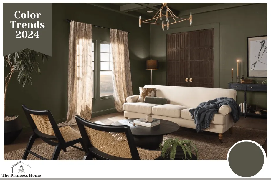
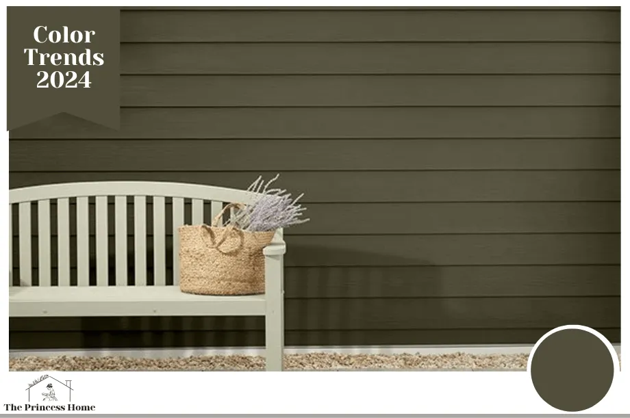
8.Dutch Boy Paints Color of the Year:
Ironside
To inspire consistent comfort in the home, Dutch Boy Paints introduced Ironside as its 2024 One-Coat Color of the Year. Whether applied throughout a large room or in a smaller space, this deep olive shade provides an elegant touch while fostering wellness. She emphasized the importance of adopting a natural approach to healthy living and safe spaces in the current landscape.
Ironside aims to create a sanctuary where individuals can feel secure and focus on their overall well-being.
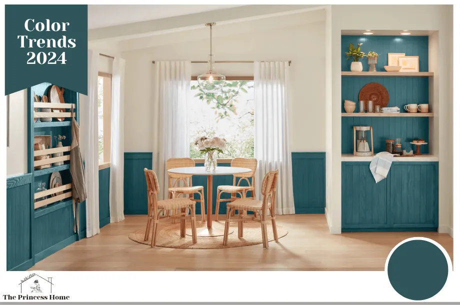
9.Minwax Color of the Year:
Bay Blue
Time for a cool-toned, nature-inspired update to your home’s wood accents with Minwax. The company has declared Bay Blue (MW1049) as its 2024 Color of the Year. According to Sue Kim, director of color marketing for Minwax, this year’s color aims to inspire DIY enthusiasts to explore bold and rich color stain options for transformative home projects, leading to a complete transformation of their living spaces.
Consider using the blue-green stain to distinguish wood paneling and rejuvenate furniture.
10.Graham & Brown Color of the Year:
Viridis
Connected to nature, Graham & Brown’s 2024 Color of the Year, Viridis, is a muted green perfect for entertaining spaces and entryways, generating a warm, peaceful atmosphere. According to Maryanne Cartwright, Graham & Brown head of design, Viridis creates a calming effect with tones of new beginnings, ideal for entertaining.
Cartwright added that Viridis reflects harmony, stability, symbolizes growth and health, evoking feelings of abundance and a plentiful environment.

11.York Wallcoverings Color of the Year:
Bay Brown
York Wallcoverings chose Bay Brown as its 2024 Color of the Year—an inviting, intimate, and effortlessly chic shade. According to Carol Miller, York Wallcoverings’ color and trend expert, Bay Brown is influenced by a continued fascination with the natural world, including elements like the forest, mushrooms, and the equestrian lifestyle. It’s prominently featured in academia aesthetics, especially in applications like dark leather upholstery, wooden furniture, and retro styles reminiscent of the 60s and 70s.
12.Krylon Color of the Year:
Bluebird
Krylon’s Bluebird is the Color of the Year for 2024, offering a vibrant twist on pale blues. It reimagines the cool, pastel shade in a brighter, punchier fashion, evoking joy and contentment within a space. Ashley Banbury, Krylon’s color marketing manager, notes that Bluebird harmonizes effortlessly with both warm and cool shades, facilitating a balance in pairing accent colors, vintage furnishings, and modern elements.
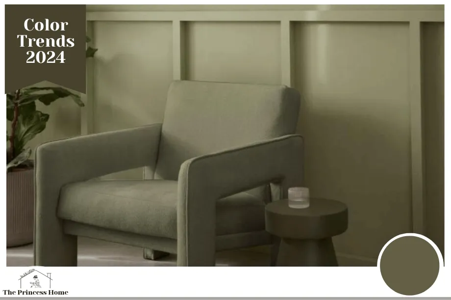
13.James Hardie Color of the Year:
Mountain Sage
James Hardie, a global building materials company, introduced its inaugural Color of the Year for housing exteriors: Mountain Sage. This green hue, with its mood-boosting quality, fosters tranquility and harmony.
Choosing a harmonizing color paint for your home involves considering several factors to create a cohesive and pleasing aesthetic. Here are some key factors to keep in mind:
1.Existing Decor and Furnishings:
Take into account the color of your furniture, carpets, curtains, and other existing decor elements. Choose a paint color that complements or contrasts harmoniously with these items.
2.Room Size and Lighting:
Lighter colors tend to make a room feel larger and more open, while darker colors can create a cozy and intimate atmosphere. Consider the size of the room and the amount of natural light it receives when selecting a paint color.
3.Personal Preferences:
Your personal style and preferences play a significant role. Consider the colors that you are naturally drawn to and that make you feel comfortable. Your home should reflect your personality and taste.
4.Architectural Features:
Highlight or complement architectural features such as trim, molding, or accent walls. Choose colors that enhance these elements rather than clash with them.
5.Color Wheel Basics:
Familiarize yourself with the color wheel. Harmonizing colors can be achieved through analogous colors (those next to each other on the wheel), complementary colors (opposite each other), or triadic colors (equally spaced around the wheel).
6.Undertones:
Pay attention to the undertones in paint colors. Even neutrals can have warm or cool undertones. Consider the undertones of your existing elements and choose a paint color with similar undertones to maintain harmony.
7.Overall Mood:
Consider the mood you want to create in each room. Cool colors (blues and greens) can create a calm atmosphere, while warm colors (reds and yellows) can evoke energy and coziness.
8.Flow Between Rooms:
Maintain a sense of continuity and flow between rooms by choosing a color scheme that works well throughout the entire home. Consider how colors will transition from one space to another.
9.Sample Testing:
Always test paint colors on a small section of the wall before making a final decision. Paint can look different in various lighting conditions, and it’s essential to see how it interacts with your specific space.
10.Trends vs. Timelessness:
While it’s okay to incorporate current trends, consider the longevity of your chosen color. Trends can change quickly, and you want a color that will stand the test of time.
11.Maintenance and Durability:
Consider the practical aspects of the paint, such as its durability and ease of maintenance. Some finishes are easier to clean than others, which is important, especially in high-traffic areas.
Remember that choosing a harmonizing color palette is about creating a cohesive and visually pleasing environment that suits your tastes and enhances the overall atmosphere of your home.
While it’s technically possible to mix and match paint colors from different brands, it’s not always recommended. Here are some considerations to keep in mind:
1.Consistency and Accuracy:
Different paint brands may have variations in color formulations, even if they share the same name or code. This can lead to inconsistencies in color when you mix paints from different brands. It’s essential to test the colors together before committing to a large project.
2.Quality and Performance:
Paint quality can vary between brands, affecting factors like coverage, durability, and finish. Mixing paints from different brands may compromise the overall performance and longevity of the paint on your walls.
3.Sheen and Finish:
Each paint brand may have its own range of sheens and finishes. Mixing paints with different sheens can result in an uneven appearance on your walls. Ensure that the sheen and finish are compatible for a smooth and cohesive look.
4.Warranty and Support:
Some paint brands offer warranties or support for their products. Mixing brands may void these warranties and make it more challenging to seek assistance if issues arise.
5.Color Matching:
If precise color matching is crucial for your project, it’s better to stick to a single brand. Different brands may interpret colors differently, and achieving an exact match can be challenging.
6.Testing and Samples:
Before committing to a large project, it’s crucial to test the colors together on a small section of the wall. This will give you a better idea of how the colors interact and whether they create the harmonious look you desire.
If you decide to mix and match colors from different brands, consider the following tips:
1.Choose a Dominant Brand: Use paint from one brand as the primary color and consider the other brand for accents or smaller areas.
2.Check Compatibility: Ensure that the paints have similar bases and are compatible for mixing. Water-based and oil-based paints, for example, may not mix well.
3.Consult with Professionals: Seek advice from paint professionals or experts who can provide insights into compatibility and potential issues.
4.Document Formulas: If you need to replicate the color in the future, document the ratios and formulas used for mixing the colors.
It’s generally safer and more straightforward to stick with a single paint brand for a cohesive and reliable result. If you have specific colors in mind from different brands, consider bringing samples to a paint store and asking for assistance in finding a close match within a single brand’s offerings.
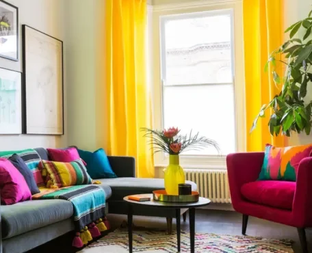
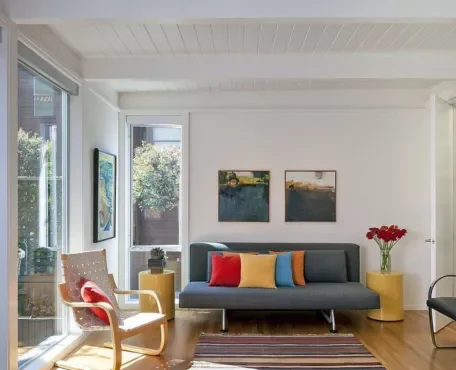
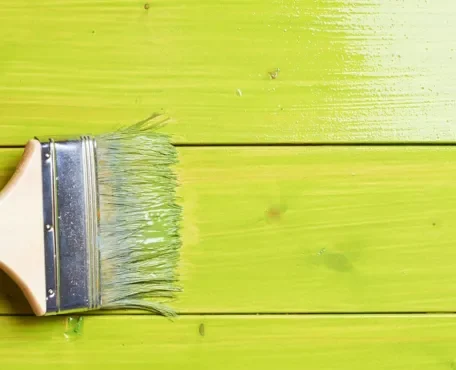
Experimenting with bold paint colors can add vibrancy and personality to a space, but it’s important to do so in a way that enhances the room without overwhelming it.
Here are some tips to help you experiment with bold colors while maintaining balance:
1.Accent Wall:
Start by painting just one accent wall with the bold color. This allows you to introduce the vibrant hue without it dominating the entire space. Choose a wall that naturally draws attention, such as one with architectural features or the wall behind a focal point like a bed or sofa.
2.Use Neutral Base Colors:
Pair bold colors with neutral base colors. This can include white, beige, gray, or muted tones. A neutral backdrop helps balance the intensity of the bold color, preventing the space from feeling too busy.
3.Furniture and Decor:
Introduce bold colors through furniture, decor items, or accessories instead of painting the entire room. This allows you to experiment with pops of color that can be easily changed or adjusted.
4,Consider the Lighting:
Bold colors can look different in various lighting conditions. Consider how natural and artificial light will affect the color in your space. Test the color in different lighting situations before making a final decision.
5.Create a Color Scheme:
Develop a cohesive color scheme by choosing complementary or analogous colors. This involves selecting colors that either contrast or harmonize with the bold color, creating a well-balanced and visually appealing palette.
6.Gradual Transition:
If you’re hesitant about a fully bold room, consider a gradual transition. Start with a small space like a powder room, hallway, or entryway before committing to bolder colors in larger, more central areas.
7.Patterns and Textures:
Use patterns and textures to break up the intensity of bold colors. Incorporate patterned rugs, textured fabrics, or artwork to add visual interest and depth.
8.Test with Temporary Methods:
Experiment with temporary methods such as removable wallpaper, decals, or large artwork to introduce bold colors. This allows you to assess how the color feels in the space without a long-term commitment.
9.Create Balance with Neutrals:
Balance bold colors with plenty of neutral elements to prevent the space from feeling overwhelming. This can include neutral-colored furniture, curtains, and flooring.
10.Consult Color Professionals:
Seek advice from color professionals or interior designers who can provide insights into color combinations and balance. They can help you find the right balance for your specific space and style.
Remember that bold colors can be powerful and transformative, so it’s okay to start small and gradually increase the intensity as you become more comfortable. The key is to find a balance that suits your taste and enhances the overall aesthetic of your home.
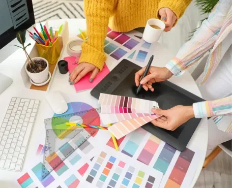
Finding inspiration for harmonizing paint colors for your home can come from various sources.
Here are some ideas to help you discover color combinations that resonate with your style and preferences:
1.Online Platforms:
Pinterest: Explore Pinterest for a vast array of home decor and color palette ideas. Create boards for different rooms and themes to collect inspiration.
Instagram: Follow interior designers, home decor accounts, and hashtags related to home styling. Many designers and homeowners share their projects on Instagram, providing a visual feast of color combinations.
2.Interior Design Websites:
Visit interior design websites and blogs that showcase home makeovers, room designs, and color schemes. Websites like Houzz, Apartment Therapy, and Elle Decor often feature inspiring home interiors.
3.Color Palette Websites:
Utilize online color palette tools and websites that offer pre-made color schemes. These platforms can provide ideas for coordinating colors effectively. Adobe Color, Coolors, and Design Seeds are popular choices.
4.Magazines:
Browse home and interior design magazines for color inspiration. Magazines like Architectural Digest, Better Homes & Gardens, and House Beautiful often feature articles on color trends and home makeovers.
5.Paint Manufacturer Websites:
Explore the color galleries on paint manufacturer websites. Companies like Benjamin Moore, Sherwin-Williams, and Behr provide online tools and inspiration galleries showcasing their paint colors in various settings.
6.Sample Paint Swatches:
Visit paint stores and collect sample paint swatches. Arrange them together to see how different colors work in combination. Many paint stores also provide brochures and guides with suggested color palettes.
7.Nature and Outdoors:
Take inspiration from nature. Look at the colors in your garden, landscapes, or beach scenes. Nature often provides harmonious color combinations that can be translated into your home.
8.Art and Museums:
Explore art galleries and museums to discover unique color combinations. Artists often use intriguing color palettes that can serve as inspiration for your home.
9.Color Theory Books:
Delve into color theory books that explain the principles of color harmony. Understanding color relationships can help you create visually appealing combinations.
10.Personal Experiences:
Consider your own experiences and memories. Colors associated with positive memories or places you love can serve as inspiration for creating a harmonious and comforting environment.
11.Interior Design Shows:
Watch interior design shows on TV or streaming platforms. Designers often discuss their color choices and design philosophies, providing insights into creating cohesive spaces.
12.Consult with Professionals:
If you’re unsure, consider consulting with interior designers or color professionals. They can provide personalized advice based on your preferences, lifestyle, and the specific characteristics of your home.
Remember to keep an open mind, and don’t be afraid to experiment with different color combinations. Test samples in your space to see how they look in different lighting conditions. Finding inspiration is a creative process, and your home’s color scheme should reflect your unique style and personality.
Colors can have a significant impact on our emotions and well-being, and certain hues are often associated with tranquility and a sense of calm. One color that is commonly linked to promoting relaxation and well-being is blue.
Different shades of blue can evoke various feelings, but in general, blue is known for its calming and soothing effects. Here are a few considerations:
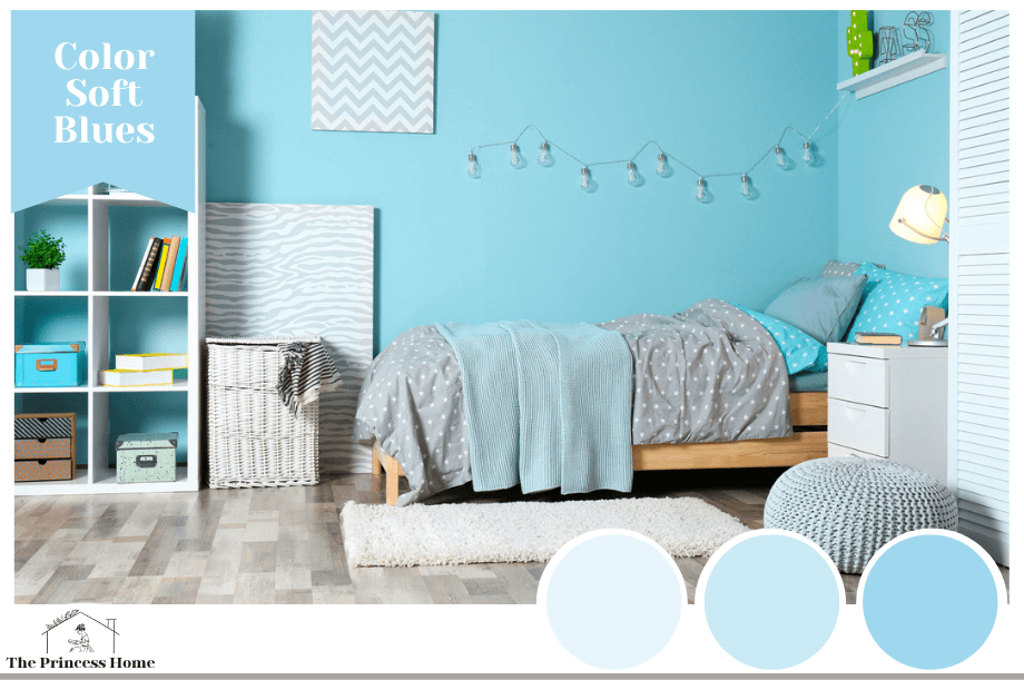
1.Soft Blues:
Light and soft shades of blue, such as powder blue or sky blue, can create a serene and tranquil atmosphere. These colors are often associated with the sky and water, bringing a sense of openness and calmness to a space.
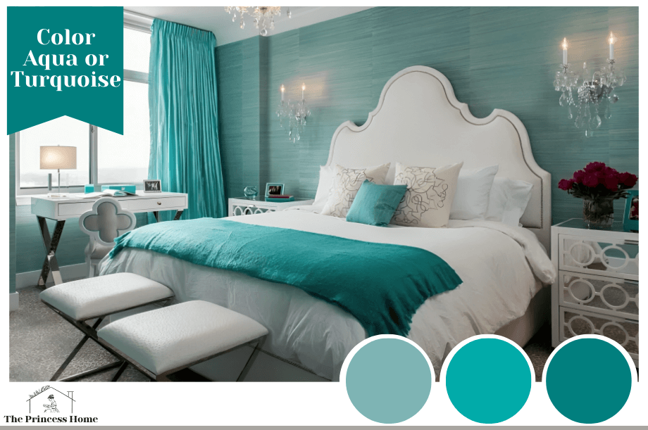
2.Aqua or Turquoise:
These shades of blue with a hint of green can also be calming and refreshing. They can evoke the feeling of a tropical beach or a peaceful oasis.
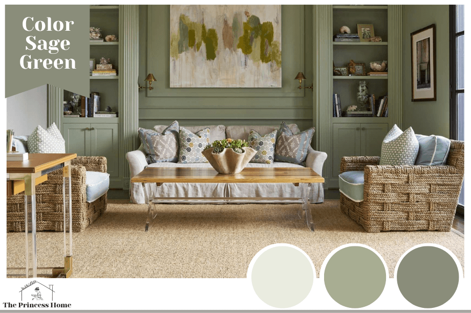
3.Sage Green:
While not a shade of blue, sage green is another color often associated with tranquility. It has a muted, earthy quality that can create a serene and grounded environment.
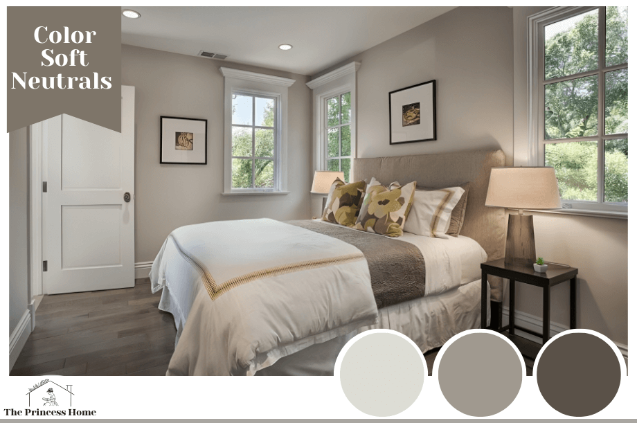
4.Soft Neutrals:
Light, neutral colors such as light gray, beige, or muted pastels can also contribute to a tranquil atmosphere. These colors create a soft and understated backdrop that allows other elements in the room to stand out.
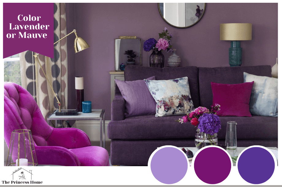
5.Lavender or Mauve:
These light purple hues can bring a sense of calmness and sophistication to a space. They are often associated with relaxation and can work well in bedrooms or other areas where tranquility is essential.
Remember that individual preferences vary, and the impact of color can be influenced by personal experiences and cultural associations. It’s always a good idea to test paint samples in your specific space and observe how they make you feel in different lighting conditions.
Additionally, creating a tranquil atmosphere is not solely dependent on the color of the walls. Consider incorporating elements such as natural light, comfortable furniture, and calming decor to enhance the overall sense of well-being in your home.
Conclusion:
The 2024 Renewed Comfort Color Collection reflects evolving interior design trends, highlighting comfort, personalization, and well-being.
Certainly! Below are some frequently asked questions (FAQs) related to harmonizing home color paint, along with their answers:
Q1: What factors should I consider when choosing a harmonizing color paint for my home?
Answer: When selecting a harmonizing color paint, consider the overall theme, natural lighting, room size, and existing furnishings. Choose colors that evoke the desired atmosphere and complement the space.
Q2: How can I use color paint to create a harmonious atmosphere in my home?
Answer: Create a harmonious atmosphere by selecting a cohesive color palette for different rooms. Choose colors that flow well together, considering warm and cool tones, and maintain a consistent theme throughout the home.
Q3: Are there specific color trends for home paint in 2024?
Answer: Yes, color trends for home paint can vary each year. In 2024, trends may include muted greens, warm neutrals, vibrant blues, and earthy tones. Stay updated with the latest color of the year announcements from various paint brands.
Q4: How can I incorporate harmonizing paint colors in utility spaces like kitchens or bathrooms?
Answer: Utilize harmonizing paint colors in utility spaces by choosing shades that enhance functionality and create a pleasant environment. Consider neutral tones, calming blues, or warm earthy colors for a balanced and inviting feel.
Q5: Can I mix and match paint colors from different brands to achieve a harmonious look?
Answer: While mixing paint colors from different brands is possible, it’s recommended to stick to a single brand or collection for consistency in finish and color accuracy. Test samples to ensure compatibility before applying to larger areas.
Q6: Is there a specific color that promotes tranquility and well-being for home interiors?
Answer: Colors like muted greens, soft blues, and earthy neutrals are often associated with tranquility and well-being. Consider shades that resonate with your personal preferences and contribute to a calming atmosphere.
Q7: How can I experiment with bold paint colors without overwhelming the space?
Answer: Experiment with bold paint colors by using them as accent walls or on specific architectural features. Balance bold colors with neutral tones and incorporate them in smaller doses through accessories or furnishings.
Q8: Can I use harmonizing paint colors to visually expand smaller rooms?
Answer: Yes, lighter and neutral harmonizing colors can visually expand smaller rooms. Consider using light tones on walls, ceilings, and trim to create an open and airy feel, maximizing the perception of space.
Q9: Are there specific paint finishes that work best for harmonizing home colors?
Answer: The choice of paint finish depends on personal preference and the intended use of the space. Matte finishes can add a sophisticated touch, while satin or eggshell finishes are easy to clean and suitable for various areas.
Q10: Where can I find inspiration for harmonizing paint colors for my home?
Answer: Seek inspiration from interior design magazines, online platforms, paint brand color forecasts, and home improvement websites. Create mood boards or use virtual tools to visualize how different harmonizing colors will look in your home.

