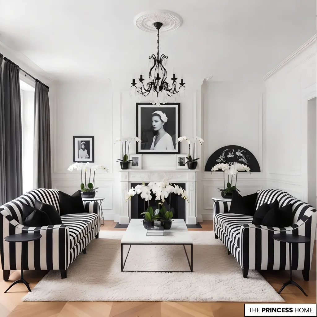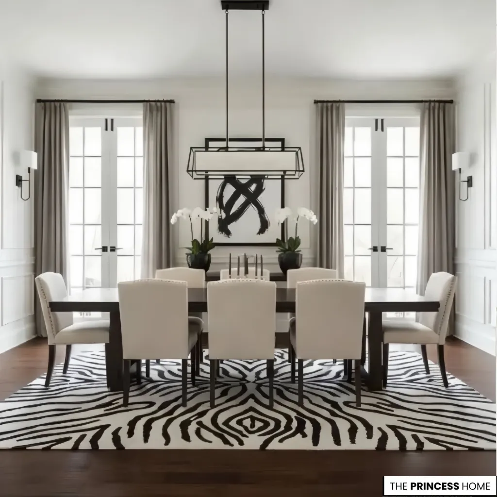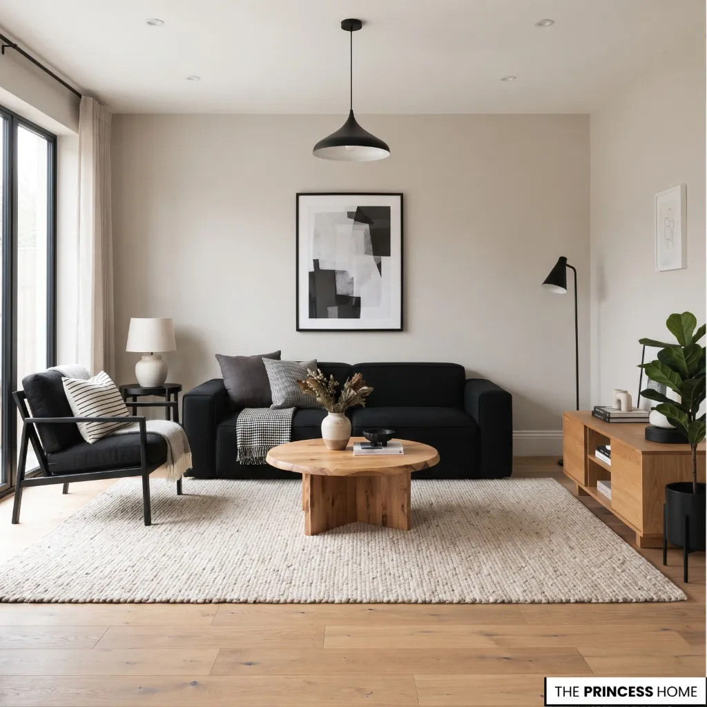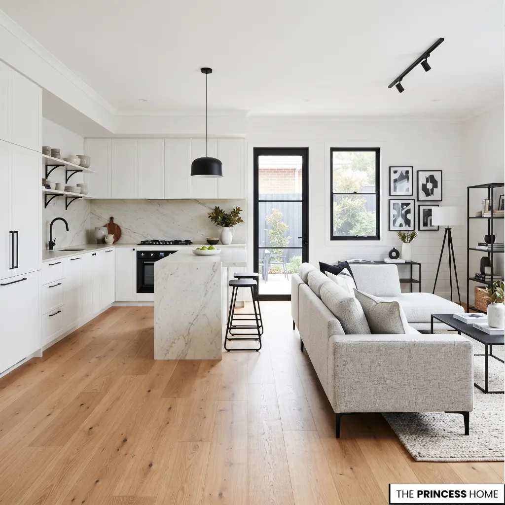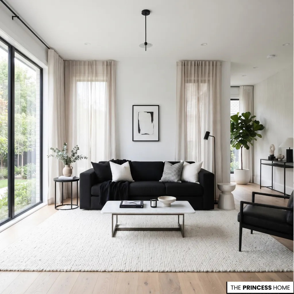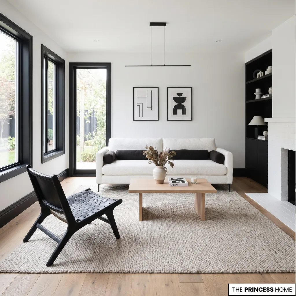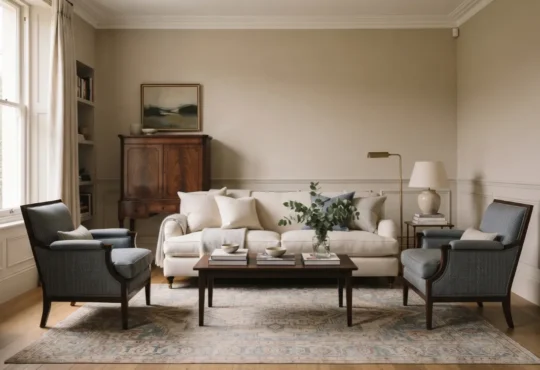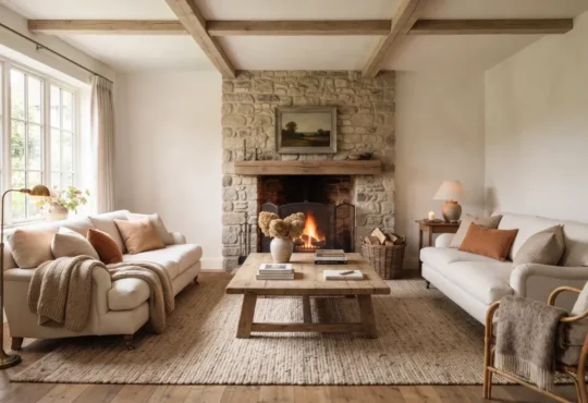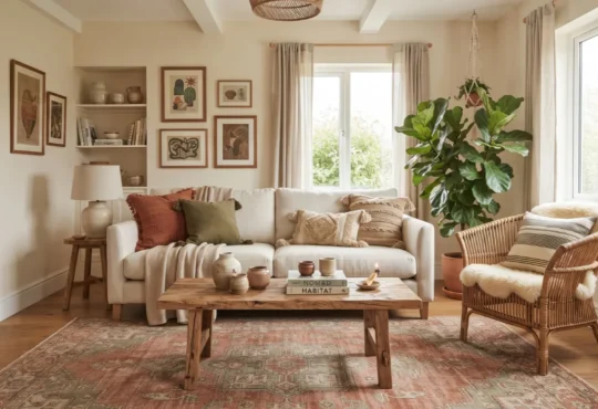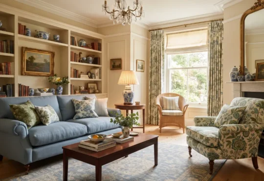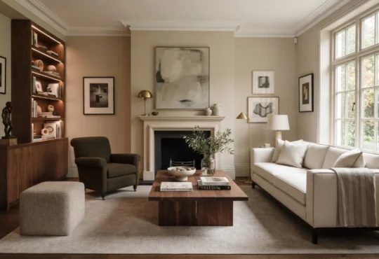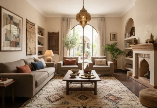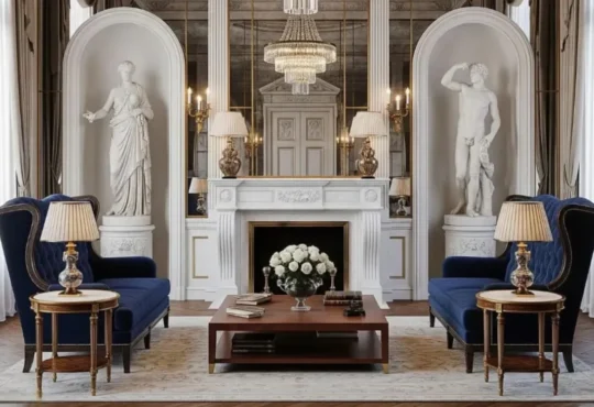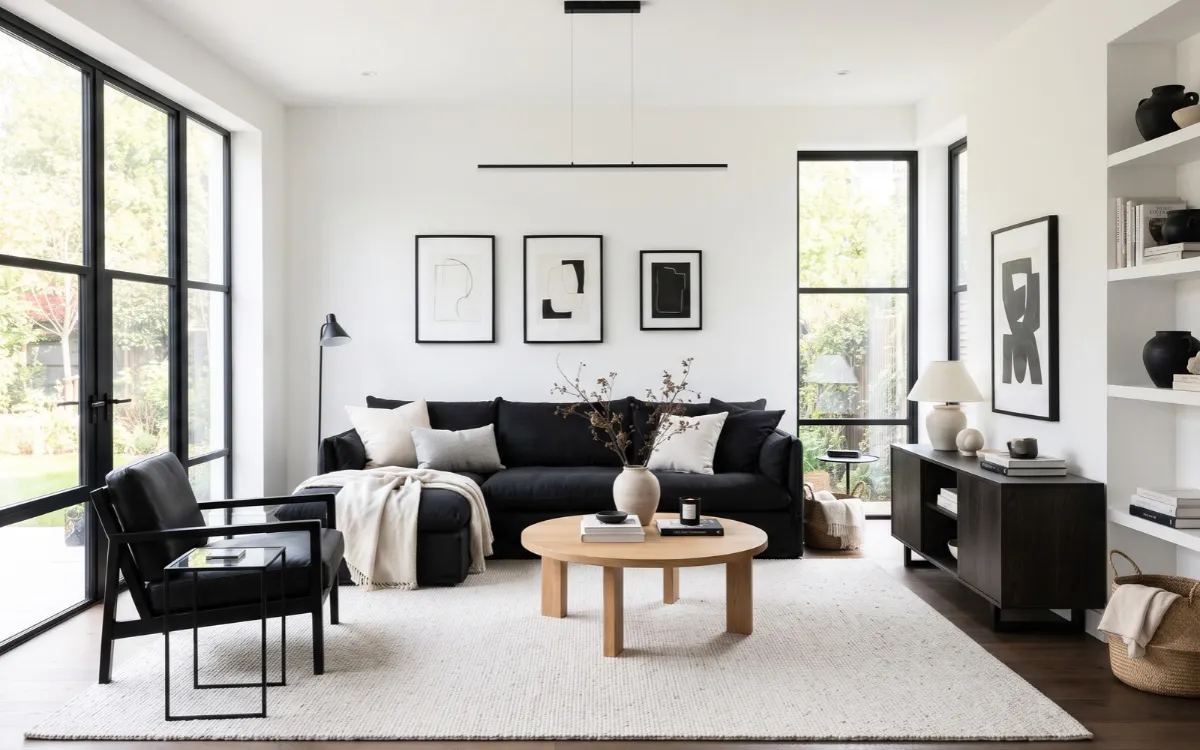
A black and white home provides a versatile foundation for modern, classic, and contemporary interiors. The challenge is balancing these contrasting colors without making rooms feel cold, flat, or overly dramatic. The key lies in choosing the right proportions, furniture, materials, and lighting for each space.
This guide explains how to coordinate the palette throughout your home, introduce texture and warmth, and create rooms that remain practical and visually coherent over time.
Black and White Basics
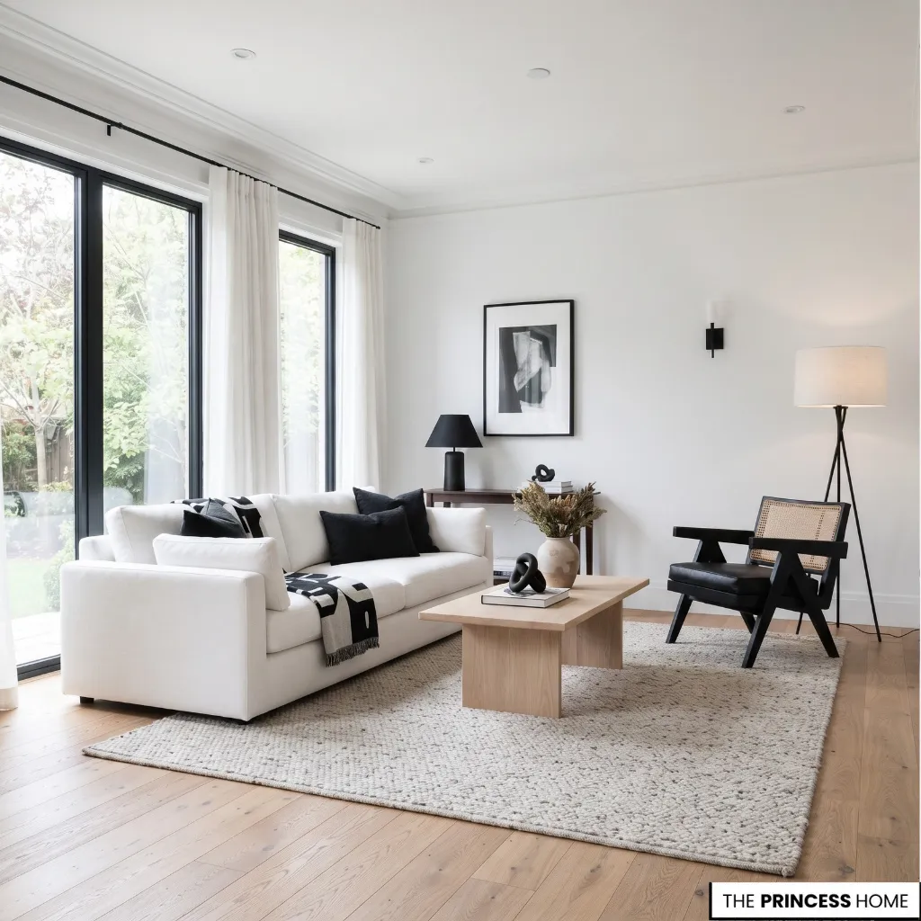
Black and white interiors use contrast to define shapes, highlight architectural details, and organize a room visually. White generally reflects more light than black, while black creates stronger visual weight. Together, they provide a clear foundation that can support several interior styles.
The character of the room depends on more than its colors. Simple furniture, clean lines, and limited accessories suit a minimalist interior. Traditional furniture, decorative molding, and classic patterns create a more formal look.
Natural wood, textured fabrics, and softer white tones support a relaxed contemporary approach. Choose a foundation that suits your home and personal preferences. Pure white paired with deep black produces strong contrast, while ivory, charcoal, and softer gray create a gentler transition.
You can also use black primarily for furniture frames, lighting, window frames, and hardware while keeping larger surfaces light. When choosing a white, consider the undertones of your flooring, countertops, upholstery, and other permanent finishes.
A warm white may work better with creamy fabrics and warm wood, while a cooler white may suit cooler stone and gray finishes. Compare paint samples beside these materials in your actual room, because the same white can look different depending on its surroundings and the available light.
The goal is to establish a consistent relationship between black and white rather than apply them in equal amounts. Once you understand that relationship, it becomes easier to select furniture, materials, and decorative details.
For more ideas: ⭐Interior Design Styles Choose Your Home’s Personality
Balance Black and White
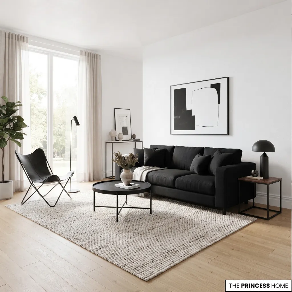
The balance between black and white determines how a room looks and feels. A predominantly white interior often appears brighter, while extensive black surfaces create a more dramatic effect. The right choice depends on natural light, room proportions, existing finishes, and the intended use of the space.
Start with the largest surfaces: walls, ceilings, floors, and built-in cabinetry. These establish the overall color balance before you introduce furniture and accessories. In a room with limited daylight, light walls and ceilings can help maintain a brighter appearance.
Black can then define selected elements, such as window frames, furniture, lighting, or cabinetry details. If you want a calm, open atmosphere, let white or a soft off-white dominate and use black to define important features.
If the room receives abundant daylight and you want a more dramatic effect, you can introduce larger dark elements, provided the remaining surfaces maintain enough contrast.
Consider the room’s existing finishes before deciding: a space with dark floors, dark cabinetry, or limited daylight may need a lighter overall balance than a bright room with pale flooring.
In a bright living room, a black sofa or dark feature wall can provide a strong focal point against lighter surroundings. If the room already has dark flooring or substantial black furniture, lighter upholstery and pale curtains may provide the balance it needs.
Avoid adding more dark elements simply to repeat the color throughout the room. Consider visual weight as well as color. A large black cabinet attracts more attention than a small black picture frame, even when both have the same finish.
Distribute dark elements according to their size and position so one side of the room does not become unintentionally heavy. Gray and off-white can soften the transition between black and white. Use them when the contrast feels too sharp, but choose undertones that work with the existing finishes.
Before committing to a large painted surface, test the color in the actual room. Observe it in daylight and under artificial lighting, because the appearance of black, white, and their undertones can change with the light.
Choose Timeless Furniture
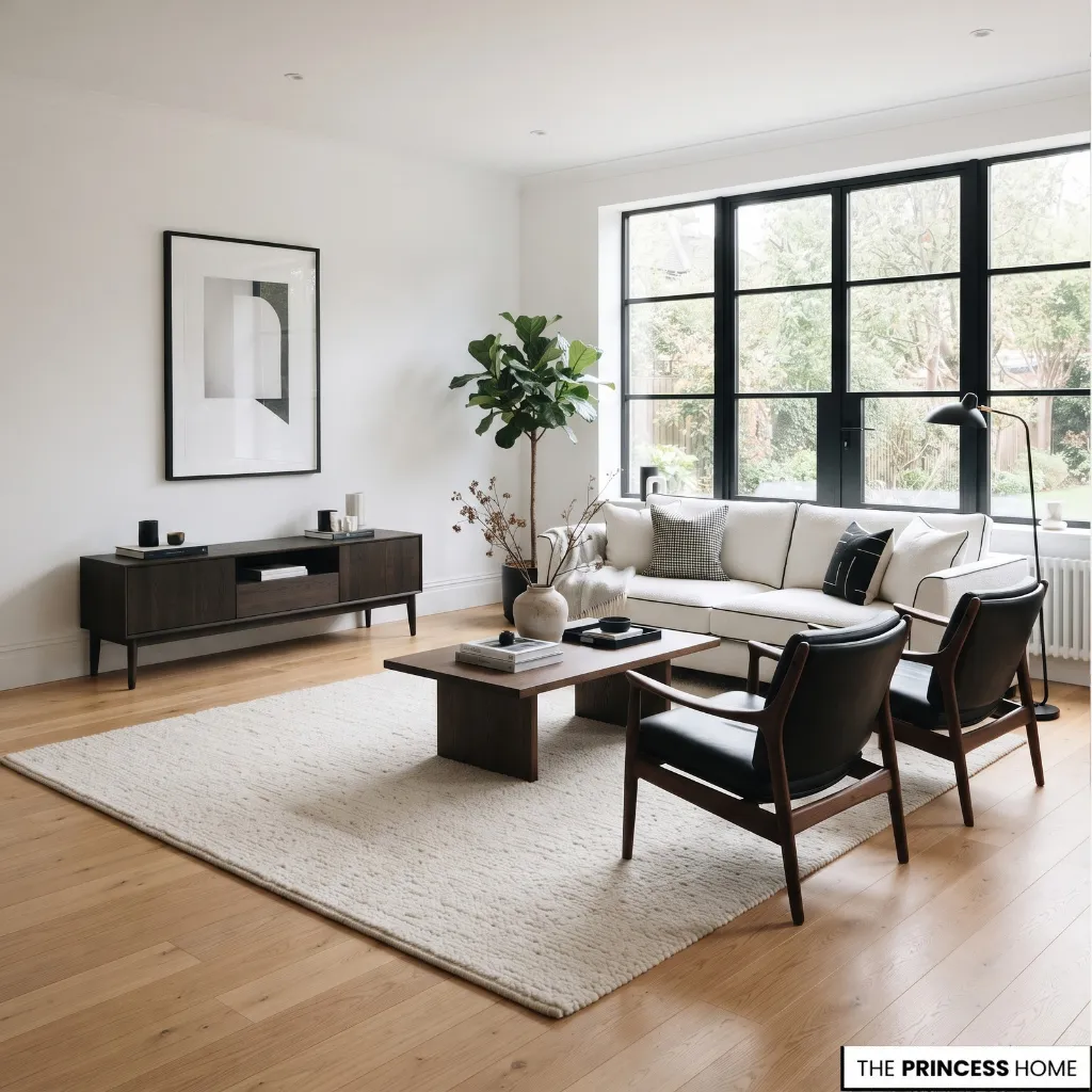
Furniture establishes the structure of a black and white home. Its size, shape, upholstery, and placement determine how the palette appears at eye level and across the floor. Choose furniture according to the room’s proportions and practical needs before deciding whether each piece should be black or white.
A large black sofa can anchor a spacious living room, while lighter upholstery may suit a smaller room with limited daylight. Black metal frames and dark wood furniture introduce contrast without requiring every major piece to be upholstered in black. Consider how furniture shapes work together.
Straight-lined sofas and simple tables support a contemporary interior, while curved armchairs, turned legs, and traditional profiles introduce a different character. Mixing styles works when the pieces share compatible proportions, finishes, or levels of detail.
Pay attention to the floor beneath the furniture. A black table on a dark floor may lose some of its definition, while the same table against a pale rug becomes more noticeable. Light upholstery also stands out against dark flooring. Use these relationships to decide where each piece will have the greatest impact.
If your existing floor is dark and cannot be changed, use a lighter rug beneath the main furniture group or introduce lighter upholstery and curtains to restore contrast. If you already own a black sofa or dark cabinet, treat it as part of the starting design rather than assuming it must be replaced.
The surrounding surfaces can often be adjusted to make the piece feel intentional. Avoid selecting every item as part of a matching black or white set. Repeating the same color across all major surfaces can make a room look flat, while too many contrasting shapes can make it feel disorganized.
Establish a few principal pieces and let the remaining furniture support them. You do not need to replace all your existing furniture. A suitable wooden table, neutral sofa, or well-proportioned armchair may already work with the palette.
Repainting an appropriate piece, changing its upholstery, or updating selected hardware can provide a more useful improvement than purchasing an entirely new set.
For more ideas: Classic Style: A Timeless Guide to Choosing Elegance
Layer Textures and Materials
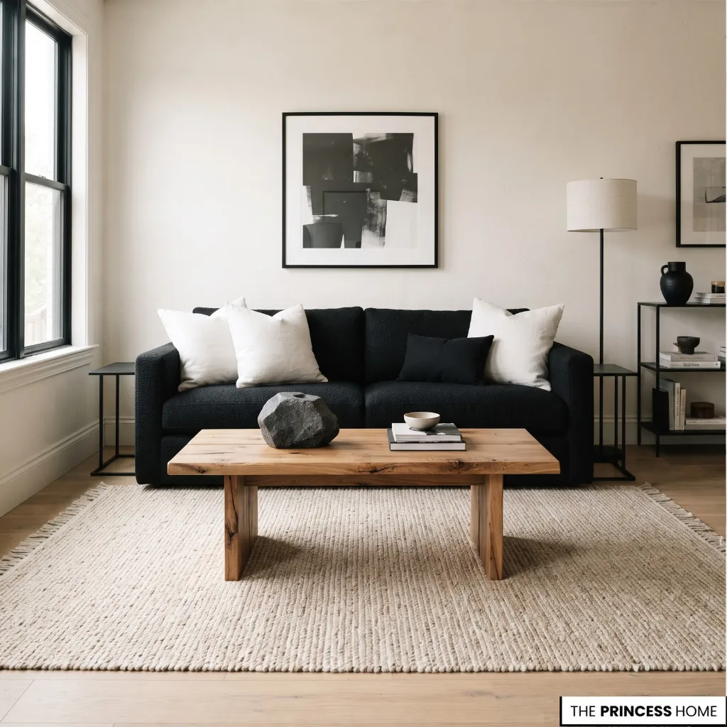
When black and white dominate a room, differences in texture and material become especially important. Without them, a space can appear flat even when the furniture and colors are well chosen. Combining smooth, rough, soft, and reflective surfaces introduces variation without requiring additional strong colors.
Natural wood is one of the most useful materials for this purpose. A wooden coffee table, dining table, or storage cabinet introduces visible grain and a warmer tone. Light woods can soften a high-contrast room, while darker woods provide a richer transition between black furniture and white walls.
Choose a tone that relates to the existing flooring and furniture rather than adding several unrelated wood finishes. Stone and marble introduce surface variation through their natural patterns.
White marble with restrained veining can complement black cabinetry or a dark dining table, while darker stone creates a stronger contrast with pale surroundings. Consider the scale of the veining before combining it with patterned rugs or graphic textiles.
Several competing patterns can weaken the clarity of the design. Textiles make the palette more comfortable and practical. Linen, cotton, wool, and woven fabrics offer different surface qualities even when their colors are similar.
A textured white rug, a black linen cushion, or a wool throw can distinguish one surface from another without introducing a new dominant color. Velvet provides a more pronounced texture, while cotton and linen can create a quieter effect.
Metal and glass add further variation. Black metal connects lighting fixtures, furniture frames, and window details. Glass helps preserve visual openness around tables and shelving, while selected reflective finishes distribute light across a room. Use reflective surfaces carefully when glare is already a problem.
You can achieve this layered effect without expensive materials. Existing wooden furniture, woven baskets, textured cushions, and a simple rug may provide all the variation a room needs. The objective is to choose materials that contribute something distinct rather than accumulate finishes for their own sake.
For more ideas: Farmhouse Style: A Complete Guide to Creating Warm &Inviting
Plan Effective Lighting
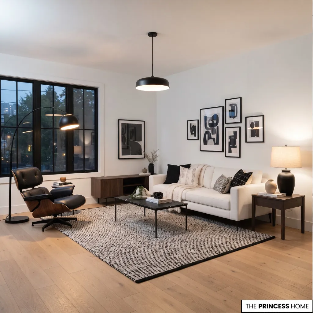
Lighting affects how black and white surfaces appear throughout the day. A white wall may look crisp in daylight but cooler under some artificial lighting, while a black surface can reveal different textures depending on the direction and intensity of illumination.
Begin with natural light. Consider the size and position of windows, the amount of daylight entering the room, and whether curtains or furniture obstruct it. In darker spaces, keep important surfaces sufficiently light and distribute artificial lighting carefully.
Black can still work, but large dark areas should be assessed in the context of the room rather than chosen from an inspiration photograph alone. Artificial lighting should serve different purposes.
Ambient lighting provides general illumination, task lighting supports activities such as cooking or reading, and accent lighting highlights selected features. A living room may need a ceiling fixture, a floor lamp beside a chair, and a table lamp near the sofa.
A kitchen requires suitable illumination over work surfaces, while a bedroom benefits from useful bedside lighting. Choose fixtures that relate to the rest of the interior. Black metal pendants, simple wall lights, and dark lamp bases can reinforce the palette.
White shades and lighter finishes can reduce the visual weight of the fixtures. The size of each fixture should suit the room and the furniture beneath it. Avoid relying on a single bright ceiling light to illuminate every part of the room.
Uneven illumination can leave corners dark and make strong contrasts more pronounced. Combining several suitable light sources gives you more control over the room’s appearance and daily use. If you are working with a limited budget, reposition existing lamps before buying new fixtures.
Adding one well-placed reading lamp or improving the light over a work surface may solve a practical problem more effectively than replacing the entire lighting scheme.
Use Patterns and Accents
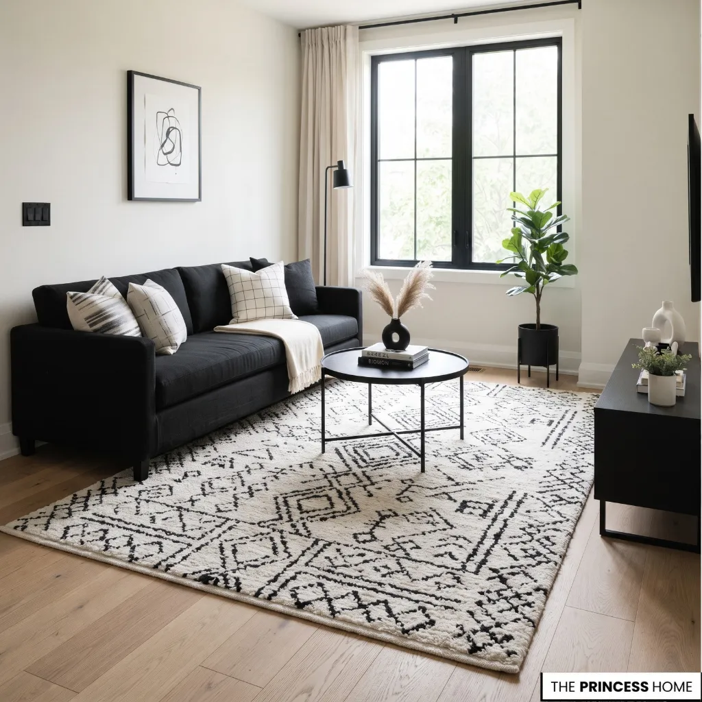
Patterns and decorative accents introduce personality into a black and white home. Their scale and placement should relate to the rest of the room so they add interest without competing for attention. Stripes, checks, geometric designs, and abstract patterns are all suitable options.
A striped cushion provides a small accent, while a geometric rug can become the main decorative feature. Choose the pattern’s scale according to the surrounding surfaces. Large patterns need sufficient visual space, while small patterns can become busy when repeated across many items.
Start with one strong patterned element and build around it. If your rug has a prominent geometric design, keep the largest upholstery surfaces relatively simple. If the furniture is plain, patterned cushions or artwork can provide variation.
Repeating a motif in a few carefully chosen places connects the room without making everything identical. Artwork and mirrors also help organize the palette. Black frames create definition against light walls, while white or neutral artwork can soften a dark surface.
A mirror may reflect daylight or an attractive part of the room, but its placement should be deliberate rather than purely decorative. Metallic finishes can be introduced through lighting, handles, or selected accessories.
Warm metals may soften the contrast, while black finishes maintain a more restrained appearance. Greenery introduces natural color and organic shapes. Neither greenery nor metallic accents is essential; the room should still work if you prefer a strictly black and white scheme.
A third color is most useful when the room needs a specific quality that black and white alone do not provide, such as the natural warmth of wood, the freshness of greenery, or a softer transition through beige or muted gray.
Choose one supporting color according to the materials already present and repeat it selectively. If the palette already feels balanced and comfortable, there is no need to add another color simply for variety.
Avoid distributing small decorative objects across every available surface. A few well-positioned items allow the furniture, materials, and artwork to remain visible. Before adding another accessory, assess whether the room needs more contrast, more texture, or simply fewer competing details.
For more ideas: Moroccan Decor Transform Your Space with Exotic Elegance
Decorate Each Room
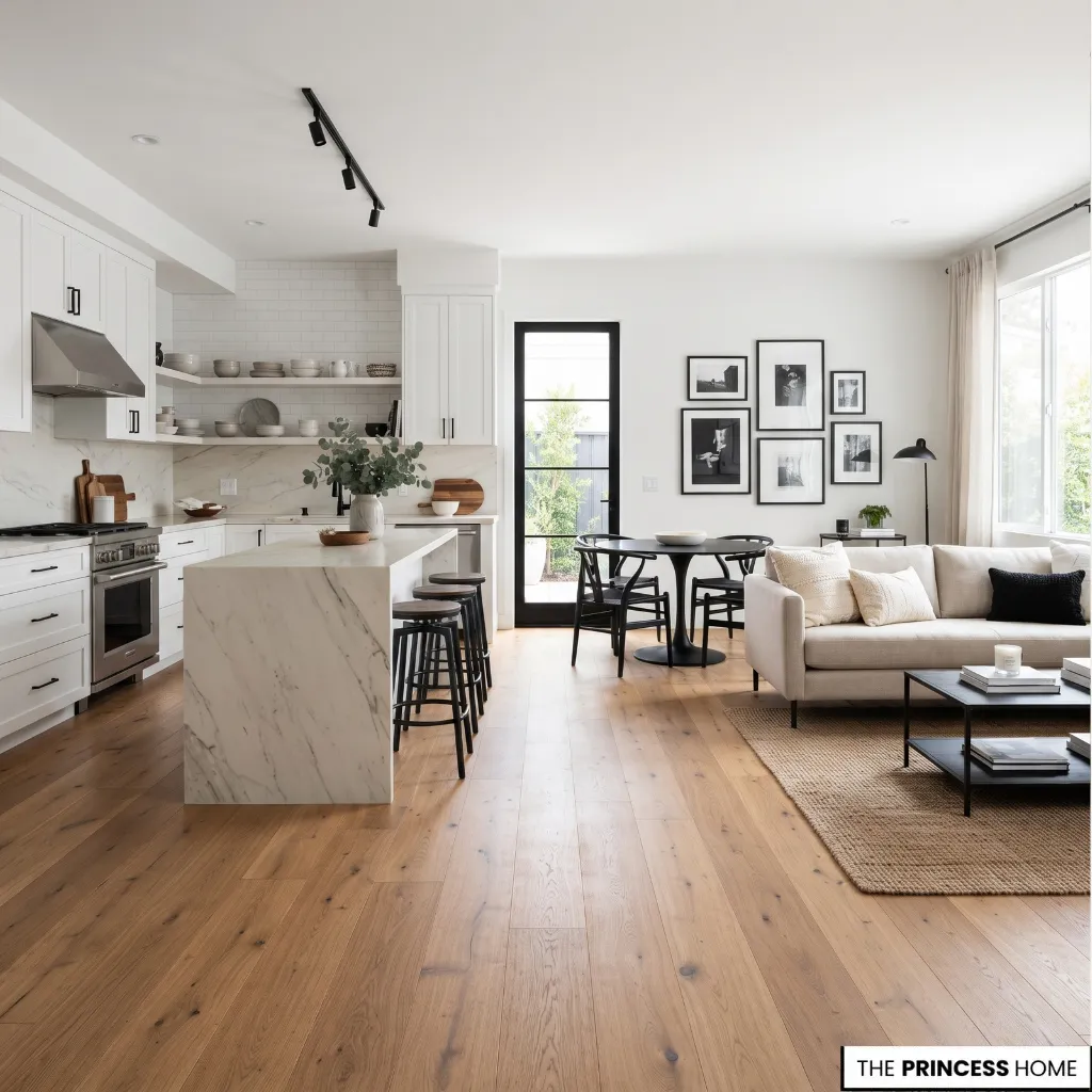
A black and white home works best when each room applies the same palette according to its function. The colors can remain consistent throughout the house, while their proportions, materials, and patterns change to suit each space.
Living room: Begin with the seating arrangement and the largest surfaces. A light sofa against a pale wall can support black tables, frames, and lighting. A black sofa works just as well when the surrounding floor, walls, and textiles provide enough contrast.
Use a rug to connect the seating pieces and define the arrangement, while keeping clear routes between the furniture and the room’s entrances.
Bedroom: Prioritize a comfortable, visually quiet arrangement. White or ivory bedding provides a light foundation, while black bedside tables, a bed frame, or selected lighting fixtures establish contrast.
Layering linen, cotton, and textured blankets prevents the bed from looking flat. Keep strong patterns and dark accents controlled if you want the room to remain restful.
Kitchen: Coordinate cabinetry, countertops, backsplash, flooring, and hardware before selecting decorative details. White cabinetry with black handles and darker work surfaces creates a clear contrast.
Black cabinetry can also work when paired with lighter counters, a suitable backsplash, and effective task lighting. Consider cleaning and maintenance as well as appearance, because some dark finishes show dust, fingerprints, or water marks more readily than others.
Dining room: Let the table and surrounding furniture establish the main relationship between black and white. A dark table can stand out against a pale rug or light walls, while light chairs can soften an arrangement dominated by dark wood or metal.
Choose a pendant or chandelier that suits the table’s scale and provides useful illumination. Keep the surrounding decor simple enough that the dining area remains the focus.
Bathroom: Use contrast to define the vanity, fittings, mirrors, and tile surfaces. White walls or tiles can support black taps, framed mirrors, or a dark vanity. Alternatively, a patterned black-and-white floor can provide the main decorative feature while the remaining surfaces stay quieter.
Check the suitability, cleaning requirements, and slip resistance of flooring and wet-area finishes before choosing them.
Entryway: Use black and white to establish a clear first impression without obstructing circulation. A black-framed mirror, dark console, light wall, or simple artwork can provide enough definition. In a larger entry, a patterned floor or distinctive light fixture may become the main feature.
Keep storage practical and avoid filling a narrow entrance with furniture or accessories that restrict movement.
Consistency comes from repeating a few related finishes and design decisions rather than making every room identical. Black hardware, similar wood tones, or a recurring frame finish can connect separate rooms while allowing each space to meet its own needs.
To create continuity, repeat a small number of details, such as a similar black metal finish, a related wood tone, or the same family of white shades. Then let each room vary its proportions and materials according to its function.
A bedroom can remain softer and lighter, while a kitchen or entryway uses stronger contrast. The aim is for the rooms to feel connected when viewed together, not decorated from an identical set of rules.
For more ideas: Neo-Classical Design How to Create Timeless Interiors
Adapt Small Spaces
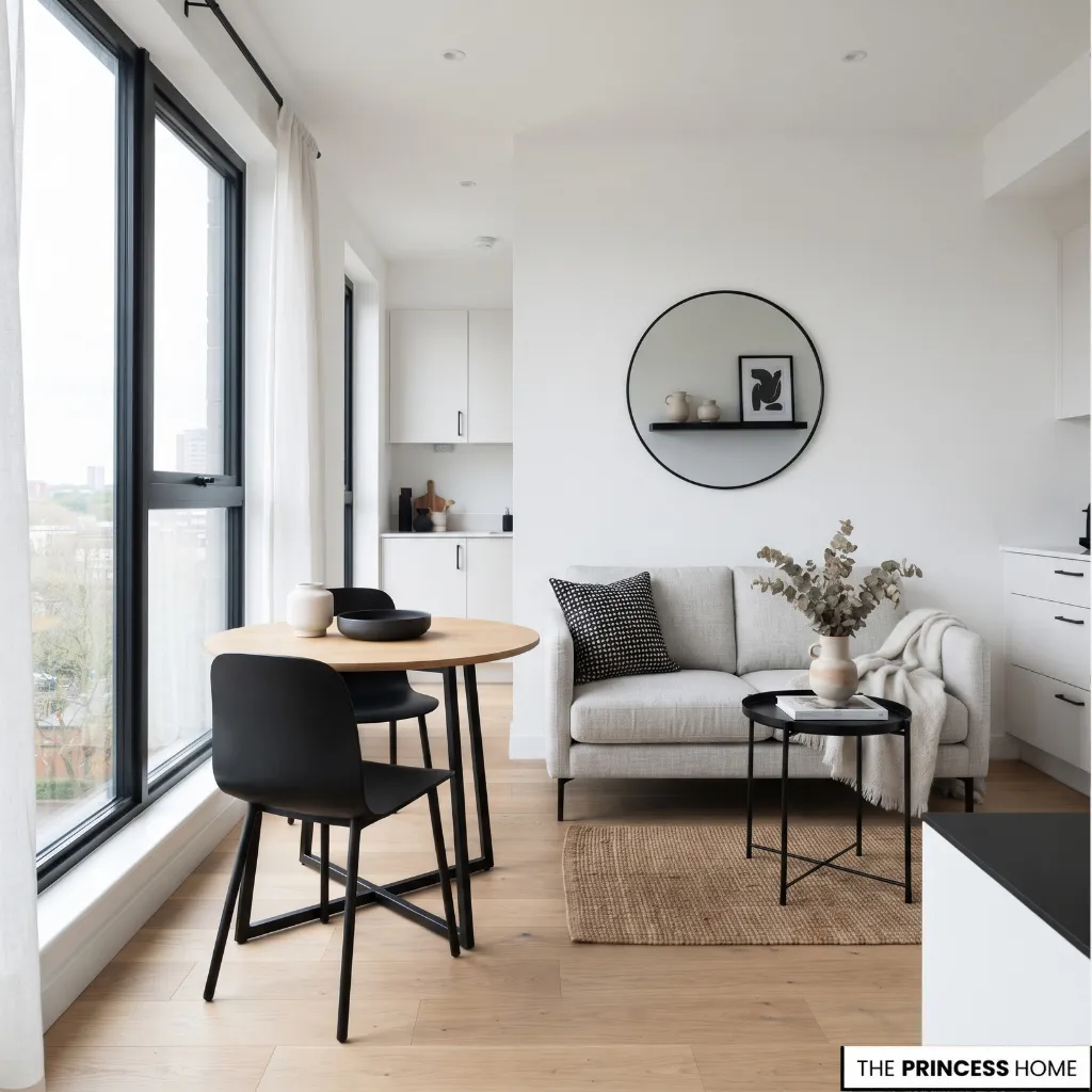
Black and white can work in small apartments and compact rooms, but the distribution of dark surfaces deserves careful attention. The aim is to preserve usable space and maintain a clear arrangement rather than follow a rule that every small room must be white. Start by identifying the room’s main limitations.
A compact room with good daylight may support a dark feature wall or black cabinetry. A narrow room with little daylight may benefit from lighter walls, lighter large furniture, and smaller areas of black. The effect depends on how much surface the color covers and where it is placed.
Choose furniture that fits the room without obstructing circulation. A compact sofa, a table with a visually light base, or open shelving may help preserve clear sightlines. Avoid adding numerous small pieces simply because they are individually attractive.
A smaller number of appropriately scaled furnishings often creates a clearer arrangement. Use black where it can define an element without overwhelming the available space. Black window frames, table legs, cabinet handles, or a single focal piece may provide sufficient contrast.
If you choose a dark wall, consider how the remaining walls, ceiling, floor, and lighting will support it. Mirrors and reflective finishes can help distribute available light when positioned thoughtfully, but they cannot compensate for every lighting problem.
Prioritize adequate illumination and practical furniture placement first. In a rental property, choose changes that can be reversed easily. Black cushions, removable artwork, lamps, rugs, and suitable freestanding furniture can establish the palette without requiring permanent changes to walls, cabinetry, or flooring.
For more ideas: Farmhouse Style: A Complete Guide to Creating Warm &Inviting
Decorate on a Budget
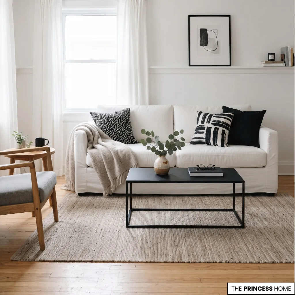
Creating a black and white home does not require replacing every piece of furniture or purchasing expensive finishes. Start by identifying what already works and deciding which changes would improve the room’s balance.
If the room feels disconnected, repeat a few existing finishes or remove decorative items that compete with one another. To add depth to a flat palette, introduce texture through cushions, curtains, a rug, or existing wooden furniture.
When the room feels harsh, reassess the lighting and the relationship between pure white surfaces and softer tones. Spend selectively on elements that have a meaningful effect on the room.
A well-proportioned sofa, a suitable rug, or an appropriate light fixture may influence the overall result more than several small accessories. Where existing furniture is functional and suitable, keep it and make targeted adjustments instead of replacing it simply to match the colors.
Repainting can be a practical option for suitable furniture or walls, provided the surface preparation and finish are appropriate. Changing handles or updating lampshades may also help connect older pieces to the palette. Test finishes and colors before committing to a large project.
Avoid treating inexpensive purchases as automatic savings. Poorly proportioned furniture, unsuitable materials, or decorative pieces that serve no practical purpose can make the room harder to coordinate. A restrained plan that preserves useful existing items is often more effective than buying many new objects.
Prioritize changes in a clear order: correct the largest imbalance, improve essential lighting, address furniture or textile needs, and then add selected decorative details. This keeps spending connected to the result rather than the number of items purchased.
Avoid Common Mistakes
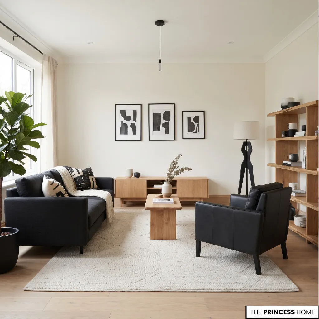
Using too much black without considering its visual weight can make a room feel more enclosed, particularly when daylight is limited. The solution is not necessarily to remove all black. Reassess which dark elements are most important, then lighten selected surrounding surfaces or redistribute the contrast.
A second mistake is relying on color alone to create interest. A room with white walls, a black sofa, and plain accessories may feel flat when every surface has a similar finish. Introduce a few contrasting textures, such as linen, wood grain, wool, or a woven rug, rather than adding more decorative objects.
Inconsistent undertones can also weaken the result. Some whites appear warmer, while others look cooler. When these finishes sit beside one another, their differences may become more noticeable.
Compare samples in the actual room and consider how they look under daylight and artificial lighting before selecting paint, upholstery, or cabinetry.
Too many strong patterns create another problem. Striped textiles, a busy geometric rug, patterned tiles, and elaborate artwork may compete for attention. Select one main pattern and allow the surrounding surfaces to support it. Smaller patterns can then be introduced where they add something distinct.
Poor lighting can make even a well-planned palette uncomfortable. A single overhead fixture may leave corners poorly illuminated, while excessive glare can make reflective surfaces distracting. Combine ambient lighting with task and accent lighting according to the room’s needs.
Finally, avoid adding black accents simply to distribute the color evenly. Repetition can connect a room, but every object does not need a black counterpart.
Consider the overall arrangement and remove elements that do not serve a clear purpose. Sometimes the best correction is to simplify the room rather than purchase another accessory.
Conclusion
A successful black and white home depends on thoughtful decisions about contrast, proportion, materials, and light. Start with the largest surfaces, select furniture that suits the space, and introduce texture where the colors need greater variation.
Then adjust the lighting, patterns, and accents according to how each room is used. The result should be a coherent, comfortable home shaped by practical choices rather than a fixed decorating formula.
Explore the visual gallery below for inspiring ideas that bring this aesthetic to life in your home.