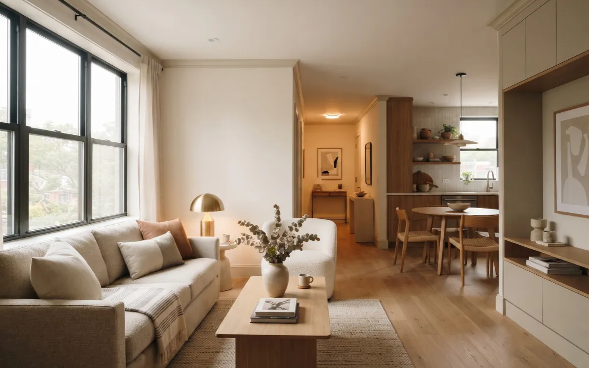
Choosing the best paint colors for small apartments is not simply about finding the palest shade. A small apartment can feel dark, fragmented, or cramped when the paint works against its natural light, flooring, furniture, or room connections.
The right color can improve brightness and visual continuity while giving the apartment a more considered, modern character. The best choice depends on the apartment you actually have. Light direction, undertones, LRV, contrast, and the relationship between connected rooms all matter.
These guidelines will help you choose a color that works with those conditions rather than relying on a universal “small room” rule.
Choose for Light
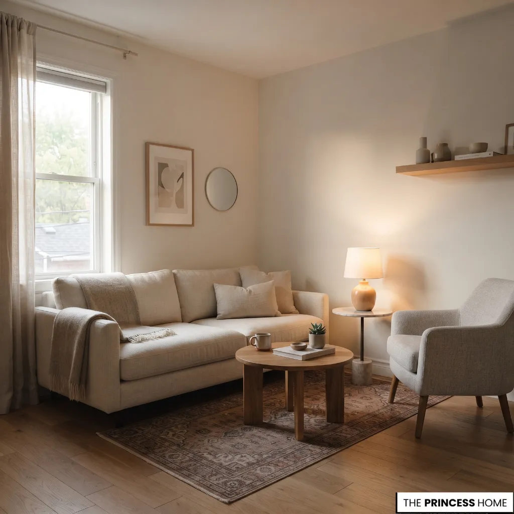
Natural light should be the starting point when choosing paint for a small apartment. The same color can look noticeably different in a bright south-facing room than in a north-facing room with limited daylight.
Observe when each room receives the most natural light. North-facing rooms generally receive cooler, softer light, so warmer neutrals can help prevent the walls from appearing cold. South-facing rooms receive stronger, warmer daylight and can usually accommodate a broader range of colors.
East-facing rooms change significantly between morning and afternoon, while west-facing rooms often become warmer later in the day.
Artificial lighting matters as well. A warm lamp can make a neutral wall appear creamier at night, while cooler bulbs can make the same color appear sharper.
For this reason, there is no single best paint color for every small apartment. Start by identifying the room’s light, then choose a color family that supports it.
If the apartment receives very little natural light, begin with warm off-whites or soft warm neutrals rather than automatically choosing a stark, cool white. These colors can help prevent the limited daylight from making the room feel colder.
The final choice should still be tested in the actual room because the amount and quality of available light will affect the result.
Understand LRV
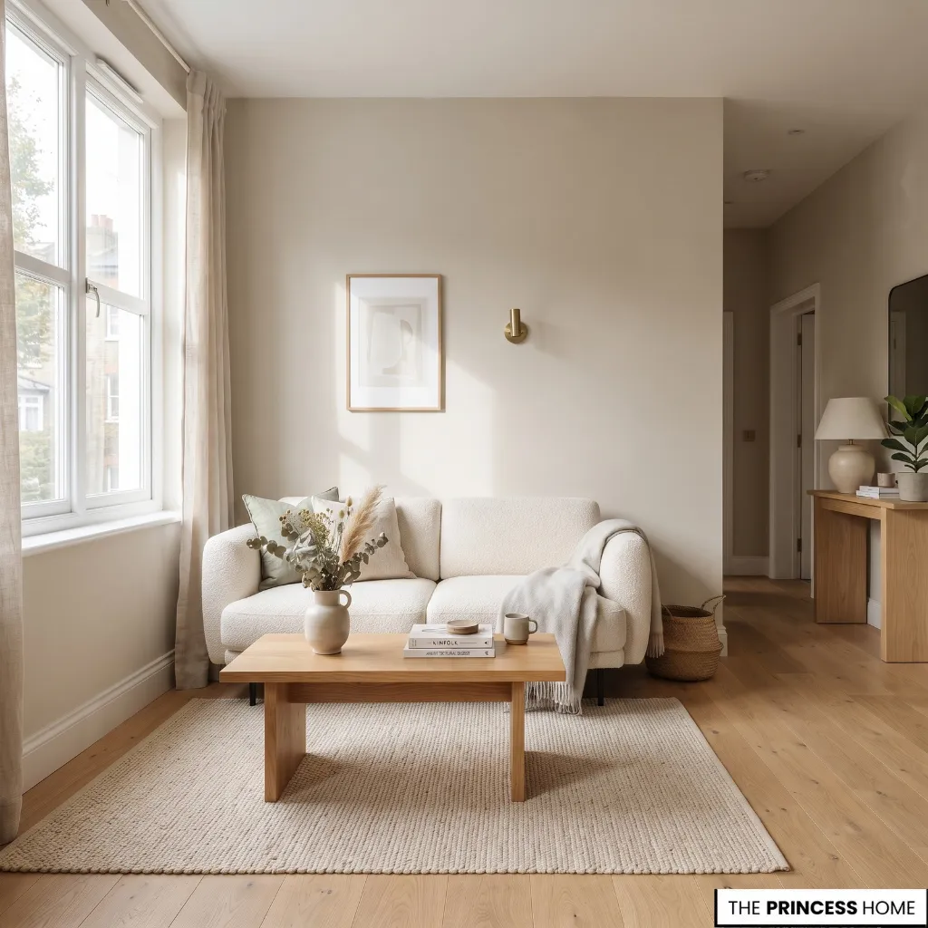
LRV, or Light Reflectance Value, describes how much light a paint color reflects. Higher-LRV colors generally reflect more light, while lower-LRV colors absorb more.
If brightness is the main concern, higher-LRV colors are a useful starting point. Soft whites, pale neutrals, and light colors can help a room appear brighter, particularly when natural light is limited.
LRV should not be treated as a guarantee that a room will look larger. A high-LRV color can still look wrong if its undertone clashes with the flooring or furnishings. Likewise, a lower-LRV color can work when the goal is intimacy rather than maximum brightness.
Use LRV alongside natural light, undertone, contrast, furnishings, and the amount of color visible across the apartment.
Best Light Neutrals
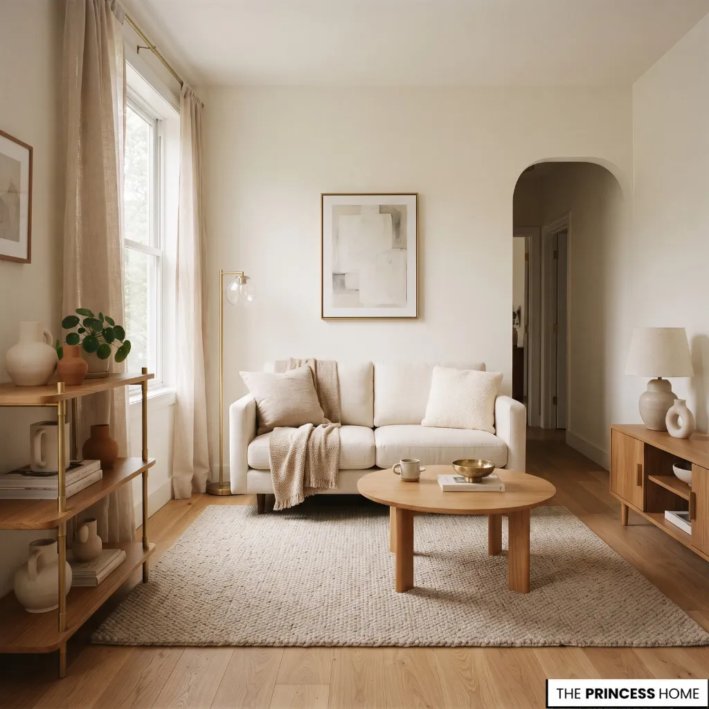
Light neutrals remain some of the most versatile paint colors for small apartments because they can brighten walls without making the interior feel stark.
Warm off-whites are a strong choice when the apartment contains warm wood, cream upholstery, beige textiles, brass, or other warm finishes. Benjamin Moore Swiss Coffee and White Dove are useful examples of warm or balanced whites that provide brightness without the sharper appearance of a very pure white.
If you want more color than white, pale beige and soft greige provide a slightly deeper background while remaining relatively light. Benjamin Moore Pale Oak, Edgecomb Gray, and Balboa Mist are examples of neutral families worth considering.
The important decision is not the paint name alone. Look at the undertone beside the apartment’s flooring, cabinetry, sofa, curtains, and trim. A gray with a cool undertone can make warm beige furnishings look disconnected, while an overly warm neutral can appear noticeably yellow in strong warm light.
For an apartment with limited daylight, avoid choosing an icy white simply because it has a high LRV. A balanced or gently warm white may produce a more comfortable result.
Add Soft Color
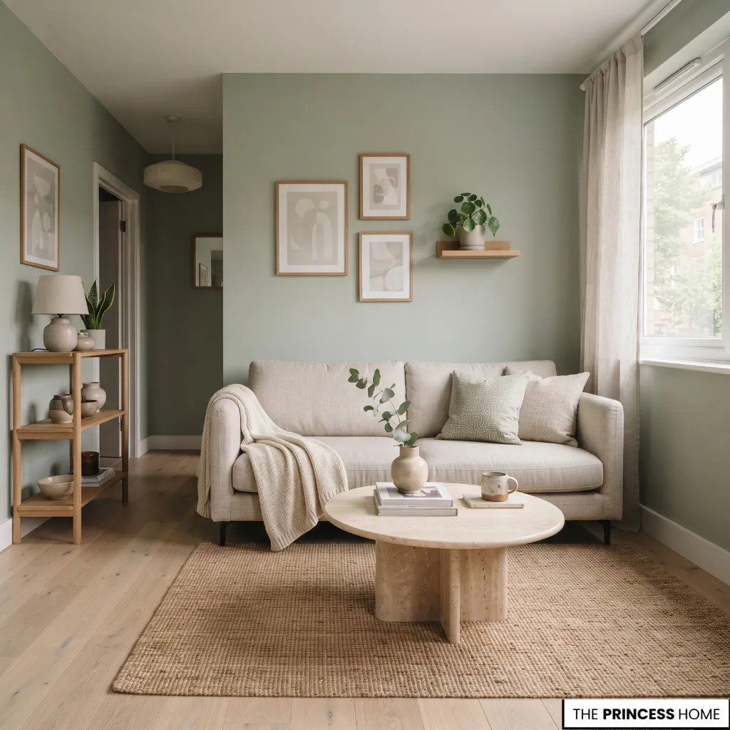
Small apartments do not need to be entirely white or beige. Soft color can introduce personality while preserving a light visual character.
Pale blue is useful when you want noticeable color without choosing something visually heavy. Soft blues can also have a receding quality, making them useful for compact rooms when the shade remains sufficiently light.
Soft greens are another strong option, especially when the apartment contains natural wood, linen, stone, or botanical elements. A muted green can provide more character than a neutral while remaining restrained.
Other softened colors can work in the same way. Muted blue-green, pale clay, dusty blush, and gentle earthy tones can be considered when they connect naturally with the furnishings and materials already present.
The goal is controlled color rather than simply adding more color. In a small apartment, a softer version of a hue is often easier to coordinate across walls, furniture, and adjoining rooms than a highly saturated shade.
Use Deeper Colors
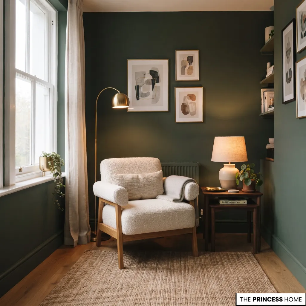
A small apartment does not automatically require light paint everywhere. Deeper colors can work when the goal is intimacy, character, or an enveloping room rather than maximum brightness.
Deep green, navy, charcoal, and earthy brown can all be effective when the room receives enough light or when a darker atmosphere is intentional. The amount of furniture, the flooring, and the contrast between surfaces also influence the result.
Application matters as much as the color. A dark accent wall surrounded by very bright contrasting walls can make the boundaries of a small room more obvious. Using a deeper color across several connected surfaces can instead create a more continuous envelope.
This does not mean dark paint makes a room physically larger. It changes the visual character of the space. Use it when you want depth and intimacy, and choose lighter colors when brightness and visual openness are the priority.
Coordinate Walls
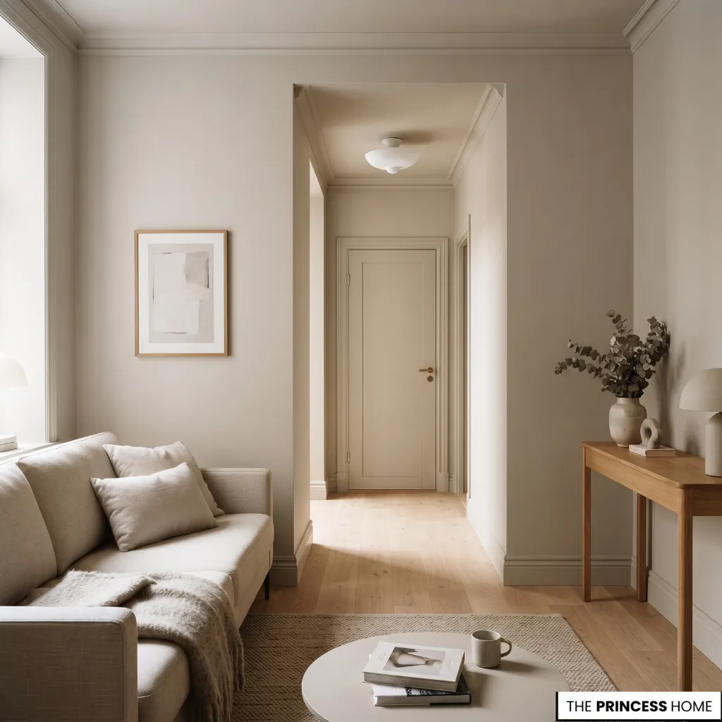
Wall color should be considered together with the ceiling, trim, doors, built-ins, and nearby rooms.
Strong contrast between a wall and its trim can clearly outline the room. That can be useful when architectural details are meant to stand out, but reducing unnecessary contrast can help a small apartment feel more visually continuous.
One way to achieve this is color drenching: using the same or closely related color across walls, trim, doors, and sometimes the ceiling. The surfaces do not have to be identical in every situation. Closely related shades can provide continuity while retaining subtle definition.
Color drenching does not add actual square footage. Its value comes from reducing visual interruptions and making boundaries less dominant.
The same principle applies between connected rooms. Instead of selecting a completely different color for every space, use related shades or one adaptable neutral throughout areas that are visually connected. This can make a small apartment feel more unified and prevents each doorway from becoming a strong visual break.
For many small apartments, using one main neutral or color family across several connected spaces is the simplest way to maintain continuity.
Different colors can still work when rooms have distinct functions or when the change is intentional, but strong shifts between unrelated colors can make a compact home feel more divided.
When in doubt, keep adjoining rooms within the same color family and let individual rooms vary through depth or undertone rather than completely different hues.
The ceiling does not always need to be bright white. A white or very light ceiling can help when maximum brightness and clear vertical contrast are desired, particularly in a darker apartment.
In a room where visual continuity is more important, carrying the wall color onto the ceiling, or using a closely related lighter shade, can make the boundary between wall and ceiling less pronounced. The choice should follow the room’s light, ceiling height, and overall color strategy.
Match Each Room
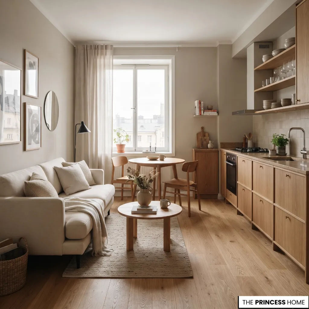
A small apartment benefits from an overall color strategy, but each room still has its own practical conditions.
Living Room
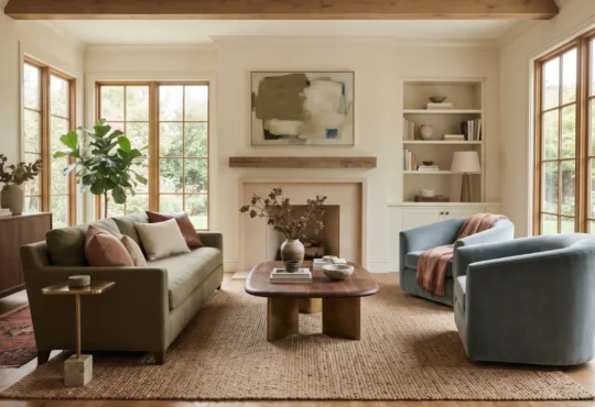
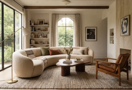
Start with the largest visual elements: sofa, flooring, curtains, and rug. Choose a wall color that works with their undertones rather than selecting the paint in isolation.
If the living room connects directly to the kitchen or hallway, consider how the colors appear together from different viewpoints. A shared neutral or closely related palette can make the apartment feel more cohesive.
Bedroom
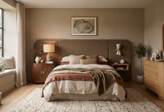
The bedroom can use a slightly softer or deeper color if you want a quieter atmosphere. Warm off-whites, muted greens, soft blues, and gentle greiges can all work.
The amount of daylight matters. A darker bedroom may benefit from a lighter wall color if brightness is important, while a naturally bright bedroom gives you more freedom to use a deeper shade.
Kitchen
Kitchen paint needs to work with fixed materials that are often expensive or difficult to change. Look closely at the cabinetry, countertop, backsplash, flooring, and metal finishes before choosing the wall color.
A warm white may work beautifully with cream cabinetry and warm wood, while a cooler neutral may suit cleaner gray or stone surfaces. The paint should connect these materials rather than compete with them.
Bathroom
Bathrooms often depend heavily on artificial lighting, mirrors, tile, and reflective surfaces. Test the paint under the lighting you actually use.
A soft neutral or muted color can prevent a compact bathroom from feeling visually crowded. Use a paint system suitable for the bathroom’s moisture conditions rather than choosing a color without considering the surface and environment.
Hallways
Hallways are important in a small apartment because they connect several rooms. A continuous wall color can help the transition between spaces feel deliberate.
If individual rooms already have different colors, a coordinating hallway neutral can act as a visual bridge rather than introducing another unrelated shade.
Test Before Painting
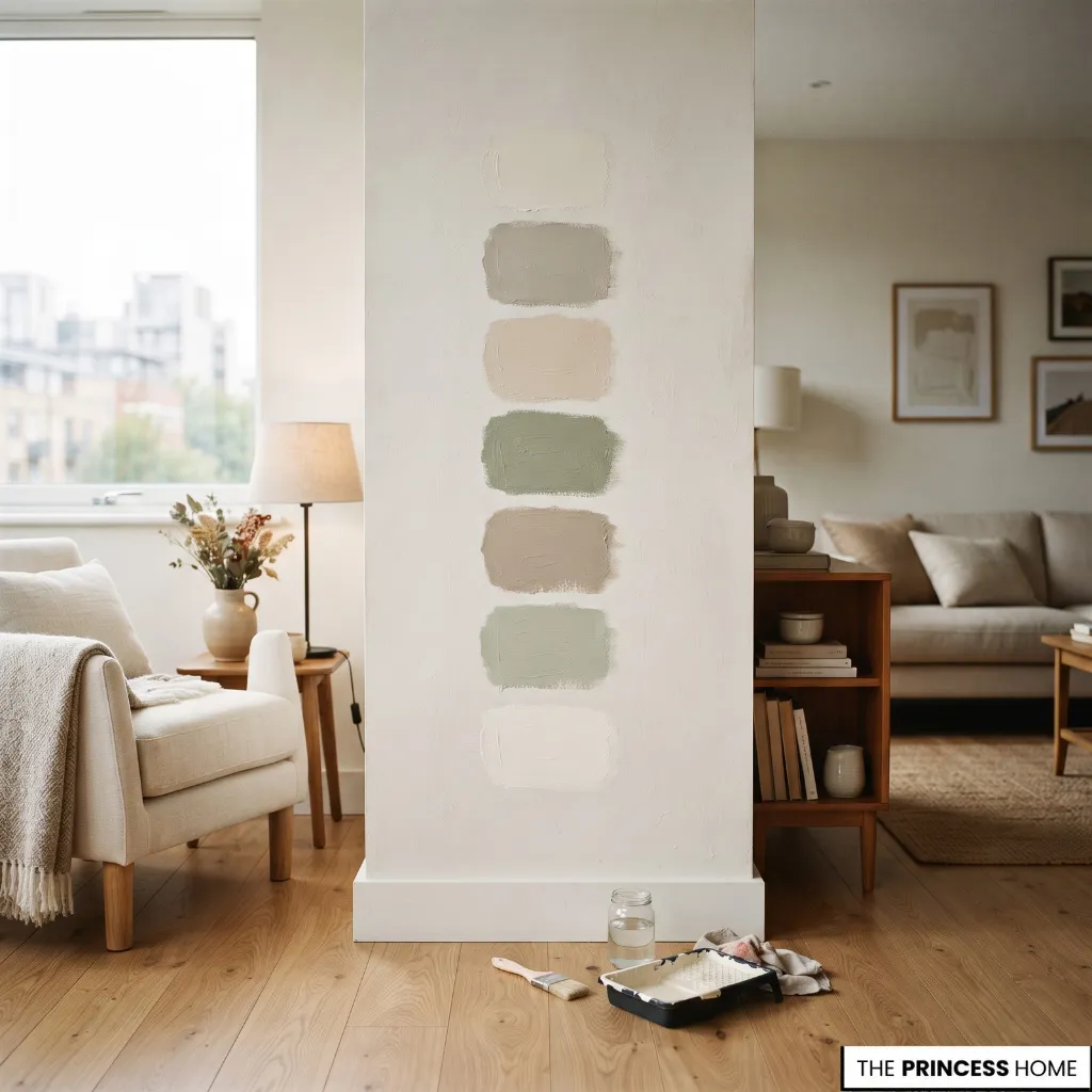
Once you have narrowed your choices, test the actual paint before committing to the entire apartment. Start with a small group of candidates rather than collecting dozens of samples. Place physical samples where the paint will be used and compare them with the flooring, trim, furniture, and other fixed finishes.
Observe the samples in morning light, afternoon light, and evening artificial light. A neutral that looks clean in daylight can reveal a yellow, pink, green, or gray undertone later in the day.
It is also useful to place samples on more than one wall when possible. A wall facing the window can receive very different light from an interior wall.
Do not rely on a digital color shown on a phone or computer alone. Screen settings and surrounding colors can change how a shade appears. Physical samples give you a much more reliable view of how the paint interacts with your actual apartment.
Choose the final color only after seeing it in the environment where it will live.
Avoid Common Mistakes
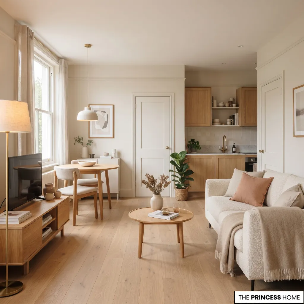
Choosing white automatically is one of the most common mistakes. A small apartment may benefit from a light color, but the right white depends on the room’s light and surrounding finishes.
Ignoring flooring and furniture creates another problem. Paint can look completely different beside warm wood, cool gray tile, cream upholstery, or reddish wood tones. Always evaluate the undertones together.
Choosing from a screen alone can also lead to an unexpected result. Test physical samples under different lighting conditions before painting large areas.
Another mistake is creating too much contrast. Dark trim, bright white ceilings, strongly contrasting doors, and several unrelated wall colors can divide a compact apartment into visually separate pieces. If spaciousness is the priority, consider where continuity would be more useful.
Dark paint can also be used without considering the amount of natural light. A deep color is not automatically wrong, but it needs to support the room’s actual conditions and the atmosphere you want to create.
Finally, avoid searching for one universal “best” color. A warm off-white may be ideal for one apartment and look too yellow in another. A soft green may be beautiful beside natural wood but less successful beside cool gray finishes. The best choice comes from matching the color to the space.
Conclusion
The best paint colors for small apartments are the ones that work with the apartment’s light, materials, proportions, and visual connections. Light neutrals are useful when brightness is the priority, while soft colors and deeper shades can add character when the conditions support them.
Start with the room, not the paint chart. Understand the light, compare undertones, consider LRV, control unnecessary contrast, and test your choices before committing. This approach creates a paint scheme that feels intentional and modern without depending on a single passing color trend.