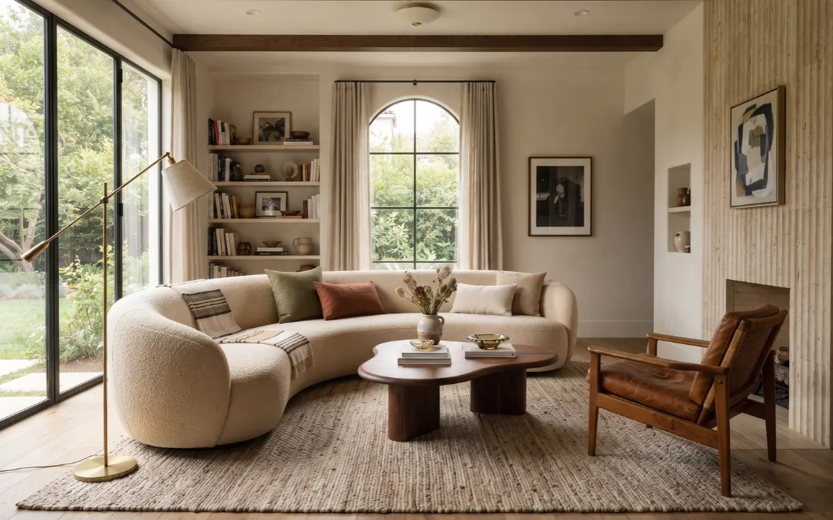
Decor trends for 2027 are pointing toward warmer colors, tactile materials, more personal rooms, and a stronger mix of modern and vintage elements. At the same time, there is no single style that defines the year. Current forecasts feature earthy neutrals, deep greens, sculptural furniture, and natural materials.
The useful question is not which trend to copy. It is which ideas can improve your home while working with its architecture, proportions, and everyday needs. This guide explains the major Decor Trends 2027, why they matter, and how to use them without making your home feel temporary.
2027 Decor Trends
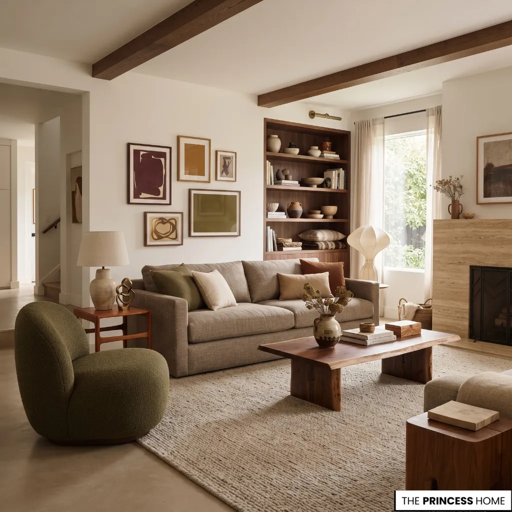
The strongest 2027 decorating forecasts share several themes: warmer color, greater use of texture, more individuality, natural materials, comfortable furniture, and rooms that combine different periods and influences.
These directions appear across current color forecasts and designer trend research, but they should be understood as emerging directions rather than fixed rules.
In this context, decor trends describe the visible choices used to shape a room, such as color, materials, furniture, lighting, and wall treatments, while interior design trends can also include broader decisions about layout, function, and the way spaces are planned.
For most homeowners, however, the two areas overlap because these visible choices still need to work with the room’s architecture and everyday use. This does not mean minimalist interiors are disappearing or that every home should become highly decorated.
Instead, contemporary rooms are moving away from perfectly matched furniture and limited neutral palettes toward more layered and individual combinations. The most useful way to approach these trends is as a set of design tools. Color can update a room without replacing the furniture.
Texture can add interest without filling the room with accessories. A vintage piece can make a modern interior more personal, while a distinctive light fixture can establish a focal point without requiring a complete redesign. Because 2027 is still a forecast period, individual predictions may change.
The more lasting lesson is to understand the design direction behind them and choose the parts that genuinely suit your home. You do not need to replace your furniture or redesign the entire home to respond to these directions; many trends can be introduced through smaller, adaptable changes.
Warm Natural Colors
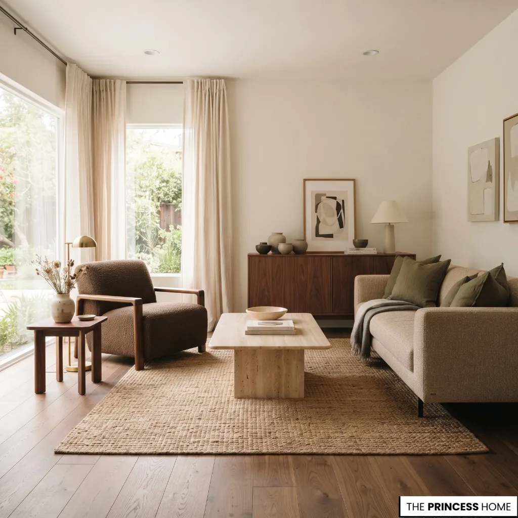
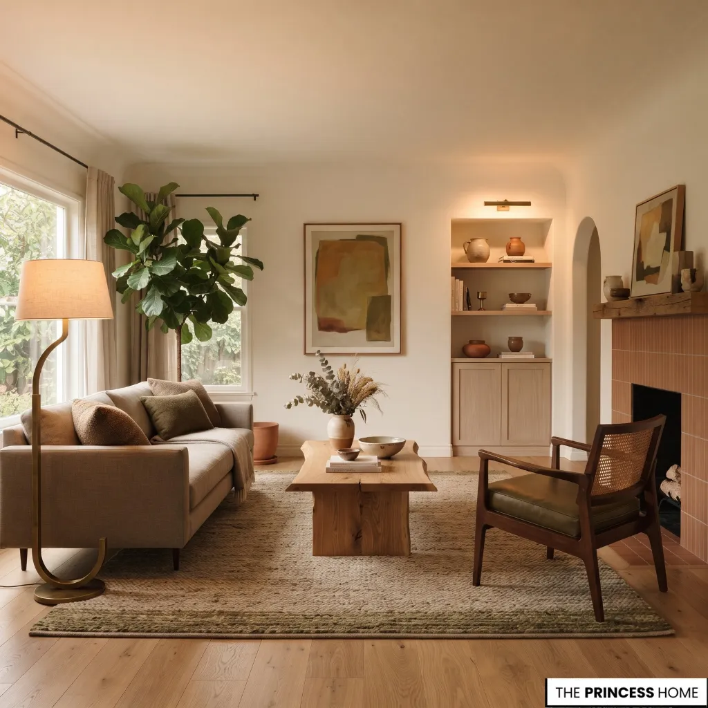
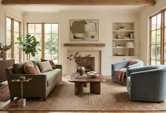
Warm, nature-connected colors are among the clearest directions in current 2027 forecasts. Brown, earthy green, clay, terracotta, warm white, deeper red, and softened mauve tones are appearing across different forecasts, although paint companies select different colors rather than converging on one universal shade.
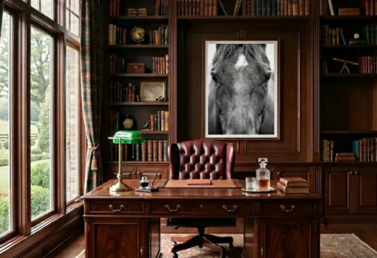
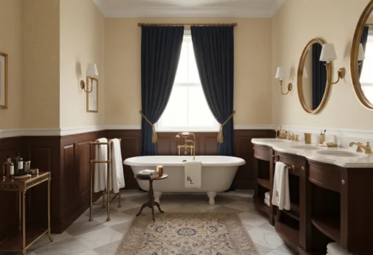
Brown is particularly versatile because it can function as either a neutral or a stronger accent. Coffee, chocolate, walnut, and mushroom-brown tones can work on walls, cabinetry, upholstery, rugs, or smaller decorative pieces.
A deep brown wall has a very different visual weight from a walnut table, so the amount and placement of the color matter as much as the color itself. Earthy greens range from quiet sage and olive to deeper botanical shades. They work naturally with wood, stone, linen, and other textured materials.
Deeper reds and burgundy-family colors can be used more selectively on upholstery, curtains, rugs, artwork, or furniture when a stronger focal point is appropriate. Mauve, dusty pink, and softened purple tones offer another option for adding color without moving toward highly saturated schemes.
They can work particularly well with warm whites, brown, muted green, and natural wood. Warm whites remain useful as balancing colors. The move toward stronger color does not mean every surface should become saturated. A restrained room can use one deeper color while keeping larger areas quiet.
When choosing a 2027 color, consider natural light, flooring, wood tones, furniture, and the colors visible from adjoining rooms. A color that looks balanced in a large, naturally lit room can become heavy in a smaller space with limited daylight.
Layered Color Schemes
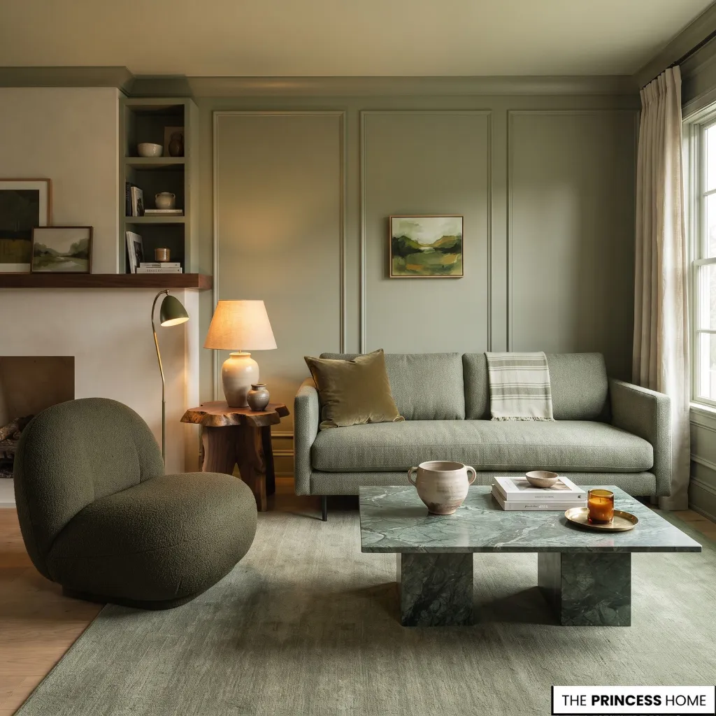
One of the more useful developments in current color forecasting is the move from isolated accent colors toward more complete color relationships. Instead of painting one wall a fashionable shade and leaving everything else unrelated, designers increasingly use related tones across walls, trim, furniture, and textiles.
Color drenching is one expression of this approach. It uses a closely related color across several surfaces, reducing sharp visual breaks and allowing the architecture and furniture to become part of the same color scheme.
The technique does not require a strong color. A room can be color-drenched in muted green, warm beige, brown, dusty pink, or another restrained shade. The important decision is the relationship between the tones and the amount of visual weight they introduce.
For a strong color, consider the largest areas of the room first. Walls, flooring, and large furniture already occupy much of the visual field, so adding the same intensity through curtains, upholstery, and accessories can quickly become overwhelming.
A more accessible approach is to build a tonal scheme around existing furniture. Keep the largest pieces and introduce related shades through curtains, cushions, artwork, rugs, or a painted cabinet. This lets you explore the trend without committing the entire room to a new palette.
Tactile Natural Materials
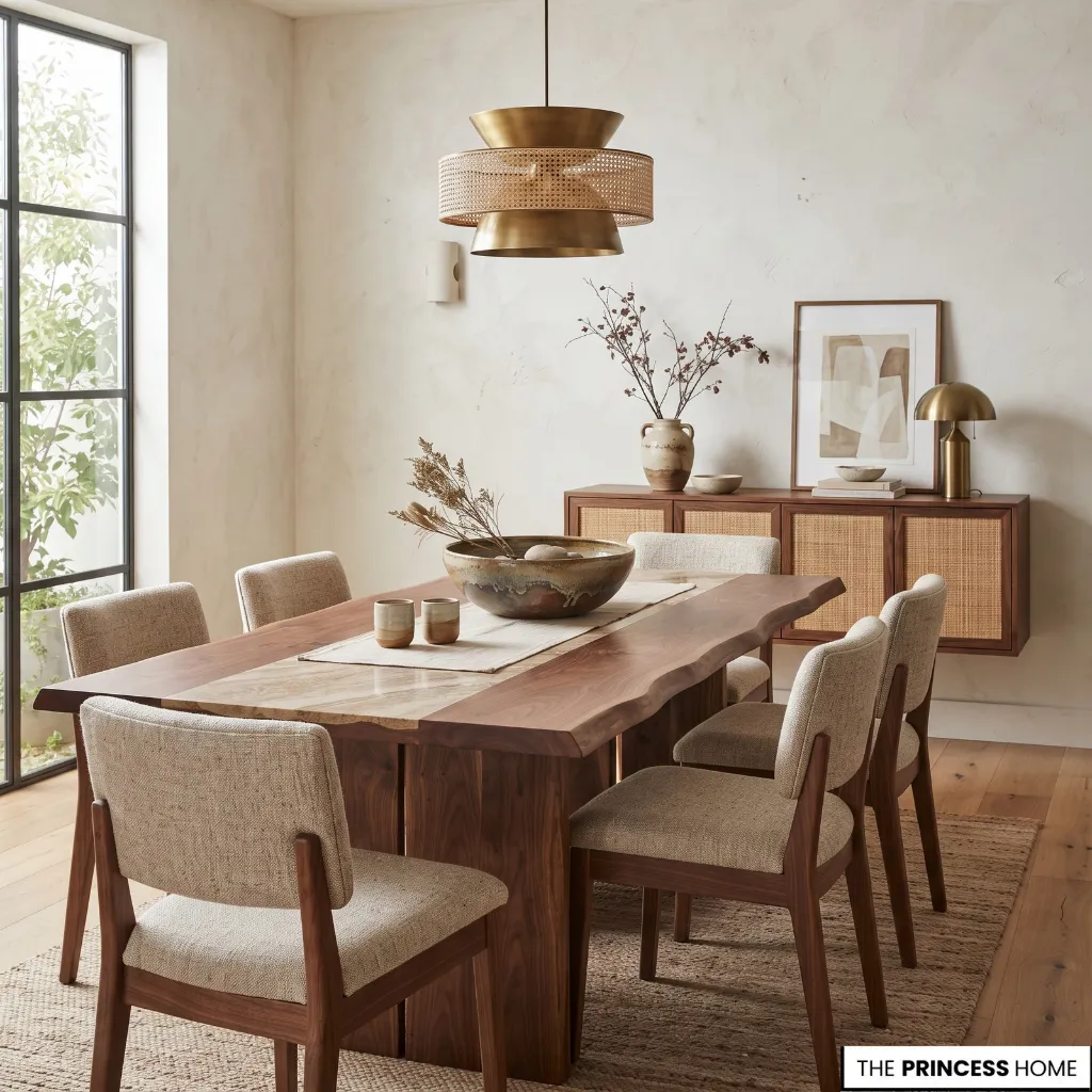
Natural and tactile materials are becoming increasingly important because they give contemporary rooms visual interest without relying entirely on decoration. Wood, stone, plaster-like finishes, natural fibers, ceramics, textured wall treatments, and varied surfaces all support this direction.
The useful distinction is between a material that is simply fashionable and one that improves the room’s composition. Wood can provide a substantial visual anchor. Stone can introduce natural pattern and variation. A textured wall provides interest where furniture would make the room too busy.
Visible variation is part of the appeal. Natural stone does not need to look perfectly uniform, and handmade ceramics do not need identical shapes. Small irregularities can make a room feel more individual, particularly when the surrounding architecture is clean and controlled.
Natural materials still need to suit the way a room is used. Consider maintenance, durability, cost, and how each material relates to existing finishes. A highly textured surface may be difficult to clean in a busy area, while a delicate material may not be practical where it receives heavy use.
When combining several natural materials, vary their texture and visual weight rather than adding every material available. Wood with stone and linen may already provide enough contrast; another texture should have a clear purpose.
Sculptural Comfortable Furniture
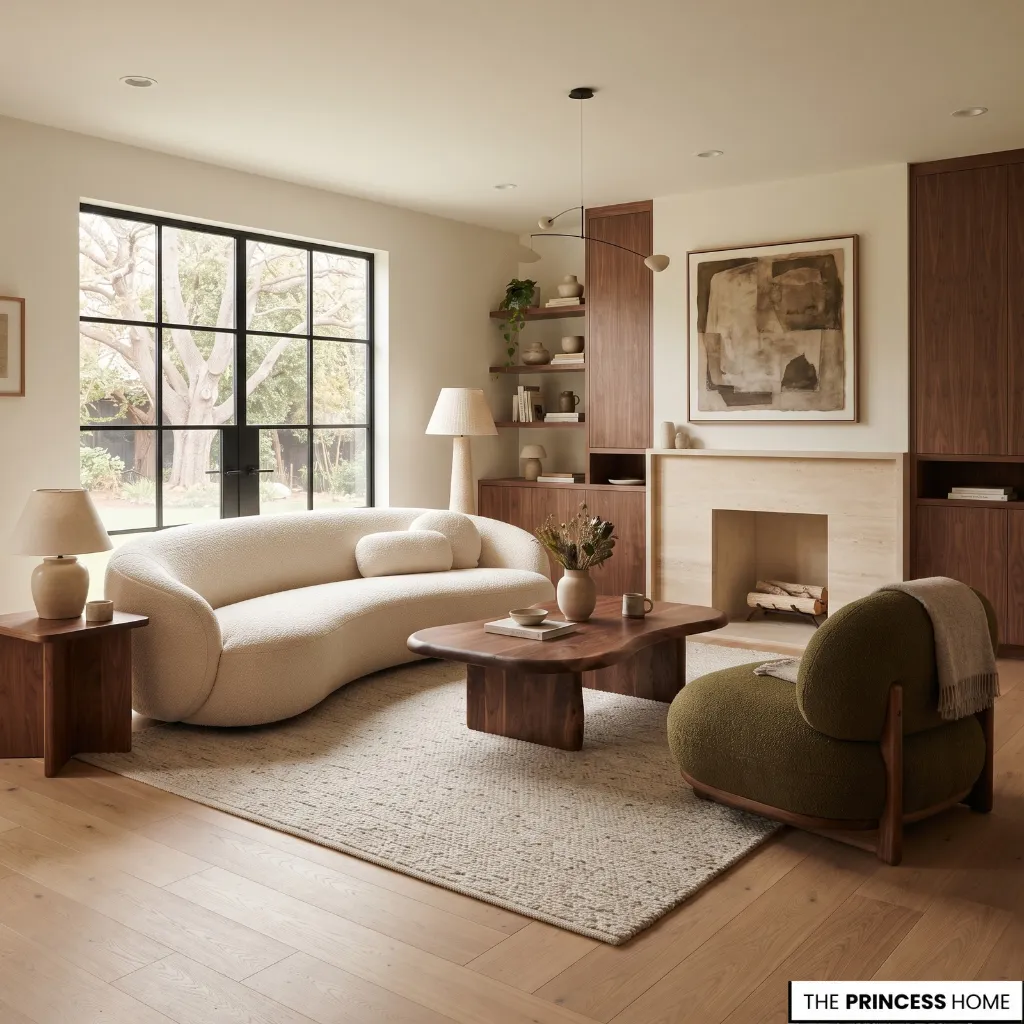
Furniture forecasts for 2027 continue to explore curved forms, irregular silhouettes, substantial seating, statement tables, and pieces with stronger visual identity. The important point is that sculptural appearance still needs to work alongside comfort and function.
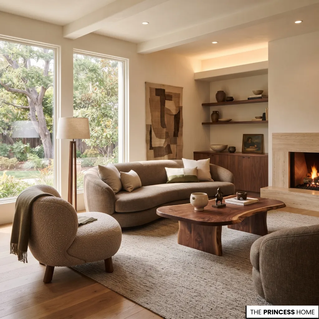
A curved sofa, rounded chair, irregular table, or distinctive cabinet can give a room a clear focal point. Shape alone does not make a piece successful, however. Its dimensions must work with the room, circulation must remain comfortable, and the furniture must perform its intended function.
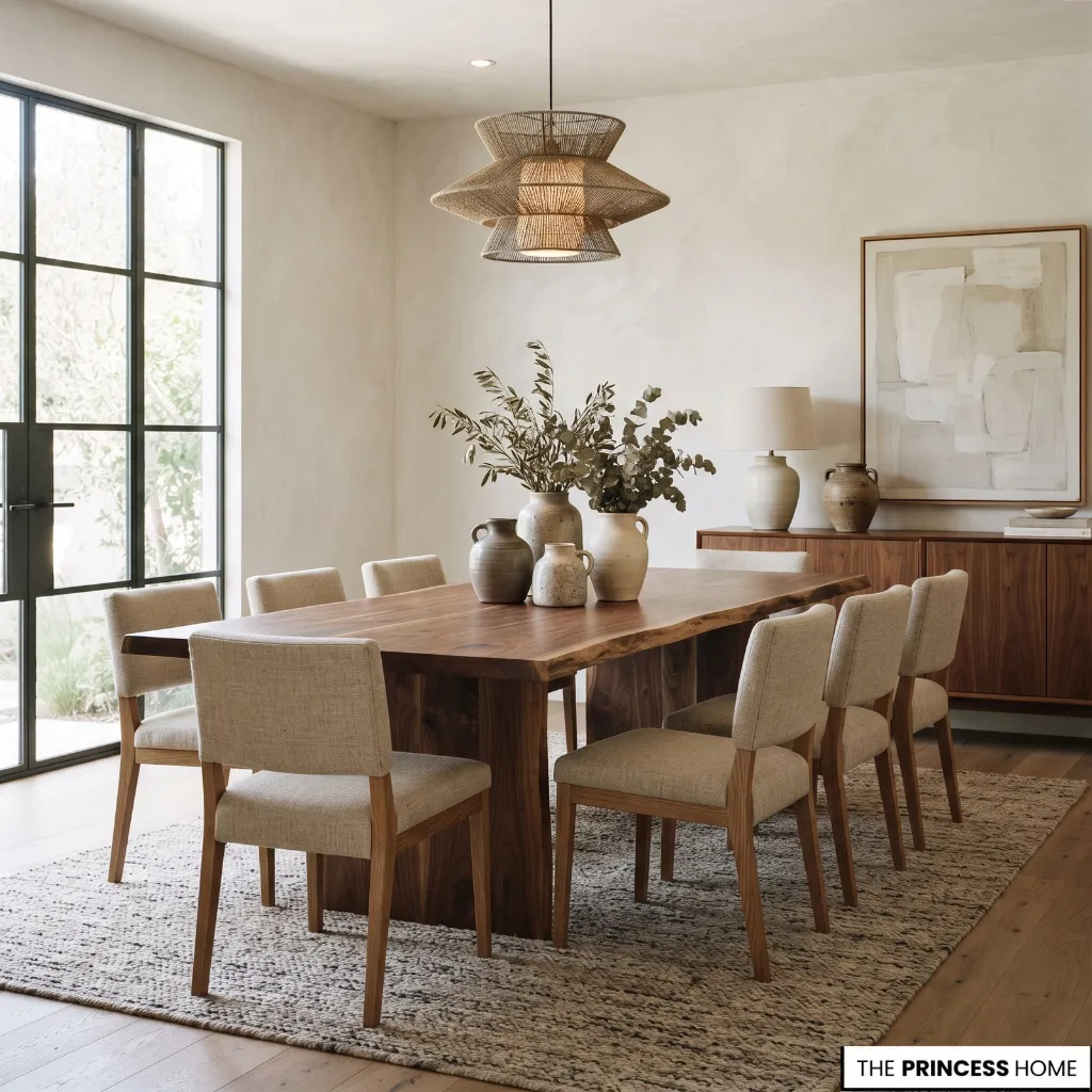
Use a sculptural piece where the room benefits from a stronger focal point. In a simple living room, one distinctive chair or coffee table may be enough. In a dining room, the table can become the main sculptural element while the surrounding furniture remains quieter. Avoid filling a room with pieces competing.
If the sofa, coffee table, lighting, artwork, and accessories all have unusual silhouettes, the room can lose a clear hierarchy. For a smaller room, choose one piece with a distinctive form rather than several oversized statement pieces.
Existing furniture can also remain if it already provides the necessary function and proportion. A new light fixture, rug, or occasional chair may communicate the desired direction without replacing an entire furniture set.
Collected Modern Rooms
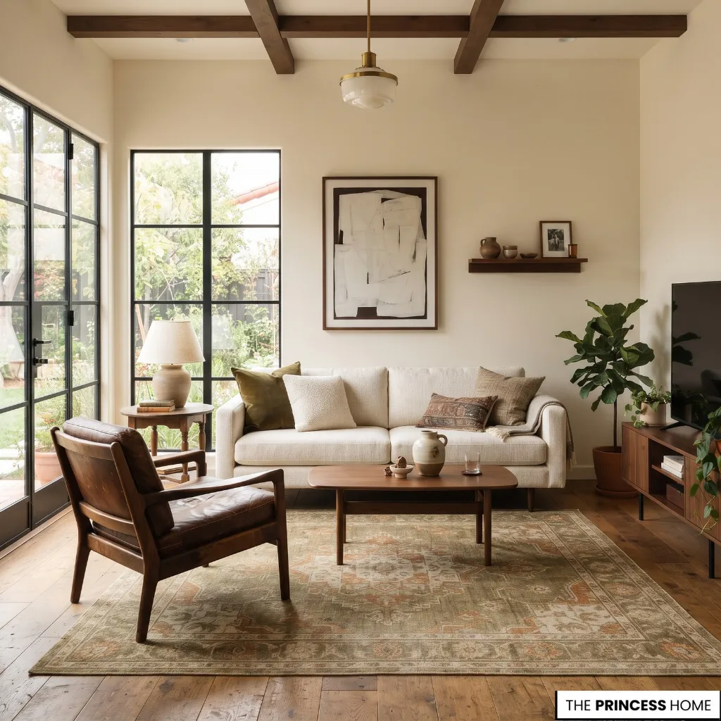
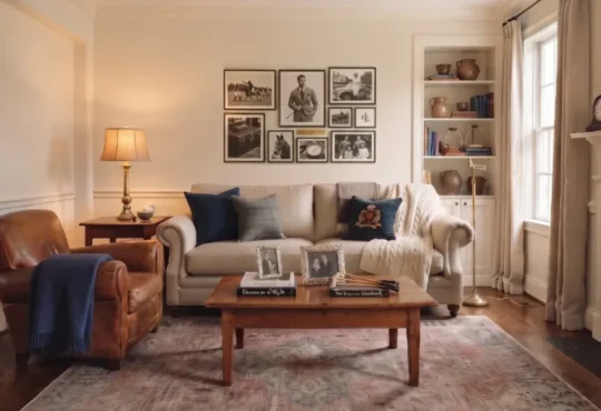
A more personal and collected approach is another important direction in current interior design. Instead of furnishing a room entirely from one collection, homeowners can combine contemporary pieces with vintage furniture, antiques, inherited objects, artwork, and objects with personal meaning.
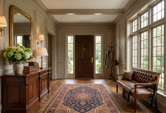
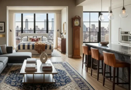
A collected room still needs visual relationships between its elements. Similar color, scale, material, shape, or visual weight can connect pieces from different periods. For example, a traditional wooden chair can work beside a contemporary sofa when both relate to the room’s colors and proportions.
An older table can become the focal point of a modern dining room, while contemporary lighting keeps the composition from becoming a period recreation. This approach is particularly useful when updating an existing home because it does not require every older piece to be replaced.
A useful vintage cabinet, inherited chair, or older artwork may provide more character than a collection of newly purchased decorative objects. Collected does not mean filling every surface. The room still needs areas of visual quiet.
Edit accessories so individual objects can be seen, and allow the architecture and larger furniture to establish the main structure. The goal is a room that looks assembled over time rather than purchased all at once.
Statement Lighting
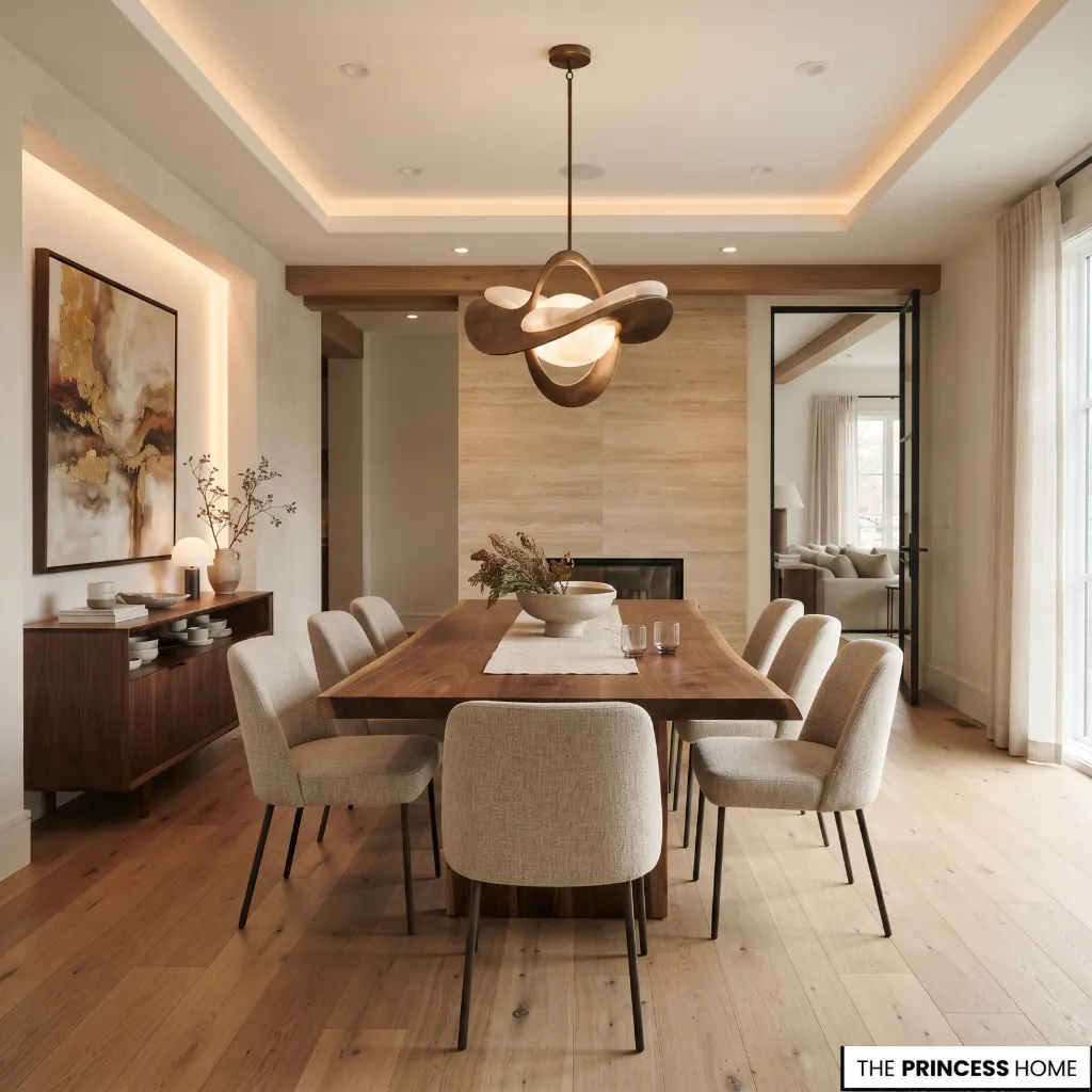
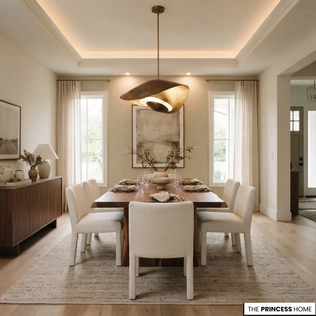
Lighting is becoming more expressive, with sculptural fixtures, distinctive pendants, decorative chandeliers, and artistic forms receiving greater attention. The more useful lighting lesson, however, is to treat lighting as both a functional system and part of the room’s composition. Begin with the required layers.
Ambient lighting provides general illumination, task lighting supports activities such as reading or cooking, and accent lighting can highlight artwork, architectural details, or specific objects. A statement fixture can then become part of this layered system.
A sculptural pendant above a dining table, a distinctive chandelier in a living room, or an unusual bedside light can introduce personality without requiring major changes elsewhere. Scale matters.
A fixture should have enough visual presence for the room without obstructing circulation or overwhelming the furniture beneath it. Its finish should also relate to existing materials rather than being selected in isolation. Warm residential light remains a useful starting point, with around 2700K often suitable for living spaces.
This is a practical guideline rather than a universal 2027 specification; the appropriate light depends on the room’s function, existing bulbs, and desired atmosphere. When the budget is limited, upgrading one important fixture can have a greater visual effect than replacing several small decorative pieces.
Patterned Walls
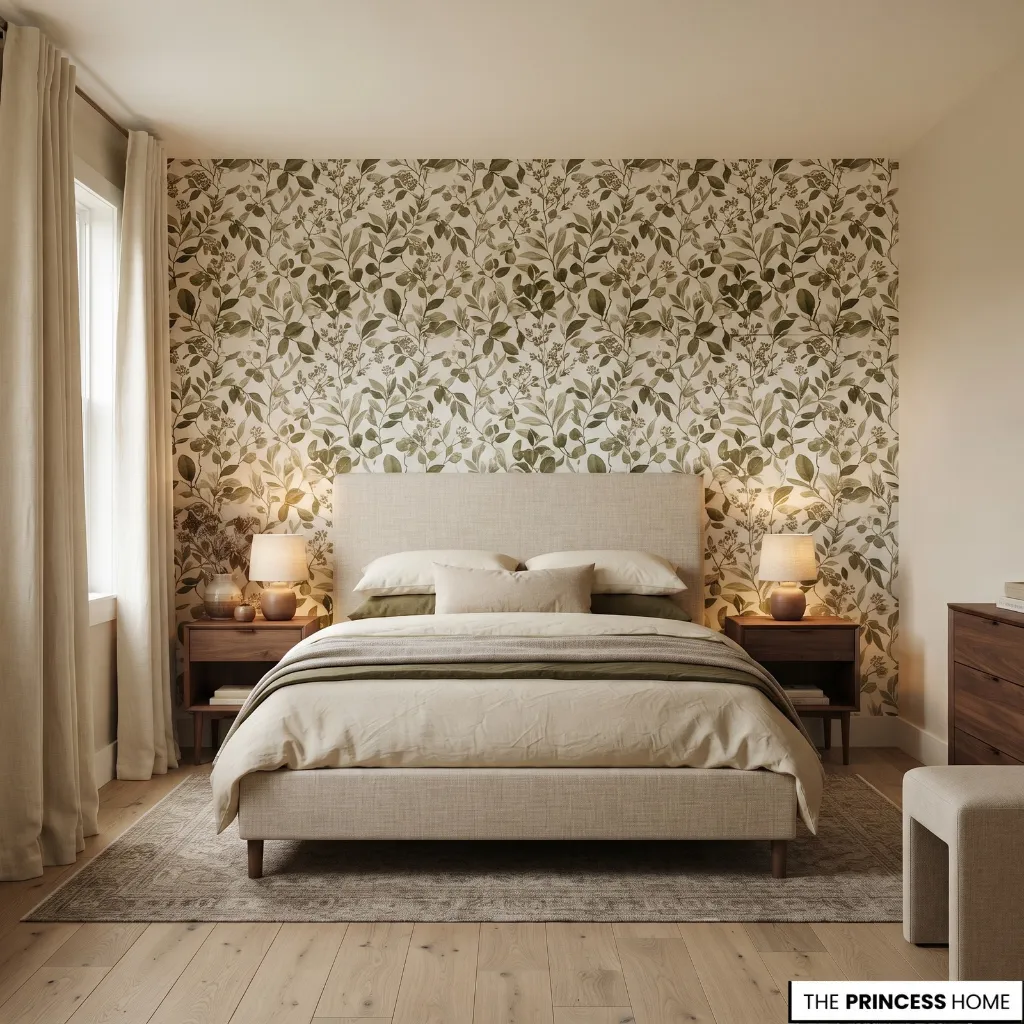
Wallpaper and more expressive wall treatments continue to receive attention, including botanical patterns, murals, textured wallcoverings, and wallpaper applied beyond conventional wall surfaces. Pattern works best when its scale is considered in relation to the room.
A small repetitive pattern behaves differently from a large mural, while a highly detailed design requires more visual space around it. Wallpaper can be used throughout a room when the architecture and pattern support it, or selectively on one wall when a focal point is more appropriate.
Ceilings can also become part of the composition, particularly when the ceiling has architectural significance. Consider the surrounding furniture before choosing a pattern.
If the room already contains highly patterned upholstery, artwork, and rugs, an equally dominant wall treatment may create unnecessary competition. A quieter pattern can unify the room instead.
If you want to introduce this trend without a major commitment, use wallpaper in a smaller room, on a single wall, inside cabinetry, or in another contained area. This allows you to evaluate its scale and relationship with the rest of the room before expanding the treatment.
Pattern should support the room’s proportions and visual hierarchy rather than exist simply because patterned walls are fashionable.
Natural Living
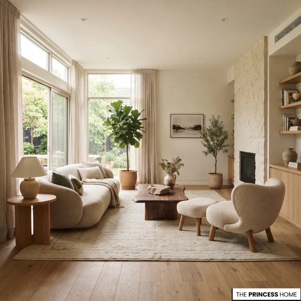
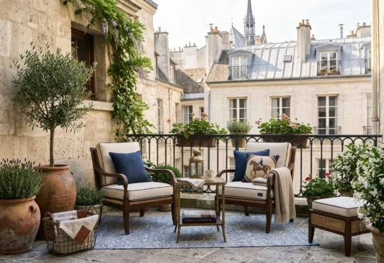
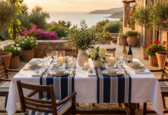
The connection between interiors and nature remains an important part of contemporary design. In practical terms, this extends beyond adding plants. Natural living can include daylight, views, organic forms, nature-derived colors, wood, stone, woven materials, and textures that strengthen the connection with the outdoors.
Plants can contribute, but they should suit the room’s light levels, available space, and maintenance requirements. A few well-placed plants are often more useful than filling every corner. Natural materials can reinforce the same idea without adding more objects.
A wooden table, stone surface, linen curtains, woven rug, or handmade ceramic can introduce a natural reference through the material itself. Organic shapes can also soften rooms dominated by straight architectural lines.
A rounded mirror, irregular table, curved chair, or naturally shaped stone accessory can provide this contrast without changing the entire design. The most useful approach is to combine a few natural references with good daylight, comfortable furniture, and an appropriate amount of open space.
Natural living should improve the way the room functions rather than become another decorative checklist.
Use Trends Wisely
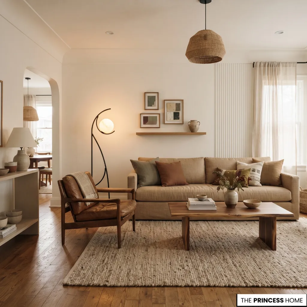
The easiest way to make a home look temporary is to apply every trend at once. A more lasting approach is to identify which 2027 direction solves a real design need in your home. Start with what already works. Keep furniture that has good proportions and useful function.
Then identify what actually needs attention: outdated color, insufficient lighting, a lack of texture, weak focal points, or a room that feels disconnected from the rest of the home. Select one or two trends that address those problems.
A room that feels flat may benefit from richer color or more tactile materials, while an overly coordinated space can gain character from a vintage piece or distinctive artwork. When the furniture feels visually heavy, a lighter arrangement or more open space may provide the necessary contrast.
For a limited budget, begin with changes that communicate the chosen direction without requiring renovation. Paint, textiles, lighting, artwork, hardware, and one distinctive furniture piece can often change a room more effectively than many small accessories. Small rooms benefit from the same principle.
A single rich color, a well-scaled light fixture, one patterned wall, or one characterful vintage piece can introduce a trend without overcrowding the space. Before committing to a strong color or expensive material, test it against the room’s natural light, existing finishes, and neighboring spaces.
Trends become more useful when they are adapted to the home rather than copied from a photograph. This also makes it easier to separate lasting design choices from more temporary expressions of a trend.
Proportion, comfort, useful materials, good lighting, and a room’s relationship to its architecture can remain valuable even when a particular color, pattern, or furniture shape becomes less fashionable.
Conclusion
The most useful Decor Trends 2027 are less about finding one new look and more about understanding the directions gaining attention: warmer colors, richer materials, personal collections, comfortable sculptural furniture, expressive lighting, and stronger connections with nature.
Use these ideas as design tools rather than rules. Choose the changes that improve your room’s proportions, function, materials, and character, then introduce them at a scale that can remain useful after the trend itself changes.
Explore the visual gallery below for inspiring ideas that bring this aesthetic to life in your home.