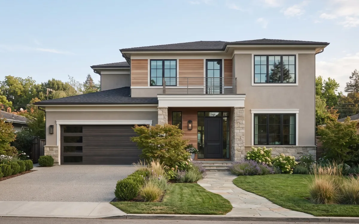
Exterior home painting is both a design decision and a practical project. The right color can strengthen the architecture, coordinate permanent materials, and give the house a more current appearance.
The challenge is choosing a 2027-inspired palette without letting a short-term trend dictate a color that does not suit your home. This guide explains the major exterior color directions for 2027 and how to choose, test, prepare, and apply them successfully.
What Defines 2027 Exteriors?
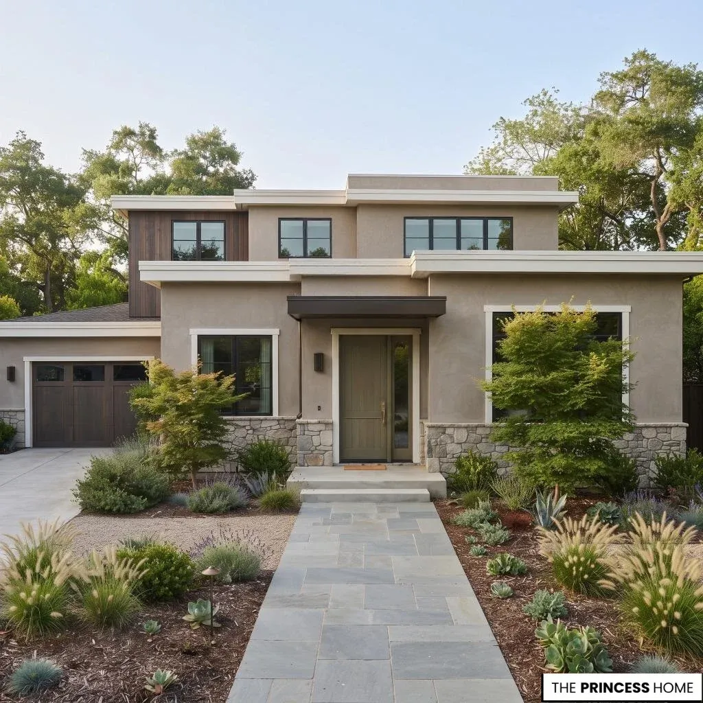
Exterior color trends for 2027 are moving toward warmer, more natural, and more nuanced palettes. Instead of relying heavily on cool grays or stark contrasts, current selections are giving more attention to muted greens, softened blue-grays, warm neutrals, richer earth tones, and softer whites.
Several major paint manufacturers support this broader direction through their 2027 Color of the Year selections.
Behr selected Grounded, a mossy olive; Valspar selected Cottage Door, a gray-blue; Sherwin-Williams selected Celery, a pale green; and Dunn-Edwards selected French Press Coffee, a deep brown with subtle plum undertones.
These colors are different, but together they point toward greater interest in nature-connected and warmer color families. The useful lesson is not to copy one Color of the Year. Exterior trends are better treated as a source of direction. A muted green may work beautifully on one house and feel disconnected on another.
The final choice still depends on the architecture, roof, permanent materials, natural light, climate, and surface being painted. For a modern exterior, the strongest 2027 approach is warmer color with restraint. Personality can come from the color family, while a controlled palette keeps the exterior coherent.
For more ideas: Decor Trends 2027 Modern Styles, Colors & Home Inspiration
Assess Your Exterior
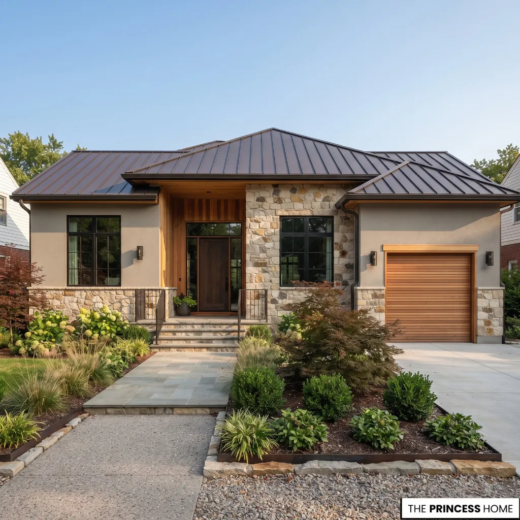
Before choosing paint, study what is already part of the house. The roof, brick, stone, wood, windows, gutters, garage door, and landscaping all influence how a new exterior color will appear. Start with the elements that cannot easily be changed.
A roof with warm brown or terracotta tones will influence the most suitable body colors, just as cool gray stone or blue-gray roofing will influence another palette. Natural wood and brick should also remain part of the color decision rather than being treated as unrelated details.
Next, identify what can change. The body, trim, front door, shutters, and garage door may all be candidates for repainting, but they do not necessarily need new colors. A good exterior often has fewer color decisions than the homeowner initially expects.
Consider the condition of the existing paint as well. Peeling, cracking, mildew, chalking, or damaged surfaces should be addressed before color becomes the main focus. A fresh color cannot compensate for an unstable surface. For a smaller exterior, visual continuity is especially useful.
Closely related body and trim colors, fewer transitions, and one deliberate accent can keep the facade from appearing fragmented. The direction of the facade can also influence the first color shortlist.
North-facing surfaces often receive cooler, less direct light, while south-facing surfaces generally receive stronger light for longer periods.
East-facing facades can change noticeably between morning and later in the day, while west-facing surfaces may appear warmer and stronger in afternoon light. These are useful starting points rather than fixed rules, which is why testing the actual color on the house remains important.
Choose 2027 Colors
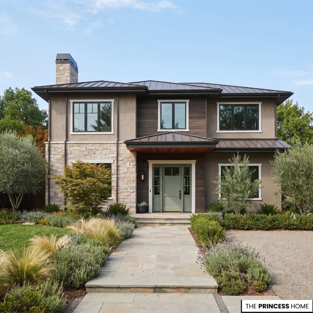
The most useful way to approach 2027 exterior paint colors is by color family rather than by a fixed list of fashionable paint chips.
Warm natural neutrals include mushroom, taupe, khaki, warm greige, stone, and soft brown. They work well when you want the exterior to feel grounded and adaptable while allowing architecture and materials to remain visible.
Muted greens include sage, olive, moss, and green-gray. These colors can connect naturally with landscaping, stone, wood, and other outdoor materials. Their muted quality also makes them easier to integrate than highly saturated greens.
Soft blue-grays offer a cooler alternative while remaining more restrained than bright blue. They can suit homes where the roof, masonry, or surrounding landscape already contains cooler undertones.
Soft whites provide clarity without requiring the starkness of a pure, icy white. A warmer white can be especially useful when the roof, stone, wood, or surrounding landscape has warm undertones.
Richer earth colors such as deep brown, clay, terracotta, and related shades can provide stronger character. They require more careful evaluation when used across large surfaces, so they may be more effective on selected architectural elements depending on the house.
The goal is to select a color family that supports the house rather than simply choosing the newest color. A 2027 trend becomes more useful when it can remain appropriate after the trend itself fades.
When deciding between a light, medium, or dark body color, consider the visual weight of the house as well as the surrounding materials. Light colors generally keep large surfaces visually lighter, while medium tones can provide more definition without making the facade dominant.
Dark colors can give a house a stronger architectural presence, but they deserve more careful testing on large surfaces because sunlight, substrate, climate, and surrounding colors can change their appearance and performance.
For more ideas: Color Trends 2027 Renewed Collection Harmonizing Your Home
Build Color Combinations
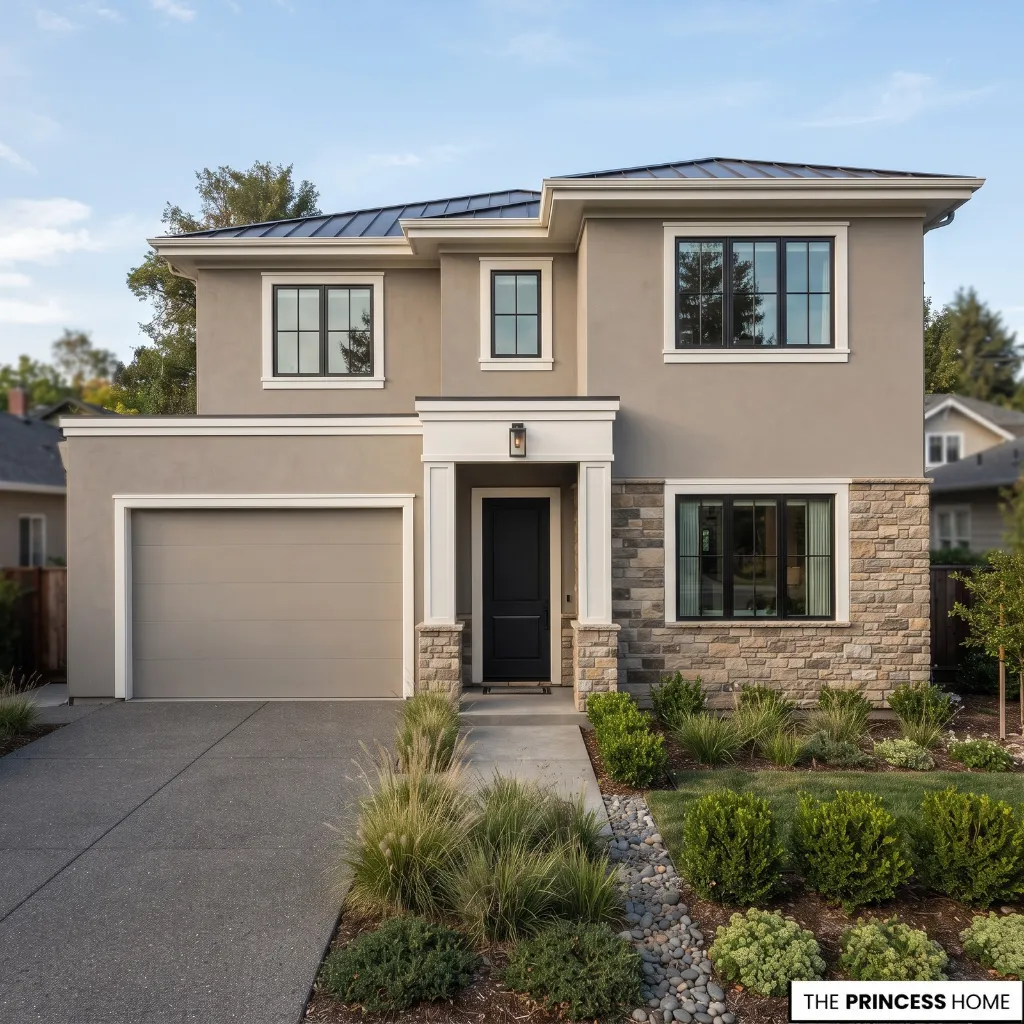
Once the main color family is established, assign clear roles to the colors. The simplest exterior hierarchy is body, trim, and accent.
The body occupies the largest visual area, so it should usually carry the most stable and adaptable color. Trim defines windows, doors, rooflines, and other architectural edges. An accent can then draw attention to a front door, shutters, garage door, or selected architectural detail.
A tonal palette uses closely related colors with modest contrast. This can be effective for contemporary houses, smaller exteriors, and homes with strong natural materials that already provide visual interest. A light body with a darker accent gives more emphasis to selected features.
A mid-tone body with soft light trim creates definition without making every architectural edge dominant. A dark body with light trim can also be successful, but it deserves more careful consideration.
The amount of sunlight, exterior material, climate, architecture, and product specifications all affect whether the combination is appropriate. Two colors can separate architectural volumes when a house has clearly defined upper and lower sections, wings, or other structural breaks.
Avoid adding a second body color simply because two colors look attractive in a sample. The change should correspond to something meaningful in the architecture.
A practical starting point is to let the body carry the largest color field, use the trim to define important architectural edges, and reserve the strongest contrast for one or two focal elements.
There is no universal maximum number of exterior colors, but keeping the palette focused usually makes the architecture easier to read. Windows, the front door, and the garage door should be considered together rather than assigned unrelated accent colors.
Match Architectural Style
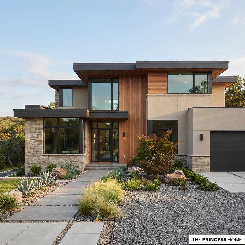
Exterior paint should support the character of the house rather than compete with it. The same 2027 color can produce very different results on a Colonial, Craftsman, modern, farmhouse, or Mediterranean-inspired home.
Traditional and Colonial houses often benefit from restrained body colors, clear trim hierarchy, and controlled accents. Warm neutrals, softened whites, and selected darker details can reinforce the architecture without making it feel overly decorated.
Craftsman homes can accommodate earthy neutrals, muted greens, warm browns, and other natural colors that relate to wood and architectural detailing. The palette should support the strong horizontal and structural character already present.
Modern homes generally benefit from fewer color transitions and greater attention to the relationship between large architectural masses. Sophisticated neutrals, softened earth colors, and controlled dark accents can work when they reinforce the geometry of the building.
Farmhouse exteriors can use soft whites, warm neutrals, muted greens, and selected dark accents. The key is to avoid turning the style into a fixed formula. Mediterranean and Spanish-influenced architecture can work with mineral whites, warm earth colors, and natural tones that coordinate with tile and masonry.
These are starting points rather than rules. Architecture should guide the palette without limiting the homeowner to one predetermined color scheme.
For more ideas: Curved Furniture 2027 Best Ideas for Modern Living Rooms
Coordinate Materials
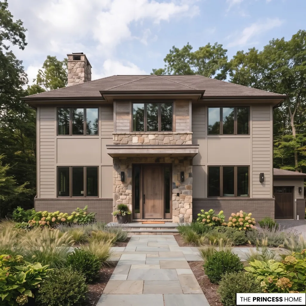
Paint is only one part of an exterior. Brick, stone, wood, roofing, metal, concrete, stucco, and siding remain visible and become part of the final palette. Begin by identifying the undertones of these permanent materials.
Warm stone may coordinate more naturally with warm neutrals, while cool gray stone can support softer blue-grays or carefully balanced warm colors. Red or orange brick already has considerable color, so adding another strong competing warm tone may make the exterior feel unnecessarily busy.
Natural wood deserves similar consideration. If the wood is attractive, painting around it may produce a better result than covering it. The surrounding paint can establish a stronger hierarchy while allowing the material to remain a focal element. The substrate also affects the technical choice.
Wood, stucco, masonry, metal, and vinyl do not all have the same coating requirements. For wood, consider whether the existing surface is painted, stained, bare, or weathered before selecting the coating system.
Stucco and masonry require products appropriate to their porous surfaces and moisture conditions, while metal may require preparation and primers suited to the specific substrate. Fiber-cement siding also has its own manufacturer recommendations.
The practical rule is to match the coating system to the surface rather than choosing an exterior paint solely by color. Vinyl siding requires particular care with dark colors because darker surfaces can absorb more solar heat. Some manufacturers specify approved colors or specialized products for vinyl.
Always follow the siding and coating manufacturer’s requirements rather than assuming that a dark exterior color is suitable for every vinyl surface.
Use Light Strategically
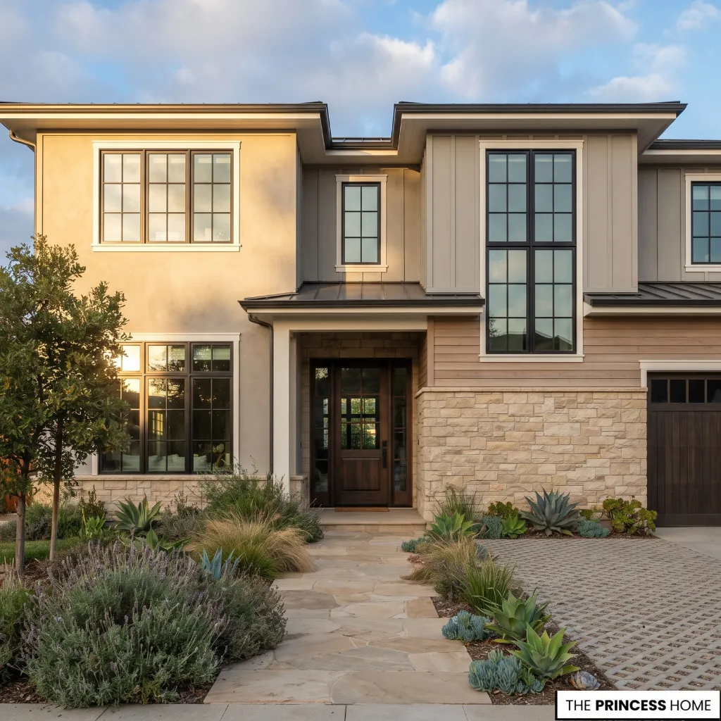
Exterior color should always be evaluated in natural light. A paint chip or digital image cannot fully reproduce how a color will appear across an entire facade throughout the day. Direct sunlight can make a color appear lighter and more intense, while shade can reveal cooler or darker qualities.
Morning and afternoon light can also change the apparent temperature of a color. Surrounding greenery, paving, neighboring buildings, and other surfaces can influence what the eye perceives. This is why the same warm neutral may look beige on one house and gray-brown on another.
Light Reflectance Value (LRV) is also useful when comparing colors. A higher LRV generally means that a color reflects more light, while a lower LRV generally indicates a darker color. LRV can help explain why two colors with similar visual descriptions behave differently in strong sunlight.
It should not, however, become an arbitrary formula for choosing every exterior color. Material manufacturers may establish their own requirements, particularly for products such as vinyl siding.
For the same reason, a color that works on a shaded north-facing facade may appear very different on a sun-exposed south- or west-facing wall. Test colors on the actual elevation where they will be used, especially when comparing light and dark options.
Select Paint Finish
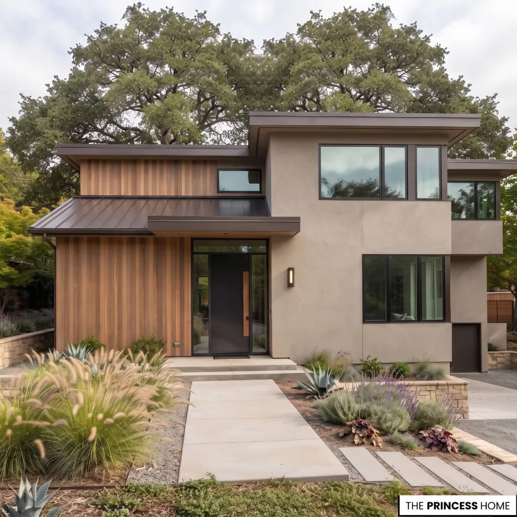
The paint finish should support both the appearance and practical requirements of the surface. Large body areas are often well suited to lower-sheen finishes because they reduce reflection and draw less attention to minor surface irregularities. Satin finishes are commonly used for broad exterior applications.
Trim, shutters, and doors can often use a higher sheen when greater definition or easier cleaning is desirable. Semi-gloss is commonly used for these architectural elements, although the appropriate choice still depends on the product, substrate, and desired appearance.
The finish should therefore be selected after considering the surface rather than choosing one sheen for the entire house automatically.
Follow the paint manufacturer’s recommendations for the specific product and substrate. A finish that works well on exterior siding may not be the best choice for a particular masonry, metal, or wood application.
Prepare Before Painting
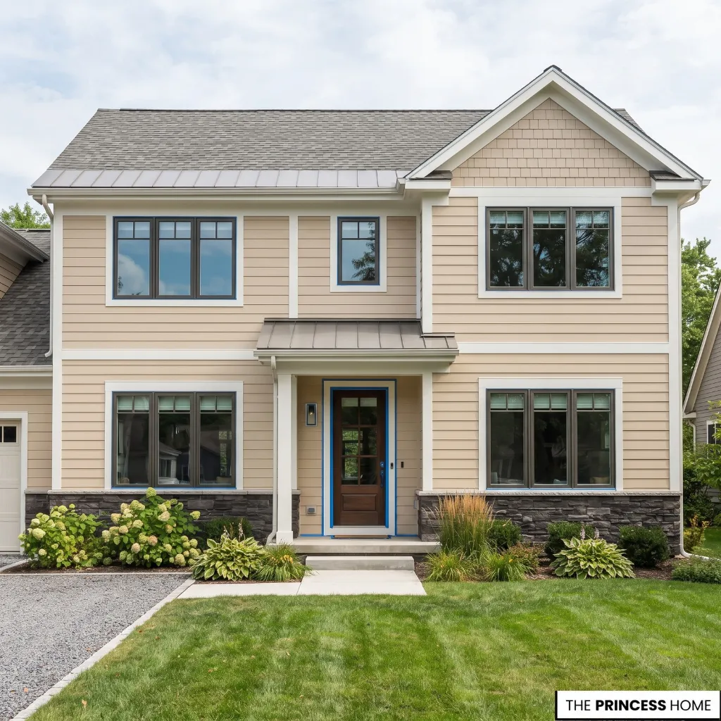
Good exterior home painting begins with preparation, not color. Inspect the surface for peeling paint, cracks, damaged areas, mildew, dirt, chalking, and other conditions that can interfere with adhesion.
Clean the surface appropriately, repair defects, remove loose coatings, and allow the surface to become properly dry before painting. A clean, sound, dry surface provides the foundation for good adhesion, while inadequate preparation can contribute to coating failure.
Primer is also condition-dependent. It can be important when painting bare substrate, repaired areas, or surfaces with specific adhesion or coating requirements. A complete repaint of a sound, previously painted surface may not require a separate primer everywhere if the selected coating system does not call for it.
Weather matters as well. Temperature, humidity, rain, surface moisture, and drying time can affect application and performance. Always follow the product’s stated conditions instead of relying on a general rule about when it is safe to paint.
Older painted surfaces may also present safety issues. In the United States, homes built before 1978 may contain lead-based paint, and disturbing such coatings can require lead-safe practices and, for certain paid renovation work, EPA requirements. Homeowners elsewhere should follow the regulations that apply in their own country.
Test Before Committing
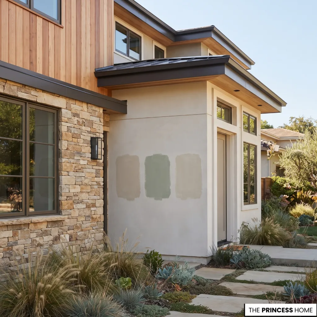
Once the palette has been narrowed down, test it on the actual exterior. Start with a few candidate colors rather than painting large areas immediately. Place samples where they can be viewed against the roof, stone, brick, wood, trim, and other permanent materials.
Observe them at different times of day and in both direct sunlight and shade. A color that looks balanced in the afternoon may appear considerably cooler in morning shade. The same process applies to trim and accent colors. Test the relationship between colors rather than judging each paint sample in isolation.
This step is particularly important for large exterior surfaces because color becomes more visually powerful when spread across an entire facade. A subtle undertone that seems insignificant on a small card can become obvious when the color covers hundreds of square feet.
Digital previews can help narrow the choices, but physical testing on the house should carry greater weight before the final purchase.
Modernize Without Repainting
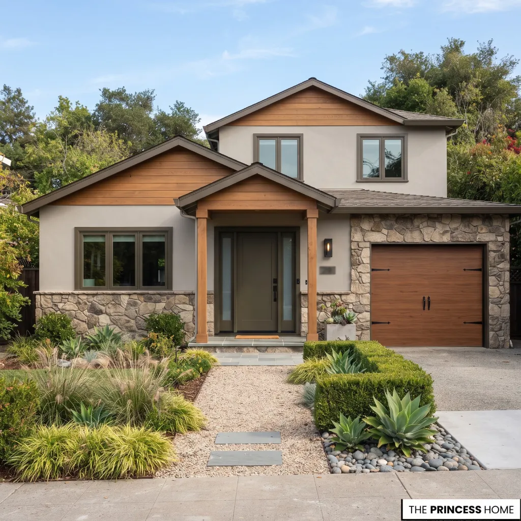
A modern exterior does not always require a complete repaint. If the main body color is still appropriate and the surface is in good condition, a smaller project may create a meaningful improvement.
Repainting the front door, refreshing trim, simplifying accent colors, or changing the garage-door relationship can alter the visual hierarchy without replacing every exterior finish.
The most useful approach is to identify the element that currently looks most disconnected from the rest of the house. A dated accent color may be a stronger problem than an otherwise suitable body color.
Likewise, inconsistent trim colors can make a house appear visually fragmented even when the main paint is attractive. When the existing stone, brick, or wood is a strong feature, preserve it when possible. Paint can then be used to support that material rather than hiding it.
For a limited budget, prioritize surface preparation and the largest visible areas before spending on secondary decorative details. Reducing the number of changes can often preserve the design intent better than using inexpensive substitutes for important architectural elements.
If the windows, front door, or garage door are not being replaced, treat their existing colors and materials as fixed parts of the palette . A new body color should work with them rather than forcing every element into the same color family.
In some cases, repainting one focal element can provide more improvement than repainting several secondary features. Paint quantity should also be planned before purchasing materials.
The amount required depends on the total surface area, the number of coats, the condition and porosity of the substrate, and the coverage stated for the specific product. Measure the surfaces as accurately as practical and use the manufacturer’s coverage information rather than relying on a generic estimate.
For more ideas: Top 2027 Bedroom Trends Every Homeowner Should Know
Avoid Painting Mistakes
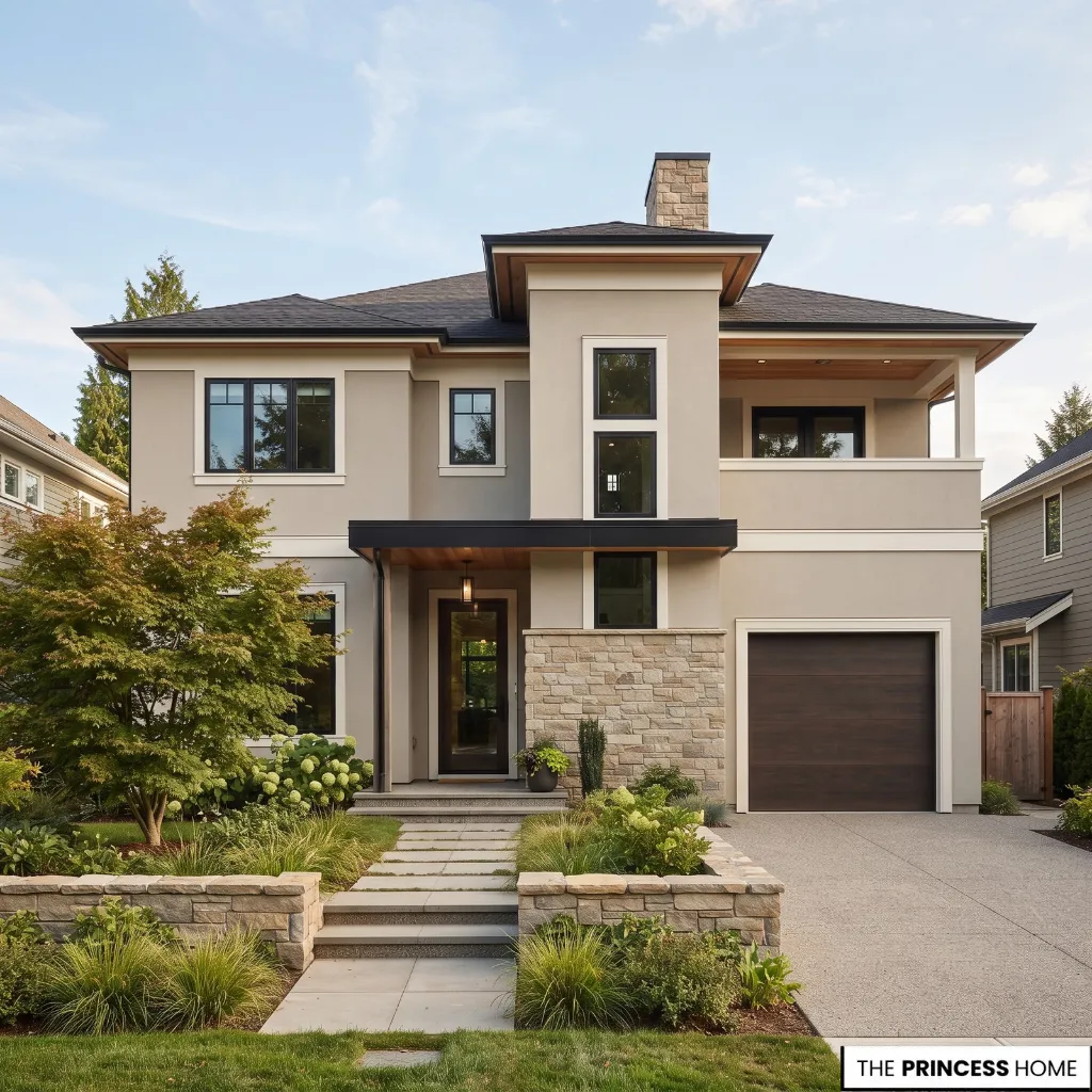
One common mistake is choosing a color entirely from a screen. Digital color can vary by display, lighting, and surrounding colors. Test physical samples on the exterior before making a final decision. Another mistake is ignoring permanent materials.
A beautiful paint color can still look wrong when it conflicts with the roof, brick, stone, or natural wood. Build the palette around these fixed elements first. Using too many exterior colors can also weaken the architecture. Give the body, trim, and accent clear roles instead of assigning a separate color to every visible feature.
Trend-driven selection creates another problem. A color can be fashionable and still be unsuitable for the house. Evaluate its temperature, intensity, and relationship to the architecture before committing. Surface condition should never be treated as secondary.
New paint can make peeling, cracking, damaged, or poorly prepared areas more noticeable. Repair and preparation should come before the final decorative decision. Dark colors require additional care on certain substrates.
With vinyl siding, for example, solar heat absorption can be a concern, so the siding and paint manufacturer’s approved color guidance should be followed.
Finally, avoid painting in unsuitable weather simply to keep a project on schedule. Moisture, temperature, and drying conditions are part of the coating process, not minor details.
Plan The Project
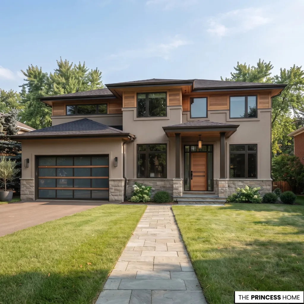
A successful exterior painting project follows a logical order. Begin by inspecting the house and identifying repairs, surface conditions, permanent materials, and elements that will remain unchanged. Then establish the overall visual direction you want, such as warm and natural, restrained and contemporary, or more traditional.
Choose the body color family first because it covers the greatest area. Select the trim next, using it to support the architecture rather than automatically choosing the highest possible contrast. Add accent colors only where they have a clear purpose.
Before purchasing the final quantity of paint, confirm material compatibility and test the selected colors under real exterior lighting. Then choose the appropriate finish and coating system for each surface. Preparation comes before application.
Clean, repair, prime where required, and make sure weather conditions meet the product specifications. For a limited budget, prioritize surface preparation, major body areas, important trim, and then focal accents.
This keeps money focused on decisions that affect the overall result rather than spending heavily on details while underlying surfaces remain unresolved.
The final project should therefore move from inspection to color selection, testing, preparation, and application, rather than starting with a paint chip and working backward.
For more ideas: Bathroom Trend 2027 Timeless Design Ideas for a Luxurious Space
Conclusion
The best 2027 exterior home painting choices are not simply the colors featured in trend forecasts. They are the colors that work with the home’s architecture, materials, natural light, and practical needs.
Explore warmer neutrals, muted greens, softened blue-grays, softer whites, and richer earth tones. Then let the house determine which direction works best. When color, materials, finish, and proportion work together, the result can feel current without depending on a passing trend.