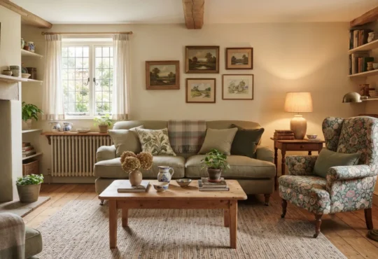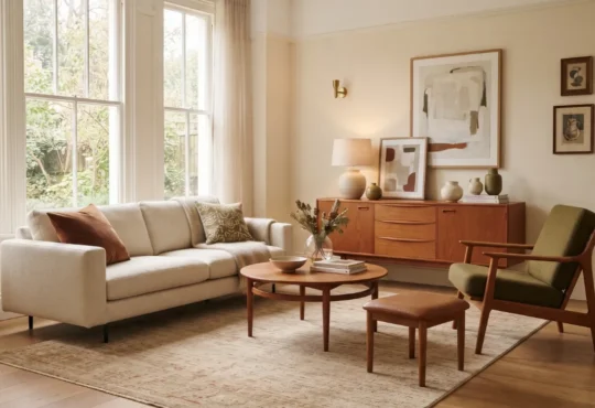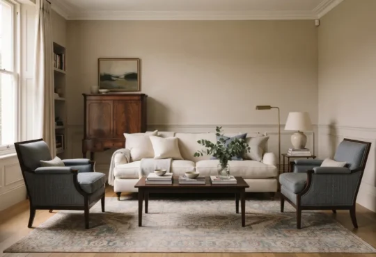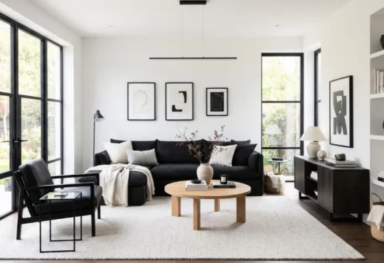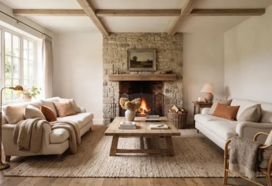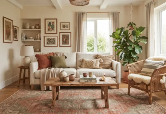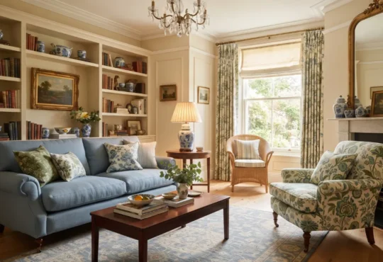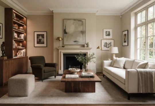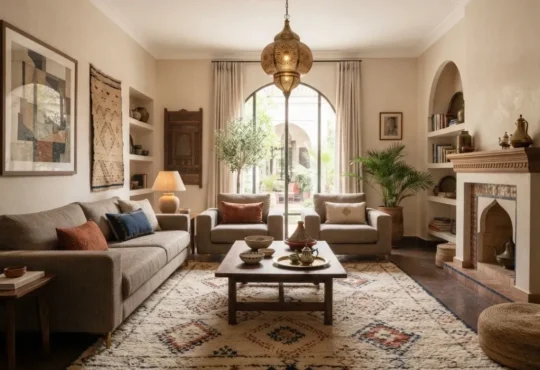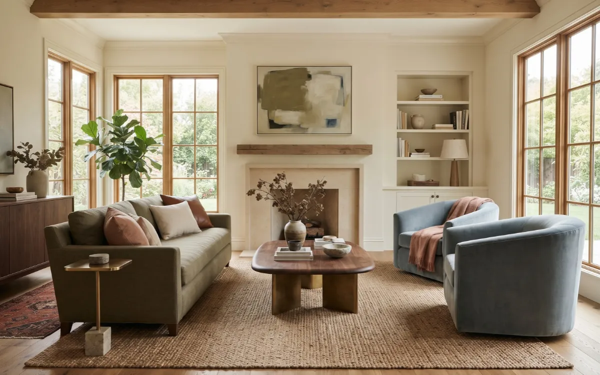
Color Trends 2027 are moving in several directions at once, from natural greens and softened blues to warm browns, earthy pinks, and deeper expressive shades. The challenge is that major color forecasters are not choosing one universal color for the year.
Instead, their selections reveal several broader directions that can be adapted to real homes. This guide explains those directions and, more importantly, how to choose, combine, and place them so they work with your room rather than simply following a trend.
2027 Color Direction
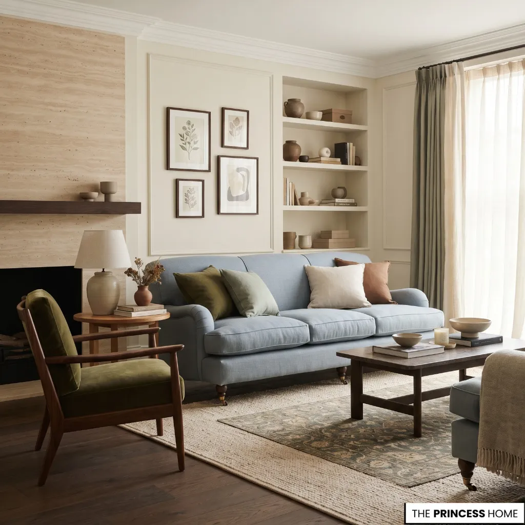
There is no single universal color for 2027. Different forecasting organizations and paint companies have selected different shades, making the overall picture more useful than any individual Color of the Year.
WGSN and Coloro selected Luminous Blue as their 2027 Colour of the Year and identified Meadowland Green and Clay among their S/S 27 Key Colours. Their forecast also describes a wider connection between nature, technology, tradition, and more expressive uses of color. (WGSN)
Paint companies are emphasizing other parts of the spectrum. Sherwin-Williams selected Celery, an airy herbal green, while Dulux selected Soulful Sage, a soft, silvery green. Behr selected Grounded, an earthy olive that sits between olive and moss with subtle brown undertones. (Sherwin-Williams)
Blue appears in quieter forms as well. Valspar selected Cottage Door, a grayed-out blue with warm undertones, while PPG selected Artifact, a smoky blue. (Valspar)
Warm brown is another clear direction. Dunn-Edwards selected French Press Coffee, a deep brown with a subtle plum undertone, while Little Greene selected Marle, a warm mid-tone brown. (Dunn-Edwards Paints)
Taken together, these selections point toward several useful residential directions: natural greens, nuanced blues, warm earthy neutrals, clay and earthy pinks, and deeper brown or red-based colors.
The important distinction is that a forecast identifies a direction; it does not determine which color belongs in your room. Your architecture, natural light, existing materials, and personal preferences still determine the right application.
For more ideas: Decor Trends 2027 Modern Styles, Colors & Home Inspiration
Choose Natural Greens
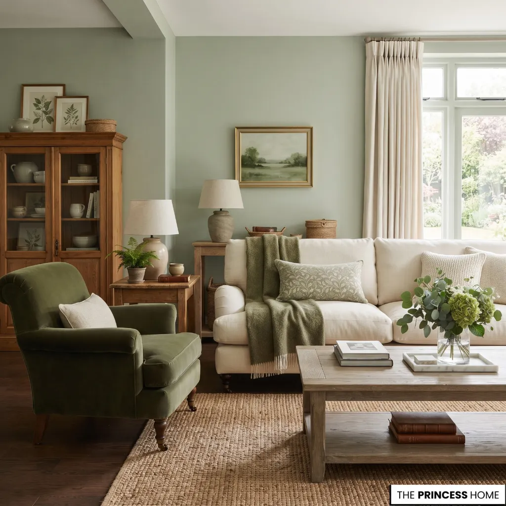
Green is one of the strongest recurring directions in the 2027 forecasts, but the useful choice is not simply whether to use green. It is deciding which type of green belongs in the room.
Sherwin-Williams’ Celery is an airy herbal green, Dulux’s Soulful Sage is softer and more silvery, and Behr’s Grounded moves toward olive and moss with brown undertones. These colors belong to the same broad family while behaving differently in a room. (Sherwin-Williams)
Choose a lighter herbal or sage green when you want color to remain relatively quiet. These shades can work across walls, bedrooms, kitchens, and living spaces where you want a noticeable color without making it the dominant feature. Choose olive or moss when the room can support more depth.
Brown undertones can help green relate to timber, leather, stone, cream, and other warm materials. Avoid choosing a green from a screen without checking its undertone. A green that appears fresh online can look noticeably yellower, grayer, or darker under your home’s lighting.
Apply green according to its visual weight. A pale sage can cover a larger surface, while a stronger olive may work better on cabinetry, upholstery, a smaller room, or one architectural feature.
Explore Softer Blues
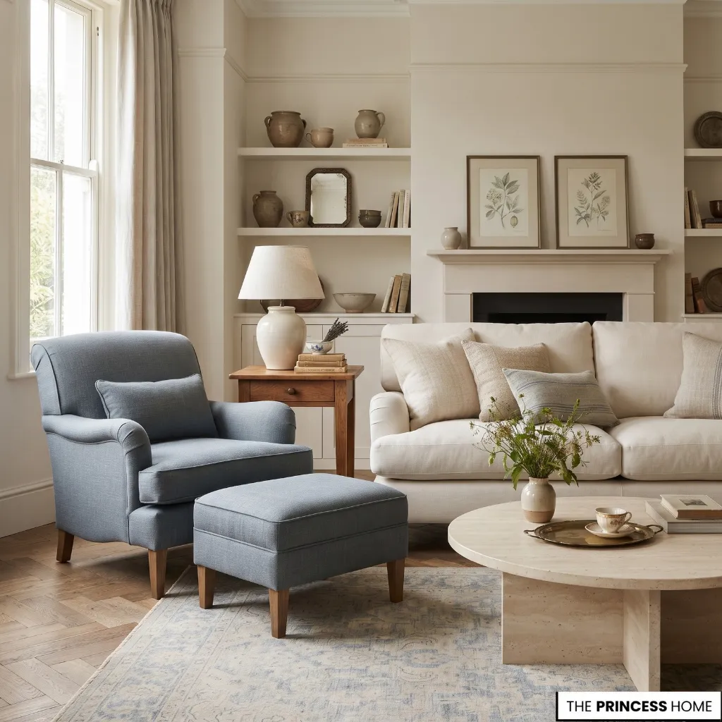
Blue remains an important 2027 direction, but the forecasts show how different blue can look depending on saturation and undertone.
WGSN and Coloro’s Luminous Blue is a vivid, energetic blue with a strong presence. Valspar’s Cottage Door is a grayed-out blue with warm undertones, while PPG’s Artifact is a smoky blue intended as a quieter foundation. (WGSN)
Choose a strong blue when you want the color itself to become part of the room’s identity. It can work through an upholstered chair, artwork, cabinetry, a painted architectural feature, or a carefully considered wall. Choose a softened or smoky blue when you want a more restrained background.
These versions can work particularly well with warm wood, cream, stone, and muted textiles. Avoid treating all blues as interchangeable. A clear saturated blue and a gray-blue may require different supporting colors and different amounts of visual space.
Apply blue according to its intensity. If the shade is strong, give it enough quieter space around it. If the shade is muted, it can usually participate more easily in a layered palette.
Warm Earthy Neutrals
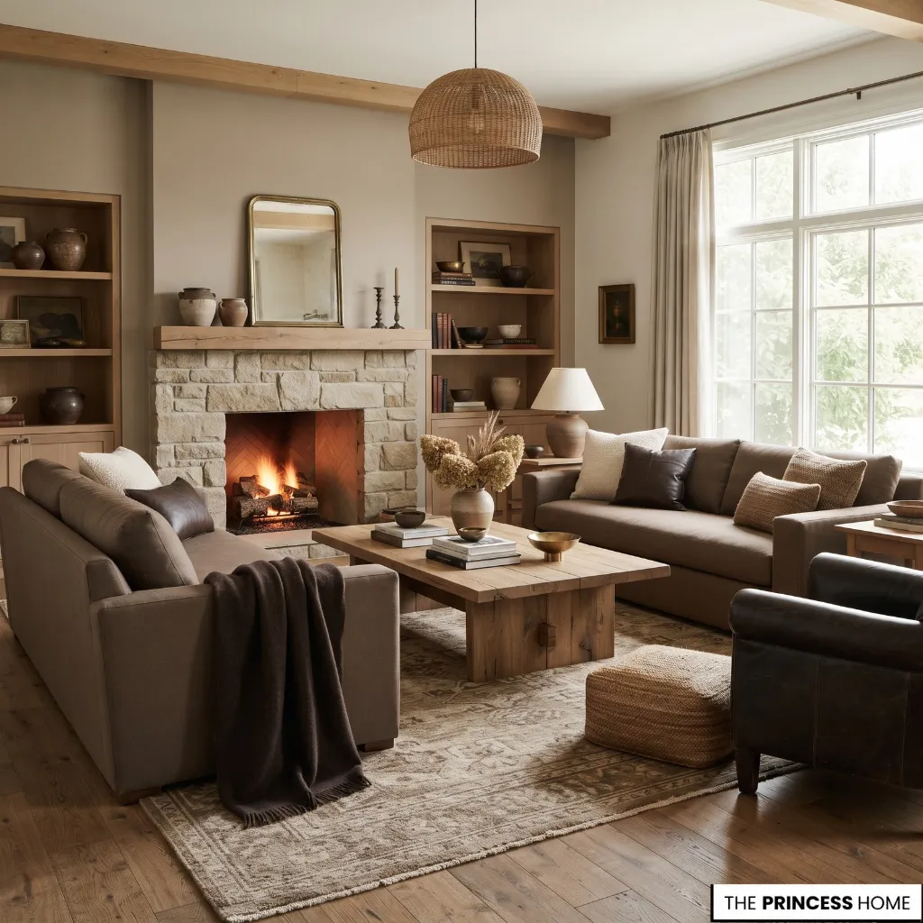
One of the most useful 2027 directions is the movement beyond flat beige, stark white, and cool gray toward neutrals with more visible character.
Dunn-Edwards’ French Press Coffee demonstrates this through a deep brown with a subtle plum undertone. Little Greene’s Marle takes the direction toward a softer, mid-tone brown designed to work as either a supporting or more dominant neutral. (Dunn-Edwards Paints)
A warm neutral can include brown, taupe, mushroom, clay, warm cream, or another muted earth-based color. The defining quality is not simply that the color is light. Its undertone determines how it relates to the rest of the room.
Choose a warm neutral when your existing materials already contain wood, stone, leather, woven fibers, or other natural finishes. The right neutral can connect those materials rather than making each one appear separate.
Avoid assuming that every beige is automatically warm or every brown will work with warm materials. Undertones still matter.
Apply deeper neutrals to walls, cabinetry, upholstery, or smaller architectural areas according to the room’s light and visual weight. A dark brown can become a major background color when the room can support it, while a lighter earthy neutral may be more appropriate for a larger surface.
Add Earthy Pink
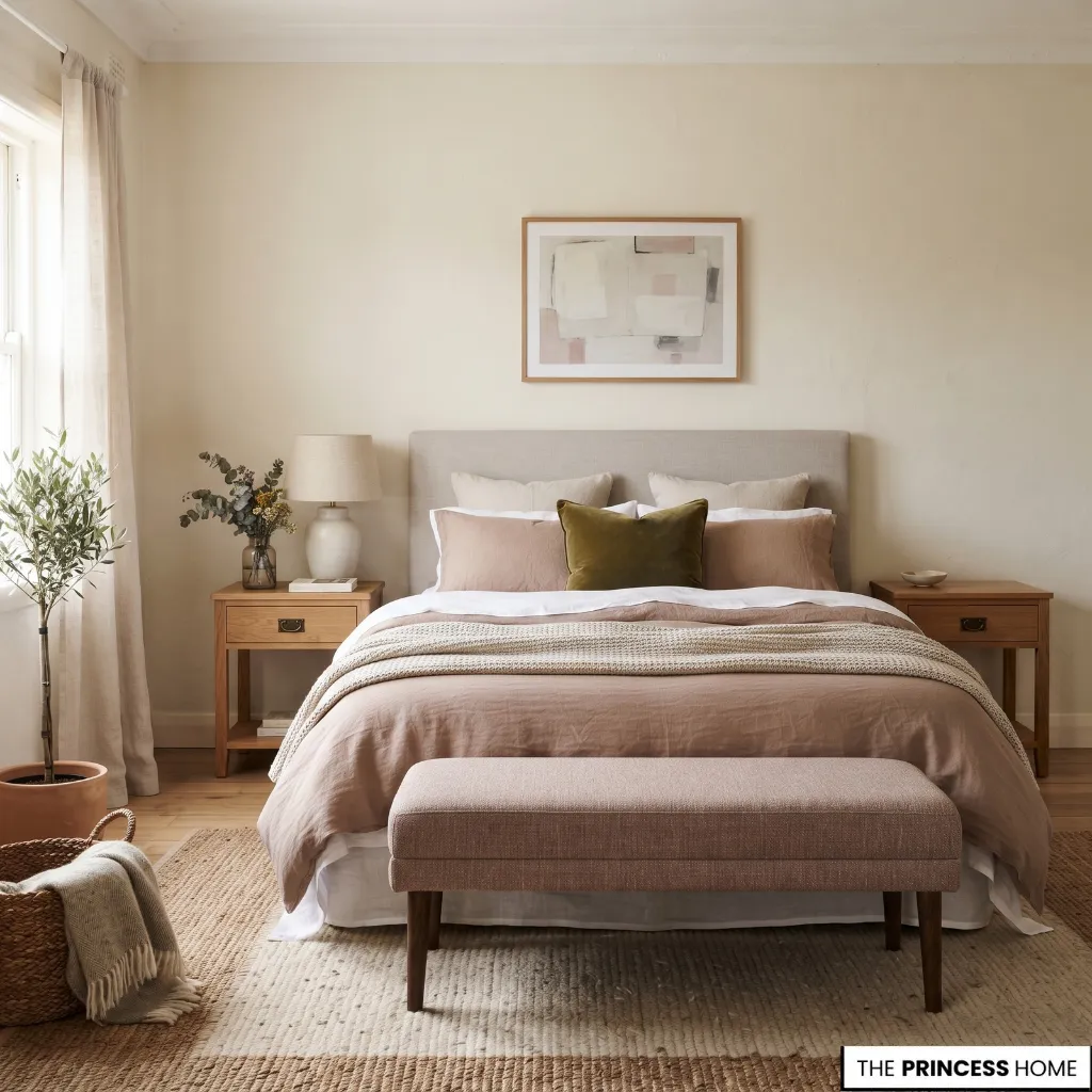
Pink becomes more useful in interiors when it moves away from sugary or highly decorative versions and toward clay, muted rose, and brown-influenced tones.
WGSN and Coloro identify Clay as one of their S/S 27 Key Colours, placing it within a wider 2027 palette that combines earthy and expressive shades. (WGSN)
Choose earthy pink when you want warmth without relying entirely on beige or brown. It can work particularly well with cream, olive, warm wood, muted blue, and deeper red-brown colors.
Avoid treating pink as a standalone statement that must dominate the room. Its usefulness often comes from its relationship with surrounding colors.
Apply it through upholstery, bedding, curtains, artwork, rugs, or smaller furnishings when you want an easier commitment. It can also work on walls when the shade is sufficiently muted and the surrounding palette is controlled.
Use Deeper Colors
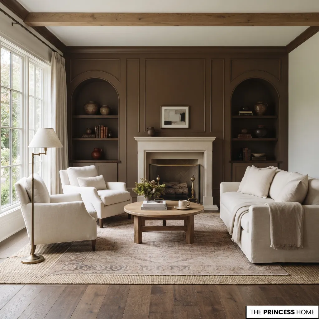
The 2027 palette is not limited to light and soft colors. Deeper greens, brown, plum, burgundy, and red-brown shades can provide stronger visual anchors.
This direction appears in several forecasts. Sherwin-Williams’ broader 2027 forecast includes deeper reds and other expressive colors, while Dunn-Edwards places a nuanced brown at the center of its 2027 selection. (Dunn-Edwards Paints)
The practical issue with a deep color is visual weight. A dark shade on a wall has a different effect from the same shade on a cushion or small piece of furniture.
Choose a deep color when the room has enough architectural definition, suitable lighting, or surrounding lighter elements to support it. Avoid adding several dark colors at once without establishing which one should dominate.
Apply one strong color as the anchor and allow the supporting colors to remain quieter. A deep brown wall, for example, may need lighter textiles and natural wood around it. A burgundy chair can instead act as the single strong note within a much lighter palette.
Build Harmonious Palettes
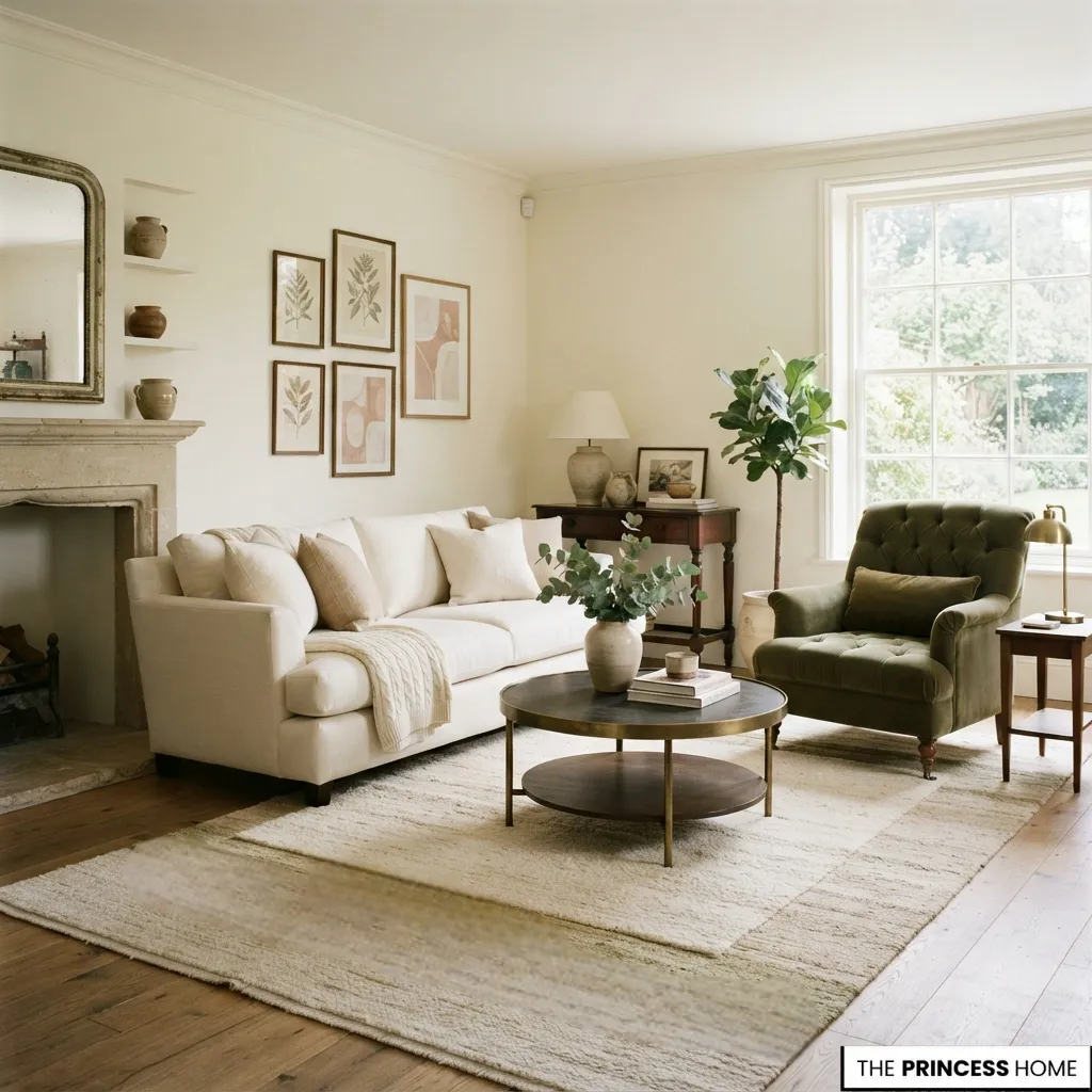
The most useful way to work with Color Trends 2027 is to stop thinking about individual shades and start thinking about relationships. A practical palette can be organized as dominant color → supporting color → accent color.
The dominant color occupies the greatest visual area. The supporting color connects other major elements, while the accent adds smaller moments of contrast or emphasis.
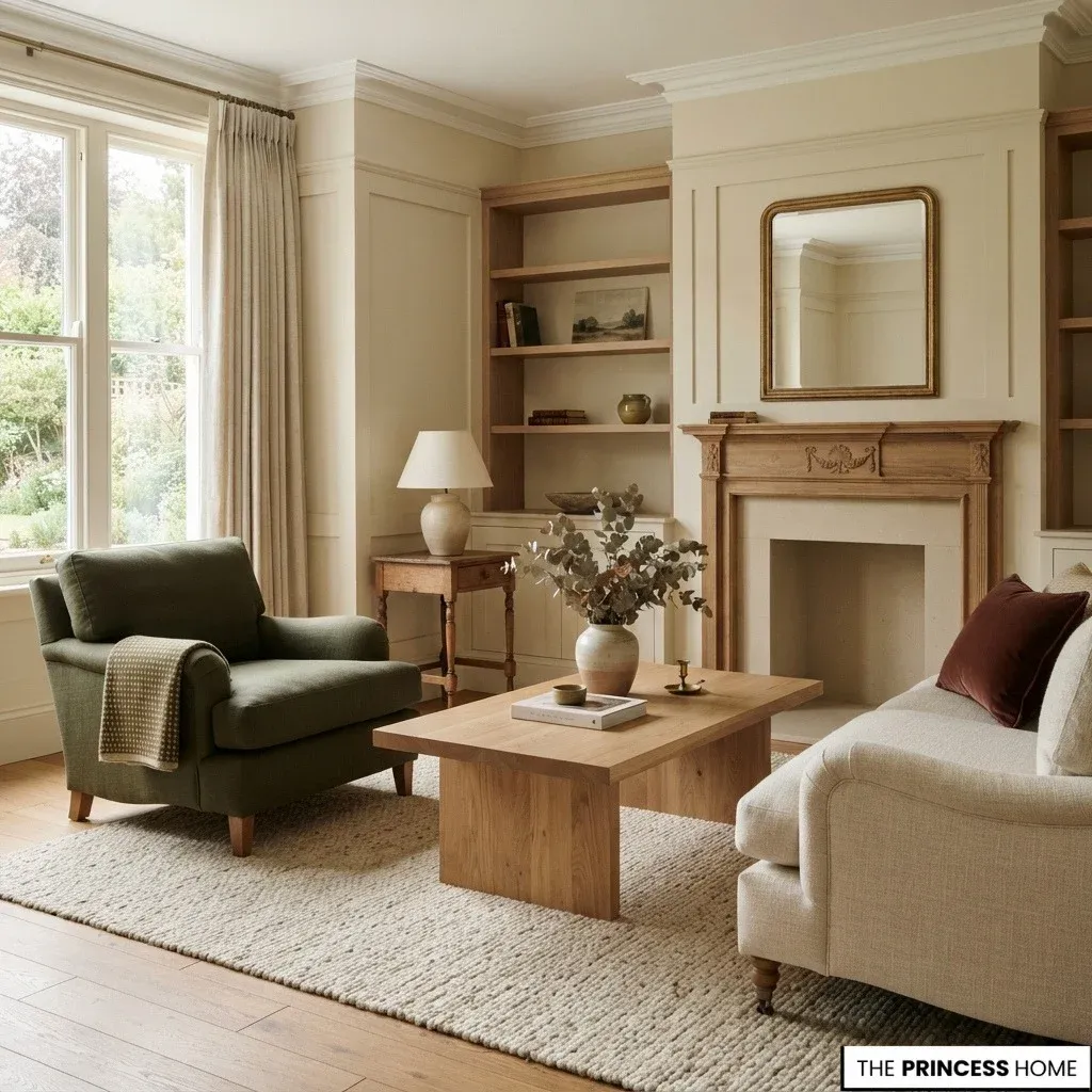
For example, warm cream can provide the dominant background, olive can support it through upholstery or cabinetry, and earthy pink can appear through textiles or artwork. A softened blue can work with warm brown and cream. Olive can sit beside clay and warm white.
A deeper red-brown can become an accent within a palette of cream, olive, and natural wood. These combinations are starting points rather than fixed 2027 formulas. The same three colors can look completely different depending on their value, saturation, surface area, and surrounding materials.
When building a palette, compare more than hue. Value determines how light or dark the colors are, saturation determines how intense they appear, and undertone affects how they interact with nearby colors.
Harmony comes from managing these relationships rather than making every color equally noticeable.
Match Color to Light
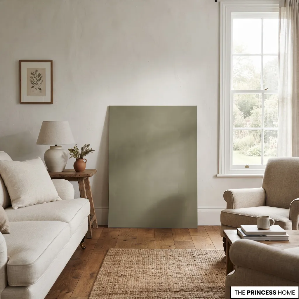
A color chosen from a digital image can change significantly when it enters a real room. Natural light varies throughout the day, while artificial lighting introduces another layer of color. The surrounding floor, ceiling, furniture, and fabrics also influence how a painted surface is perceived.
Start with a physical sample rather than relying only on an online image. Place it where the color will actually be used and observe it at different times of day.
Look at it in morning and afternoon light, then check it again under the room’s evening lighting. Compare the sample with flooring, upholstery, wood, stone, and other permanent finishes.
Do not assume that a particular room orientation will always produce one predictable result. The actual windows, surrounding buildings, season, furnishings, and artificial lighting all affect the appearance.
This matters especially with nuanced 2027 colors. A gray-blue, sage, olive, brown, or earthy pink can reveal undertones that are difficult to recognize on a screen.
Place Color Strategically
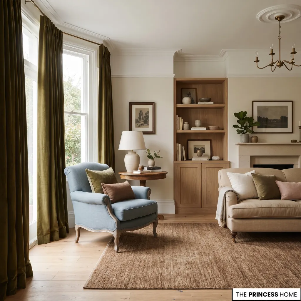
Choosing a trend color does not mean putting it on every wall. Walls provide the largest commitment, but color can also enter through cabinetry, doors, upholstery, rugs, curtains, artwork, and accessories.
Use a trend color on a larger surface when you have tested it thoroughly and it works with the room’s architecture and permanent materials.
Use it on furniture or textiles when you like the direction but want more flexibility. A blue chair, olive curtains, earthy pink upholstery, or brown rug can introduce a 2027 color without changing the entire room.
Permanent elements deserve more scrutiny than replaceable ones. Paint can be changed, but cabinetry, tile, flooring, and major furniture pieces require greater effort and cost.
If repainting is unsuitable, introduce the same color relationship through textiles, artwork, furniture, or decorative elements. The goal is not to reproduce a wall color on a cushion. The goal is to preserve the intended relationship between colors.
For a living room, use stronger colors selectively through upholstery, artwork, rugs, or one architectural surface, while allowing larger neutral areas to support them. In a bedroom, sage, muted green, softened blue, earthy pink, and warm neutrals can be layered through walls and textiles without requiring every element to match.
In a kitchen, green or blue cabinetry creates a larger commitment than accessories, so test the color beside countertops, flooring, backsplash materials, and hardware first. For a dining room, deeper green, brown, clay, or red-brown can be used more deliberately because the room often has fewer competing functional elements.
For a bathroom, consider the relationship between paint, tile, vanity, stone, and metal finishes before introducing a trend color. The same shade that works beautifully on a painted wall may compete with a strongly patterned tile.
Small rooms do not automatically require pale colors. Instead, consider the amount of natural light, ceiling height, fixed finishes, visual weight, and number of competing colors. A deeper shade can work in a small room when the palette remains controlled.
For more ideas: Top 2027 Bedroom Trends Every Homeowner Should Know
Adapt Existing Rooms
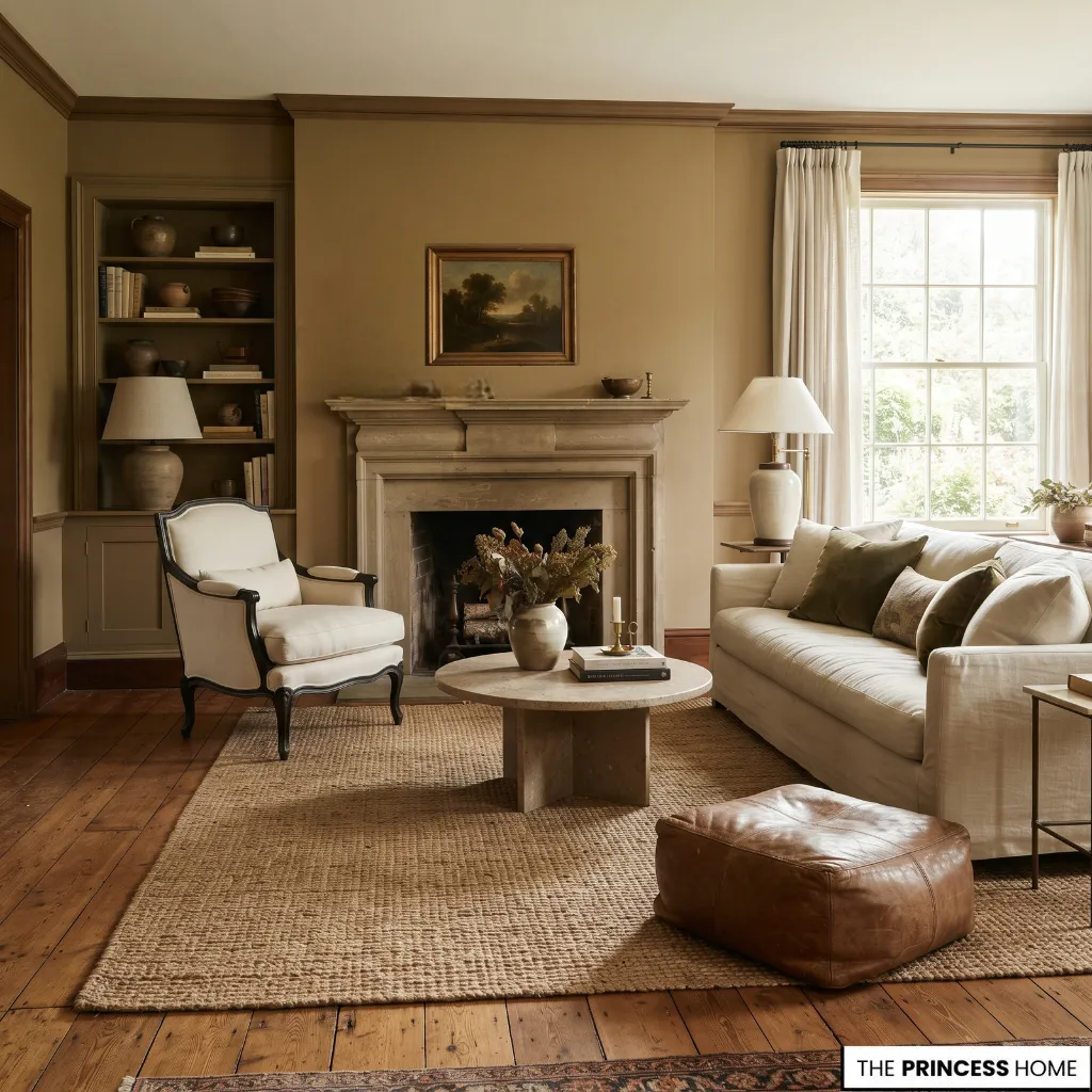
You do not need to start with an empty room to use 2027 color trends successfully. Begin with what cannot easily change. Look at the flooring, wood tones, stone, cabinetry, upholstery, rugs, and architectural finishes already present. These elements are already part of the room’s palette.
If your room contains warm oak, for example, a warm earthy color may integrate more naturally than a cool gray-based color. A room with blue-gray stone or upholstery may benefit from a softened blue that provides continuity.
When olive or green is already present, another green with a compatible undertone can extend the palette without making the room look newly decorated.
This approach also reduces unnecessary replacement. Instead of asking, “Which 2027 color should I use?” ask, “Which 2027 color direction already has a useful relationship with what I own?”
The answer may lead you toward a new wall color, or it may suggest a smaller change through textiles, artwork, or one significant piece of furniture.
To make that decision more practical, compare each possible color direction against four things: the materials already in the room, the way natural light changes the color, the amount of visual weight you want the color to carry, and how permanent you want the change to be.
A strong direction that works with the room’s materials and light may suit a larger surface, while a color you like but cannot fully support can be introduced through a more flexible element.
This gives you a simple way to choose between the main 2027 directions. If the room already has warm wood and natural materials, warm earthy neutrals, olive, or clay may extend the existing palette. If the room contains cooler stone or blue-gray elements, a softened blue may create continuity.
When the existing palette is relatively quiet, a deeper color can provide a controlled focal point without requiring the entire room to change.
For more ideas: Exterior Home Painting 2027 Modern Colors, Trends & Expert Tips
Avoid Color Mistakes
Choosing a color only because it is trending. A forecast tells you what color direction is receiving attention. It does not tell you whether the color suits your room. Start with the room and then evaluate the trend.
Treating every Color of the Year as a wall color. Some strong colors are more useful as furniture, artwork, cabinetry, or accents. The right placement depends on visual weight.
Ignoring undertones. Two colors that appear to belong to the same family can interact very differently with your flooring, wood, stone, and fabrics.
Combining too many strong colors. Several saturated shades can compete for attention. Establish one dominant color and let supporting colors remain controlled.
Matching everything too literally. Harmony does not require every object to repeat the same color. Related undertones and values can create a more natural connection.
Judging color from a screen. Digital images cannot reproduce the exact appearance of a paint sample in your room. Test the actual color before making a permanent decision.
Ignoring existing materials. A new wall color can look disconnected when it has no relationship with the flooring, cabinetry, furniture, or stone already in the room.
Using a deep color without considering visual weight. Dark shades can occupy a large visual area. Balance them with appropriate values, materials, and surrounding colors.
Assuming neutrals automatically create harmony. A room filled with unrelated beige, gray, and cream tones can still feel disconnected. Undertone and value need to work together.
Making a permanent change before testing. Sample the color first, observe it in changing light, and compare it with the actual materials in the room.
Conclusion
Color Trends 2027 are more useful as directions to interpret than as colors to copy. Greens, softened blues, warm earthy neutrals, clay tones, and deeper expressive colors can all become part of a considered home when their undertones, proportions, lighting, and surrounding materials are understood.
Choose the color direction that works with your room first, then decide where and how much of it to use. That allows you to respond to 2027 color trends while keeping the home harmonious, personal, and useful beyond a single forecast.